• Skip to main content
  • Skip to header right navigation
  • Skip to site footer

My Online Training Hub

Learn Dashboards, Excel, Power BI, Power Query, Power Pivot

  • Courses
  • Pricing
    • Free Courses
    • Power BI Course
    • Excel Power Query Course
    • Power Pivot and DAX Course
    • Excel Dashboard Course
    • Excel PivotTable Course – Quick Start
    • Advanced Excel Formulas Course
    • Excel Expert Advanced Excel Training
    • Excel Tables Course
    • Excel, Word, Outlook
    • Financial Modelling Course
    • Excel PivotTable Course
    • Excel for Customer Service Professionals
    • Excel for Operations Management Course
    • Excel for Decision Making Under Uncertainty Course
    • Excel for Finance Course
    • Excel Analysis ToolPak Course
    • Multi-User Pricing
  • Resources
    • Free Downloads
    • Excel Functions Explained
    • Excel Formulas
    • Excel Add-ins
    • IF Function
      • Excel IF Statement Explained
      • Excel IF AND OR Functions
      • IF Formula Builder
    • Time & Dates in Excel
      • Excel Date & Time
      • Calculating Time in Excel
      • Excel Time Calculation Tricks
      • Excel Date and Time Formatting
    • Excel Keyboard Shortcuts
    • Excel Custom Number Format Guide
    • Pivot Tables Guide
    • VLOOKUP Guide
    • ALT Codes
    • Excel VBA & Macros
    • Excel User Forms
    • VBA String Functions
  • Members
    • Login
  • Blog
  • Excel Webinars
  • Excel Forum
    • Register as Forum Member
  • Login

Excel Project Management Burn Down and Burn Up Charts

You are here: Home / Excel Charts / Excel Project Management Burn Down and Burn Up Charts
burn up burn down charts
November 3, 2022 by Mynda Treacy

Excel Burn Down and Burn Up Charts are easy to make with line or scatter charts. If you’re familiar with Agile Project Management, then you’ll know that these charts are useful for monitoring the progress of a project against expectations. While the terminology is specific to Agile Project Management, the concept is relevant to managing any project and can be applied to measures of time, number of tasks, costs etc.

Burn down chart example 1

Burn up chart example 1

Watch the Video

Subscribe YouTube


Download Workbook

Enter your email address below to download the sample workbook.

By submitting your email address you agree that we can email you our Excel newsletter.
Please enter a valid email address.

Download the Excel Workbook and follow along. Note: This is a .xlsx file please ensure your browser doesn't change the file extension on download.

Burn Down Charts Explained

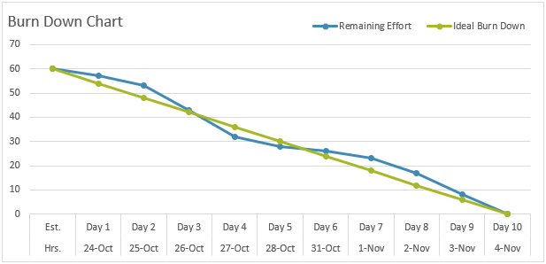
A Burn Down chart tracks the total expected effort (think tasks, milestones, time, costs), vs the actual effort, over time. For example, let’s say we have 60 hours of effort to complete 10 tasks in a 10 workday period. If we work at a steady pace, we’d use 6 hours per workday.

It’s called a burn down chart because it starts with the total effort available and over time that amount reduces until all effort is used up.

In the chart below the expected effort is the ‘ideal burn down’ line and the actual effort is the ‘remaining effort’ line.

Burn down chart example 1

If the remaining effort line is above the ideal burn down line, the project is falling behind. Conversely, if the remaining effort line is below the ideal burn down line, the project is ahead. In the example above the team were initially behind, but by day 4 they had pulled ahead only to fall behind again on day 6. However, they managed to finish in line with expectations.

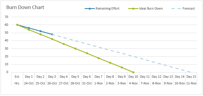
This isn’t always the case and these charts are used to enable the team to adjust their original targets and communicate with stakeholders early on of any changes to the original plan. For example, in the chart below we can see that after 3 days of work the average hours is closer to 4 per day instead of 6, and if we extrapolate that out the project will take 15 days to complete, rather than the planned 10. At this point we can either add resources to bring the project back in line with the time deadline but at an increased cost, reduce the scope of the project to bring it in on time and budget, or accept it will take longer and cost more.

Burn down chart example 2

Building Excel Burn Down Charts

In the table below we have 10 tasks and in column C we have the estimated hours each task will take. As each day passes the actual hours of work completed are entered in columns D through M.

Burn up down chart data

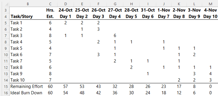
Row 15 – Remaining Effort: Each day the cumulative hours of work completed are subtracted from the total estimated hours to show how many hours are remaining. The formula in cell D15 is:

=$C$15-SUM($D$5:D14)

Copied across, the sum increments by one column at a time to return the cumulative effort, which is subtracted from the total estimated hours.

Row 16 Ideal Burn Down: is the total hours evenly distributed over the 10 days on the assumption that the same amount of work will be completed each day. The formula in cell D16 is:

=$C$15-$C$15/10*COUNT($D$15:D15)

Copied across, the count increments by one column at a time to increase the hours subtracted from the total estimated hours in cell C15.

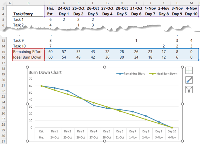
In the image below you can see the chart is simply plotting rows 15 and 16 in a line chart:

Burn up down chart plotted data

Burn Up Charts Explained

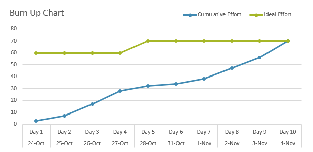
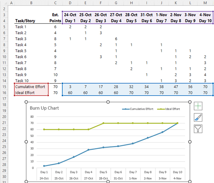
Burn up charts plot the ideal effort at a constant rate and display the cumulative actual effort over time. Their purpose is the same i.e. to identify if a project is off track and unlikely to meet its goals. Under Agile Project Management, burn up charts typically quantify progress in points, rather than time, hence the terminology in the chart below. However, if you’re not bound by Agile, you can use them for costs, hours, milestones etc.

Burn up chart example 1

In the chart above, at day 5 the scope of the project increased. Hence the jump in the Ideal Effort line from 60 to 70. This helps give context to the project to the stakeholders reading the chart.

Like the burn down chart, the burn up chart also plots the last two rows of data, with the cumulative effort simply summing the effort to date for each day with a sum formula in cell D15:

=SUM($D$5:D14)

Which is then copied across to increment by one day at a time.

Burn up down chart example 6

Like burn down charts, with burn up charts you can forecast a few days into the work to see if you’re on target and make changes accordingly.

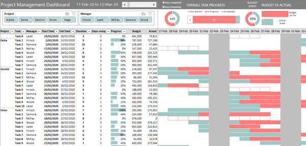
I hope you find these charts useful. If you’d like more Project Management ideas, please see my Excel Project Management Dashboard tutorial.

project management dashboard

burn up burn down charts
Mynda Treacy

Microsoft MVP logo

AUTHOR Mynda Treacy Co-Founder / Owner at My Online Training Hub

CIMA qualified Accountant with over 25 years experience in roles such as Global IT Financial Controller for investment banking firms Barclays Capital and NatWest Markets.

Mynda has been awarded Microsoft MVP status every year since 2014 for her expertise and contributions to educating people about Microsoft Excel.

Mynda teaches several courses here at MOTH including Excel Expert, Excel Dashboards, Power BI, Power Query and Power Pivot.

More Charts Posts

wee people font charts

Excel WeePeople Font Charts

Excel WeePeople Font Charts are a nice change from generic shapes for waffle charts, bar/column charts and more.
excel dot map charts

Excel Dot Map Charts

Interactive Excel dot map charts are not built-in, but with some creative use of Excel’s built-in tools we can create something unique.
Excel S Curve Charts

Excel S-Curve Charts

Easy Excel S-curve Charts made with PivotTables for project management. Track progress by including budget amounts.
highlighting data in power bi visuals

Highlighting Data in Power BI Visuals

Learn several techniques to highlight or label important data points in your Power BI visuals. Sample file and code to download.
shape maps in power bi

Shape Maps in Power BI

Shape maps in Power BI can be used to show the distribution of a variable across geographic regions. Learn a trick to plot discrete data too.
using jitter to avoid over plotting

Using Jitter to Avoid Over Plotting in Power BI

Plotting data that has one variable where values are similar, can result in points that are plotted over each other. Use jitter to avoid this overplotting.
Excel custom chart labels

Excel Custom Chart Labels

Create dynamic Excel custom chart labels with this category axis hijack trick
Sorting Excel Date Slicers

Sorting Excel Date Slicers

Slicers have some shortcomings when it comes to dates and sort order. This post explains a couple of ways to sort dates correctly in Excel slicers.
Charting Disparate Data in Excel – 3 Solutions and 1 Crazy Mess

Charting Disparate Data in Excel – 3 Solutions and 1 Crazy Mess

4 Charts – Same Data. Which do you think is best?

4 Charts – Same Data. Which do you think is best?

More Excel Charts Posts

wee people font charts

Excel WeePeople Font Charts

Excel WeePeople Font Charts are a nice change from generic shapes for waffle charts, bar/column charts and more.
excel dot map charts

Excel Dot Map Charts

Interactive Excel dot map charts are not built-in, but with some creative use of Excel’s built-in tools we can create something unique.
highlighting data in power bi visuals

Highlighting Data in Power BI Visuals

Learn several techniques to highlight or label important data points in your Power BI visuals. Sample file and code to download.
animating excel charts

Animating Excel Charts

Use animation correctly to enhance the story your data is telling. Don't animate your chart just for some eye candy. Sample code and workbook to download.
project management dashboard

Excel Project Management Dashboard

Excel project management dashboard video tutorial covering various techniques including conditional formatting, PivotTables, Slicers, charts and more.
jitter in scatter charts

Jitter in Excel Scatter Charts

Jitter introduces a small movement to the plotted points, making it easier to read and understand scatter plots particularly when dealing with lots of data.
Custom Excel Chart Label Positions

Custom Excel Chart Label Positions

Custom Excel Chart Label Positions using a dummy or ghost series to force the label position neatly above the columns of data
Lookup Pictures in Excel

Lookup Pictures in Excel

Lookup Pictures in Excel using values in cells returned by data validation lists (drop down lists) or Slicers. No VBA/Macros required!

Cross Highlight Excel Charts

Filter and Cross Highlight Excel Charts like you can in Power BI using some Excel Power Pivot magic, regular charts and a Slicer.
save chart as image

Save Chart as Image

List all the charts in your workbook then select the ones you want to save as either PNG or JPG. Sample workbook and code to download

More Excel Charts Posts

interactive python charts in excel

Interactive Python Charts in Excel

How to build interactive Python Charts in Excel and regular charts with Slicers connected to data from Power Query.
Circle Progress Charts

Excel Progress Circle Charts

How to easily create dynamic Excel Progress Circle Charts, using doughnut charts and some wizardry, including Slicers to change the data.
professional vs amateur chart formatting

Pro Excel Chart Formatting

10 tell-tale signs that show you’re a chart amateur and the Excel chart formatting you should use instead.

Excel Scroll and Sort Table

Excel scroll and sort table using dynamic array formulas is far simpler than the old approach which required multiple tables, formulas and helper columns.
picture fill excel charts

Picture Fill Excel Charts

Using a stylish picture fill in your Excel Charts is a simple way to make your data visualizations more captivating and memorable
excel speedometer charts

Excel Speedometer Charts

How to build Excel Speedometer Charts or Gauge Charts as they're also know, why they are BAD and what to use instead.
burn up burn down charts

Excel Project Management Burn Down and Burn Up Charts

Excel Burn Down and Burn Up Charts are easy to make with line or scatter charts. They are useful for monitoring the progress of a project.
wee people font charts

Excel WeePeople Font Charts

Excel WeePeople Font Charts are a nice change from generic shapes for waffle charts, bar/column charts and more.
excel dot map charts

Excel Dot Map Charts

Interactive Excel dot map charts are not built-in, but with some creative use of Excel’s built-in tools we can create something unique.
Excel S Curve Charts

Excel S-Curve Charts

Easy Excel S-curve Charts made with PivotTables for project management. Track progress by including budget amounts.


Category: Excel ChartsTag: charts, excel charts
Previous Post:wee people font chartsExcel WeePeople Font Charts
Next Post:Hidden Excel Double Click Shortcutsdouble click shortcuts thumbnail

Reader Interactions

Leave a Reply Cancel reply

Your email address will not be published. Required fields are marked *

Current ye@r *

Leave this field empty

Sidebar

More results...

office scripts course

Popular Content

  • 10 Common Excel Mistakes to Avoid
  • Top Excel Functions for Data Analysts
  • Secrets to Building Excel Dashboards in Less Than 15 Minutes
  • Pro Excel Formula Writing Tips
  • Hidden Excel Double-Click Shortcuts
  • Top 10 Intermediate Excel Functions
  • 5 Pro Excel Dashboard Design Tips
  • 5 Excel SUM Function Tricks
  • 239 Excel Keyboard Shortcuts

100 Excel Tips and Tricks eBook

Download Free Tips & Tricks

239 Excel Keyboard Shortcuts

Download Free PDF

mynda treacy microsoft mvpHi, I'm Mynda Treacy and I run MOTH with my husband, Phil. Through our blog, webinars, YouTube channel and courses we hope we can help you learn Excel, Power Pivot and DAX, Power Query, Power BI, and Excel Dashboards.

Blog Categories

  • Excel
  • Excel Charts
  • Excel Dashboard
  • Excel Formulas
  • Excel Office Scripts
  • Excel PivotTables
  • Excel Shortcuts
  • Excel VBA
  • General Tips
  • Online Training
  • Outlook
  • Power Apps
  • Power Automate
  • Power BI
  • Power Pivot
  • Power Query
microsoft mvp logo
trustpilot excellent rating
Secured by Sucuri Badge
MyOnlineTrainingHub on YouTube Mynda Treacy on Linked In Mynda Treacy on Instagram Mynda Treacy on Twitter Mynda Treacy on Pinterest MyOnlineTrainingHub on Facebook

Sign up to our newsletter and join over 400,000
others who learn Excel and Power BI with us.


Company

  • About My Online Training Hub
  • Disclosure Statement
  • Frequently Asked Questions
  • Guarantee
  • Privacy Policy
  • Terms & Conditions
  • Testimonials
  • Become an Affiliate
  • Sponsor Our Newsletter

Support

  • Contact
  • Forum
  • Helpdesk – For Technical Issues

Copyright © 2023 · My Online Training Hub · All Rights Reserved. Microsoft and the Microsoft Office logo are trademarks or registered trademarks of Microsoft Corporation in the United States and/or other countries. Product names, logos, brands, and other trademarks featured or referred to within this website are the property of their respective trademark holders.