I get the fanfare around infographics. They’re used to make information more appealing, grab attention, awaken interest, lessen boredom and make that information memorable and easier to understand.
However sometimes they don’t deliver on all points and often miss the most important point, which is to quickly and clearly communicate your message.
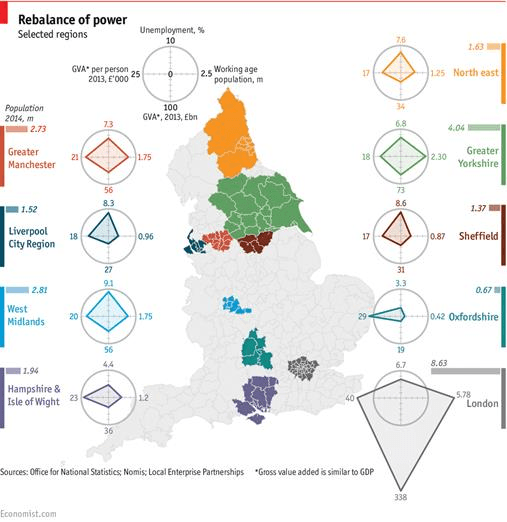
Just take the graphic below by Economist.com titled “Rebalance of power”, which I wouldn’t say is strictly an infographic but it’s had a bit of zhushing. To test its effectiveness see how long it takes you to:
- compare one region’s results to another
- find the region with the lowest unemployment %
- compare the shape of each region’s radar charts
Now, my economics training consists of one semester as part of my accounting qualification so perhaps I’m not the target audience for this infographic. That said, if the target audience are economists then I’d have thought they don’t need it all pretty to get the message.
So for the purpose of this post let’s assume that the target audience is your average man on the street because I want to address the use of radar charts in general and look at alternatives for them.
Chart Effectiveness
Before we dive in to critiquing the infographic let’s recap the purpose of a chart, which also applies to an infographic:
The goal with any chart or graph is to clearly and quickly communicate your message.
Testing the info-graphic against that statement, and assuming the target audience is your average Joe Blow, it falls short.
To Map or not to Map
Whenever you’re reporting data by region or country it’s tempting to use a map. However the map in this example, while attention grabbing, is really just a space hogging, fancy legend with no substance or message to deliver.
Off the Radar
The radar charts are the real problem here though.
Radar charts display data in a circular fashion, which is the opposite of the straight line comparisons we’re able to subconsciously perform. This means we have to work hard to make any comparisons and as a result we’re likely to make mistakes in our assumptions.
I could go on scolding radar charts but Stephen Few has already written this paper; “Keep Radar Graphs Below the Radar – Far Below”.
Caveat; as with pie charts there will always be advocates for radar charts and as Few cites in his paper, there are a few instances where you might argue radar charts are good, including when:
- The data consists of multiple measures that require different quantitative scales, which a bar graph cannot accommodate.
- The objective of the graph is to assess the symmetry of the values rather than to compare their magnitudes.
- The data fits a circular display because it is intuitively circular in nature or by convention.
That said, I still think most of the time you’re better off using charts that allow you to plot data in a linear fashion as this makes it easier for all ability levels to interpret. i.e. not only Economists.
Download
Download the Excel workbook to see close ups of the images below and how I set up the Conditional Formatting and in-cell bar charts.
Enter your email address below to download the sample workbook.
Note: This is a .xlsx file please ensure your browser doesn't change the file extension on download.
Excel Alternatives to Radar Charts
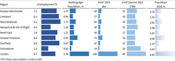
One option is to use Conditional Formatting Data Bars as shown below:
Boring, I hear you say 🙂 I agree it doesn’t have the same attention grabbing appeal of the infographic but it’s a lot quicker and easier to interpret and your readers will thank you for that.
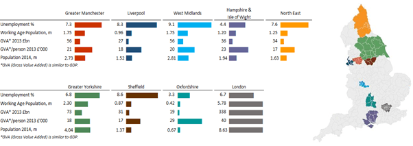
If you wanted to retain some of the eye catching infographic effect you could do something like this:
But, personally I think grouping the data by region makes comparisons difficult. And if you retain the grouping by measure (see below), then the colour coding makes it look like a Christmas tree and you don't know where to look first:
Note: the map in this example is a static image. This tutorial does not cover creating choropleth maps in Excel but you can find some choropleth chart templates here.
Moral of the Story
If you want to compare data across multiple criteria and regions then radar charts are not ideal. Better choices are Conditional Formatting Data Bars, bar charts, small multiples and Sparklines.


Good article Mynda! When I see graphics like the “Rebalance of Power” graphic my first thought is, “this was done because the creator “could”, without regard to whether they “should” (use that format). People often confuse “colorful” with “informative”, and sadly it seems to get worse with each new technical capability.
“People often confuse “colorful” with “informative” couldn’t have said it better 🙂
Good article! Thanks!
Thanks Pmsocho 🙂
Hi Mynda,
Hello from chilly England.
I am very interested in this article for displaying data in dashboards. I looked further into choropleth maps and came across this brilliant article
Hope this may be of interest for others.
Please keep up the great work educating the world’s Excel users.
P.S. Completed your dashboard course a couple of years ago and have never looked back since. I thoroughly recommend this course to all out there who need training in this wonderful data presentation technique.
Hi Chris,
Thanks for sharing the choropleth maps link. It’s a shame they’re so complicated but hopefully Power BI will come to our rescue….if it can ever recognise regions in countries outside of the U.S.!
Glad you enjoyed my Excel Dashboard course and are making good use of it.
Cheers,
Mynda
Thanks Mynda, nice writeup! I especially like how simple it is to setup the first alternative chart, using the Conditional Formatting data bars. I noticed that the ranges you used in your conditional formatting ranges are a bit segmented (instead of having just one continuous range for each column of data), but it looks like it will work with a continuous range also. Could you let me know if there is a special reason to set them up the way you did?
Hi James,
Glad you like the alternatives to radar charts.
The conditional formatting in that file looks a little messed up in the Conditional Formatting manager. Probably because I moved the tables around quite a bit while I was figuring out what layout worked best. I’ve tidied it up in this file.
Mynda
Thanks Mynda! I never realized that moving things around could result in those staggered ranges, now I’ll know when it happens to me!
Very nice article Mynda. Well thought out and well presented.
When I see charts like your opening Economist.com presentation, I immeditaely ignore them as I believe they are created by frustrated Picasso’s, hell bent of trying to show they can produce something fancy, but which in reality is meaningless.
Your alternatives are far more instructive, as well as being less distracting.
Well done.
Thanks, Roger. I had to bite my tongue when writing about the economist.com’s presentation 🙂