• Skip to main content
  • Skip to header right navigation
  • Skip to site footer

My Online Training Hub

Learn Dashboards, Excel, Power BI, Power Query, Power Pivot

  • Courses
  • Pricing
    • Free Courses
    • Power BI Course
    • Excel Power Query Course
    • Power Pivot and DAX Course
    • Excel Dashboard Course
    • Excel PivotTable Course – Quick Start
    • Advanced Excel Formulas Course
    • Excel Expert Advanced Excel Training
    • Excel Tables Course
    • Excel, Word, Outlook
    • Financial Modelling Course
    • Excel PivotTable Course
    • Excel for Customer Service Professionals
    • Excel for Operations Management Course
    • Excel for Decision Making Under Uncertainty Course
    • Excel for Finance Course
    • Excel Analysis ToolPak Course
    • Multi-User Pricing
  • Resources
    • Free Downloads
    • Excel Functions Explained
    • Excel Formulas
    • Excel Add-ins
    • IF Function
      • Excel IF Statement Explained
      • Excel IF AND OR Functions
      • IF Formula Builder
    • Time & Dates in Excel
      • Excel Date & Time
      • Calculating Time in Excel
      • Excel Time Calculation Tricks
      • Excel Date and Time Formatting
    • Excel Keyboard Shortcuts
    • Excel Custom Number Format Guide
    • Pivot Tables Guide
    • VLOOKUP Guide
    • ALT Codes
    • Excel VBA & Macros
    • Excel User Forms
    • VBA String Functions
  • Members
    • Login
  • Blog
  • Excel Webinars
  • Excel Forum
    • Register as Forum Member
  • Login

Excel Actual vs Target Chart

You are here: Home / Excel Charts / Excel Actual vs Target Chart
Excel Actual vs Target Charts
November 6, 2019 by Mynda Treacy

Often, you’ll find Actual vs Target charts based on categorical data in the form of a column chart, however they’re slow to read.  Thankfully we can make a big improvement in how quick and easy they are to read with a few simple changes.

Watch the Video

Subscribe YouTube


Download Workbook

Enter your email address below to download the sample workbook.

By submitting your email address you agree that we can email you our Excel newsletter.
Please enter a valid email address.

Download the Excel Workbook and follow along. Note: This is a .xlsx file please ensure your browser doesn't change the file extension on download.

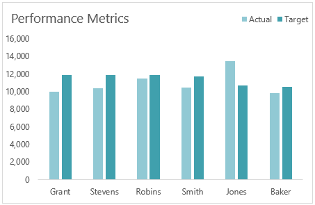
Two Series Actual vs Target Chart

Let’s take the two series actual vs target chart example below. It’s slow to interpret because it takes time for the reader to compare the height of each column for each category on the horizontal axis:

two series actual vs target chart

Whereas with two changes we can compare the actual to target at a glance, almost without even focusing on the chart columns at all! This effect is often called a thermometer chart.

thermometer chart

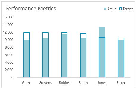
It’s so clear that we can still see the actual vs target in our peripheral vision while focusing on the vertical and horizontal axes. It reminds me of those magic eye pictures where in order to see the 3D picture you don’t focus on the detail. If you were a kid in the 90s, you’ll know what I mean!

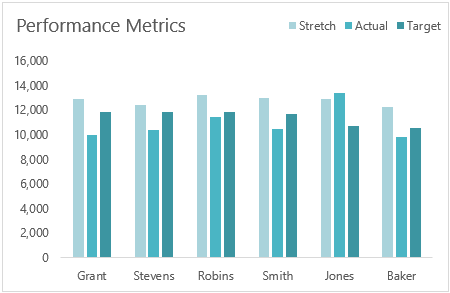
Three Series Actual vs Target Chart

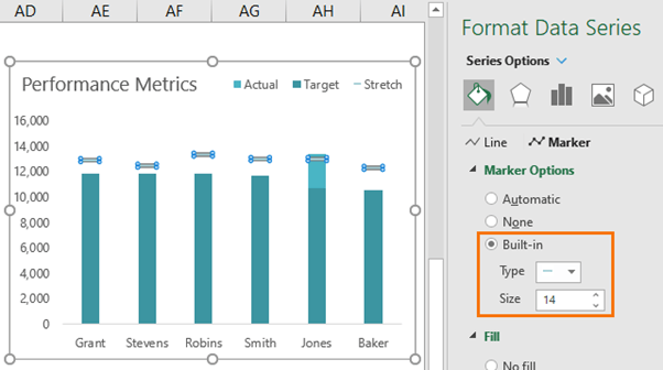
Sometimes we’ll have three series; actual vs target vs forecast, or as in the example below, stretch target:

three series actual vs target chart

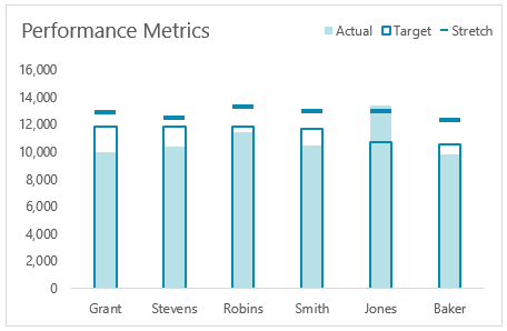
We can use a similar technique, this time displaying the stretch target as a dashed line:

stretch target as a dashed line

Creating Thermometer Charts

Steps for creating thermometer charts:

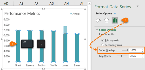
Step 1: Select one of the series in the chart > CTRL+1 to open the format data series pane

Step 2: Go to the Series Options tab > set the series overlap to 100%

set the series overlap to 100 %

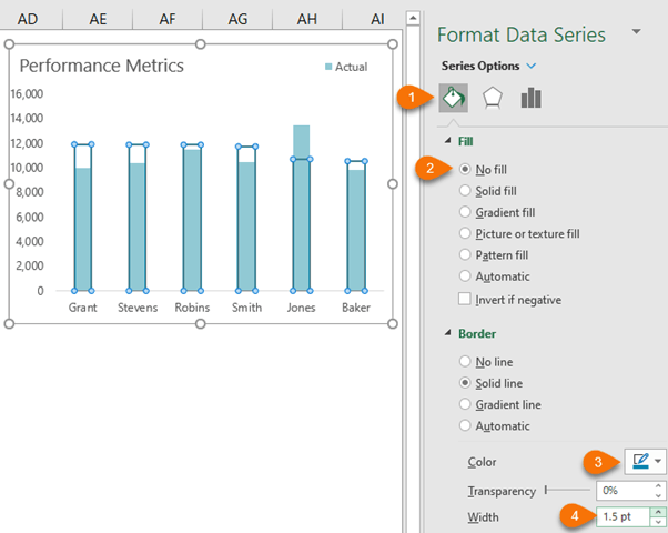
Step 3: Go to the paint bucket icon > set the Fill to ‘No fill’. Give the border a darker colour and increase the width.

set the fill to no fill

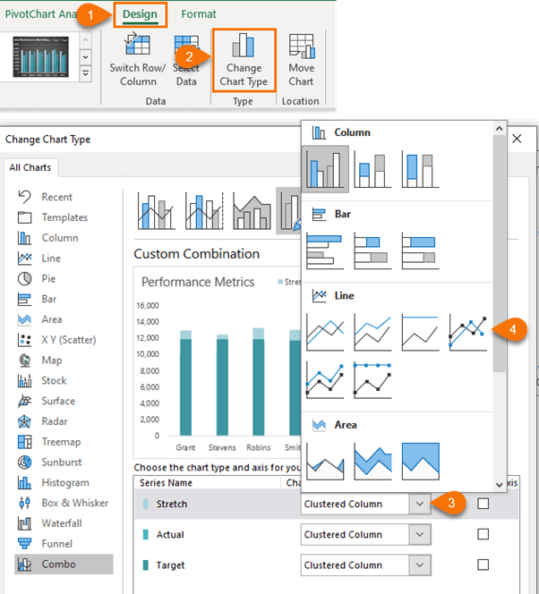
If you’re working with a 3 series chart,

Step 4: Change the chart type to a Line with Marker via the Chart Design tab:

change chart type to a line with marker

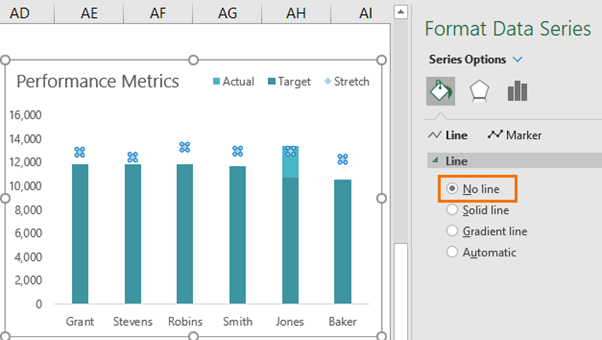
Step 5: Format the line to ‘No line’

format the line to no line

Step 6: Format the Marker to the dash built in style and size 14, or whatever you think is appropriate for the width of your chart columns:

format the marker

Related Lessons

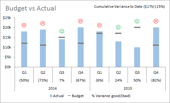
Charting Variances in Excel – a bit of fun with emojis!

variance chart

Excel Actual vs Target Charts
Mynda Treacy

Microsoft MVP logo

AUTHOR Mynda Treacy Co-Founder / Owner at My Online Training Hub

CIMA qualified Accountant with over 25 years experience in roles such as Global IT Financial Controller for investment banking firms Barclays Capital and NatWest Markets.

Mynda has been awarded Microsoft MVP status every year since 2014 for her expertise and contributions to educating people about Microsoft Excel.

Mynda teaches several courses here at MOTH including Excel Expert, Excel Dashboards, Power BI, Power Query and Power Pivot.

More Excel Charts Posts

interactive python charts in excel

Interactive Python Charts in Excel

How to build interactive Python Charts in Excel and regular charts with Slicers connected to data from Power Query.
Circle Progress Charts

Excel Progress Circle Charts

How to easily create dynamic Excel Progress Circle Charts, using doughnut charts and some wizardry, including Slicers to change the data.
professional vs amateur chart formatting

Pro Excel Chart Formatting

10 tell-tale signs that show you’re a chart amateur and the Excel chart formatting you should use instead.

Excel Scroll and Sort Table

Excel scroll and sort table using dynamic array formulas is far simpler than the old approach which required multiple tables, formulas and helper columns.
picture fill excel charts

Picture Fill Excel Charts

Using a stylish picture fill in your Excel Charts is a simple way to make your data visualizations more captivating and memorable
excel speedometer charts

Excel Speedometer Charts

How to build Excel Speedometer Charts or Gauge Charts as they're also know, why they are BAD and what to use instead.
burn up burn down charts

Excel Project Management Burn Down and Burn Up Charts

Excel Burn Down and Burn Up Charts are easy to make with line or scatter charts. They are useful for monitoring the progress of a project.
wee people font charts

Excel WeePeople Font Charts

Excel WeePeople Font Charts are a nice change from generic shapes for waffle charts, bar/column charts and more.
excel dot map charts

Excel Dot Map Charts

Interactive Excel dot map charts are not built-in, but with some creative use of Excel’s built-in tools we can create something unique.
Excel S Curve Charts

Excel S-Curve Charts

Easy Excel S-curve Charts made with PivotTables for project management. Track progress by including budget amounts.


Category: Excel Charts
Previous Post:Checking values in range objects with vbaChecking Values in Range Objects With VBA
Next Post:Overlay Line Chart LabelsOverlay Line Chart Labels

Reader Interactions

Comments

  1. Rashad

    March 17, 2020 at 5:56 am

    Hello Mynda
    thank you very mcuh for your effort. your vedios are really beneficial.

    i have a question if you can help me, how can i show the delta between the actual and target

    Reply
    • Mynda Treacy

      March 17, 2020 at 3:16 pm

      Hi Rashad,

      Glad you find our content helpful 🙂 In terms of showing the difference between Actual and Target, you can do this a number of ways:

      1. Add it as a series on the secondary axis
      2. Use custom chart labels linked to the variance
      3. Only plot the variance in the chart
      4. Show the variance in the axis labels

      Hope that gives you some ideas.

      Mynda

      Reply
      • Rashad R alyaheby

        March 18, 2020 at 10:41 pm

        Thank you very much Mynda for your help. the answer is very usfel

        Reply
  2. Allyn

    November 14, 2019 at 9:02 pm

    Hi Mynda, as always this is so simple yet effective. Thank you. But I do have a question regarding data labels. I would like to have data labels for the Actuals and there are various options for label position but I cant make the Actual data labels appear above the Target column, instead they float above the actual so for some they are within the target column, some overlap and some are above. Any advice please?

    Reply
    • Mynda Treacy

      November 14, 2019 at 9:14 pm

      Hi Allwyn,

      Glad you liked it. Label position can be a problem in cases like you describe. The solution is to add a dummy series to your chart that is higher than the target values, then you can assign the “actuals” labels to that series using the ‘Value from cells’ option. Then hide the dummy series by setting its fill colour to none. See step 8 in this post for Value from Cells.

      Mynda

      Reply

Leave a Reply Cancel reply

Your email address will not be published. Required fields are marked *

Current ye@r *

Leave this field empty

Sidebar

More results...

office scripts course

Popular Content

  • 10 Common Excel Mistakes to Avoid
  • Top Excel Functions for Data Analysts
  • Secrets to Building Excel Dashboards in Less Than 15 Minutes
  • Pro Excel Formula Writing Tips
  • Hidden Excel Double-Click Shortcuts
  • Top 10 Intermediate Excel Functions
  • 5 Pro Excel Dashboard Design Tips
  • 5 Excel SUM Function Tricks
  • 239 Excel Keyboard Shortcuts

100 Excel Tips and Tricks eBook

Download Free Tips & Tricks

239 Excel Keyboard Shortcuts

Download Free PDF

mynda treacy microsoft mvpHi, I'm Mynda Treacy and I run MOTH with my husband, Phil. Through our blog, webinars, YouTube channel and courses we hope we can help you learn Excel, Power Pivot and DAX, Power Query, Power BI, and Excel Dashboards.

Blog Categories

  • Excel
  • Excel Charts
  • Excel Dashboard
  • Excel Formulas
  • Excel Office Scripts
  • Excel PivotTables
  • Excel Shortcuts
  • Excel VBA
  • General Tips
  • Online Training
  • Outlook
  • Power Apps
  • Power Automate
  • Power BI
  • Power Pivot
  • Power Query
microsoft mvp logo
trustpilot excellent rating
Secured by Sucuri Badge
MyOnlineTrainingHub on YouTube Mynda Treacy on Linked In Mynda Treacy on Instagram Mynda Treacy on Twitter Mynda Treacy on Pinterest MyOnlineTrainingHub on Facebook

Sign up to our newsletter and join over 400,000
others who learn Excel and Power BI with us.


Company

  • About My Online Training Hub
  • Disclosure Statement
  • Frequently Asked Questions
  • Guarantee
  • Privacy Policy
  • Terms & Conditions
  • Testimonials
  • Become an Affiliate
  • Sponsor Our Newsletter

Support

  • Contact
  • Forum
  • Helpdesk – For Technical Issues

Copyright © 2023 · My Online Training Hub · All Rights Reserved. Microsoft and the Microsoft Office logo are trademarks or registered trademarks of Microsoft Corporation in the United States and/or other countries. Product names, logos, brands, and other trademarks featured or referred to within this website are the property of their respective trademark holders.

Download A Free Copy of 100 Excel Tips & Tricks

excel tips and tricks ebook

We respect your privacy. We won’t spam you.

x