• Skip to main content
  • Skip to header right navigation
  • Skip to site footer

My Online Training Hub

Learn Dashboards, Excel, Power BI, Power Query, Power Pivot

  • Courses
  • Pricing
    • Free Courses
    • Power BI Course
    • Excel Power Query Course
    • Power Pivot and DAX Course
    • Excel Dashboard Course
    • Excel PivotTable Course – Quick Start
    • Advanced Excel Formulas Course
    • Excel Expert Advanced Excel Training
    • Excel Tables Course
    • Excel, Word, Outlook
    • Financial Modelling Course
    • Excel PivotTable Course
    • Excel for Customer Service Professionals
    • Excel for Operations Management Course
    • Excel for Decision Making Under Uncertainty Course
    • Excel for Finance Course
    • Excel Analysis ToolPak Course
    • Multi-User Pricing
  • Resources
    • Free Downloads
    • Excel Functions Explained
    • Excel Formulas
    • Excel Add-ins
    • IF Function
      • Excel IF Statement Explained
      • Excel IF AND OR Functions
      • IF Formula Builder
    • Time & Dates in Excel
      • Excel Date & Time
      • Calculating Time in Excel
      • Excel Time Calculation Tricks
      • Excel Date and Time Formatting
    • Excel Keyboard Shortcuts
    • Excel Custom Number Format Guide
    • Pivot Tables Guide
    • VLOOKUP Guide
    • ALT Codes
    • Excel VBA & Macros
    • Excel User Forms
    • VBA String Functions
  • Members
    • Login
  • Blog
  • Excel Webinars
  • Excel Forum
    • Register as Forum Member

Overlay Line Chart Labels

You are here: Home / Excel Charts / Overlay Line Chart Labels
Overlay Line Chart Labels
November 12, 2019 by Mynda Treacy

Labeling charts is useful if the reader needs to know the exact value for each point.

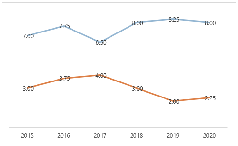
We can position labels left, right, above, below or overlaid (centred) on the line. However, when you overlay line chart labels it typically looks messy, as you can see below:

overlay line chart labels

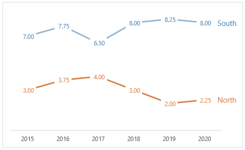
This is easily solved with some formatting to achieve this effect:

add formatting

Download Workbook

Enter your email address below to download the sample workbook.

By submitting your email address you agree that we can email you our Excel newsletter.
Please enter a valid email address.

Download the Excel Workbook and follow along. Note: This is a .xlsx file please ensure your browser doesn't change the file extension on download.

Watch the Video

Subscribe YouTube


Steps to Overlay Chart Labels

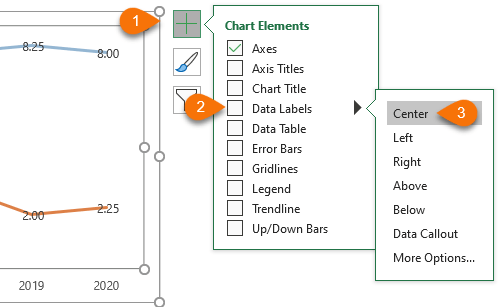
Step 1: Add Data Labels

add data labels

Step 2: Format Labels

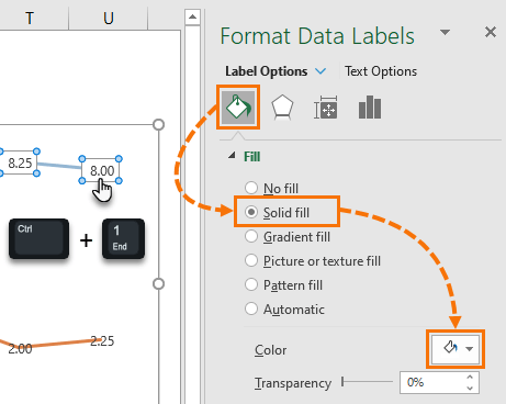
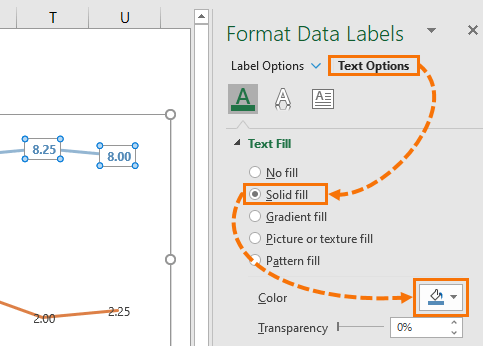
Left click on one of the labels to select them all then press CTRL+1 to open the Format Data Labels pane where you select the paint bucket and set the fill to solid white:

format labels

Step 3: Format Label Text

Click on the Text Options in the Format Data Labels pane and format the font the same colour as the line.

Tip: If the line is a pale colour, choose the next shade darker.

format label text

Repeat for the next series.

Step 4: [Optional] Add a Manual Legend

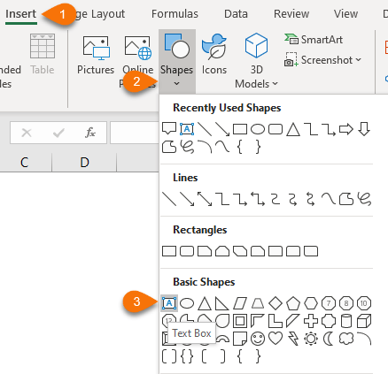
You can add the built-in legend if you want, however with line charts like this I like to label the end of the lines using text boxes. You’ll find them on the Insert tab of the ribbon:

add a manual legend

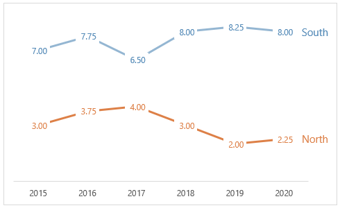
Tip: Colour code the legend labels to match the line. Your end result should look like this:

colour code the legend labels

If you find the labels too much, consider only labelling the first and last points:

only label the first and last points

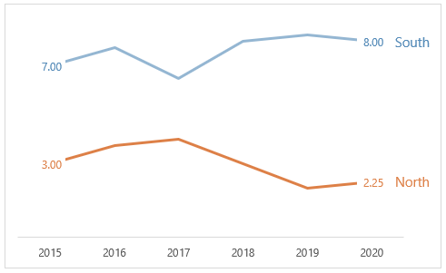
To remove the extra labels, left click on each one twice (slowly so as not to double click), then press the delete key.

Related Topics

Custom Chart Labels

Custom Chart Labels

Overlay Line Chart Labels

More Excel Charts Posts

picture fill excel charts

Picture Fill Excel Charts

Using a stylish picture fill in your Excel Charts is a simple way to make your data visualizations more captivating and memorable
excel speedometer charts

Excel Speedometer Charts

How to build Excel Speedometer Charts or Gauge Charts as they're also know, why they are BAD and what to use instead.
burn up burn down charts

Excel Project Management Burn Down and Burn Up Charts

Excel Burn Down and Burn Up Charts are easy to make with line or scatter charts. They are useful for monitoring the progress of a project.
wee people font charts

Excel WeePeople Font Charts

Excel WeePeople Font Charts are a nice change from generic shapes for waffle charts, bar/column charts and more.
excel dot map charts

Excel Dot Map Charts

Interactive Excel dot map charts are not built-in, but with some creative use of Excel’s built-in tools we can create something unique.
Excel S Curve Charts

Excel S-Curve Charts

Easy Excel S-curve Charts made with PivotTables for project management. Track progress by including budget amounts.
chart axis switch

Excel Chart Axis Switch

Use radio button form controls to create an Excel chart axis switch enabling you to toggle pannel charts between same axis and own axis.

Excel Charts with Shapes for Infographics

Excel Charts with Shapes for Infographic styling and increased interest in your charts. Easy to insert but there are a few tricks required.
excel pyramid chart

Excel Pyramid Charts

Excel Pyramid charts are useful for visualising demographic data across multiple categories. Let’s look at 3 ways we can build them in Excel.

Highlighting Periods in Excel Charts

Highlighting Periods in Excel Charts helps your users interpret them more quickly and or focus their attention on a point or area.


Category: Excel Charts
Previous Post:Excel Actual vs Target ChartsExcel Actual vs Target Chart
Next Post:Excel Small Multiple ChartsExcel Small Multiple Charts

Reader Interactions

Comments

  1. Jimmy

    November 12, 2021 at 3:03 am

    Just curious if it’s been presented before. I have two charts that I’d like to overlay. They are line charts, but one is K$ and the other is a record count.

    Reply
    • Mynda Treacy

      November 12, 2021 at 8:59 am

      I can’t see why not. They would be different series so they can each have their own formatting.

      Reply
  2. jim

    January 16, 2020 at 7:54 pm

    great ideas Mynda,
    instead of adding a textbox that needs manual alignment for the legend, I select the last label and have it contain the Series name as well, separated by a new line
    and like Jon, I leave the transparency at around 10%

    Reply
    • Mynda Treacy

      January 18, 2020 at 12:19 pm

      Nice touch, Jim. Thanks for sharing 🙂

      Reply
  3. Jon Wittwer

    November 14, 2019 at 11:27 am

    Hi Mynda, Another thing you could do is set the white fill on the data labels to 25% transparency. This lets you see the line graph faintly behind the data label.

    Reply
    • Mynda Treacy

      November 14, 2019 at 12:33 pm

      Nice idea, Jon! Thanks for sharing.

      Reply

Leave a Reply Cancel reply

Your email address will not be published. Required fields are marked *

Current ye@r *

Leave this field empty

Sidebar

More results...

launch excel macros course excel vba course

Featured Content

  • 10 Common Excel Mistakes to Avoid
  • Top Excel Functions for Data Analysts
  • Secrets to Building Excel Dashboards in Less Than 15 Minutes
  • Pro Excel Formula Writing Tips
  • Hidden Excel Double-Click Shortcuts
  • Top 10 Intermediate Excel Functions
  • 5 Pro Excel Dashboard Design Tips
  • 5 Excel SUM Function Tricks
  • 239 Excel Keyboard Shortcuts

100 Excel Tips and Tricks eBook

Download Free Tips & Tricks

Subscribe to Our Newsletter

Receive weekly tutorials on Excel, Power Query, Power Pivot, Power BI and More.

We respect your email privacy

239 Excel Keyboard Shortcuts

Download Free PDF

mynda treacy microsoft mvpHi, I'm Mynda Treacy and I run MOTH with my husband, Phil. Through our blog, webinars, YouTube channel and courses we hope we can help you learn Excel, Power Pivot and DAX, Power Query, Power BI, and Excel Dashboards.

Blog Categories

  • Excel
  • Excel Charts
  • Excel Dashboard
  • Excel Formulas
  • Excel PivotTables
  • Excel Shortcuts
  • Excel VBA
  • General Tips
  • Online Training
  • Outlook
  • Power Apps
  • Power Automate
  • Power BI
  • Power Pivot
  • Power Query
microsoft mvp logo
trustpilot excellent rating
Secured by Sucuri Badge
MyOnlineTrainingHub on YouTube Mynda Treacy on Linked In Mynda Treacy on Instagram Mynda Treacy on Twitter Mynda Treacy on Pinterest MyOnlineTrainingHub on Facebook
 

Company

  • About My Online Training Hub
  • Disclosure Statement
  • Frequently Asked Questions
  • Guarantee
  • Privacy Policy
  • Terms & Conditions
  • Testimonials
  • Become an Affiliate

Support

  • Contact
  • Forum
  • Helpdesk – For Technical Issues

Copyright © 2023 · My Online Training Hub · All Rights Reserved. Microsoft and the Microsoft Office logo are trademarks or registered trademarks of Microsoft Corporation in the United States and/or other countries. Product names, logos, brands, and other trademarks featured or referred to within this website are the property of their respective trademark holders.