• Skip to main content
  • Skip to header right navigation
  • Skip to site footer

My Online Training Hub

Learn Dashboards, Excel, Power BI, Power Query, Power Pivot

  • Courses
  • Pricing
    • Free Courses
    • Power BI Course
    • Excel Power Query Course
    • Power Pivot and DAX Course
    • Excel Dashboard Course
    • Excel PivotTable Course – Quick Start
    • Advanced Excel Formulas Course
    • Excel Expert Advanced Excel Training
    • Excel Tables Course
    • Excel, Word, Outlook
    • Financial Modelling Course
    • Excel PivotTable Course
    • Excel for Customer Service Professionals
    • Excel for Operations Management Course
    • Excel for Decision Making Under Uncertainty Course
    • Excel for Finance Course
    • Excel Analysis ToolPak Course
    • Multi-User Pricing
  • Resources
    • Free Downloads
    • Excel Functions Explained
    • Excel Formulas
    • Excel Add-ins
    • IF Function
      • Excel IF Statement Explained
      • Excel IF AND OR Functions
      • IF Formula Builder
    • Time & Dates in Excel
      • Excel Date & Time
      • Calculating Time in Excel
      • Excel Time Calculation Tricks
      • Excel Date and Time Formatting
    • Excel Keyboard Shortcuts
    • Excel Custom Number Format Guide
    • Pivot Tables Guide
    • VLOOKUP Guide
    • ALT Codes
    • Excel VBA & Macros
    • Excel User Forms
    • VBA String Functions
  • Members
    • Login
    • Password Reset
  • Blog
  • Excel Webinars
  • Excel Forum
    • Register as Forum Member

Charting Variances in Excel

You are here: Home / Excel Charts / Charting Variances in Excel
Excel variance charts
April 1, 2015 by Mynda Treacy

In my previous life as an accountant one of my main tasks was to analyse budget vs actual variances and then report these variances to department heads who were less than enthusiastic about finance, despite my repeated ‘Finance is Fun’ chants!

Let’s see how we can present variances in a chart that’s quick and easy to digest for anyone, even those who find finance a chore.

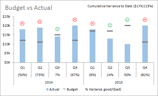
Charting Variances in Excel - Emoticon Rollercoaster Chart

In the spirit of ‘Finance is Fun’ we’re going to build what I call the Emoticon Rollercoaster Chart. It gets its name because the emoticons go up and down just like a rollercoaster…. sad, sad, happy, sad, sad, happy, happy, sad. …get it? 🙂

excel budget vs actual chart variances

Don’t be fooled into thinking this chart is only for fun. There are some important lessons about data visualisation to learn here too, and if you don’t think the emoticons will go down well with your crowd then you can leave them out and make this into a ‘Finance is Serious Business’ chart.

Download the Excel File

Enter your email address below to download the sample workbook.

By submitting your email address you agree that we can email you our Excel newsletter.
Please enter a valid email address.

Download the Excel Workbook. Note: This is a .xlsx file please ensure your browser doesn't change the file extension on download.

Watch the Video to see how it’s done in Excel 2007/2010

Note: it's much easier to create this chart in Excel 2013. Click here to see how.

If you like this video and want me to do more please give it the thumbs up in YouTube so I know 🙂

Data Visualisation Lessons

  • Remove clutter and noise from your charts – keep your charts clean and simple so the data can speak for itself.
  • Anticipate questions and try to answer them by including that information in the chart, as I have done with the % variances included in the axis labels and the cumulative variance to date in a dynamic text label.
  • Pitch it at the right level; if your report is for non-finance people then help them interpret it with clear legends e.g. % Variance good/(bad) is absolutely clear. There’s no point in using acronyms and symbols that only finance people understand. Instead of ‘good’ and ‘bad’ you could use % Variance +ve/-ve.

Answers to questions I know you’re going to ask – the answers are all NO!

Q1. Can I show the percentage and the emoticon in the same label?

A1. No.

The font for the labels is set to Wingdings so displaying the number and the emoticon in the same label will display the numbers in Wingdings too. Unfortunately unlike a cell, the label cannot take more than one font format.

Workaround: add another XY scatter series and insert the percentage labels in there.

Q2. Can I colour the % Variances in the axis labels red and green?

A2. The answer is also no.

You can’t colour individual items in the axis labels.

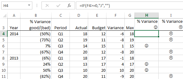
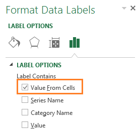
Custom Chart Labels Excel 2013

If you have Excel 2013 you can easily insert custom chart labels and have them automatically update colour changes using the new ‘Value From Cells’ option found in the Label Options menu.

If you haven't already, Download the Excel Workbook to see the Excel 2013 version. Note: This is a .xlsx file please ensure your browser doesn't change the file extension on download.
 

Creating coloured custom labels in Excel 2013 is easy:

  1. Layout your data so that you have happy faces in one column and sad faces in another - see columns H and I below:   excel 2013 data layout
  2. Insert two new series (on the primary axis) using the Max data in column G > Select cells G3:G11 > Ctrl+C to copy > select the chart > CTRL+V to paste the series into the chart; one will be for your happy faces and the other for your sad faces,
  3. Then apply labels for each of these series using the (new in Excel 2013) Value from Cells option and linking to the cells containing your emoticons (H34:H11 and I4:I11):

    excel 2013 value from cells labels

  4. Colour the two series labels red/green accordingly.
  5. Hide the columns for these series since they’re only present to set the location of the emoticon above the highest point for each column.

Thanks

Big thanks to Dave Hoffmeister for reminding about the XY Scatter Chart solution for Excel 2007/2010.

Your To-Do List

In no particular order:

  1. Download the workbook if you haven't already.
  2. Share this tutorial and the workbook with a friend or colleague.
  3. Have some fun with your reports, if you think your audience will appreciate it.
  4. Give my video the Thumbs Up in YouTube if you want me to record more often.
  5. Spread the 'Finance is Fun' motto if you work in Finance.
  6. Leave me a comment below and tell me what you do with your reports to improve audience engagement.
Excel variance charts

More Excel Charts Posts

picture fill excel charts

Picture Fill Excel Charts

Using a stylish picture fill in your Excel Charts is a simple way to make your data visualizations more captivating and memorable
excel speedometer charts

Excel Speedometer Charts

How to build Excel Speedometer Charts or Gauge Charts as they're also know, why they are BAD and what to use instead.
burn up burn down charts

Excel Project Management Burn Down and Burn Up Charts

Excel Burn Down and Burn Up Charts are easy to make with line or scatter charts. They are useful for monitoring the progress of a project.
wee people font charts

Excel WeePeople Font Charts

Excel WeePeople Font Charts are a nice change from generic shapes for waffle charts, bar/column charts and more.
excel dot map charts

Excel Dot Map Charts

Interactive Excel dot map charts are not built-in, but with some creative use of Excel’s built-in tools we can create something unique.
Excel S Curve Charts

Excel S-Curve Charts

Easy Excel S-curve Charts made with PivotTables for project management. Track progress by including budget amounts.
chart axis switch

Excel Chart Axis Switch

Use radio button form controls to create an Excel chart axis switch enabling you to toggle pannel charts between same axis and own axis.

Excel Charts with Shapes for Infographics

Excel Charts with Shapes for Infographic styling and increased interest in your charts. Easy to insert but there are a few tricks required.
excel pyramid chart

Excel Pyramid Charts

Excel Pyramid charts are useful for visualising demographic data across multiple categories. Let’s look at 3 ways we can build them in Excel.

Highlighting Periods in Excel Charts

Highlighting Periods in Excel Charts helps your users interpret them more quickly and or focus their attention on a point or area.


Category: Excel Charts
Previous Post:SnailPausing or Delaying VBA Using Wait, Sleep or A Loop
Next Post:Excel Chart Vertical Axis Text Labelstext labels on chart y axis

Reader Interactions

Comments

  1. John Young

    June 16, 2022 at 5:02 pm

    Like it.

    Would be interested to know if you can do this in horizontal format, but instead of font style, using a dynamic icon?

    Reply
    • Mynda Treacy

      June 16, 2022 at 8:32 pm

      Hi John,

      The labels are pretty limited, so you wouldn’t be able to use an icon unless it was generated by a font style.

      Mynda

      Reply
  2. Bia

    July 17, 2018 at 9:00 am

    Awesome video!! You saved me adding it manually! Ugh!
    For those not fun Finance folks, there are other more boring wingdings you can use, like up/down arrows, thumbs up/down, etc. But webdings has even MORE fun icons! Hearts, thunderstorms… 🙂

    Reply
    • Mynda Treacy

      July 17, 2018 at 9:35 am

      Thanks, Bia 🙂

      Here is an example of how to build a more conservative chart that uses up/down arrows.

      Mynda

      Reply
  3. David N

    June 20, 2017 at 4:07 am

    You might not be able to get exactly the same smile and frown faces, but you can use the UNICHAR function in Excel 2013 with ampersand or CONCATENATE to get both the percentage and emoticon into the same label and without any need to use the Wingding font.
    Example: =IF(F4>=0,B4&” “&UNICHAR(128534),””)

    Reply
    • Catalin Bombea

      June 20, 2017 at 3:27 pm

      Hi David,
      There are many way to get to the same result, thanks for this useful tip.
      Catalin

      Reply
  4. Jae

    October 4, 2016 at 1:42 pm

    Is it possible to show the variance amount rather than happy faces? Great tutorial btw 😉

    When I replaced the data with variance nos. and deleted the primary axis on the top, the chart formatting went crazy. It’d be really appreciated if you could advise on this.

    Reply
    • Mynda Treacy

      October 4, 2016 at 4:51 pm

      Hi Jae,

      Did you change the font in the labels? The font is set to Wingdings for the emoticons, but if you want to show numbers then you need to change the font.

      Not sure why you deleted the primary axis. Perhaps you can post your question on our Excel Forum were you can share your file. Also let us know which version of Excel you’re using.

      Mynda

      Reply
  5. jim

    February 18, 2016 at 9:25 pm

    yeah, tried that once and was told not to be so childish
    some finance people certainly ain’t fun!

    Reply
  6. Tim

    April 28, 2015 at 5:26 am

    Hi Mynda,

    I struggled a bit with the Practice chart trying to duplicate the Completed chart with a minimum of looking back-and-forth to the on-line tutorial. After finally getting the Practice chart to work, I changed the data set to a table and was totally blown-away when the chart updated itself dynamically based on filters applied to the data.

    Thanks so much for your clear presentations in your tutorials. I totally sold on using tables in Excel to present my data.

    Best regards,

    Tim

    P.S. Being a scientist I am at a loss as to what cumulatives variances and such were all about, but I can certainly use the techniques to turn data into information. Now you only have to sell me on enjoying finance.

    Reply
    • Mynda Treacy

      April 28, 2015 at 9:43 am

      Hi Tim,

      Great to hear you’ve mastered the chart.

      It’s disappointing you’re not sold on FiF (Finance is Fun), I will have to think about how I can better market it 🙂

      Mynda

      Reply
  7. Eve Peterson

    April 11, 2015 at 10:27 pm

    So clever:)

    Reply
    • Mynda Treacy

      April 12, 2015 at 2:06 pm

      Thanks, Eve!

      Reply
  8. Julian

    April 6, 2015 at 11:43 pm

    I tried Excel 2007 many times and finally found the only way to have the wanted emoticons is to merge the two columns “% Variance L” and “% Variance J” into one column.

    Reply
    • Mynda Treacy

      April 7, 2015 at 8:22 pm

      Hi Julian,

      Did you try the XY Scatter chart method above? It worked for me in Excel 2007.

      Mynda

      Reply
      • Julian

        April 28, 2015 at 6:52 pm

        Hi Mynda,

        I did follow your instructions on video step by step. It’s okay to get the “happy face” first, but when I applied the same approach later on for the “sad faces”, all the previous “happy faces” were gone. It’s really frustrated for me . Finally I tried my own way as I mentioned and It worked. Any way, thanks a lot for your great works. I enjoyed it very much.

        Reply
        • Mynda Treacy

          April 28, 2015 at 8:01 pm

          Hi Julian,

          It sounds like you didn’t insert two separate data series for the faces; one for the sad faces and one for the happy faces. Not to worry, the main thing is you got it to work.

          Mynda

          Reply
          • Julian

            April 29, 2015 at 1:27 pm

            Hi Mynda,

            It’s very nice having talked to you. Expect to see more great posts from you.

            Julian

Leave a Reply Cancel reply

Your email address will not be published. Required fields are marked *

Current ye@r *

Leave this field empty

Sidebar

More results...

Featured Content

  • 10 Common Excel Mistakes to Avoid
  • Top Excel Functions for Data Analysts
  • Secrets to Building Excel Dashboards in Less Than 15 Minutes
  • Pro Excel Formula Writing Tips
  • Hidden Excel Double-Click Shortcuts
  • Top 10 Intermediate Excel Functions
  • 5 Pro Excel Dashboard Design Tips
  • 5 Excel SUM Function Tricks
  • 239 Excel Keyboard Shortcuts

100 Excel Tips and Tricks eBook

Download Free Tips & Tricks

Subscribe to Our Newsletter

Receive weekly tutorials on Excel, Power Query, Power Pivot, Power BI and More.

We respect your email privacy

Guides and Resources

  • Excel Keyboard Shortcuts
  • Excel Functions
  • Excel Formulas
  • Excel Custom Number Formatting
  • ALT Codes
  • Pivot Tables
  • VLOOKUP
  • VBA
  • Excel Userforms
  • Free Downloads

239 Excel Keyboard Shortcuts

Download Free PDF

Free Webinars

Excel Dashboards Webinar

Watch our free webinars and learn to create Interactive Dashboard Reports in Excel or Power BI

Click Here to Watch Now

mynda treacy microsoft mvpHi, I'm Mynda Treacy and I run MOTH with my husband, Phil. Through our blog, webinars, YouTube channel and courses we hope we can help you learn Excel, Power Pivot and DAX, Power Query, Power BI, and Excel Dashboards.

Blog Categories

  • Excel
  • Excel Charts
  • Excel Dashboard
  • Excel Formulas
  • Excel PivotTables
  • Excel Shortcuts
  • Excel VBA
  • General Tips
  • Online Training
  • Outlook
  • Power Apps
  • Power Automate
  • Power BI
  • Power Pivot
  • Power Query
microsoft mvp logo
trustpilot excellent rating
Secured by Sucuri Badge
MyOnlineTrainingHub on YouTube Mynda Treacy on Linked In Mynda Treacy on Instagram Mynda Treacy on Twitter Mynda Treacy on Pinterest MyOnlineTrainingHub on Facebook
 

Company

  • About My Online Training Hub
  • Disclosure Statement
  • Frequently Asked Questions
  • Guarantee
  • Privacy Policy
  • Terms & Conditions
  • Testimonials
  • Become an Affiliate

Support

  • Contact
  • Forum
  • Helpdesk – For Technical Issues

Copyright © 2023 · My Online Training Hub · All Rights Reserved. Microsoft and the Microsoft Office logo are trademarks or registered trademarks of Microsoft Corporation in the United States and/or other countries. Product names, logos, brands, and other trademarks featured or referred to within this website are the property of their respective trademark holders.