Descriptive statistics enable you to summarize, organize, and simplify large datasets to derive meaningful patterns and insights.
For a long time there’s only really been one tool to get descriptive statistics in Excel, but in this tutorial, I cover 3 ways. They all have their pros and cons.
Table of Contents
- Download the Excel File
- Excel Descriptive Statistics 3 Ways Video
- Excel Descriptive Statistics Written Steps
- How to Add the Data Analysis TookPak Add-in
- How to Insert the Descriptive Statistics Summary Table
- Why Use Descriptive Statistics
- Advantages of Analysis ToolPak for Descriptive Statistics
- Limitations of Descriptive Statistics
- Frequency Tables and Histogram
- How to Insert a Frequency Table & Histogram
- Limitations of Frequency Tables and Histograms
- Descriptive Statistics Using PivotTables
- Advantages of Using Pivot Tables for Descriptive Statistics
- Limitations of Using Pivot Tables for Descriptive Statistics
- Frequency Tables & Histograms using PivotTables
- Descriptive Statistics using Python in Excel
- Next Steps
Download the Excel File
Enter your email address below to download the example files.

Excel Descriptive Statistics 3 Ways Video

Excel Descriptive Statistics Written Steps
The Excel Descriptive Statistics tool in the Analysis ToolPak provides a concise summary of data through its key statistical measures. This includes central tendency, dispersion, and shape of the distribution of the dataset, offering essential insights for preliminary data analysis.
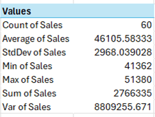
It automatically generates a table of statistics from your data:

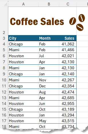
Suppose your boss wants you to analyze the below monthly units of coffee sales:
Using the Descriptive Statistics tool, you can calculate the average sales, min to max range, total sales, count of sales, and many more insightful metrics in the blink of an eye.
All you need is the free Data Analysis ToolPak Add-in
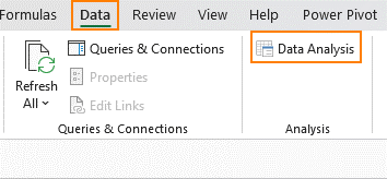
How to Add the Data Analysis TookPak Add-in
When enabled, the Data Analysis feature appears in the Data tab.
However, by default, the Analysis ToolPak Addin is inactive.
To activate it go to File tab > Select Options > Go to the Add-ins Tab > Press Go to Manage Add-ins Dropdown:
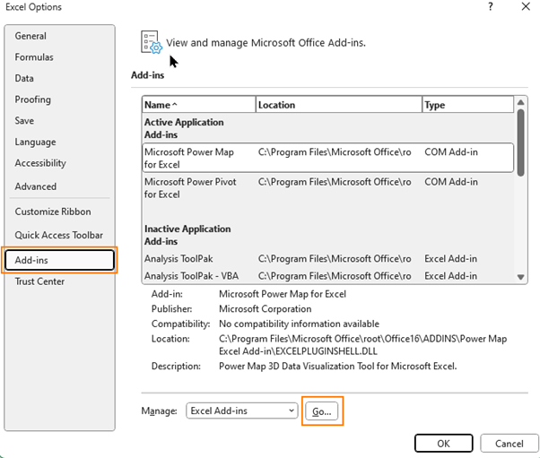
Note: Ensure the Manage Add-ins dropdown has Excel Add-ins selected. If you select another option, you will get a totally different Add-ins list in the Add-ins window.
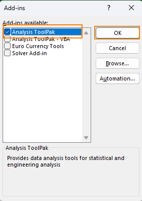
Check ‘Analysis ToolPak’ in the Add-ins window that appears and press OK:
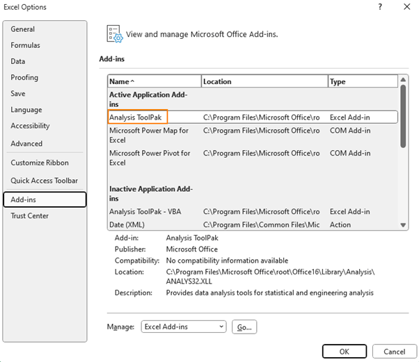
The Add-ins window will close without giving you any confirmation that the changes have been applied. But when you open the Data tab, it will now show you the Analysis group.

If you revisit the Add-ins option from the Files menu, before activation Analysis ToolPak was under Inactive Application Add-ins, and after activation it has moved into Active Application Add-ins
Now you can summarize your data with descriptive statistics and create Histograms too.
How to Insert the Descriptive Statistics Summary Table
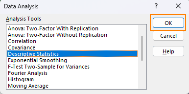
- Go to the Data Tab, select Data Analysis
- Choose Descriptive Statistics and press ok
- Input the data range which contains Sales numbers in the Input range
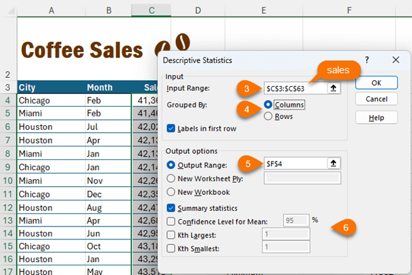
- Select Columns in the Grouped By option
- Select output range – the cell where you want the summary table
- Select everything you want in the table from Summary Statistics, Confidence Level for Mean, Kth Largest & Kth Smallest, for example, let’s say we want 2nd largest or 2nd
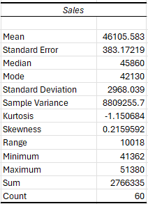
For our simplistic data, we have only selected the Summary Table, which returns this:
Why Use Descriptive Statistics
Descriptive statistics enable you to summarize, organize, and simplify large datasets to derive meaningful patterns and insights.
For example, you can measure seasonality in sales using the Skewness of the data. Skewness greater than 1 or less than -1 means your data is highly skewed.
Generally, electronics sales are highly skewed because people buy new gadgets during the holiday season.
But something like Coffee, which is more of a necessity, is sold consistently across the year.
Therefore, low Skewness for reinstates our assumption that coffee demand is fairly constant throughout the year.
With this insight, we can go ahead and stock up more coffee inventory to meet the regular demand.
Advantages of Analysis ToolPak for Descriptive Statistics
- Quick and Simple: They can be generated with just a few button clicks
- Gives quick insights: Just by looking at the summary table you get actionable insights, without doing any calculations
- Input range doesn’t need tabular data: Descriptive Statistics can be created from data in a column or a row, so you don’t need to adjust your reporting style.
Limitations of Descriptive Statistics
- Doesn’t update: Every time you update data, you need to recreate the summary table
- Visually unappealing: The summary table looks like it’s straight out of a textbook. It needs manual formatting before you can use it in any form of reporting
- Unresponsive to Slicers: Slicers are an intuitive way to filter data but the summary table doesn’t respond to Slicer selection.
Frequency Tables and Histogram
While the summary table gives you a bird's eye view of the entire dataset, it is still limited if we want to categorize input data.
To do this, you will have to create individual summary tables that categorize data into distinct scenarios or group data into bins.
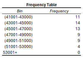
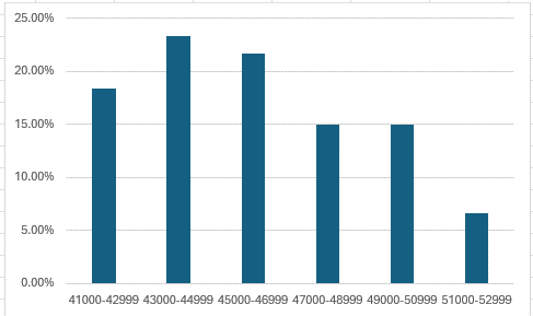
Suppose you want to group coffee sales into bins as follows:

Creating multiple summary tables would:
- Require data rearrangement
- This would occupy a lot of reporting estate
- And require reformatting for visualization
An easier option is to use the Frequency Table and Histogram tools.
How to Insert a Frequency Table & Histogram
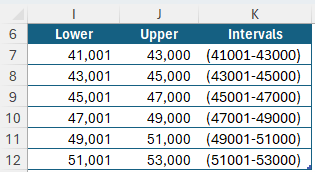
First, create a scenario table with lower and upper bins.
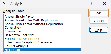
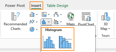
Go to the Data Tab, select Data Analysis

Choose Histogram from the Analysis Tools Window
As shown in the image below:
- Input the data range which contains Sales numbers in the Input range with the label.
- Select upper bin values with the label.
- Select labels.
- Select output range.
- Select Chart output
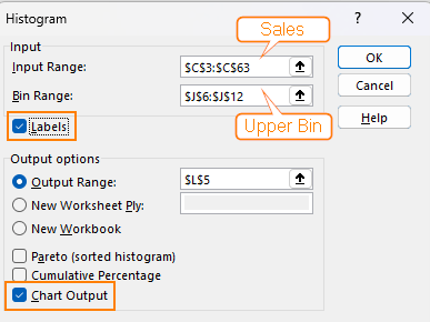
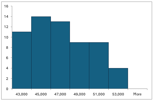
This will create the frequency table and histogram.
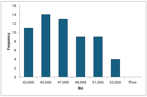
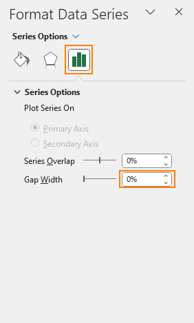
You can reduce the gap width for the chart to 0 to bring the bars right next to each other.
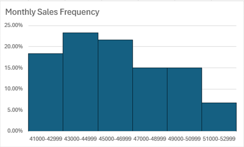
Also, add borders to the columns for clarity:

By default, the horizontal axis only shows the upper bin value. You can link it to the interval column of the class interval table:
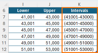
Tip: Class Intervals can be created using the Concatenate function or this formula
="("&[@Lower]&"-"&[@Upper]&")"
Also, by default, the output frequency table only contains upper limit values
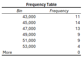
You can paste as values the intervals created above in this table and change ‘More’ manually (although in this case I could also omit the last datapoint as I don’t have any values in it):

These changes will feed through to the chart’s Horizontal axis:
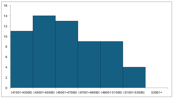
Tip: Format labels to make them align horizontally.
Note: Excel 2016 onward have a built-in Histogram chart as an alternative to the Data Analysis ToolPak but that doesn’t render the frequency table and it also isn’t compatible with PivotTables as the source data.
Limitations of Frequency Tables and Histograms
While the histogram provides further insight, they have their own limitations.
- They don’t update when the source data changes
- They’re unresponsive to slicer selection
- The overflow bin or more bin always appears even when the data doesn’t overflow beyond the stated class interval. Of course, you can manually eliminate this from the chart.

Alternatively, you can use Pivot Tables for this analysis.
Descriptive Statistics Using PivotTables
PivotTables also have inbuilt Descriptive Statistics functionality, and they are very simple to create. Check out this tutorial on
Once you have your PivotTable follow the below steps:
- Add the Sales field to Values multiple times
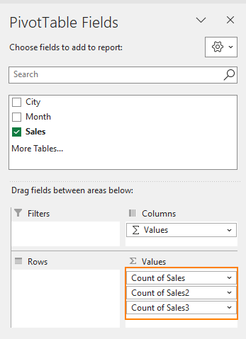
- Click on the field drop down > click on Value Field Settings:
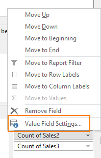
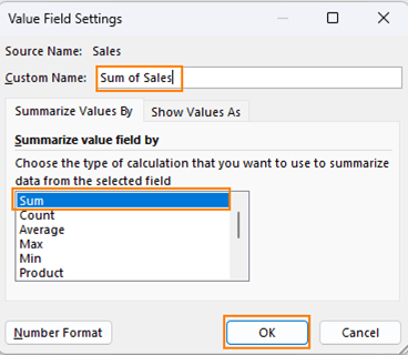
- Choose the aggregation you want. For example, instead of the count of sales, select the sum of sales. Also, update the Custom Name, and press ok
- Repeat this process for all other Sales fields to have all the summarizations you need
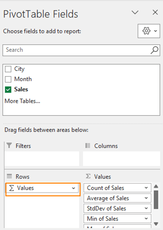
- Finally drag the Values field from columns to Rows to have a concise-looking Summary Table
Advantages of Using Pivot Tables for Descriptive Statistics
- PivotTables offer more flexibility and can be updated as data changes.
- They are responsive to Slicers
- Pivot Tables can further break down data by adding more parameters, such sales by month or city:
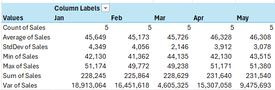
- The chart can be created from Pivot Tables without reformatting or restructuring the table
- Pivot tables also have more formatting options.
Limitations of Using Pivot Tables for Descriptive Statistics
- They don’t calculate Kurtosis, Skewness, or Range.
- They can't use the in-built Histogram chart. Instead, a column chart can be used as a workaround.
Frequency Tables & Histograms using PivotTables
To create a Frequency Table, follow the below steps:
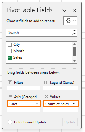
- Drag the Sales field in Values, use Count summarization
- Again, drag the Sales field in Rows
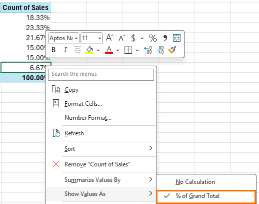
- Right-click the count and set the Show Values as to % of Grand Total:
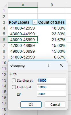
- With PivotTable Grouping we can group the Sales in the Row Labels into bins by right-clicking on the row labels > Group:
- Using this table, insert the Column chart
- Click on any column > CTRL+1 to open the Column formatting and reduce the gap width to 0% from the format data series menu. Give it a title and you now have the required Histogram.
Descriptive Statistics using Python in Excel
With the introduction of Python in Excel those familiar with Python can now reference data inside Excel using Pandas, SciPy, Statsmodels and Numpy. Watch the video above to see step by step.
Note: Python in Excel is currently in beta for Microsoft 365 users on the Insider Channel.
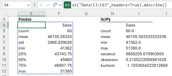
As shown below (in columns E:F), using pandas and the new xl function I have referenced my Coffee Sales data in cells C3:C63 and used the describe function to return the count, mean, standard deviation, minimum, maximum and percentiles.
And with SciPy (columns H:I) you have even more options, but the code is also more complicated:
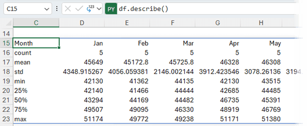
Python offers more flexibility with functions like Pivot that enable you to create subsets of the data grouped by month:
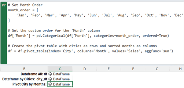
And return descriptive statistics accordingly:
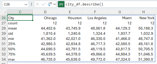
Or by city:
Download the Excel Workbook to see the Python examples.
More on how to write Python in Excel here.
Next Steps
Analysis ToolPak In Depth
If you’d like to learn more about the Analysis ToolPak, its other features like regression, correlation, sampling etc. and how you can use it for business decision making, check out our Analysis ToolPak course - Statistics for a non-statistician.
This course is ideal for executives or analysts who need to calculate and report the statistics of data or make decisions based on statistical output. This course will show you how to do it fast and efficiently without the burden of using calculators or the lengthy procedures necessary with conventional Excel functions.
Get Up to Speed with PivotTables FAST
Master PivotTables for quick statistics and data discovery in our PivotTable Quick Start course. Many people are afraid of PivotTables, but in this course, I’ll have you building your own PivotTables with confidence in under 1.5 hours.
Once you understand the key ingredients of a PivotTable, you’ll wonder what all the worry was about.
Get Started with Python in Excel
Python in Excel introduces new ways to analyse, visualize and clean data as well as machine learning and predictive analysis. Get started with Python in Excel here.
