When you plot multiple series in a chart the labels can end up overlapping other data. A solution to this is to use custom Excel chart label positions assigned to a ghost series.
For example, in the Actual vs Target chart below, only the Actual columns have labels and it doesn’t matter whether they’re aligned to the top or base of the column, they don’t look great because many of them are partially covered by the target column:

The solution is to assign the label to a ghost series which is based on the maximum value of the Actual and Target series, giving the effect below:
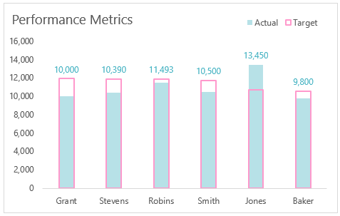
Note: The colour coding of the labels associates them with the actual column, so the reader knows which series they related to.
Watch the Video

Download Workbook
Enter your email address below to download the sample workbook.
Custom Excel Chart Label Positions – Setup
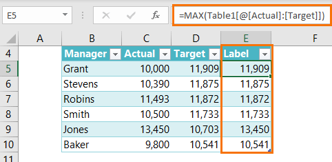
The source data table has an extra column for the ‘Label’ which calculates the maximum of the Actual and Target:
The formatting of the Label series is set to ‘No fill’ and ‘No line’ making it invisible in the chart, hence the name ‘ghost series’:

The Label Series uses the ‘Value From Cells’ setting (available in Excel 2013 onward) to reference the ‘Actual’ column values:
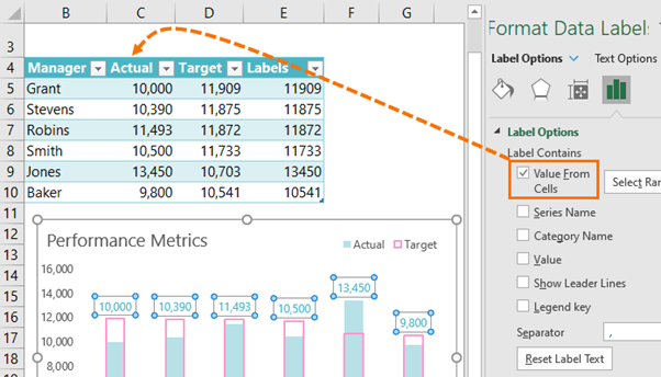
Now all you need to do is format the label font colour to match the Actual column so your reader knows what series they refer to.
Tip: If necessary, go one shade darker. This will make the labels easier to read but they’ll still appear to be the same colour as the columns.

Hi Mynda
I need to create a dashboard either in excel or in Power BI whichever you recommend.
I have the data in excel that I download from different websites on daily basis. If you could please give me a chance to discuss it further.
Hi Haris,
Please contact us via email website at myonlinetraininghub.com to discuss further.
Thanks,
Mynda
Mynda,
I’ve used this technique before but (Duh!) had forgotten all about it. Too bad as I could have used this recently.
It’s very powerful, such as in the case where you have:
– A horizontal bar chart,
– With bars extending to the LEFT,
– So that all labels are to the RIGHT of the vertical axis and left justified for easier reading.
Ah, yes good idea to use it with the bar chart too! Thanks for the idea 🙂
Is possible to repeat the video from starting point of creating the table,.
Thanks ,
Hi Ahmed,
This video covers creating an actual vs target chart.
Mynda
Is there an alternative method for those of us who are stuck with older versions of Excel?
Hi Andrea,
The alternate method is to add the labels to the ghost series, and then manually assign the actual value cells, one by one, to the labels by clicking each one twice (slowly, not a double click) to select the individual label > click in the formula bar and type = then click on the cell that contains the actual value for that label. Rinse and repeat for remaining labels. Of course this means you would need to manually update them if you add data to your chart.
Mynda