If you use a scatter plot for a dataset that has discrete values in one dimension, for example your x-axis shows the days of the week, you can get points overlapping when you plot the data.

To make the chart easier to interpret you can introduce jitter to the data points. This means moving the plotted points slightly so they don't overlap so much.
Doing this makes it easier to see the distribution and frequency of values.

Download Sample Workbook
Enter your email address below to download the workbook containing the data, charts and examples used in this post.
The data, charts and examples in this post can be downloaded in this workbook.
Creating Jitter
The first thing to say is that one axis needs to be discrete numeric values.
If you are plotting x-y values where x already varies a great deal, then there's no need to use jitter.
In the case of my example, I'm looking at the value of restaurant bills over four different days. These days can be represented by different numbers e.g. 6 represents Friday, 7 is Saturday etc.
Jitter in Power BI
I'm using the same tips dataset from my post on Jitter in Power BI.
NOTE: Excel doesn't provide a built-in way to scatter plot categorical data where the categories are not numeric. If you are in this situation then you will need to assign numeric values to your categories so your data can be plotted, then create your own text labels on the categorical axis.
Shift
We want to move, or shift, the x value a little left and right. We aren't actually changing the value we are measuring which is plotted on the y-axis.
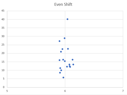
Sample of Data
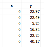
You'll notice that the x-axis values are all 6. This equates to Fri when I set the axis format to date and use a custom format ddd.
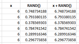
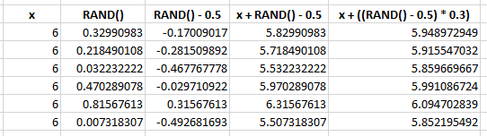
To start, use the RAND function to generate a random number. You'll get something greater than or equal to 0 and less than 1.
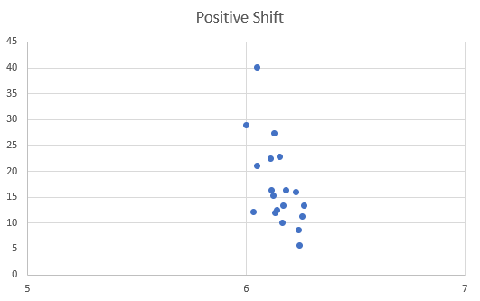
If you add this to your original x value, it will be increased (of course). Doing this for all your data points will result in the data being pushed along the x-axis in the positive direction.
Sample Data Shifted Right
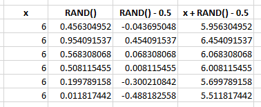
But we really want the data distributed either side of the central, original value. To achieve this, deduct 0.5 from the value generated by RAND. For random numbers less than 0.5 you'll end up with a negative value. Adding this to your data point will move it left along the x-axis.
For random values greater than 0.5 (which must also be less than 1) you will end up with a number greater than or equal to 0 and less than 0.5. Adding this to your data point shifts it in the positive direction along your x-axis.
Sample Data Shifted Left and Right
You end up with some data points shifted left, and some shifted right, giving a nice looking distribution around the original x-axis value.
Spread
Having created even shift we can also control the spread of these values, that is, the distance moved from the original value.
To control the spread, multiply the shift value by some number. The larger the number the wider the spread. In the animation below, with a small spread value of 0.1 the data points are clustered close to the central value of Friday. With a spread value of 0.8, the points are spread out much more.
For the data I am using, a value of 0.3 is good but you will need to find a suitable spread value for your own data.
Jitter Formula
We end up with this final formula to calculate jitter
= x + ((RAND() - 0.5) * 0.3)
In practice we can use a formula like this, and copy down for every data point
=A1+((RAND()-0.5)*$E$2)
where A1 is our value on the x-axis and $E$2 contains the value that controls the spread of the data. If you refer to a cell for the spread value, you can change this on the fly.
NOTE: RAND is volatile so points are recalculated and replotted every time Excel recalculates. This is why the RAND values in the images above are different in each image. You can leave it this way in your workbook or you can copy/paste as values after calculating jitter. I leave it as it is and like pressing F9 to watch the points dance.
Plotting Jittered Data
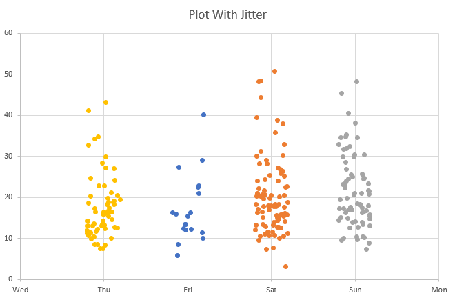
Plotting the unaltered data we get this

As you can see there are many overlapping points. Not easy to read.
Applying the jitter formula from above to the x value for each data point, we get a chart that provides a lot more information.

For the final plot you created, how did you get the points to be separate colors for each day of the week?
I am having troubles separating the X-axis points into the different categories as I am trying to make a legend based on color.
Thank you
Hi Robert,
The data for each day of the week is added as a separate series so they automatically get different colours.
Regards
Phil
How would I make categorical X-axis labels that are not the days of the week? I am trying to make my X-axis locations.
Is there a way of editing the X-axis labels so it shows as whatever you want it to?
Hi Robert,
You can create extra series that have the location as the Series name, and a single x,y co-ord where y is always 0. The x values for each category/location will be the same as the central value of the category.
So in my example if I wanted to make the Friday category London instead, create a series London,x=6,y=0 which when plotted puts a single marker at 6,0 right under the data points for Friday.
Then remove the (Primary Horizontal) x-axis.
Click on the single data point for the London series -> Add data Labels – > Below. Format the Label Options so that the Label Contains only the Series name
Format the marker for this data point to have no line, no fill. You should end up with the word London under the data points for Friday.
Repeat for other categories.
I’ve created an example in this workbook https://d13ot9o61jdzpp.cloudfront.net/files/Custom-X-Axis-Labels-Jitter-in-Excel-Scatter-Charts.xlsx
If you need any more help please start a topic on the forum and attach your workbook.
Regards
Phil
Since this chart is an x-y graph, how do you get the days of the week to show up as categories along the x-axis. I believe this is part of Colin’s question.
Hi Rick,
In the Creating Jitter section above, all the sample data has the x value of 6, for Friday.
The days are represented by numbers (Thu = 5, Fri = 6, Sat = 7, Sun = 8) so these are your categories along x.
When you plot 5, 6, 7, 8 along the x axis, format the axis as Date and set the format to a custom format ddd which displays only the 3 letter abbreviation for the day i.e. Fri, Sat etc.
Note that the number representing each day ‘wraps’ – so that Sunday is 1 but also 8. Mon is 2 and 9 etc.
Regards
Phil
Thanks!
Rick
no worries.
Hi guys,
I can’t seem to get my Horizontal axis to display the days of the week. Instead, I get the incremental amounts generated by RAND. When first creating the graph should I be selecting all three columns: days of the week, RAND formula multiplied by spread and tips? Also, on the tab with the Excel table what role does the first “Column1” play? When I right-click and select data on the scatter graph, it does not link back to the data source?
Thanks,
Colin
Hi Colin,
Have you examined the data series in the chart in my example workbook – on the Jitter sheet? That should show how the data is selected for plotting.
You just need to select the 2 columns containing the day of the week (which is a number) and the jittered values. The jittered values are the result of putting the total bill value into the jitter formula.
Select the data for each day separately and add as separate series to your chart.
On the tips sheet, that is the original dataset. I’ve extracted the data I need, which is the data you see on the Jitter sheet. Column1 is just the record/row number and was part of the original dataset.
If you are still having issues, please start a topic on the forum and supply your workbook.
Regards
Phil
“…like pressing F9 to watch the points dance”
yeah, we’ve all been there…
🙂
You guys are great 🙂
Nice one, like I quiet often repeat in my postings when helping persons with their VBA, the limit lies in your imagination.
Great job.
“IT” Always crosses you path …
Thanks Hans
Is it possible to create the jitters from in color groups like a bubble chart?
For example: Is it possible to populate the jitters in Thursday in 3 color groups?
1) Values less than 10% is Red.,
2) Values between 10% and 20% is Yellow..
3) And anything greater than 20% is Green colored jitters.
Please let me know if that is doable?
Thanks / Steve
Hi Steve,
Yes you can do this by adding the points as 3 different data series. If you have some data you want to do this with, please post a topic on the forum and attach the workbook.
Regards
Phil