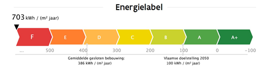
Can somebody help me with making this lookalike graph with the pointer moving with some given value ?
Cordially
Julien
I've got a few ideas, but honestly, I don't think you are going to get much help with such an ambiguous request. Have you attempted to make this graph? What is the data you want to use? Where did you get stuck? Are you just wanting us to do the work for you? If so, this isn't really the forum you are looking for.
I decided it looked like fun and I had to make one, it was fun to make (I'm a nerd, I know); use a scatter plot. Hope you have as much fun as I did! 🙂
Hi Julien,
As mentioned in my email reply to you, please upload a sample Excel file containing your data so we don't have to do the work for you. It will also answer many questions we're likely to have about your request.
Thanks,
Mynda
Here is what I did managed to do for the moment, but the dot doesn't where I expect it to be.
Someone has an idea how to resolve it?
Cordially
Unfortunately, it's in read-only mode and I can't take it out, so I can't see how you have it set up. Can you try to re-upload it and allow for edits, please?

I believe the problem lies in the fact that you are trying to combine a stacked bar chart with a line chart on separate axes. If you can live with a stacked column chart and a line chart, both on the same axis it will work. Though the chart will be shaped vertically. See attached.
