Excel is the key to unlocking limitless opportunities. It's a skill that can elevate your career, manage your finances like a pro, and turn raw data into powerful insights.
Table of Contents
In this tutorial I cover everything from the basics right through to tools most Excel users never learn. Topics include:
I've also put together a practice file that accompanies this video with extra challenges for you to try. So be sure to download it from the link below.
Watch the Excel for Beginners Video

Download Practice File
Get started with my practice Excel workbook that also contains extra challenges and tips.
Enter your email address below to download the sample workbook.
Navigating the Interface
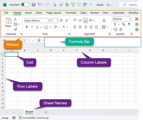
When you open Excel, you're greeted with a Workbook. You can think of it as a book filled with blank pages ready for your data.
In Excel pages are called Sheets. A new workbook typically starts with one sheet, but you can add more as you need.
Each sheet operates independently, allowing you to manage different datasets, analysis, or reports in one place, yet they can also work together, sharing data and insights.
Tip: You can double click to rename the sheet tabs to reflect the content they hold, making it easier to navigate.
Ribbon
The Ribbon is your command centre.
Think of it as the main toolbar, but instead of one-size-fits-all, it's a dynamic tool that adapts to your needs. It's organized into tabs like Home, Insert, and Formulas.
Each tab houses a group of related features and functions.
Entering Data
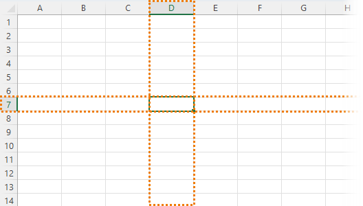
Imagine each cell as a tiny box for storing information. Cells are identified by their unique address - a combination of their column letter and row number. For example, the cell located in row 7 of column D is referred to as D7.
This simple yet powerful system allows you to organize, locate, and manipulate data efficiently.
Navigation
Navigating through an Excel spreadsheet is straightforward. You can use the arrow keys on your keyboard to move between cells, or the Tab key to advance to the next cell in a row. And ENTER to move down a row. Of course you can also use the mouse to select a cell.
To quickly jump to the edge of your data set, press Ctrl (or Command on Mac) along with an arrow key This will take you to the last cell before an empty one in the direction you chose.
I've also put together a comprehensive PDF and cheat sheet containing 239 Excel Keyboard Shortcuts which you can download here.
Entering Data
To enter data, simply click on a cell and start typing. Press Enter when you're finished, and you'll automatically move to the next row down.
If you're entering data across a row, press Tab to move to the next cell to the right.
To edit data in a cell, double-click it or press F2 to activate the cell for editing. Or click in the formula bar.
CAUTION: The great thing about Excel is its flexibility, but this also gets most Excel users in trouble because they store their data the wrong way. So, bookmark this tutorial on Tabular Data Format and ensure you store data in Excel the right way thus avoiding costly mistakes.
Autofill
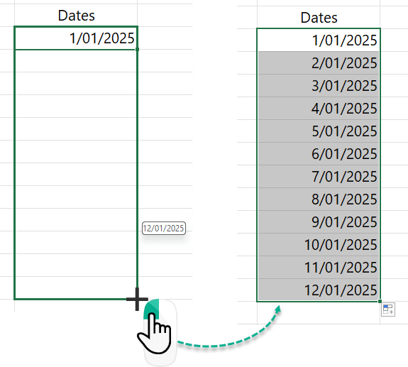
Autofill lets you quickly fill adjacent cells with several types of data, including values, series, and formulas.
For example, I can enter the first date in my series, then, left click the fill handle in the lower-right corner of the cell. And drag the fill handle to populate the cells you want with consecutive dates.
There are loads of things you can do with the fill handle, so give it a try with other types of data, like numbers, month names or day names to name a few.
Formulas and Functions
Formulas and functions are one of Excel's most powerful features.
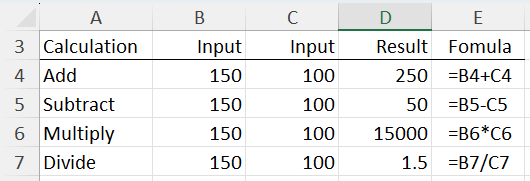
Formulas always start with the equal sign. Then you can combine numbers and cell references together with operators like plus (+), multiply (*), divide (/) and minus (-), to name a few.
The table below displays some examples of different operations applied to values in cells:
Start your formula in an empty cell by typing = then use the mouse or arrow keys to select the cells you want in your formula. Press Enter, and voila, you have your result.
Functions simplify complex calculations. Let's look at four essential functions every Excel user should know.
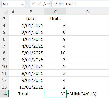
Let's say I want to add up a list of numbers. I can write a formula to do it and use the plus sign between each cell like so:
=C4+C5+C6+C7 ...
But that's the slow way.
Instead, I can use the SUM function to speed this up:
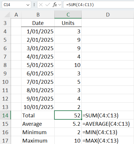
Similarly, I can calculate the average, minimum and maximum for the range of cells with their respective functions:
Absolute & Relative References
Ever noticed a dollar sign in an Excel formula? It's not about cash. It's a cool trick to keep cells locked in place, even when you move your formula around.
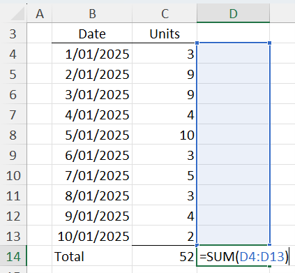
Normally, if you write a formula using cell references, like the ones I wrote above, and then use the fill handle to copy it to column D, the references shift. If we look at the formula below, you can see it now references cells D4:D13:
That's because it's a relative formula, always moving based on where you've copied it to. But sometimes, you don't want it wandering off.
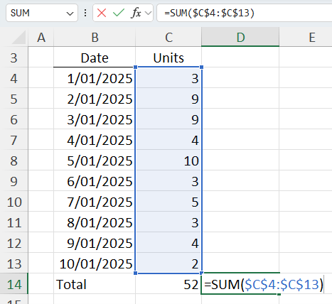
You want it to stick to cells C4:C13, no matter where you copy that formula. That's where the dollar sign comes in.
I can do this by adding a dollar sign before the column and row references. And voila, you've got an absolute formula:
Now, no matter where you copy it, it stays fixed on cells C4:C13.
Tip: use the F4 key to automatically add the dollar signs to the cell reference.
By the way, you can cut or copy and paste cells with CTRL+C for copy, or CTRL+X to cut, then CTRL+V to paste.
Advanced Excel Formulas
We've cracked the basics!
But here's the deal: mastering Excel's formulas doesn't have to be a never-ending quest of trial and error. You can speed up the journey with my Advanced Excel Formulas Course.
It's your fast track to becoming a pro.
We're talking big efficiency gains with functions that might seem advanced but will feel like a breeze once you've completed the course. Short videos, real-world examples, and insider tricks that'll make you stand out. Check out the course here.
Formatting
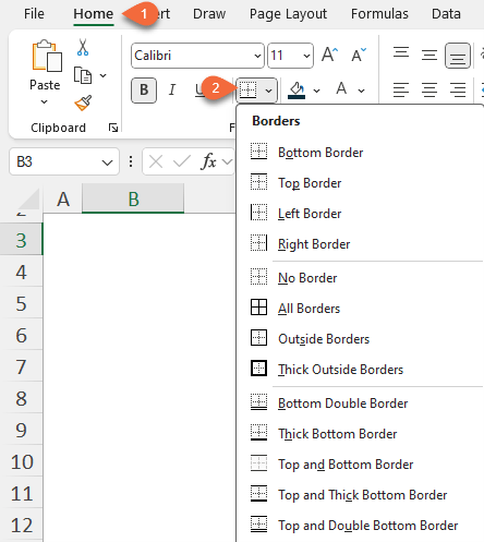
Borders help define areas of your spreadsheet, making it easier to distinguish between different data sets or sections. To add or change borders:
- Select your cells.
- On the 'Home' tab, click the 'Borders' button and choose the style you want to apply:
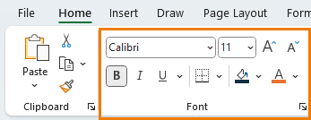
Fonts and cell fill can impact how your data is perceived. To change the cell fill colour, font type, size, or colour.
- Highlight the cells you want to format.
- In the 'Home' tab, you'll find options for cell fill, font type, size, and colour.
Choose your preferred settings to make your text clearer or to emphasize certain sections.
Tip: Remember, consistency is key. Stick to one or two fonts for a professional look.
Formatting Numbers
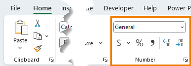
When working with large numbers, it's helpful to format them with a comma separator.
If the numbers are large and you don't need to see the decimals, then hide them. If you have percentages, display them accordingly. Use the tools in the Number group on the home tab to set the formats:
Conditional Formatting
Conditional formatting is one of Excel's most powerful tools, allowing you to automatically apply formatting based on a cell value.
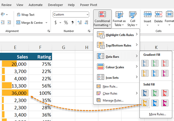
For example, let's help our readers interpret data at a glance with data bars to illustrate the size of the numbers.
- Start by selecting the cells you want to format.
- Go to the 'Home' tab and click 'Conditional Formatting.'
- Data bars > Solid Fill in yellow, so the numbers are also easy to read.
Conditional formatting can turn a dense table of numbers into a clear visual story, revealing patterns and insights that might not be immediately obvious. Don't forget to download the practice file above and try it yourself.
Check out more on Conditional Formatting in Excel.
Sorting
Sorting is the first step towards data organization. It allows you to order your data in a way that makes sense for your analysis, whether alphabetically, numerically, or even by date.
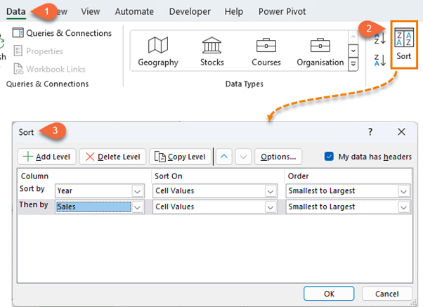
To sort data, simply select your range, go to the 'Data' tab, and choose 'Sort A to Z' or 'Sort Z to A' to sort the first column in the table.
This is perfect for quick, straightforward sorting.
For more control, use the 'Sort' dialog box where you can define multiple levels and criteria, such as sorting by Year and then by sales:
Filtering
Filtering allows you to focus on specific data. By hiding rows that don't meet your criteria, you can concentrate on the information that matters most.
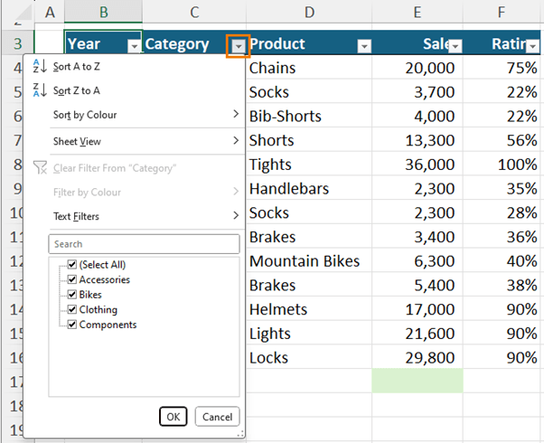
Activate filters by selecting your data headers and on the Data tab > click the 'Filter' button:
This adds a dropdown arrow in each column header.
Clicking on these arrows reveals options to filter by specific values, ranges, or even text patterns.
You'll have different options depending on whether the column contains text or numbers.
Filtering is invaluable when you're dealing with diverse datasets and need to quickly isolate data points based on specific criteria.
Data cleaning
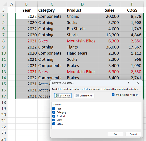
Duplicates in your dataset will completely undermine your work. Thankfully, Excel makes it easy to remove duplicates:
- Highlight the data.
- Go to the Data tab, and select "Remove Duplicates":
- At the dialog box, select which columns you want to check for duplicates. I want to check for duplicated rows, so I'll leave all columns checked.
- Click OK
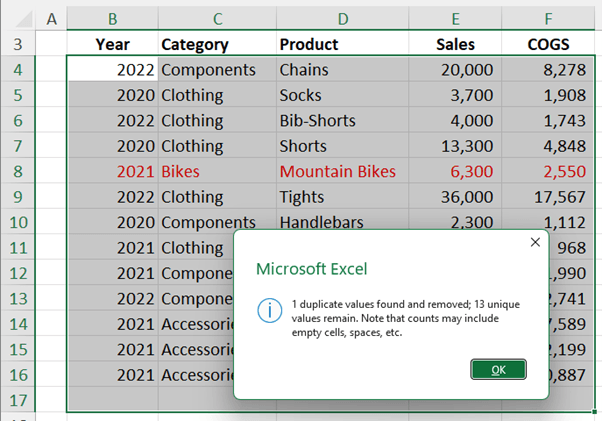
Now you can see I only have one row for 2021 mountain bikes with sales of 6300 and COGS of 2550:
Tables
Excel Tables are not just about aesthetics; they're a powerful feature that simplifies data management.
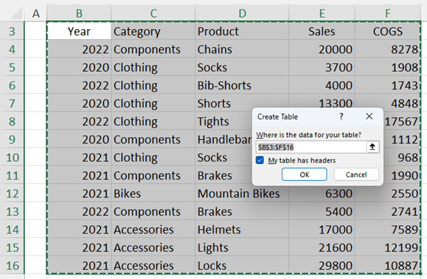
To convert your data range into a Table, select it and press Ctrl+T (Cmd+T on Mac). At the dialog box, check the box if your table has headers (tip, it should!):
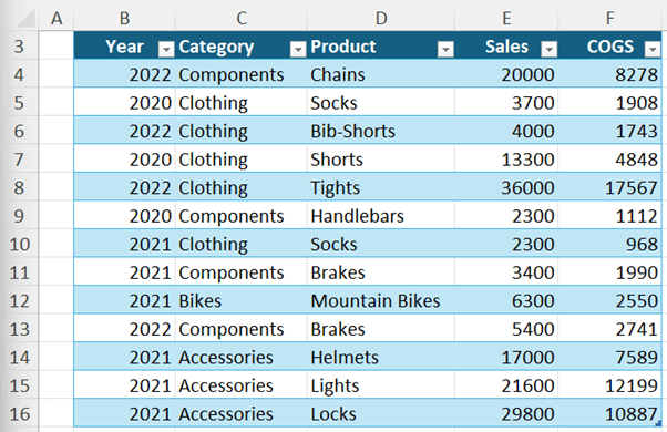
This action gives your data a structured format that's easy to work with.
Tables come with filtering and sorting capabilities by default, making it straightforward to manage your data. And the banded rows make it easier to reference.
When I select a cell in the table, the contextual Table Design tab becomes available. Here I can change the formatting and style options.
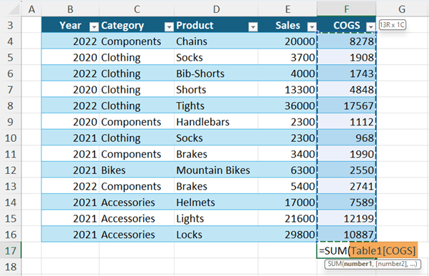
When you reference table cells in a formula, you get special cell references called Structured References that represent the columns you're referring to. It makes writing and reading formulas much quicker and easier.
The structured references will be different depending on which part of the table you reference.
Tables automatically expand to include new data as you add it, so any formulas that reference the table, will automatically include it.
Surprisingly, only a few Excel users are tapping into the power of Tables, even though they pack a huge punch for efficiency.
Tables automate so much of the tedious stuff - from updating formulas and PivotTables to sorting and filtering.
My quick Excel Tables Course has everything you need to master Tables in less than an hour.
Plus, I've got some smart workarounds for those few times Tables might stump you.
Charts
Visual representation of data can turn complex information into digestible and compelling stories.
Excel offers a variety of chart types, each suited for different kinds of data and storytelling objectives.
Column and Bar Charts: Ideal for comparing the frequency, count, or total of different categories. Use a column chart for time-sensitive data and a bar chart for longer category labels.
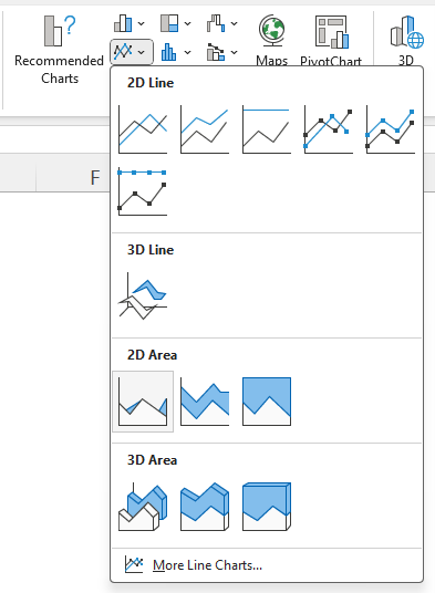
Line and Area Charts are perfect for showcasing trends over time, especially when you have many data points:
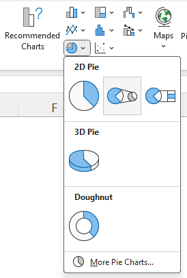
Pie and Doughnut Charts are best for displaying the proportions of a whole. They are most effective when you have no more than 5 categories that make up a whole.
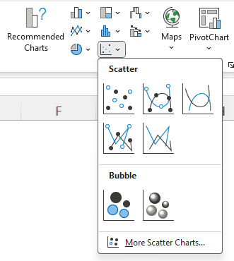
Scatter charts are excellent for showing the relationship between two variables and identifying patterns or trends in the data.
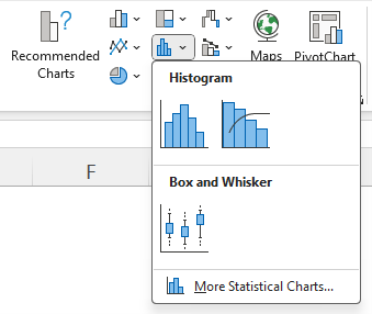
Histograms are useful for showing the distribution or frequency of data within different bands:
Creating Charts
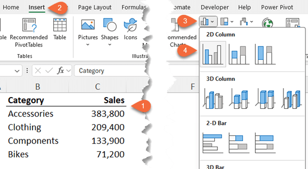
To insert a chart, highlight the data range you want to visualize, including any headers that describe your data.
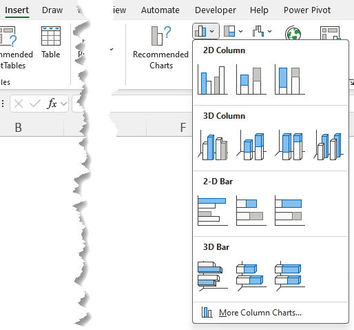
Go to the 'Insert' tab, choose the chart type that best suits your data, and select a specific chart style.
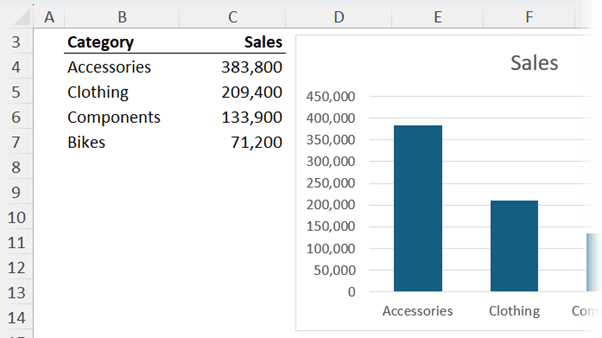
Excel will automatically generate a chart based on your data and place it in your worksheet:
Take a moment to review its accuracy and relevance.
Customising Charts
To make your chart truly impactful, customization is key.
A word of warning though, avoid the Chart Styles. Unfortunately, these styles will distract your audience and make you look like an amateur:
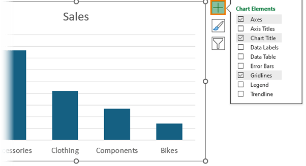
You can add, remove, or modify chart elements like titles, axis labels, and legends through the 'Chart Elements' button:
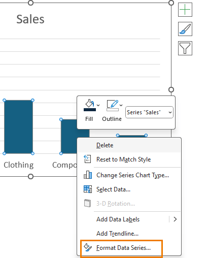
For more detailed customization, right-click on any element in your chart and select 'Format':
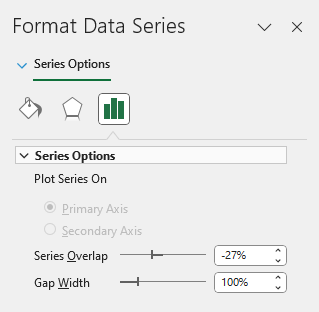
This opens a pane where you can adjust fill colors, add borders, and more.
Chart Best Practices
A couple of rules to keep in mind:
- Focus on the key message you want to convey and ask yourself if your chart enables the reader to glean this from your chart at a glance.
- Ensure that all elements of your chart are clearly labelled, making it easy for your audience to understand your data, but don't duplicate labels e.g. if you have data labels, you don't also need the vertical axis.
PivotTables
PivotTables are one of Excel's most useful tools for data analysis. They make light work of understanding large, detailed data sets and are much faster and easier than writing formulas.
Here I have sales data by Date, segment, manager, country, product, units sold, sales value, COGS and Profit:
In the image below on the Table Design tab, you can see I've formatted it in an Excel Table, called 'financials' and from here I can summarise it with a PivotTable:
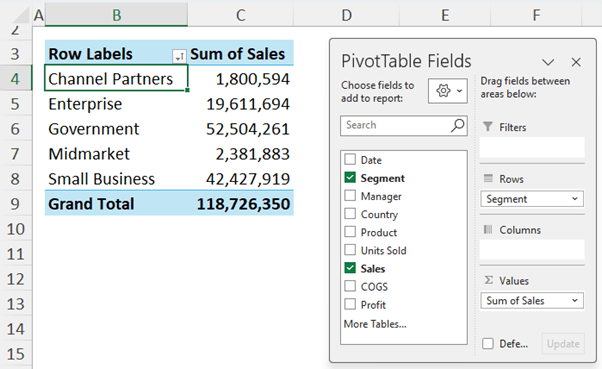
I can add the sales field to the Values area and Segment to the Rows, and I automatically have the total sales summed by segment for me without having to write any formulas:
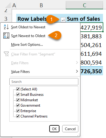
From the filter drop down, I can sort by sales in descending order:
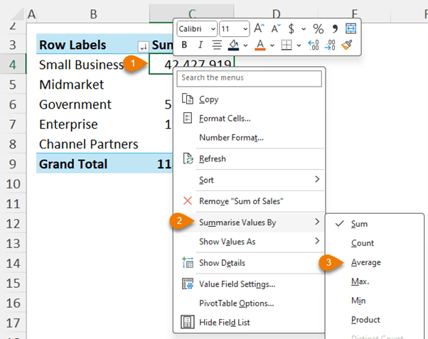
If I prefer to find the average, I can right-click and change the summarisation:
Customising PivotTables
When the PivotTable is selected, we have some new contextual tabs on the ribbon that allow you to customise the design.
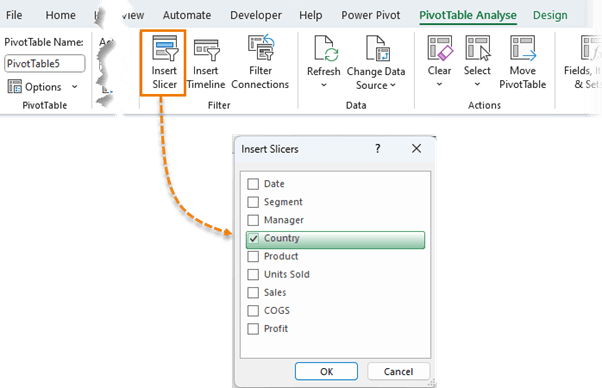
And on the Analyse tab we can insert Slicers which allow you to filter the PivotTable based on fields you choose:
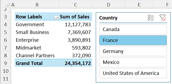
Now I can click on the Country buttons I want the PivotTable to include:
It's an easy way for your users to interact with and filter data.
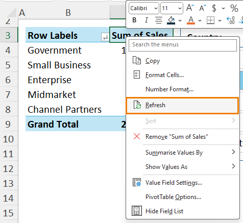
And if your Source Data changes, you can Refresh them to include the new data:
If you want to get your analysis done quickly and create reports that can be updated with one click, then PivotTables are an essential Excel skill.
If you want to get your PivotTable skills up to speed quickly, check out my PivotTable Quick Start Course.
Next Steps
Fast Track your skills: don't waste time getting your Excel skills up to speed the hard way.
Check out my Excel Expert course that covers everything from beginner topics covered above (except in much more detail), and rapidly moves you up to advanced level, so you can stand out from the crowd and 10x you productivity sooner.











Still a long way to go! But, thanks to you, I am enjoying this journey.
Great to hear, Mahmood!
The information was real helpful
Great to hear!