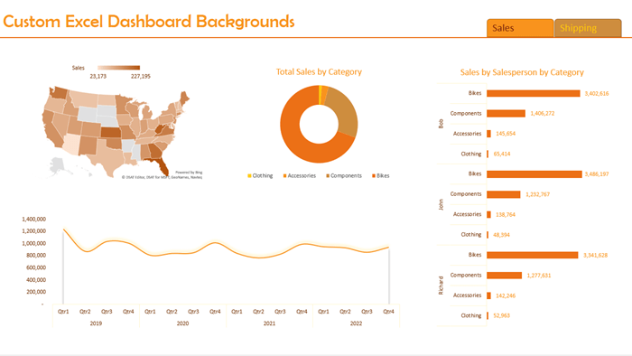
Custom Excel dashboard backgrounds are super easy to create and can bring a level of polish and professionalism to your reports. Taking your reports from this:
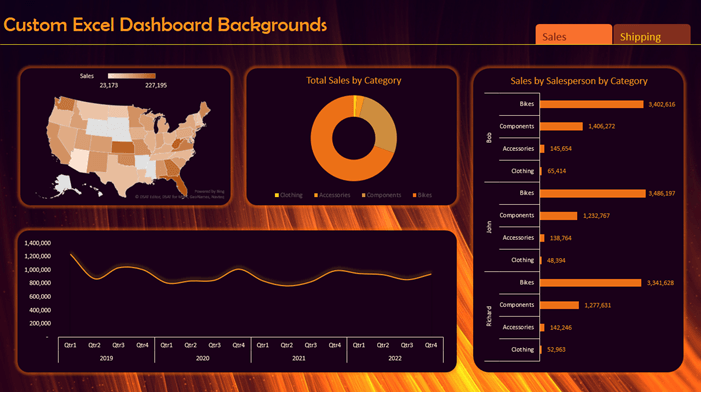
To this:
And the good news is they’re super easy to create using PowerPoint.
Watch the Video

Custom Excel Dashboard Backgrounds Step by Step
The first step is to create your dashboard or report. Once you have the charts you’re going to use, you can then design the background. Don’t do it the other way around as this will limit the dashboard, and put the importance of the design above the content, which is a no-no.
Open PowerPoint and use the canvas to insert shapes and images to place your charts and headings on.
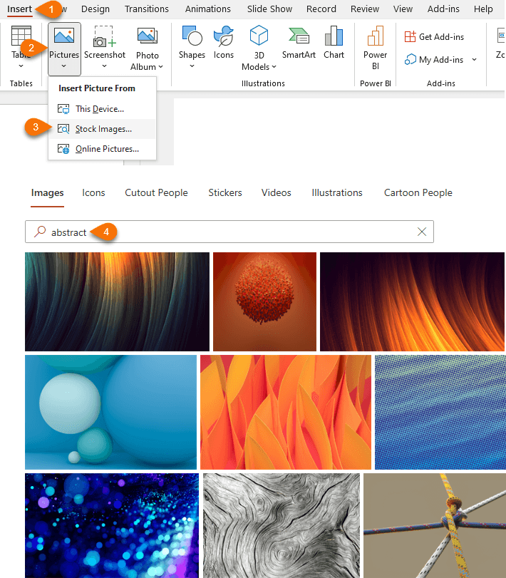
Tip: use the stock images available with Microsoft 365 for your background:
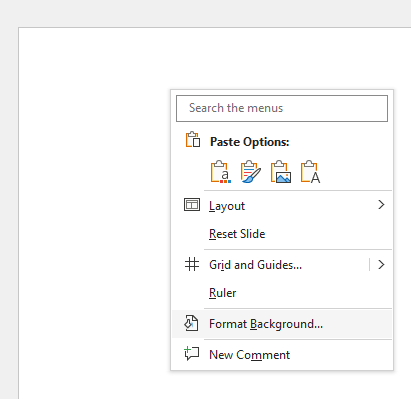
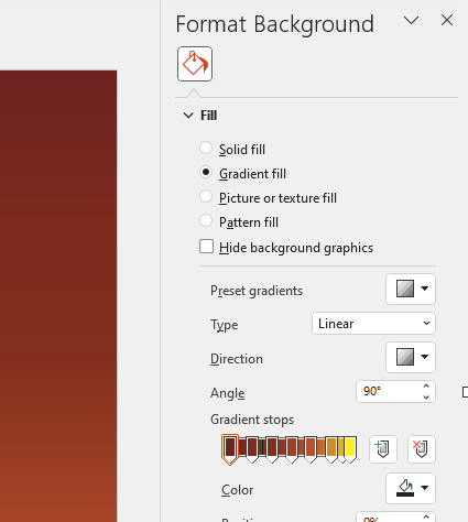
Alternatively, right-click the canvas background > Format Background:
And use the colour formatting, gradient and texture formatting available in the Formatting pane:
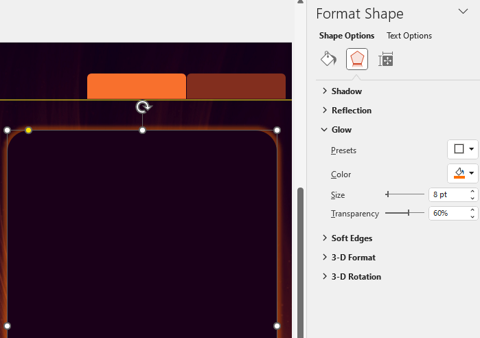
Next, add shapes where you want your charts and headings etc.:
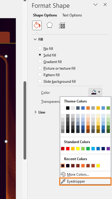
Tip: Take inspiration from the background image for your colour scheme. Use the eyedropper to grab colours from the image:
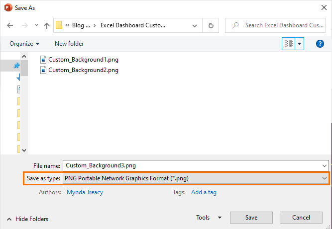
Once you have all the shapes in place, save the file as a .png or .jpg
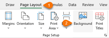
Then in Excel go to the Page Layout tab > Background:
Navigate to the location where you saved the background image and select it.
It will tile the background to fill all available rows and columns. Simply hide the excess rows and columns to leave a single background image as your dashboard canvas.
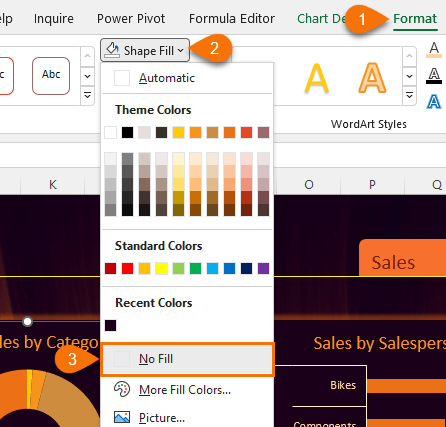
Place your charts on the background and set the fill and border of the charts to ‘No Fill’:
Want a Bigger Background?
If the PowerPoint background doesn’t fill the dashboard area you have available, you can make a custom background in Excel using the same image and shape tools. When you’re happy with it, take a screenshot using the Print Screen button, or use the Windows snipping tool by pressing the Windows logo key + SHIFT + S. Save it as a .png or .jpg and apply it as your background via the Page Layout tab.
Warnings
Keep in mind that one of the key objectives of your dashboard is to ensure it’s readable at a glance. To aid this, ensure the background behind your charts is not too busy and the colour contrast is user-friendly, especially if you have vision impaired users. More on Excel chart colour choices here.
