There's a handful of mistakes almost everyone makes when they first use Excel. I know I did. In fact some of us are still making these mistakes.
Are you?
The good news is they're easily fixed.
Mistake 1. Create reports that take a long time to update.
 I’ve done it before. I’ve I imported the data from another source but it’s not in the right format so I go about fixing it, moving columns, inserting rows, deleting data I don’t need, sorting, adding sub-totals etc.
Then I feed it into my report using formulas that refer to a fixed range, you know the ones; =SUM($C$2:$C$500) then the boss loves it and wants it updated every month.
My heart sinks ‘cause I know it’s taken me the best part of a day to prepare that report and now I have to do it every month. I’m already over worked and I don’t have a day to spare to update this report.
Solution:
- Lay your data out in a tabular format so that you can use functions like INDEX, MATCH, OFFSET, and VLOOKUP to name a few.
- Set up your data in a Table format so that new data is automatically included in any formulas referencing the table.
- Or if you prefer you can use PivotTables instead of Functions – Note: PivotTables only work with data in a tabular format so you still have to do this part.
- Set up dynamic named ranges that automatically update charts each time new data is added.
- Optional: Link your Excel file to your external data source (Access, web, Oracle database etc.) so you can update it with the press of a button each week/month.
Mistake 2. Create reports that are inflexible often resulting in having to start from scratch if changes are requested.
 You’ve spent hours creating your report based on the brief given, but when you show your boss they realise it would be better if you changed a few things.
You get back to your desk and start to make the changes but the original report was so complex that you decide it would be quicker and less error prone to start from scratch.
Solution:
As per point 1. If you’d set up your data model using a tabular format your report would be relatively quick and easy to modify.Likewise adding new analysis from the same data source is easy when your data is in a tabular format.
Bonus solution:
Build in interactive elements to your reports that allow your recipients to customise the view themselves.Built in features that automatically filter data and update charts and tables according to their selections like:
- drop down lists,
- option buttons,
- and check boxes
allow the user to customise the view without you having to press a key, which is just as well because you’ve left early for the day cause your work is already done :).
Mistake 3. Create reports that are easy for you to understand but not the recipient.
 Have you ever handed out a report only to be asked to explain it?
I know I have, and whilst at the time I put it down to people just not being versed in the language of Finance, if I’m honest I probably didn’t present the data in a way that was quick and easy for them to interpret.
Let’s face it, we’re all busy, our time is valuable and everyone is looking for quick answers.
If you can present information in this way you will earn much adoration, appreciation, and accolades….I can’t think of any more words beginning with ‘a’ but you get the picture :).
Solution:
- Ask the right questions of the right people when planning your report so you understand their objective and expectations before you spend hours preparing something you think they want.
- Use placement to draw attention to the key information you want to convey.
- Make sure the report isn’t cluttered and full of superfluous information (even if it does look pretty).
Mistake 4. Use the fancy Chart Styles and formatting from the built in Chart features in Excel.
Using some of the Photoshop-like formatting available in the Excel Charts menu usually results in garish reports that detract from the message.
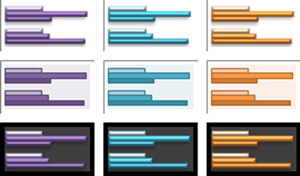 It’s natural to look at the chart layouts and fancy formatting available in Excel, especially the new graphics in Excel 2007 & 2010, and think they look great.
Especially since we’re not all born with artistic talents (my 5 year old is more artistic than me).
But the problem with a lot of the Excel chart styles is they are cluttered with unnecessary formatting, and this clutter detracts from the message.
Solution:
Less is more. Get rid of the garish colours and formatting and back away from the 3-D charts.Mistake 5. Use the wrong chart types for the data and subsequently hide key information.
A pie chart is only good if you have 4 or 5 categories at the most….and even then there’s probably a better chart.
Just take a look at the two charts below. Both plot the same data but one is much easier to make comparisons in the data than the other. You be the judge.
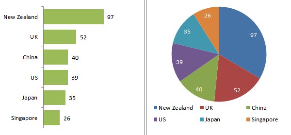
Choosing the right chart for your data is a key factor in making your message compelling.
Solution:
Know what chart will convey your message quickly and clearly. And use small charts and tables that show comparisons or trends in data.How You Can Avoid These Mistakes
The solutions I’ve described above, albeit briefly, are all integral parts of setting up your reports as Excel dashboards.
Once you understand some fundamental rules about data visualisation and best practices for modelling data in Excel you will be amazed at the amount of time saved; not only your time to create and update the reports but also your report recipients' time to interpret the report.
So, what is an Excel Dashboard?
An Excel Dashboard is simply a report like the one above that:
- Usually fits on one page
- Displays key trends, comparisons and data graphically or in small tables
- Provides the reader with conclusions to their objective
- Is often interactive allowing the user to filter data and switch views themselves
- Employs best practices that enable the report to be updated quickly and easily (often at the click of just one button)

Dashboards can be complex or simple, fancy or plain. They can contain financial or non-financial data, or both. They can work with any data in any organisation.
In fact you’ve probably created a dashboard before and not realised that‘s what it’s called.
Over the past few months I've been working on a comprehensive Excel Dashboard Course that will teach you the simple techniques you can apply in Excel to make killer dashboards and save loads of time.
Click here to learn more about the dashboard course.
