• Skip to main content
  • Skip to header right navigation
  • Skip to site footer

My Online Training Hub

Learn Dashboards, Excel, Power BI, Power Query, Power Pivot

  • Courses
  • Pricing
    • Free Courses
    • Power BI Course
    • Excel Power Query Course
    • Power Pivot and DAX Course
    • Excel Dashboard Course
    • Excel PivotTable Course – Quick Start
    • Advanced Excel Formulas Course
    • Excel Expert Advanced Excel Training
    • Excel Tables Course
    • Excel, Word, Outlook
    • Financial Modelling Course
    • Excel PivotTable Course
    • Excel for Customer Service Professionals
    • Excel for Operations Management Course
    • Excel for Decision Making Under Uncertainty Course
    • Excel for Finance Course
    • Excel Analysis ToolPak Course
    • Multi-User Pricing
  • Resources
    • Free Downloads
    • Excel Functions Explained
    • Excel Formulas
    • Excel Add-ins
    • IF Function
      • Excel IF Statement Explained
      • Excel IF AND OR Functions
      • IF Formula Builder
    • Time & Dates in Excel
      • Excel Date & Time
      • Calculating Time in Excel
      • Excel Time Calculation Tricks
      • Excel Date and Time Formatting
    • Excel Keyboard Shortcuts
    • Excel Custom Number Format Guide
    • Pivot Tables Guide
    • VLOOKUP Guide
    • ALT Codes
    • Excel VBA & Macros
    • Excel User Forms
    • VBA String Functions
  • Members
    • Login
    • Password Reset
  • Blog
  • Excel Webinars
  • Excel Forum
    • Register as Forum Member

Shape Maps in Power BI

You are here: Home / Power BI / Shape Maps in Power BI
shape maps in power bi
April 15, 2021 by Philip Treacy

In this post I'm going to show you how to use Shape Maps in Power BI, which are currently a preview feature.

example shape map

Typically, Shape Maps are used to illustrate the variation of a variable across a geographic area like a country or state.

But you can also create custom shape maps for things like buildings, seating arrangements, or custom geographic regions.

I'll explain how to assign colors using color saturation, and how not to use colors, plus I'll show you a trick to plot categorical data and assign specific colors to the categories.

Watch the Video

Subscribe YouTube


Download PBIX Desktop File

Enter your email address below to download the sample files used in this post.

By submitting your email address you agree that we can email you our Excel newsletter.
Please enter a valid email address.

Power BI Desktop File.


Getting Started With Shape Maps

Shape Maps are a Preview Feature in Power BI Desktop and are not enabled by default.

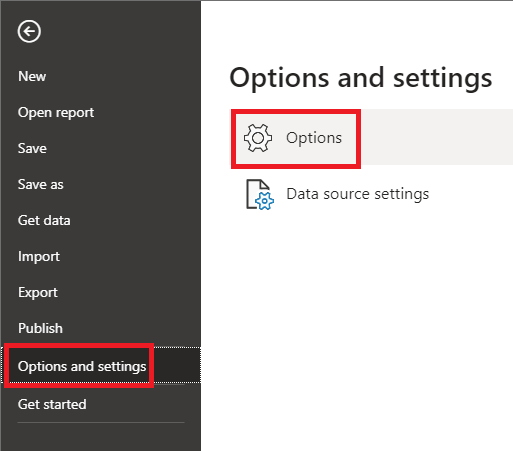
To turn on Shape Maps, go to the File menu -> Options and settings -> Options

file options settings

Click on Preview features and check the box beside Shape map visual.

preview feature shape map

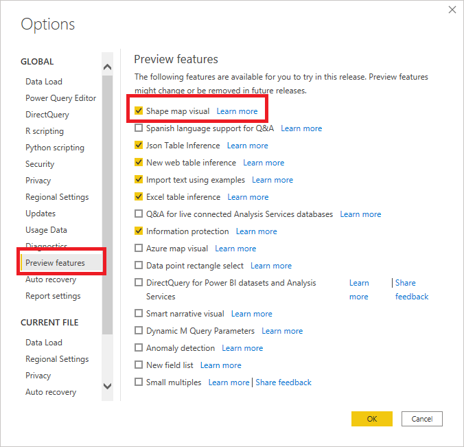
Click OK, then restart PBI Desktop.

Once restarted you should have Shape Map available in the visuals.

shape map visual icon

Adding a Shape Map

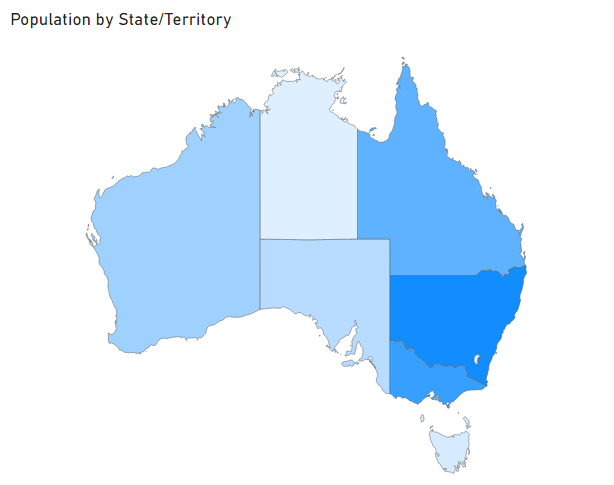
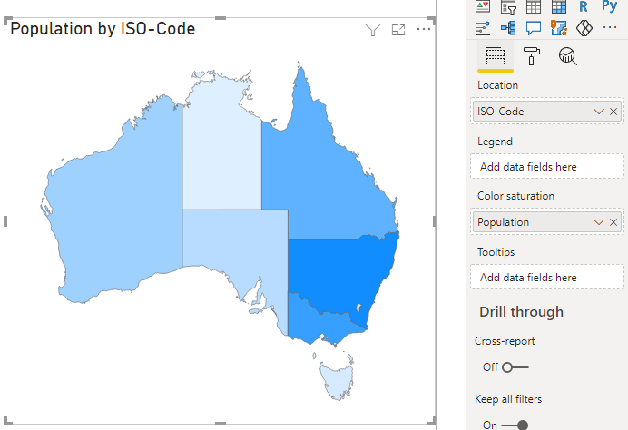
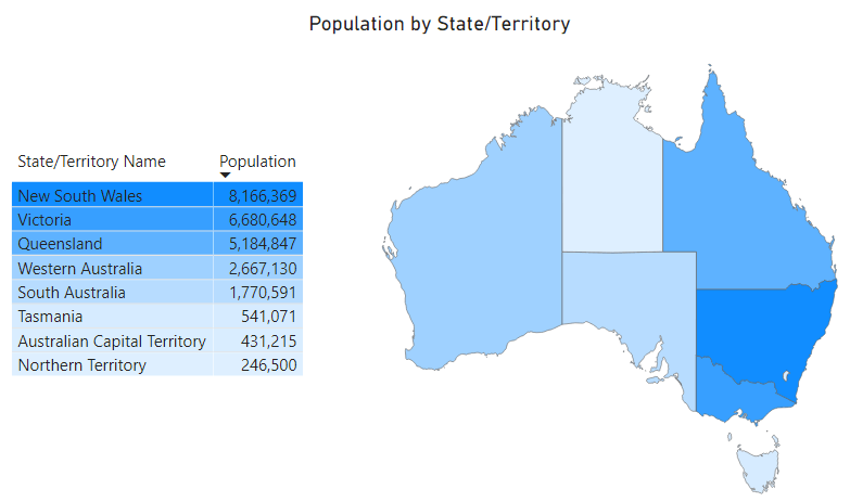
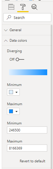
The first thing I'm going to visualize is the population distribution in mainland Australia by state and territory.

NOTE: Mainland Australia comprises six states and 3 internal territories, although the Jervis Bay territory is counted as part of the ACT for administration purposes. So in practice you'll see six states and two territories on maps. More info.

Here's my data, from 2020, sourced from WikiPedia.

sample dataset

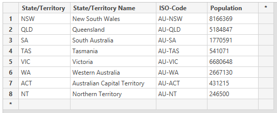
I'm using the state/territory abbreviations as well as the ISO standard codes. I'll talk more about these in a bit.

Click on the Shape Map icon in the Visuals area to add a map. You'll see a placeholder appear on the canvas.

shape map placeholder

Add Population to the Color Saturation well and State/Territory to Location - and my map shows the USA.
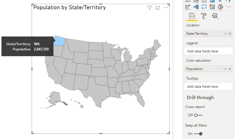
usa map

What's going on?

First, notice that the map of the USA has some color applied. That's because WA is the abbreviation for both Washington state in the USA, and Western Australia.

Because the default map is displaying USA, PBI thinks the data I've given it is for the USA so it does it's best to plot that data.

However if I change Location to contain the ISO codes for the Australian states and territories PBI now knows my data is for Australia and doesn't plot it in the USA map.

using ISO code in shape map

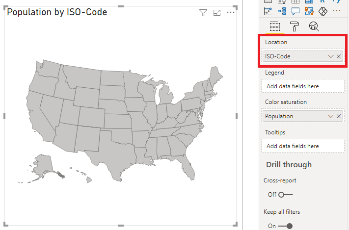
So if you are using a map with places that have identical names or abbreviations, you must use a unique identifier for each location.

So I change the map to Australia

switch to map of australia

and everything is plotted correctly.

map of australia

I can actually remove the ISO states and just use the State/Territory (which are abbreviations) or the full State/Territory Name and I'll get the same results.

australia map state and territory names

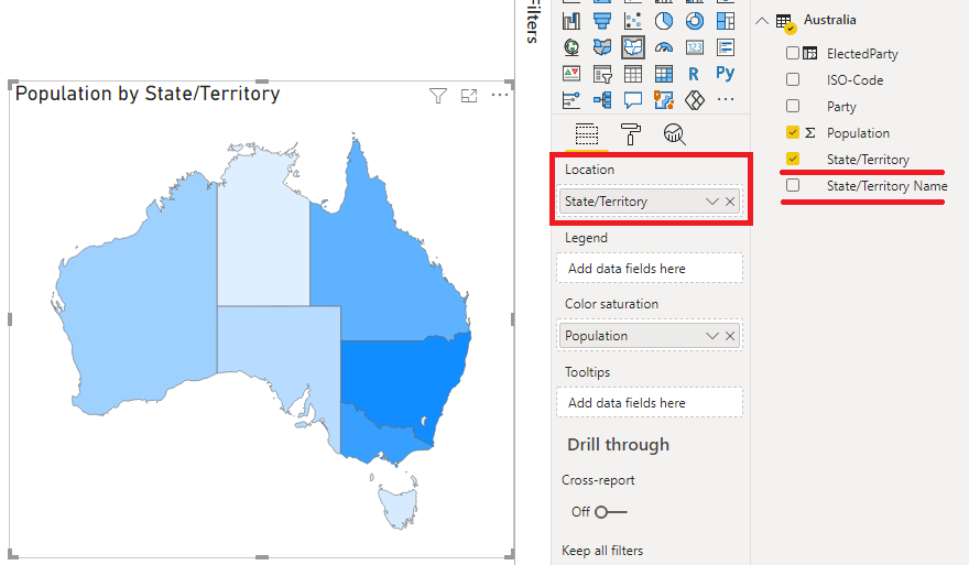
This is of course because there aren't any states or territories with the same abbreviations or name, and because the map keys understand both the abbreviations and full state and territory names.
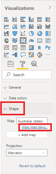
Map Keys

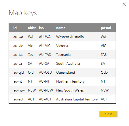
If you look here at the map keys

view map keys

You can see the unique identifiers the map recognises. You can use any of these to refer to the areas in the map, which is why I can use both full state/territory names, or their abbreviations.

map keys

Add A Table

There aren't any labels for the map so it can help to add a table. In practice the map won't generally be on its own. It'll be used in conjunction with other visuals which will give you that missing information like state/territory names.

add a table visual

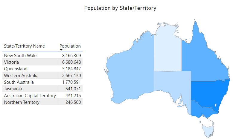
To make the table more helpful I can add conditional formatting for both columns to match the map colors.

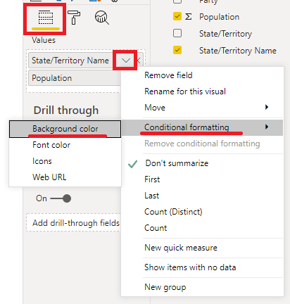
To do this, click on the table, then in the Values, click the down arrow beside State/Territory Name -> Conditional Formatting -> Background Color.

add conditional formatting to table

The settings are almost the defaults.

  • Format by : Color scale
  • Apply to : Values only
  • Based on field : Select Population here and it will display as Sum of Population (the default summarization)
  • Summarization : Sum
  • Default formatting : As zero
  • Minimum : Lowest value
  • Maximum : Highest value

conditional formatting rules for table

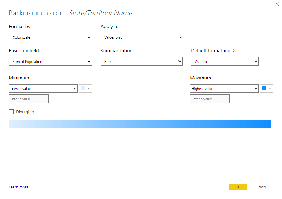
Repeat for the Population column.

table matches map colors

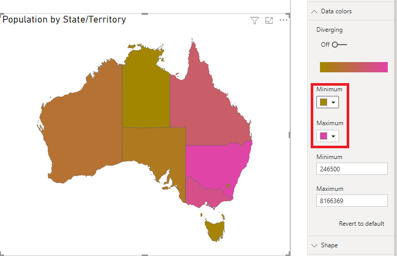
Color for Minimum and Maximum Values

If I select a state or territory from the table, like Tasmania, it's highlighted in the map - but notice that it's color has changed from the color it has when nothing is selected.

color changes when map selected

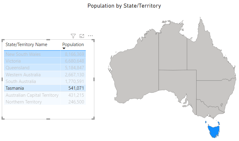
This is because I've used the default settings for the Max and Min values in the Data Colors.

default min max

I haven't specified anything for either so PBI uses the smallest and largest values currently selected (or all values if nothing's selected).

So if I select Tasmania it changes from pale blue to deep blue because with only one state selected, that state is given the color for the largest value, the deep blue.

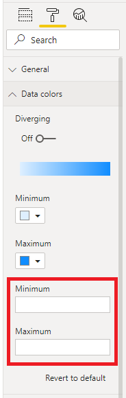
To prevent this behaviour and force each state/territory to stay the same color regardless of selections, I can manually enter minimum and maximum values for the map colors.

specify min and max values

These values are still the minimum and maximum populations, but these numbers will now always be used to assign a color in the range given he specific max and min values, regardless of active selections in other visuals.

Now if I click Tasmania in the table, it stays the same color in the map.

map selection keeps same color

Manually Choosing Map Colors

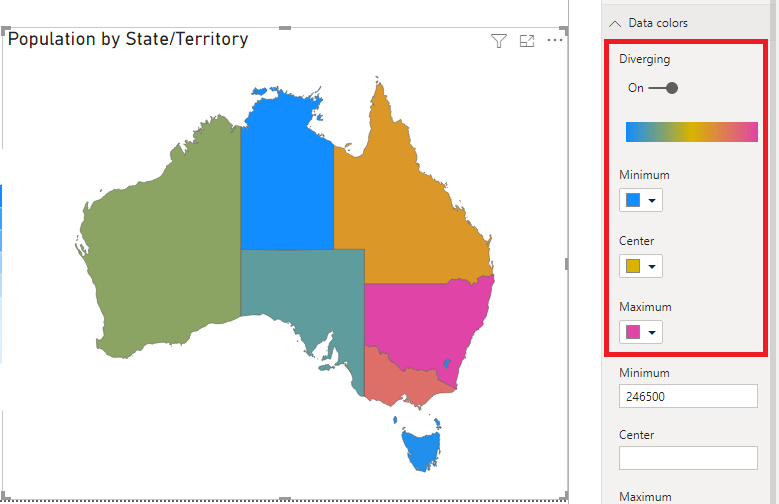
You can choose your own map colors but choosing dissimilar colors leads to confusion - I don't know what the map is telling me now.

manual color selection

Likewise, turning Diverging colors on for this map is not helpful.

map with diverging colors

Using the Legend

Adding State/Territory to the Legend colors each one individually, but again you lose the meaning of the message here. The colors no longer indicate the population distribution.

using map legend for colors

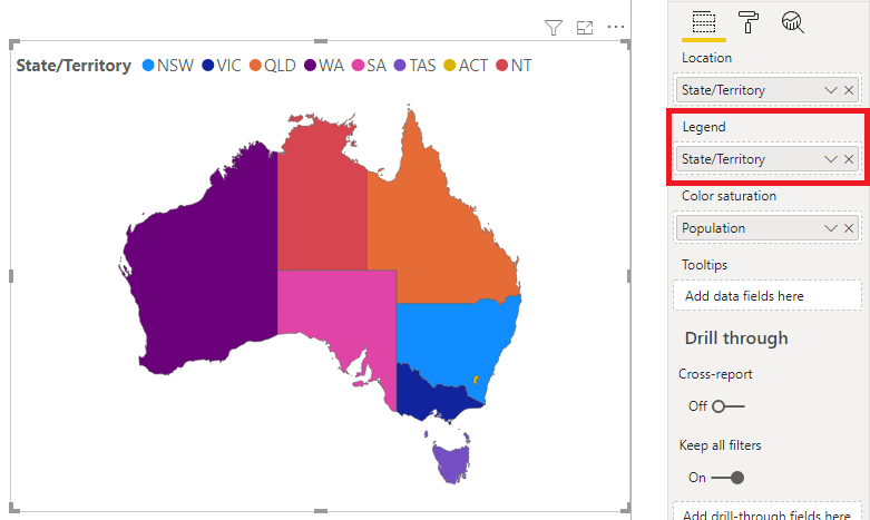
If the purpose it to educate the viewer on the location and names (or abbreviations) of the states/territories you can use this map to do this. But if you had a lot of items in the Legend it will look very messy.

Categorical Data

OK let's look at another use for shape maps. Rather than seeing the distribution of a value like population, I want to see which political parties have been elected to which state/territory.

At the moment in Australia we only have 2 parties in power : Labor and the Liberals. Here you can see which party is in control of which state or territory.

australian elected parties

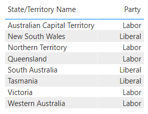
It's not obvious how to create a shape map based on text values, but it's super easy.

Start by inserting the Shape Map visual, then insert the State/Territory Name in the Location field, the Elected Party in the Legend field and the Elected Party again in the Color Saturation field. Power BI will count the Elected Party, which is fine:

categorical shape maps

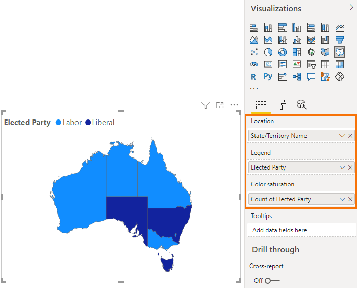
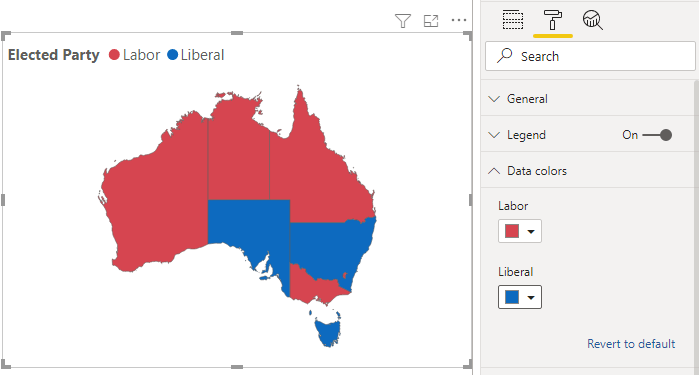
You can then apply the colors you want in the Data Colors settings:

categorical shape map color coding

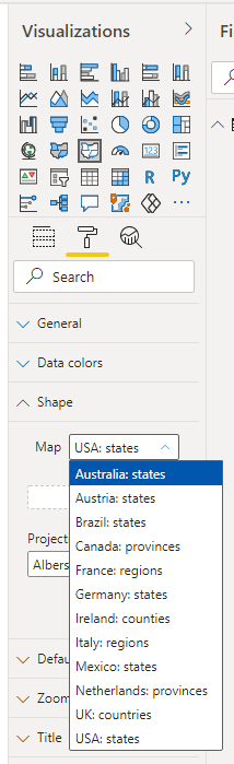
Where To Get Extra Maps

You may have noticed there aren't many default maps available

available map selections

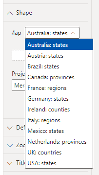
Shape Maps in PBI are a type of map known as TOPO-JSON. You can search online for sites that provide them but I've found a good collection on David Eldersveld's GitHub repository.

shape maps in power bi

More Charts Posts

burn up burn down charts

Excel Project Management Burn Down and Burn Up Charts

Excel Burn Down and Burn Up Charts are easy to make with line or scatter charts. They are useful for monitoring the progress of a project.
wee people font charts

Excel WeePeople Font Charts

Excel WeePeople Font Charts are a nice change from generic shapes for waffle charts, bar/column charts and more.
excel dot map charts

Excel Dot Map Charts

Interactive Excel dot map charts are not built-in, but with some creative use of Excel’s built-in tools we can create something unique.
Excel S Curve Charts

Excel S-Curve Charts

Easy Excel S-curve Charts made with PivotTables for project management. Track progress by including budget amounts.
highlighting data in power bi visuals

Highlighting Data in Power BI Visuals

Learn several techniques to highlight or label important data points in your Power BI visuals. Sample file and code to download.
using jitter to avoid over plotting

Using Jitter to Avoid Over Plotting in Power BI

Plotting data that has one variable where values are similar, can result in points that are plotted over each other. Use jitter to avoid this overplotting.
Excel custom chart labels

Excel Custom Chart Labels

Create dynamic Excel custom chart labels with this category axis hijack trick
Sorting Excel Date Slicers

Sorting Excel Date Slicers

Slicers have some shortcomings when it comes to dates and sort order. This post explains a couple of ways to sort dates correctly in Excel slicers.
Charting Disparate Data in Excel – 3 Solutions and 1 Crazy Mess

Charting Disparate Data in Excel – 3 Solutions and 1 Crazy Mess

4 Charts – Same Data. Which do you think is best?

4 Charts – Same Data. Which do you think is best?

More Power BI Posts

combine files with different column names in power query

Combine Files With Different Column Names in Power Query

Learn how to load data into Power Query when the column names in your data don't match up. Sampe files to download.
try otherwise power query iferror

IFERROR in Power Query Using TRY OTHERWISE

Using TRY..OTHERWISE in Power Query Replicates Excel's IFERROR So You Can Trap and Manage Errors In Your Queries.
easily compare multiple tables in power query using list functions

Easily Compare Multiple Tables in Power Query

Compare tables or lists in Power Query using List Functions. This method is great when dealing with 3 or more tables or lists.
fuzzy matching in power query

Fuzzy Matching in Power Query

Use fuzzy matching to compare non-identical text strings and match them together based on how similar one string is to the other.
handling http errors in power query and power bi

Handling HTTP Errors in Power Query and Power BI

Clearly communicate issues with custom messages when dealing with web scraping or API server errors. Download sample Excel and Power BI files
extract characters from strings in power query using text select and text extract

Extract Letters, Numbers, Symbols from Strings in Power Query with Text.Select and Text.Remove

Learn a cool technique to extract or remove letters, numbers and special characters from strings. Sample workbook to download
highlighting data in power bi visuals

Highlighting Data in Power BI Visuals

Learn several techniques to highlight or label important data points in your Power BI visuals. Sample file and code to download.

Converting Decimal Time to Days, Hours, Minutes, Seconds in Power BI

Convert times and durations from decimal numbers to easily understood formats like hh:mm:ss. Sample code and file to download.
sort by column in power bi

Sort-By Columns in Power BI

Create a Sort-By column to allow custom sort order in your Power BI Visuals. Download an example Power BI Desktop file
custom formatting strings in power bi

Custom Formatting Strings in Power BI

Control how data is displayed in Power BI using your own formats. Like hiding negative or zero values, using symbols or custom number formats

More Power BI Posts

custom tooltips in power bi

Custom Tooltips in Power BI

Create custom tooltips for Power BI visuals. Use charts, images, numeric or categorical data to enhance the information your visuals convey
conditional formatting tables and matrices in power bi

Conditional Formatting in Power BI Tables and Matrices

How to apply conditional formatting to tables and matrices in Power BI. Use color, icons, data bars and URL's.
dax editor keyboard shortcuts

DAX Editor Keyboard Shortcuts

Keyboard shortcuts for the DAX editor in Power BI. Learning DAX is hard enough. Make your life easier by using these keyboard shortcuts.
fixing incorrect totals in dax

Fixing Incorrect Totals in DAX

If you're getting incorrect totals in your DAX measures, this post explains how to fix them. VIDEO and Sample file to download.
highlighting data in power bi visuals

Highlighting Data in Power BI Visuals

Learn several techniques to highlight or label important data points in your Power BI visuals. Sample file and code to download.
Power BI Organizational Data Types

Power BI Organizational Data Types in Excel

Power BI Organizational Data Types in Excel revolutionize the way we store and access our data with one central location and small files.
shape maps in power bi

Shape Maps in Power BI

Shape maps in Power BI can be used to show the distribution of a variable across geographic regions. Learn a trick to plot discrete data too.
static data tables

Static Tables in Power Query, Power Pivot and Power BI

Use static tables to store data in Power Query, Power Pivot and Power BI without needing to load data from an external source

Converting Decimal Time to Days, Hours, Minutes, Seconds in Power BI

Convert times and durations from decimal numbers to easily understood formats like hh:mm:ss. Sample code and file to download.
Power BI Dashboards

How to Build Power BI Dashboards

This video tutorial takes you step by step through building Power BI dashboards and reports, including publishing and sharing.


Category: Power BITag: charts, Power BI
Previous Post:Workbook ProtectionExcel Workbook Protection
Next Post:Power BI Organizational Data Types in ExcelPower BI Organizational Data Types

Reader Interactions

Leave a Reply Cancel reply

Your email address will not be published. Required fields are marked *

Current ye@r *

Leave this field empty

Sidebar

More results...

Featured Content

  • 10 Common Excel Mistakes to Avoid
  • Top Excel Functions for Data Analysts
  • Secrets to Building Excel Dashboards in Less Than 15 Minutes
  • Pro Excel Formula Writing Tips
  • Hidden Excel Double-Click Shortcuts
  • Top 10 Intermediate Excel Functions
  • 5 Pro Excel Dashboard Design Tips
  • 5 Excel SUM Function Tricks
  • 239 Excel Keyboard Shortcuts

100 Excel Tips and Tricks eBook

Download Free Tips & Tricks

Subscribe to Our Newsletter

Receive weekly tutorials on Excel, Power Query, Power Pivot, Power BI and More.

We respect your email privacy

Guides and Resources

  • Excel Keyboard Shortcuts
  • Excel Functions
  • Excel Formulas
  • Excel Custom Number Formatting
  • ALT Codes
  • Pivot Tables
  • VLOOKUP
  • VBA
  • Excel Userforms
  • Free Downloads

239 Excel Keyboard Shortcuts

Download Free PDF

Free Webinars

Excel Dashboards Webinar

Watch our free webinars and learn to create Interactive Dashboard Reports in Excel or Power BI

Click Here to Watch Now

mynda treacy microsoft mvpHi, I'm Mynda Treacy and I run MOTH with my husband, Phil. Through our blog, webinars, YouTube channel and courses we hope we can help you learn Excel, Power Pivot and DAX, Power Query, Power BI, and Excel Dashboards.

Blog Categories

  • Excel
  • Excel Charts
  • Excel Dashboard
  • Excel Formulas
  • Excel PivotTables
  • Excel Shortcuts
  • Excel VBA
  • General Tips
  • Online Training
  • Outlook
  • Power Apps
  • Power Automate
  • Power BI
  • Power Pivot
  • Power Query
microsoft mvp logo
trustpilot excellent rating
Secured by Sucuri Badge
MyOnlineTrainingHub on YouTube Mynda Treacy on Linked In Mynda Treacy on Instagram Mynda Treacy on Twitter Mynda Treacy on Pinterest MyOnlineTrainingHub on Facebook
 

Company

  • About My Online Training Hub
  • Disclosure Statement
  • Frequently Asked Questions
  • Guarantee
  • Privacy Policy
  • Terms & Conditions
  • Testimonials
  • Become an Affiliate

Support

  • Contact
  • Forum
  • Helpdesk – For Technical Issues

Copyright © 2023 · My Online Training Hub · All Rights Reserved. Microsoft and the Microsoft Office logo are trademarks or registered trademarks of Microsoft Corporation in the United States and/or other countries. Product names, logos, brands, and other trademarks featured or referred to within this website are the property of their respective trademark holders.