• Skip to main content
  • Skip to header right navigation
  • Skip to site footer

My Online Training Hub

Learn Dashboards, Excel, Power BI, Power Query, Power Pivot

  • Courses
  • Pricing
    • Free Courses
    • Power BI Course
    • Excel Power Query Course
    • Power Pivot and DAX Course
    • Excel Dashboard Course
    • Excel PivotTable Course – Quick Start
    • Advanced Excel Formulas Course
    • Excel Expert Advanced Excel Training
    • Excel Tables Course
    • Excel, Word, Outlook
    • Financial Modelling Course
    • Excel PivotTable Course
    • Excel for Customer Service Professionals
    • Excel for Operations Management Course
    • Excel for Decision Making Under Uncertainty Course
    • Excel for Finance Course
    • Excel Analysis ToolPak Course
    • Multi-User Pricing
  • Resources
    • Free Downloads
    • Excel Functions Explained
    • Excel Formulas
    • Excel Add-ins
    • IF Function
      • Excel IF Statement Explained
      • Excel IF AND OR Functions
      • IF Formula Builder
    • Time & Dates in Excel
      • Excel Date & Time
      • Calculating Time in Excel
      • Excel Time Calculation Tricks
      • Excel Date and Time Formatting
    • Excel Keyboard Shortcuts
    • Excel Custom Number Format Guide
    • Pivot Tables Guide
    • VLOOKUP Guide
    • ALT Codes
    • Excel VBA & Macros
    • Excel User Forms
    • VBA String Functions
  • Members
    • Login
    • Password Reset
  • Blog
  • Excel Webinars
  • Excel Forum
    • Register as Forum Member

Segmented Survey Data Chart

You are here: Home / Excel Charts / Segmented Survey Data Chart
segmented survey data chart
August 22, 2019 by Mynda Treacy

Charting survey data can be tricky, and when you want a segmented survey data chart it adds another layer of complexity.

Bart sent me the data below and asked how I would go about visualising the data to include the size of the segments (students, lecturers, staff).

sample data

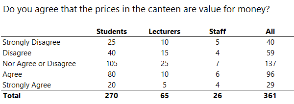
Segmented Survey Data Chart – Option 1

You might be tempted to dive straight into a stacked bar chart with percentage labels like this:

segmented survey data chart option 1

Pros: Clearly shows the proportion of each segment’s opinion and the overall consensus.

Cons: It doesn’t give any indication of the segment's sample size.

Segmented Survey Data Chart – Option 2

It’s not really a chart, rather a table with Conditional Formatting. Each segment has the lowest values highlighted in shades of red and the highest values in shades of green.

segmented survey data chart option 2

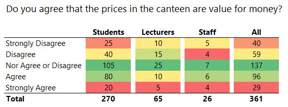
Pros: Clearly draws your attention to the frequency of the responses. We can quickly see that the majority, irrespective of their segment, are neutral or in agreement. It also shows the sample size of each segment, which is important to Bart.

Cons: Unlike a chart with bars that represent size, the table makes it difficult to compare the segments and opinions at a glance.

Segmented Survey Data Chart – Option 3

100% stacked bar chart with value labels:

segmented survey data chart option 3

As with the first example, the bars in the chart display the percentage of each opinion per segment. The data labels show the segment size.

Pros: Discloses the size of each segment and illustrates the sentiment based on the size of the coloured segments.

Cons: Could be confusing mixing values in the labels with percentages on the horizontal axis.

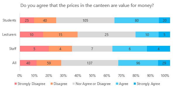
Segmented Survey Data Chart – Option 4

The chart below consists of 5 separate stacked bar charts aligned closely together so they appear as one chart.

segmented survey data chart option 4

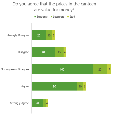
Note: It’s important that the horizontal axis scale on each chart is the same. I’ve hidden it in the charts above because I’ve used labels instead.

Pros: Easy to see the sentiment at a glance. i.e. majority are neutral or in agreement. Labels display the segment size.

Cons: Not easy to compare the total size of each segment or the proportions of opinion within each segment. e.g. it’s not easy to tell that 80 students in agreement represents 30% of the total student opinion.

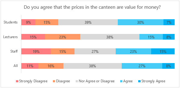
Segmented Survey Data Chart – Option 5

This chart is also 5 separate bar charts aligned close together. Again, the horizontal axis, which is hidden, has the same scale in each chart.

segmented survey data chart option 5

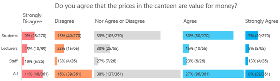
Pros: Shows both the discrete values and percentage of opinions within each segment. Easy to compare the segments within an opinion. The bars show the size of the segment. The β€˜All’ segment shows the overall sentiment.

Cons: Labels make it feel cluttered and could be confusing and time consuming to read. Also, there is a bug in Excel that resizes the label boxes upon closing the file, so they end up wrapped when you open the file again which is annoying.

Segmented Survey Data Chart – Option 6

segmented survey data chart option 6

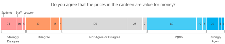
This is a twist on the more common survey data charts and like chart option 4 it shows both the sentiment and the size of the segments.

Pros: Discloses the size of each segment visually and through the labels. Illustrates the sentiment based on the size of the coloured segments.

Cons: Not easy to see the proportion of opinions within a segment. A lot of manual work to format the colours and insert the labels. Not easy to compare the size of each segment’s opinion.

My preference is chart option 4 because it’s the quickest and easiest to read and clearly shows the overall sentiment while still disclosing the size of the segments. However, if the opinion of one segment is more important than others then chart option 5 would be the best.

This survey only asked one question, however typically surveys ask multiple questions. Check out this post on Excel Charts for Surveys to get some more ideas.

Download Workbook

Enter your email address below to download the sample workbook.

By submitting your email address you agree that we can email you our Excel newsletter.
Please enter a valid email address.

Download the Excel Workbook. Note: This is a .xlsx file please ensure your browser doesn't change the file extension on download.

segmented survey data chart

More Excel Charts Posts

picture fill excel charts

Picture Fill Excel Charts

Using a stylish picture fill in your Excel Charts is a simple way to make your data visualizations more captivating and memorable
excel speedometer charts

Excel Speedometer Charts

How to build Excel Speedometer Charts or Gauge Charts as they're also know, why they are BAD and what to use instead.
burn up burn down charts

Excel Project Management Burn Down and Burn Up Charts

Excel Burn Down and Burn Up Charts are easy to make with line or scatter charts. They are useful for monitoring the progress of a project.
wee people font charts

Excel WeePeople Font Charts

Excel WeePeople Font Charts are a nice change from generic shapes for waffle charts, bar/column charts and more.
excel dot map charts

Excel Dot Map Charts

Interactive Excel dot map charts are not built-in, but with some creative use of Excel’s built-in tools we can create something unique.
Excel S Curve Charts

Excel S-Curve Charts

Easy Excel S-curve Charts made with PivotTables for project management. Track progress by including budget amounts.
chart axis switch

Excel Chart Axis Switch

Use radio button form controls to create an Excel chart axis switch enabling you to toggle pannel charts between same axis and own axis.

Excel Charts with Shapes for Infographics

Excel Charts with Shapes for Infographic styling and increased interest in your charts. Easy to insert but there are a few tricks required.
excel pyramid chart

Excel Pyramid Charts

Excel Pyramid charts are useful for visualising demographic data across multiple categories. Let’s look at 3 ways we can build them in Excel.

Highlighting Periods in Excel Charts

Highlighting Periods in Excel Charts helps your users interpret them more quickly and or focus their attention on a point or area.


Category: Excel Charts
Previous Post:year on year chartsYear on Year Charts
Next Post:PowerApps and Excel – An Introductionpowerapps and excel

Reader Interactions

Comments

  1. Howard Silcock

    October 15, 2019 at 10:40 am

    One modification that would improve ALL the charts has nothing to do with Excel! Change the label ‘Nor Agree or Disagree’ to ‘Neither Agree nor Disagree’. (Of course, this really needs to be changed in the data.) For some of us, that’s more distracting than any of the shortcomings of the individual charts!

    Reply
    • Mynda Treacy

      October 15, 2019 at 12:08 pm

      I agree πŸ™‚ however, the data wasn’t mine, so I didn’t want to change it.

      Mynda

      Reply
  2. Greg Taillon

    August 22, 2019 at 10:25 pm

    Pie charts are much better at showing a percentage of the whole. A large pie chart showing the sentiment with four smaller pie charts showing the participants’ percentages for each sentiment would clarify the results of the data.

    Reply
    • Mynda Treacy

      August 23, 2019 at 10:56 am

      Hi Greg,

      Thanks for sharing your ideas. The pie charts won’t visually illustrate the size of the segments, which was the objective for Bart.

      Mynda

      Reply
      • Philip Wiest

        August 23, 2019 at 2:28 pm

        This is a terrific article!

        I’m not a fan of pie charts… but with 3D Maps, the comparative size of a bubble could be used to communicate the relative size of the pool of respondents. With 3D Maps, you can place bubbles at separate x y coordinates that would appear as pie charts.

        This is a great illustration of how “making things look easy” … takes a lot of work!

        Reply
        • Mynda Treacy

          August 23, 2019 at 4:53 pm

          πŸ™‚ Glad you liked it and thanks for sharing your ideas, Philip.

          Reply
  3. Daniel

    August 22, 2019 at 5:46 pm

    Hi Mynda,

    those are all creative ideas, but in the market research industry only option 1 would be “correct” in the sense of a common ground. One has to ask what the goal of the chart is – I would say, one likes to know the opinion of the three groups in comparison to each other and to the Total. Option 1 does the job, all other options not (well option 3 is not bad as it makes the proportions visually comparable). If the sample size is relevant, the simplest solution is to write the numbers of cases below the group names – e.g. like (n=270) below “Students”.
    Another solution would be to show the sample size in a second chart near the original chart, in a simple way like a bar chart.

    Kind regards,
    Daniel

    Reply
    • Mynda Treacy

      August 23, 2019 at 11:49 am

      Thanks for your ideas, Daniel. The goal of the chart is to illustrate both the sentiment and the size of the segments, which isn’t typical for most surveys. This requirement to visualise the segment size was the driver behind my chart choices.

      Reply

Leave a Reply Cancel reply

Your email address will not be published. Required fields are marked *

Current ye@r *

Leave this field empty

Sidebar

More results...

Featured Content

  • 10 Common Excel Mistakes to Avoid
  • Top Excel Functions for Data Analysts
  • Secrets to Building Excel Dashboards in Less Than 15 Minutes
  • Pro Excel Formula Writing Tips
  • Hidden Excel Double-Click Shortcuts
  • Top 10 Intermediate Excel Functions
  • 5 Pro Excel Dashboard Design Tips
  • 5 Excel SUM Function Tricks
  • 239 Excel Keyboard Shortcuts

100 Excel Tips and Tricks eBook

Download Free Tips & Tricks

Subscribe to Our Newsletter

Receive weekly tutorials on Excel, Power Query, Power Pivot, Power BI and More.

We respect your email privacy

Guides and Resources

  • Excel Keyboard Shortcuts
  • Excel Functions
  • Excel Formulas
  • Excel Custom Number Formatting
  • ALT Codes
  • Pivot Tables
  • VLOOKUP
  • VBA
  • Excel Userforms
  • Free Downloads

239 Excel Keyboard Shortcuts

Download Free PDF

Free Webinars

Excel Dashboards Webinar

Watch our free webinars and learn to create Interactive Dashboard Reports in Excel or Power BI

Click Here to Watch Now

mynda treacy microsoft mvpHi, I'm Mynda Treacy and I run MOTH with my husband, Phil. Through our blog, webinars, YouTube channel and courses we hope we can help you learn Excel, Power Pivot and DAX, Power Query, Power BI, and Excel Dashboards.

Blog Categories

  • Excel
  • Excel Charts
  • Excel Dashboard
  • Excel Formulas
  • Excel PivotTables
  • Excel Shortcuts
  • Excel VBA
  • General Tips
  • Online Training
  • Outlook
  • Power Apps
  • Power Automate
  • Power BI
  • Power Pivot
  • Power Query
microsoft mvp logo
trustpilot excellent rating
Secured by Sucuri Badge
MyOnlineTrainingHub on YouTube Mynda Treacy on Linked In Mynda Treacy on Instagram Mynda Treacy on Twitter Mynda Treacy on Pinterest MyOnlineTrainingHub on Facebook
 

Company

  • About My Online Training Hub
  • Disclosure Statement
  • Frequently Asked Questions
  • Guarantee
  • Privacy Policy
  • Terms & Conditions
  • Testimonials
  • Become an Affiliate

Support

  • Contact
  • Forum
  • Helpdesk – For Technical Issues

Copyright © 2023 · My Online Training Hub · All Rights Reserved. Microsoft and the Microsoft Office logo are trademarks or registered trademarks of Microsoft Corporation in the United States and/or other countries. Product names, logos, brands, and other trademarks featured or referred to within this website are the property of their respective trademark holders.