Charts are great at revealing trends, patterns and relationships in your data. We love how they enable us to glean information in the blink of an eye, but beware of the line chart because it can lie.
Watch the Video

Download the Excel File
Enter your email address below to download the sample workbook.
Charting Disparate Data
Let’s take the line chart below that plots the trend of revenue and profit over time. It looks like revenue is growing faster than profit; after all revenue shows a steady incline whereas profit is quite flat.
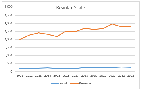
Present a chart like this and you’ll be inundated with questions from the CEO who is irate that either COGS or overheads, or both have increased, and all the extra revenue they’ve worked so hard to generate appears to be eaten up by increased costs.
To be fair, it’s not the line chart’s fault. The first line chart is plotting the data correctly. It isn’t a bug in the chart. It’s a case of relativity; a 10% increase on $1m is always going to be a bigger number than a 10% increase on $100k, and when you plot disparate data that continues to grow over time, even at the same rate, the gap is going to widen.
The Truth Chart 1 – Log Scale
However, if we look at the data plotted on a log scale we can see that revenue and profit are actually growing at similar rates.
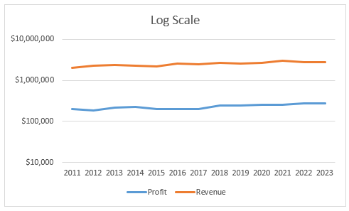
Phew, the production and operations managers have been spared, but now the CEO is after you for producing a misleading chart!
Using a Log scale is one option to prevent line chart lies, but some people find these a bit confusing to interpret so let’s look at another Truth Chart.
The Truth Chart 2 – Secondary Axis
The secondary axis is a popular choice, however among data visualisation gurus they are discouraged because they are difficult to quickly see which axis is for which line.
The other problem they pose is since they use different scales they can result in an unclear message. Let’s look at what happens when you add a secondary axis:
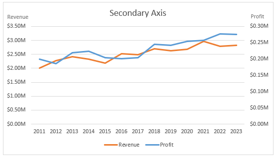
In this chart the lines for revenue and profit do follow a similar upward trend but we can’t compare the actual growth rate of one against the other.
The uneducated chart reader may even make the incorrect assumption that profit is performing better than revenue since the profit line ends at a higher point, irrespective of the scales.
We humans make split second assumptions based on what we see, often without even realising. We need to be mindful of this and try to present data in a way that is quick to interpret, but also consider any misinformation they might inadvertently convey.
Perhaps a compromise would be to add some labels with the start and end dollar values of the revenue and profit and percentage growth.
The Truth Chart 3 – Panel Charts
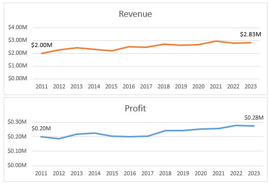
Panel charts, which in their basic form are simply two separate charts, enables you to clearly see the growth in each series and the separate axis scales enable quicker interpretation than the secondary axis charts. However, there is still a large gap between the lines which makes it difficult to compare them. This could be aided by adding labels for percentage growth.
The Truth Chart 4 – Index Numbers
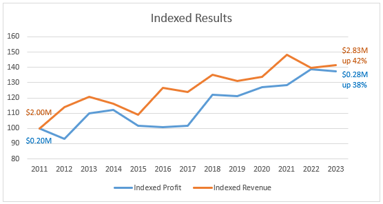
The chart above plots the change in revenue and profit figures over time relative to the starting position in 2011. These values are known as index numbers (more on that in a moment).
It tells a completely different story to the original line chart. Here we can clearly see that the growth rate of revenue and profit have followed a fairly similar pattern, and by 2022 they were almost the same.
The labels on the lines in this chart could be used in any of the charts above to aid interpretation. Download the file to see how they're done.
Calculating the Index
We index numbers by saying that in 2011 (our base period) both revenue and profit were 100, or 100% and from there we calculate the change for each year since 2011.
It’s tricky to explain in words alone so let’s take a look at this table which shows the indexed results in columns D and E (remember 1 = 100%):
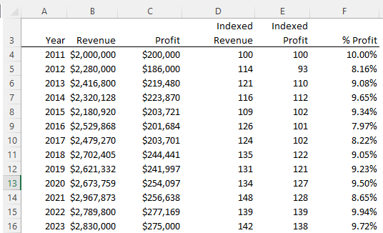
In cell D5 we can see that the indexed revenue is 114, which is the same as saying that the revenue in 2012 is 14% higher than it was in 2011. Likewise the profit in 2012 is 7% less than it was in 2011.
Each subsequent year is also compared to 2011, our base year, to come up with the indexed value for that year.
The formula in D4 is =B4/$B$4 which is then copied down the column so that D5 contains =B5/$B$4 and so on.

Well written analysis. Thanks for sharing.
Thanks, Jef 🙂
It’s not just line charts; any chart can be used in misleading ways. (Intentionally or not.)
In some cases it is useful to plot the ratio of the two numbers, for example, profit as a percentage of revenue.
Yep, and yep. Cheers, Jon. I agree. In fact profit as a percentage of revenue would be the most sensible data to plot in this scenario.
I was originally planning on using a different example for this post as I stumbled upon this issue where different figures were used; it was something like the growth of US Debt vs Imports from China, but for the life of me I couldn’t find it again.
Mynda.
Awesome job Mynda and great suggestion Jon!! Chart adjusted to help reader better interpret the more valuable data (profit as a percentage of revenue). Thoughts?
Hi Stefano,
Thanks for sharing your chart. I recommend showing the ratio increase in its own chart as bars or a line. The labels are helpful, but they’re slow to read and they clutter the chart a bit too much for my liking. How about this variation:
Mynda
Really like the index charts; real alternative to changing series from/to primary and secondary axis
I will use this in my day-to-day reporting
Great 🙂 Glad you liked it Geraldine. I definitely recommend indexing over the secondary axis option as you can see in my examples in reply to Asif.
Mynda.
Hi Mynda,
This is awesome. Now we can use excel to add real value instead of just using charts for the sake of showing numbers.
Cheers, Sanjiv 🙂
Thanks Mynda!
By Index approach, one can see the trend of both the revenue & the profit in above chart…right but a secondary axis option can be adopted to see the real values.
Now what if we have three variables plotted on Y axis with different variation in values…here index will solve our problem if we want trend but how we can get 3rd axis on a graph?
Hi Asif,
The secondary axis is a popular choice, however among data visualisation gurus they are discouraged because they are difficult to quickly see which axis is for which line.
The other problem they pose is since they use different scales they can result in an unclear message. Let’s look at what happens when you add a secondary axis:
In this chart the lines for revenue and profit do follow a similar upward trend but we can’t compare the actual growth rate of one against the other.
The uneducated chart reader may even make the incorrect assumption that profit is performing better than revenue since the profit line ends at a higher point, irrespective of the scales.
We humans make split second assumptions based on what we see, often without even realising. We need to be mindful of this and try to present data in a way that is quick to interpret, but also consider any misinformation they might inadvertently convey.
Perhaps a comprimise would be to add some labels with the start and end dollar values of the revenue and profit, although this may then confuse interpretation too:
Cheers,
Mynda.
I think that a clear division of the panels can solve the problem of the secondary axis … something like this:
https://peltiertech.com/WordPress/excel-column-chart-primary-secondary-axes/
(only the first hint that I found)
Thanks for sharing the link, Roberto. I also like a panel chart and the vertical ones are ideal for this scenario.
If you didn’t want to jump through all those hoops to create it you could always create two separate charts and align them, hiding one of the horizontal axes etc. Not as slick as Jon’s panel chart but maybe good for quickly cobbling together.
Cheers,
Mynda.
Great example of indexing! I like the chart above that shows the revenue in the labels. You could also add labels at the end of each line that state the percentage growth. For example, to the right of the orange line the label could say, “Revenue grew 42% since 2001”.
You could also accomplish this by formatting the numbers as percentages in the y-axis and adding an axis label that describes it. The reader might be confused by what 1.2 or 1.4 means.
Thanks for sharing!
Great idea, Jon.
Cheers,
Mynda.