• Skip to main content
  • Skip to header right navigation
  • Skip to site footer

My Online Training Hub

Learn Dashboards, Excel, Power BI, Power Query, Power Pivot

  • Courses
  • Pricing
    • Free Courses
    • Power BI Course
    • Excel Power Query Course
    • Power Pivot and DAX Course
    • Excel Dashboard Course
    • Excel PivotTable Course โ€“ Quick Start
    • Advanced Excel Formulas Course
    • Excel Expert Advanced Excel Training
    • Excel Tables Course
    • Excel, Word, Outlook
    • Financial Modelling Course
    • Excel PivotTable Course
    • Excel for Customer Service Professionals
    • Excel for Operations Management Course
    • Excel for Decision Making Under Uncertainty Course
    • Excel for Finance Course
    • Excel Analysis ToolPak Course
    • Multi-User Pricing
  • Resources
    • Free Downloads
    • Excel Functions Explained
    • Excel Formulas
    • Excel Add-ins
    • IF Function
      • Excel IF Statement Explained
      • Excel IF AND OR Functions
      • IF Formula Builder
    • Time & Dates in Excel
      • Excel Date & Time
      • Calculating Time in Excel
      • Excel Time Calculation Tricks
      • Excel Date and Time Formatting
    • Excel Keyboard Shortcuts
    • Excel Custom Number Format Guide
    • Pivot Tables Guide
    • VLOOKUP Guide
    • ALT Codes
    • Excel VBA & Macros
    • Excel User Forms
    • VBA String Functions
  • Members
    • Login
  • Blog
  • Excel Webinars
  • Excel Forum
    • Register as Forum Member
  • Login

Interactive Excel Chart with Map

You are here: Home / Excel Charts / Interactive Excel Chart with Map
Interactive Excel Chart with Map
July 2, 2013 by Mynda Treacy

Today Iโ€™d like to share with you a video tutorial by Isaac Gottlieb on supply-chain decision making from his book Next Generation Excel.

Isaac teaches over 2,000 MBA students a year at Columbia, NYU and Temple U and over 3,000 undergrads on-line.

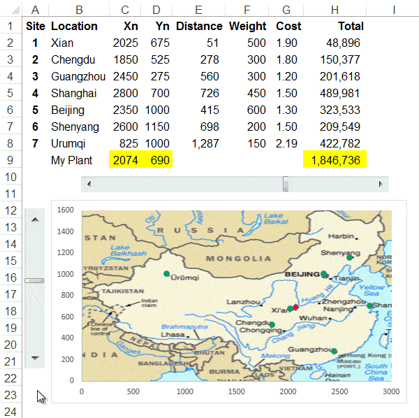
See how he uses the Solver to find out the ideal location for a manufacturing plant. He then takes the output and plots it on a scatter chart, adds some scroll bars and a sprinkling of magic dust and makes it do this (watch the red marker on the map):

Excel Solver

Here is the video:

Now I know itโ€™s not every day you need to calculate the ideal location of a manufacturing plant, but take a few minutes to think about how you could use one or more of the tips in this video and apply it to your work.

Enter your email address below to download the sample workbook.

By submitting your email address you agree that we can email you our Excel newsletter.
Please enter a valid email address.

Download the Excel workbook. Note: This is a .xlsx file, please ensure your browser doesnโ€™t change the file extension on download.

If you'd like to learn how to incorporate interactive features like this in your Excel reports and charts check out my Excel Dashboard course.
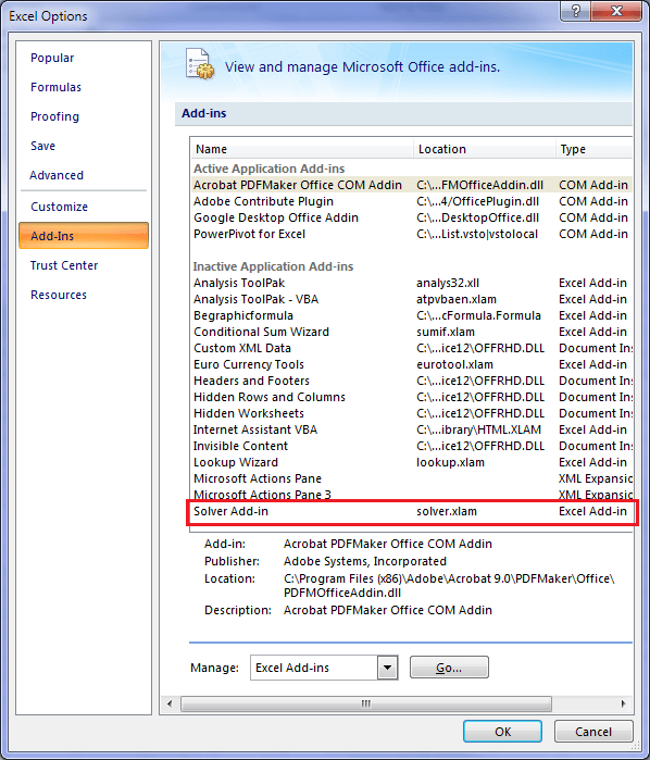
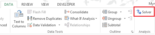
Whereโ€™s the Solver?

The Solver is an add-in. If you donโ€™t already have it on the Data tab of your ribbon you can add it by going to Excel Options (Office button or File tab) > Add-ins:

Excel Solver Add-in

Then you should have this:

Excel Solver Add-in

Where is the Scroll Bar?

On the Developer tab of the ribbbon.

Excel Solver Add-in

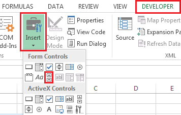
If you don't have the Developer tab available you can add it:

File Tab (2010/13), or Windows button (2007) > Options > Customize Ribbon; check the Developer box under Main Tabs in the right selection pane.

Thanks

Thank you Isaac for allowing me to share this tutorial.

If you liked this please share it with your friends and colleagues on LinkedIn, Google +1, Facebook or Twitter, or leave a comment below.

Interactive Excel Chart with Map
Mynda Treacy

Microsoft MVP logo

AUTHOR Mynda Treacy Co-Founder / Owner at My Online Training Hub

CIMA qualified Accountant with over 25 years experience in roles such as Global IT Financial Controller for investment banking firms Barclays Capital and NatWest Markets.

Mynda has been awarded Microsoft MVP status every year since 2014 for her expertise and contributions to educating people about Microsoft Excel.

Mynda teaches several courses here at MOTH including Excel Expert, Excel Dashboards, Power BI, Power Query and Power Pivot.

More Excel Charts Posts

burn up burn down charts

Excel Project Management Burn Down and Burn Up Charts

Excel Burn Down and Burn Up Charts are easy to make with line or scatter charts. They are useful for monitoring the progress of a project.
wee people font charts

Excel WeePeople Font Charts

Excel WeePeople Font Charts are a nice change from generic shapes for waffle charts, bar/column charts and more.
excel dot map charts

Excel Dot Map Charts

Interactive Excel dot map charts are not built-in, but with some creative use of Excelโ€™s built-in tools we can create something unique.
highlighting data in power bi visuals

Highlighting Data in Power BI Visuals

Learn several techniques to highlight or label important data points in your Power BI visuals. Sample file and code to download.
animating excel charts

Animating Excel Charts

Use animation correctly to enhance the story your data is telling. Don't animate your chart just for some eye candy. Sample code and workbook to download.
project management dashboard

Excel Project Management Dashboard

Excel project management dashboard video tutorial covering various techniques including conditional formatting, PivotTables, Slicers, charts and more.
jitter in scatter charts

Jitter in Excel Scatter Charts

Jitter introduces a small movement to the plotted points, making it easier to read and understand scatter plots particularly when dealing with lots of data.
Custom Excel Chart Label Positions

Custom Excel Chart Label Positions

Custom Excel Chart Label Positions using a dummy or ghost series to force the label position neatly above the columns of data
Lookup Pictures in Excel

Lookup Pictures in Excel

Lookup Pictures in Excel using values in cells returned by data validation lists (drop down lists) or Slicers. No VBA/Macros required!

Cross Highlight Excel Charts

Filter and Cross Highlight Excel Charts like you can in Power BI using some Excel Power Pivot magic, regular charts and a Slicer.

More Excel Solver Posts

More Excel Charts Posts

interactive python charts in excel

Interactive Python Charts in Excel

How to build interactive Python Charts in Excel and regular charts with Slicers connected to data from Power Query.
Circle Progress Charts

Excel Progress Circle Charts

How to easily create dynamic Excel Progress Circle Charts, using doughnut charts and some wizardry, including Slicers to change the data.
professional vs amateur chart formatting

Pro Excel Chart Formatting

10 tell-tale signs that show youโ€™re a chart amateur and the Excel chart formatting you should use instead.

Excel Scroll and Sort Table

Excel scroll and sort table using dynamic array formulas is far simpler than the old approach which required multiple tables, formulas and helper columns.
picture fill excel charts

Picture Fill Excel Charts

Using a stylish picture fill in your Excel Charts is a simple way to make your data visualizations more captivating and memorable
excel speedometer charts

Excel Speedometer Charts

How to build Excel Speedometer Charts or Gauge Charts as they're also know, why they are BAD and what to use instead.
burn up burn down charts

Excel Project Management Burn Down and Burn Up Charts

Excel Burn Down and Burn Up Charts are easy to make with line or scatter charts. They are useful for monitoring the progress of a project.
wee people font charts

Excel WeePeople Font Charts

Excel WeePeople Font Charts are a nice change from generic shapes for waffle charts, bar/column charts and more.
excel dot map charts

Excel Dot Map Charts

Interactive Excel dot map charts are not built-in, but with some creative use of Excelโ€™s built-in tools we can create something unique.
Excel S Curve Charts

Excel S-Curve Charts

Easy Excel S-curve Charts made with PivotTables for project management. Track progress by including budget amounts.


Category: Excel ChartsTag: excel charts, excel solver
Previous Post:Excel ACCRINT FunctionExcel ACCRINT Function
Next Post:Excel Form ControlsExcel Form Controls

Reader Interactions

Comments

  1. Amiram

    July 26, 2017 at 5:32 am

    Shalom isaac
    I enjoyed watching your podcast.
    It gave me new goals for the future to use in my dashboards.
    One thing that i still having problem is how to change the map size so that it will fit the coordinates of the countries /city
    Like take the map of israel what size should it be in order to put haifa city coordinate to see on the map.
    Thank you
    Amiram

    Reply
    • Isaac Gottlieb

      July 26, 2017 at 10:12 pm

      Amiram

      To adjust the axis – you can right click on the axis and set it up with the right borders and it will not change. Once you have the chart with the map – you can adjust the coordinates on the Excel sheet so that the cities are in the correct position.
      It is interesting that you asked about Israel. I created an example of Israel in Hebrew: https://www.youtube.com/watch?v=oC8KCfyhtw8

      Reply
  2. Glenn Case

    March 11, 2015 at 2:29 am

    I really enjoyed this!

    I have a couple suggestions which might address issues some people may have with this:

    1) You can easily stretch the chart to match the dimensions of the original map, so it doesn’t look skewed.

    2) I was unable to figure out how to reorient the vertical slider control so that moving up resulted in a higher number; it always seems to work backwards. So I tied the slider to another cell, J9, and changed cell D9 to be =1600-J9. Now the motion is much more intuitive.

    3) You can adjust the size of the slider controls to match the graph dimensions, which also makes it easier to use. If you adjust the slider so that the max and min positions match the edges of the map, in combination with item 2 above, then moving the slide positions the red dot in the same horizontal/vertical position as the slider bars in the controls.

    Reply
    • Mynda Treacy

      March 11, 2015 at 8:53 am

      Great tips, thanks Glenn.

      Reply
  3. Darryl

    July 3, 2013 at 8:49 pm

    Great Help from you many thanks to you. Also our co in kSA is going to start E-commerce courses on MS office..can you assit me on anything like this if possible…best regd

    Reply
    • Mynda Treacy

      July 3, 2013 at 9:04 pm

      Cheers, Darryl. Glad you liked Isaac’s video.

      Please contact me at website @ myonlinetraininghub.com about the E-commerce courses as I’m not sure what you mean.

      Kind regards,

      Mynda.

      Reply
  4. Yaa

    July 3, 2013 at 7:50 pm

    Hi, do you know how to use the Index function in Google spreadsheets? I used it on an Excel spreadsheet that I needed to share with others, bu when I upload to Google Drive, the index function doesn’t work. This is the function I have: =INDEX($G$10:$CQ$10,1), =INDEX($G$10:$CQ$10,9), and so on. Increasing the digit one by increments of 8. Don’t know if that makes sense :/

    Reply
    • Mynda Treacy

      July 3, 2013 at 8:01 pm

      Hi Yaa,

      Your formula is missing the column number argument. It should be like this:

      =INDEX($G$10:$CQ$10,,1)

      See the second comma? This is a placeholder for the row argument. You don’t need a row argument in this case because your reference is only one row high so Excel knows you must be looking in that row, but you still need to put a comma in so that it knows the next argument is for the column.

      Kind regards,

      Mynda.

      Reply
  5. chanchal

    July 3, 2013 at 2:37 pm

    Hi Isaac
    Great application tutorial.
    Regards

    Reply
  6. Michael Rempel

    July 3, 2013 at 4:06 am

    I am just amazed at what people are doing with Excel! Thanks for sharing this video!

    Reply
    • Mynda Treacy

      July 3, 2013 at 8:01 am

      Yes, it’s quite inspirational ๐Ÿ™‚

      Glad you liked it.

      Reply
  7. Brenda

    July 3, 2013 at 3:25 am

    Wow, incredible tutorial! I’ve never used solver before and this was a nice intro to using it. I didn’t understand why the weights were different; one would think they would be the same.

    Reply
    • Mynda Treacy

      July 3, 2013 at 8:05 am

      Hi Brenda,

      On behalf of Isaac, thank you.

      The weights were all different as this is the amount each location requires from the plant. The materials produced by the plant aren’t evenly distributed.

      Kind regards,

      Mynda.

      Reply
  8. Nkhoma Kenneth

    July 2, 2013 at 11:49 pm

    Hi Isaac,
    It is a great piece of genius thinking and a master-piece techinque and Solution.
    such people like you provide inspiration and motivation for others to also delve more into reseach and thinking to try and get close to your thinking.
    Iam delighted to see what you have done as i still try to grasp the whole idea.

    Cheers,
    Nkhoma

    Reply
    • Mynda Treacy

      July 3, 2013 at 8:01 am

      On behalf of Isaac, thanks.

      Reply
  9. abdul rahman

    July 2, 2013 at 10:51 pm

    It’s really awesome tutorial

    Reply
    • Mynda Treacy

      July 2, 2013 at 10:53 pm

      On behalf of Isaac, thanks ๐Ÿ™‚

      Reply

Leave a Reply Cancel reply

Your email address will not be published. Required fields are marked *

Current ye@r *

Leave this field empty

Sidebar

More results...

Popular Content

  • 10 Common Excel Mistakes to Avoid
  • Top Excel Functions for Data Analysts
  • Secrets to Building Excel Dashboards in Less Than 15 Minutes
  • Pro Excel Formula Writing Tips
  • Hidden Excel Double-Click Shortcuts
  • Top 10 Intermediate Excel Functions
  • 5 Pro Excel Dashboard Design Tips
  • 5 Excel SUM Function Tricks
  • 239 Excel Keyboard Shortcuts

100 Excel Tips and Tricks eBook

Download Free Tips & Tricks

239 Excel Keyboard Shortcuts

Download Free PDF

mynda treacy microsoft mvpHi, I'm Mynda Treacy and I run MOTH with my husband, Phil. Through our blog, webinars, YouTube channel and courses we hope we can help you learn Excel, Power Pivot and DAX, Power Query, Power BI, and Excel Dashboards.

Blog Categories

  • Excel
  • Excel Charts
  • Excel Dashboard
  • Excel Formulas
  • Excel Office Scripts
  • Excel PivotTables
  • Excel Shortcuts
  • Excel VBA
  • General Tips
  • Online Training
  • Outlook
  • Power Apps
  • Power Automate
  • Power BI
  • Power Pivot
  • Power Query
microsoft mvp logo
trustpilot excellent rating
Secured by Sucuri Badge
MyOnlineTrainingHub on YouTube Mynda Treacy on Linked In Mynda Treacy on Instagram Mynda Treacy on Twitter Mynda Treacy on Pinterest MyOnlineTrainingHub on Facebook

Sign up to our newsletter and join over 400,000
others who learn Excel and Power BI with us.


Company

  • About My Online Training Hub
  • Disclosure Statement
  • Frequently Asked Questions
  • Guarantee
  • Privacy Policy
  • Terms & Conditions
  • Testimonials
  • Become an Affiliate
  • Sponsor Our Newsletter

Support

  • Contact
  • Forum
  • Helpdesk – For Technical Issues

Copyright © 2023 ยท My Online Training Hub ยท All Rights Reserved. Microsoft and the Microsoft Office logo are trademarks or registered trademarks of Microsoft Corporation in the United States and/or other countries. Product names, logos, brands, and other trademarks featured or referred to within this website are the property of their respective trademark holders.