• Skip to main content
  • Skip to header right navigation
  • Skip to site footer

My Online Training Hub

Learn Dashboards, Excel, Power BI, Power Query, Power Pivot

  • Courses
  • Pricing
    • Free Courses
    • Power BI Course
    • Excel Power Query Course
    • Power Pivot and DAX Course
    • Excel Dashboard Course
    • Excel PivotTable Course – Quick Start
    • Advanced Excel Formulas Course
    • Excel Expert Advanced Excel Training
    • Excel Tables Course
    • Excel, Word, Outlook
    • Financial Modelling Course
    • Excel PivotTable Course
    • Excel for Customer Service Professionals
    • Excel for Operations Management Course
    • Excel for Decision Making Under Uncertainty Course
    • Excel for Finance Course
    • Excel Analysis ToolPak Course
    • Multi-User Pricing
  • Resources
    • Free Downloads
    • Excel Functions Explained
    • Excel Formulas
    • Excel Add-ins
    • IF Function
      • Excel IF Statement Explained
      • Excel IF AND OR Functions
      • IF Formula Builder
    • Time & Dates in Excel
      • Excel Date & Time
      • Calculating Time in Excel
      • Excel Time Calculation Tricks
      • Excel Date and Time Formatting
    • Excel Keyboard Shortcuts
    • Excel Custom Number Format Guide
    • Pivot Tables Guide
    • VLOOKUP Guide
    • ALT Codes
    • Excel VBA & Macros
    • Excel User Forms
    • VBA String Functions
  • Members
    • Login
    • Password Reset
  • Blog
  • Excel Webinars
  • Excel Forum
    • Register as Forum Member

Excel Quintile Chart

You are here: Home / Excel Charts / Excel Quintile Chart
Excel Quintile Chart
August 7, 2013 by Mynda Treacy

One of my Excel Dashboard course members, Mark Maher, emailed me wanting to know if a chart that Stephen Few had mocked up in Adobe Illustrator could be done in Excel.

The answer is yes (see below), but it’s not native to Excel and it took a bit of jiggery-pokery to get it to look like Stephen’s.

Stephen Few's Quintile Chart vs Excel

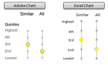
Before we dive into building this in Excel I should say that the reason behind this chart is to statistically represent how a school performs compared to Similar schools and All schools, hence the two columns.

Of course that’s not the only use. You might have cut off points for tertiles , quartiles or deciles. Feel free to adapt the chart to suit the interval of your choice.

Tricks Behind the Quintile Chart

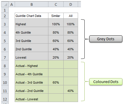
This chart uses a layering technique. The small grey dots and the larger coloured dots are actually separate series in the chart.

The coloured dots are simply sitting on top of the grey dots so you can’t see them.

As a result the data feeding the chart consists of two parts. The underlying grey dot data and the coloured dot data:

chart source data

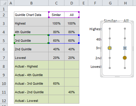
When I click on the grey dot for the 3rd quintile ‘All’ column you can also see in the image below that there is a grey dot underneath the yellow dot (because there are 4 small circles to indicate it is selected).

Plus if you look at the data table you can see the data in cells C5:D5 have the marching ants around them to indicated they are the source for that series, or quintile.

quintile chart series

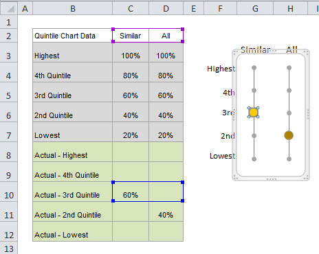
On the other hand, if I select the yellow dot you can see cell C10 is the source for the series, and because there is no value for ‘All’, the grey dot is visible.

quintile chart series actuals

Note: you might have also noticed that the chart labels are not part of the chart. I’ve put them in cells beside the chart because the actual axis labels for a scatter chart will be the quintile values of 20%, 40% and so on.

How to Build a Quintile Chart

I’ve recorded a short video on the process as there are quite a few steps.

For best viewing quality: press play then 1. click the cog and select 720p HD, and 2. click the icon on the bottom right of the video to view in full screen.


Enter your email address below to download the sample workbook.

By submitting your email address you agree that we can email you our Excel newsletter.
Please enter a valid email address.

Download the Excel Workbook. Note: This is a .xlsx file please ensure your browser doesn't change the file extension on download.

Other Uses

Make it a traffic light chart with just 3 dots.

Use this layering technique in other charts to turn on/off data displayed in your charts.

Want More?

If you produce reports in Excel and want to learn more charting tricks like this you might like to check out my Excel Dashboard course.

I only open it periodically throughout the year so if it's closed be sure to sign up for the early bird list to be notified when it's open again.

Thanks

Thank you to Mark Maher for asking this great question.

Excel Quintile Chart

More Excel Charts Posts

picture fill excel charts

Picture Fill Excel Charts

Using a stylish picture fill in your Excel Charts is a simple way to make your data visualizations more captivating and memorable
excel speedometer charts

Excel Speedometer Charts

How to build Excel Speedometer Charts or Gauge Charts as they're also know, why they are BAD and what to use instead.
burn up burn down charts

Excel Project Management Burn Down and Burn Up Charts

Excel Burn Down and Burn Up Charts are easy to make with line or scatter charts. They are useful for monitoring the progress of a project.
wee people font charts

Excel WeePeople Font Charts

Excel WeePeople Font Charts are a nice change from generic shapes for waffle charts, bar/column charts and more.
excel dot map charts

Excel Dot Map Charts

Interactive Excel dot map charts are not built-in, but with some creative use of Excel’s built-in tools we can create something unique.
Excel S Curve Charts

Excel S-Curve Charts

Easy Excel S-curve Charts made with PivotTables for project management. Track progress by including budget amounts.
chart axis switch

Excel Chart Axis Switch

Use radio button form controls to create an Excel chart axis switch enabling you to toggle pannel charts between same axis and own axis.

Excel Charts with Shapes for Infographics

Excel Charts with Shapes for Infographic styling and increased interest in your charts. Easy to insert but there are a few tricks required.
excel pyramid chart

Excel Pyramid Charts

Excel Pyramid charts are useful for visualising demographic data across multiple categories. Let’s look at 3 ways we can build them in Excel.

Highlighting Periods in Excel Charts

Highlighting Periods in Excel Charts helps your users interpret them more quickly and or focus their attention on a point or area.


Category: Excel Charts
Previous Post:Excel Pivot Tables to Extract DataExcel Pivot Tables to Extract Data
Next Post:Excel Test if a Range Contains Text, Numbers or is EmptyExcel Test if a Range Contains Text, Numbers or is Empty

Reader Interactions

Comments

  1. MICHAEL

    April 3, 2017 at 5:41 am

    I AM WORKING ON A DASHBOARD FOR THAT WILL REPRESENT ABOUT 80 PROJECTS AND I NEED SOMETHING THAT SHOWS THE STATUS OF EACH AS IN WHAT PHASE (PLANNING, DESIGN, CONSTRUCTION, CONFIGURATION MGT). I WAS THINKING ABOUT A SIMPLE INDICATOR LIKE THE QUINTILE CHART ON YOUR WEBSITE BUT I AM NOT SURE HOW TO ADAPT IT FOR SO MANY PROJECTS. DO YOU HAVE ANY SUGGESTIONS?

    Reply
    • Mynda Treacy

      April 3, 2017 at 1:27 pm

      Hi Michael,

      I’d probably just use a Conditional Formatting indicator and colour code the different phases. More on conditional formatting here, and if you get stuck please post your question on our Excel Forum.

      Mynda

      Reply
  2. Adi

    August 12, 2013 at 4:58 am

    Wonderful article Mynda. Thanks a ton!

    Reply
    • Mynda Treacy

      August 12, 2013 at 1:21 pm

      You’re welcome, Adi. Glad you liked it.

      Reply

Leave a Reply Cancel reply

Your email address will not be published. Required fields are marked *

Current ye@r *

Leave this field empty

Sidebar

More results...

Featured Content

  • 10 Common Excel Mistakes to Avoid
  • Top Excel Functions for Data Analysts
  • Secrets to Building Excel Dashboards in Less Than 15 Minutes
  • Pro Excel Formula Writing Tips
  • Hidden Excel Double-Click Shortcuts
  • Top 10 Intermediate Excel Functions
  • 5 Pro Excel Dashboard Design Tips
  • 5 Excel SUM Function Tricks
  • 239 Excel Keyboard Shortcuts

100 Excel Tips and Tricks eBook

Download Free Tips & Tricks

Subscribe to Our Newsletter

Receive weekly tutorials on Excel, Power Query, Power Pivot, Power BI and More.

We respect your email privacy

Guides and Resources

  • Excel Keyboard Shortcuts
  • Excel Functions
  • Excel Formulas
  • Excel Custom Number Formatting
  • ALT Codes
  • Pivot Tables
  • VLOOKUP
  • VBA
  • Excel Userforms
  • Free Downloads

239 Excel Keyboard Shortcuts

Download Free PDF

Free Webinars

Excel Dashboards Webinar

Watch our free webinars and learn to create Interactive Dashboard Reports in Excel or Power BI

Click Here to Watch Now

mynda treacy microsoft mvpHi, I'm Mynda Treacy and I run MOTH with my husband, Phil. Through our blog, webinars, YouTube channel and courses we hope we can help you learn Excel, Power Pivot and DAX, Power Query, Power BI, and Excel Dashboards.

Blog Categories

  • Excel
  • Excel Charts
  • Excel Dashboard
  • Excel Formulas
  • Excel PivotTables
  • Excel Shortcuts
  • Excel VBA
  • General Tips
  • Online Training
  • Outlook
  • Power Apps
  • Power Automate
  • Power BI
  • Power Pivot
  • Power Query
microsoft mvp logo
trustpilot excellent rating
Secured by Sucuri Badge
MyOnlineTrainingHub on YouTube Mynda Treacy on Linked In Mynda Treacy on Instagram Mynda Treacy on Twitter Mynda Treacy on Pinterest MyOnlineTrainingHub on Facebook
 

Company

  • About My Online Training Hub
  • Disclosure Statement
  • Frequently Asked Questions
  • Guarantee
  • Privacy Policy
  • Terms & Conditions
  • Testimonials
  • Become an Affiliate

Support

  • Contact
  • Forum
  • Helpdesk – For Technical Issues

Copyright © 2023 · My Online Training Hub · All Rights Reserved. Microsoft and the Microsoft Office logo are trademarks or registered trademarks of Microsoft Corporation in the United States and/or other countries. Product names, logos, brands, and other trademarks featured or referred to within this website are the property of their respective trademark holders.