Notifications
Clear all
Dashboards & Charts
2
Posts
2
Users
0
Reactions
442
Views
Topic starter
Hello,
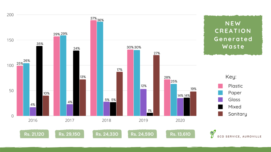
I have a combo chart made of 5 clustered column charts and 1 line chart.
Even if I'd like the clustered column charts to be based on an axis of the values, I'd like also that the data label (in red in the current chart) show the percentage for the year.

Any idea how to do it.
Thanks in advance
Fred
PS: The chart is based on a pivot table.
Posted : 28/10/2022 7:10 am
Perhaps not the most elegant way but you can create a second pivot table that shows each of the values as a % of the column total. Then you can point the labels to cells in that pivot table. Have a look at the attached file.
Posted : 28/10/2022 9:08 am
