
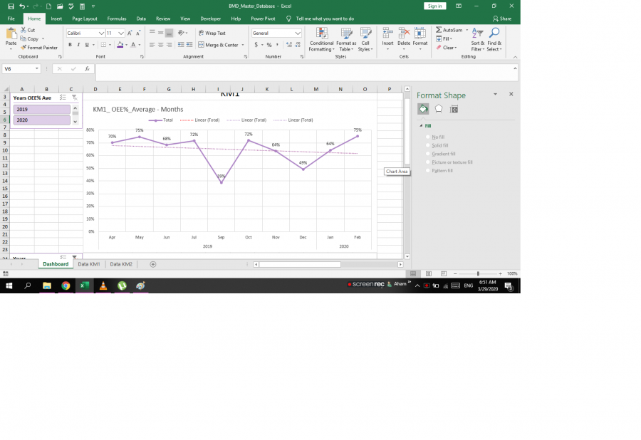
 pls, reply for further explanation??
Hi Ahamed,
Welcome to our forum. Please explain in words what your question is.
Many thanks,
Mynda
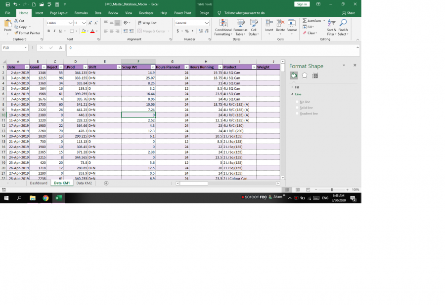 this is the master database,
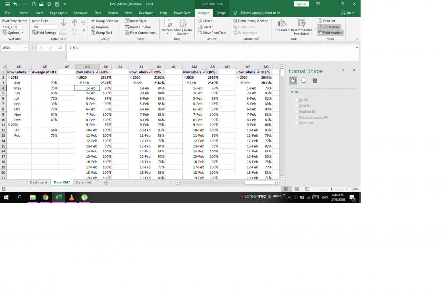 this is the pivot tables, and the following are the charts,
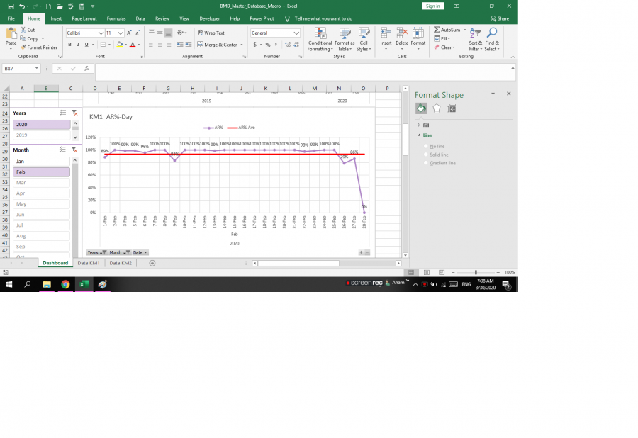
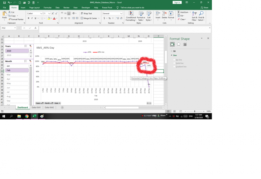
I have to change the month and the year for analysis. The problem is I can't get the same format chart data labels when I change the month/year. Also, the same issue occurred for the trend lines but I managed to write a macro for that and it is working. But the macro thing is not working for data labels of the average baseline (red line) on the 4th image (PivotQ4).
I am looking forward for your reply,
I need to add "data callout" to all the charts automatically when I change it (Month/Year).
Hi Ahmed,
I don't see what the problem is. If I remove the trend lines and then add them again in the chart settings I can change the selections in the Slicer and the charts retain the trend line. The labels are also retained.
Please show me before and after examples of what you want to see vs what you get. I also need to know the steps you're taking so I can reproduce the problem at my end.
Please upload images that are big enough for me to see. The ones you've shared so far are too small, sorry.
Mynda
Ok pls check the three snaps, 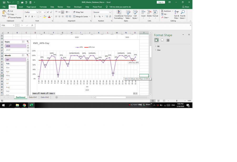 I did add the data callout to that red average line for "Jan",
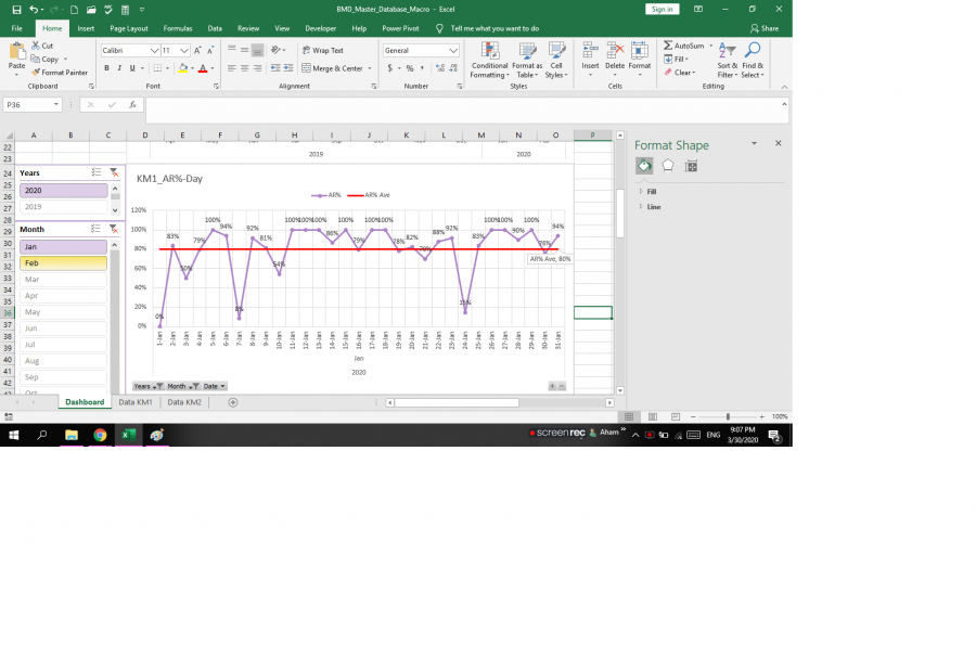 Now clicking the "Feb" tab,
 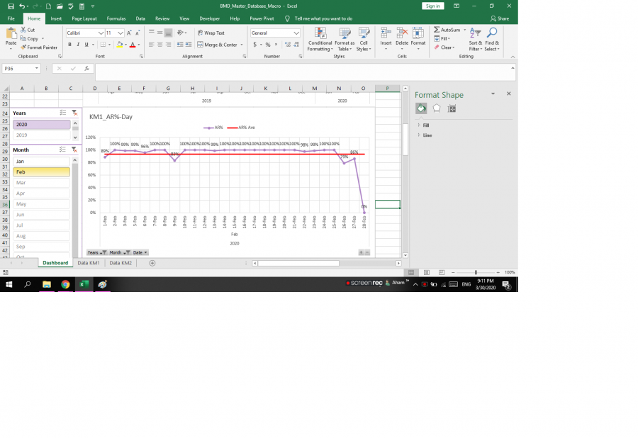 That callout is not appearing, i need to automate that, as I have about 40 charts for one month!!
If you can come through Teamviewer or any remote access app will be more convenient, only if you can
Hi Ahmed,
It's a little clearer, but for future reference, the images are still way too small. I don't need to see your whole screen, just the relevant parts. This may enable you to make the screenshot bigger so I can see it. You can see what I see by clicking on the images you have embedded. Hopefully this will help you appreciate the difficulty I'm having in understanding your question.
I recommend you use custom chart data labels as described here.
Mynda
Pls check these images (Steps),
Is it clear enough? When I change April to May Data Label of the red line isn't changing and appearing.
Those images appear blank. But don't worry as I've given you the solution in the link above.
Ohh Sorry,
Hi Ahamed,
When you programatically apply a label it doesn't respond to changes in the PivotTable. i.e. when you add a label using a macro. You need to edit the label formatting so that it is displaying the 'Value' and position is 'below'. Then when you make changes in the slicer it will be reflected in the chart. In other words, ditch the macros, as these are causing the problems and add the labels through the chart formatting options.
Mynda
Nope that Macro doesn't work, do you know a way to add labels to the whole Sum of AR AVE LABEL Series (Yellow dots)?
When I can't select the whole series once because there is no line (How can I get the line without each point, then it would be easy to add the data labels to the whole series.
I think better you come remote access my PC, or can you help me sort this out in the excel and send me. This is a small thing I couldn't find solutions online even.
File
I got it thanks for your reply and patience. I will be following you and will recommend you for sure
