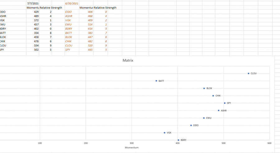
Here is a scatter plot where i am plotting a data point for a stock against another data point for the same stock. Its all as of todays data for example.
But, id like to add a tail to that data point which would be the same data points but for a data in the past...so a tail would be created....does that make sense?
I can't find any information on how to do this

Hey Mynda
Actually i mean like shown here: https://marginstone.com/an-introduction-to-relative-rotation-graphs/
Since i asked you the question i came a little bit closer but confused with the finer aspects of Excel and how i need to format the data etc
I have attached my latest trial so you can see what i am trying to achieve as compared to the link i sent you.
(In case it makes it a little clearer for you i have a way to measure stock price momentum and i give it a value. I also have a way to measure the relative strength of a stock price and i gave that a value too. So the two values plotted onto that chart for TODAYS date will create a dot on the chart. To see the TAIL of the data, i.e. where it has been, i take that momentum and relative strength info for past dates and i get a tail....so for example one might see that last year at the middle to end of December Shipping (BDRY) started to outperform Technology (QQQ) and then we would notice BDRY move into a stronger area and QQQ move into a weaker area).
So thats in a nutshell what im up to here in excel.
Best regards
Mark
Hi Mark,
There was no attachment (you need to click 'start upload' after selecting your file), but I had a look at the link and that looks like you might be able to achieve it with a scatter plot with markers.
Mynda
Hi Mynda, ive made the attachment now...as you can see its sort of all skewed off in one corner and does not even remotely look like ![]()
Also the scale at the bottom and at the right is correct but i dont know what the scale on the left axis is?
Well im just really open to suggestions of how to make this more digestible and get more out of it...if you had a video or course on it, that would be amazing. I feel guilty to taking up your time here.
Hi Mynda i would like to update my question as i have actually managed to create something which doesn't look horrific.
See attached image.
In the case of the data you can see in the attached image, there is TODAYS data, and 2 other days of data. What function could i use so that i have a little dropdown menu and can select a number such as 3, 5, 10, 20days etc and then the chart updates to select 3,5,10 or 20days of data from my data to update the visualization![]() ?
?
Also, is there a way to create quadrants on this image, and specify where the lines start and finish?
Many thanks in advance
Mark
Hi Mark,
Great to see you're making progress. You can use dynamic named ranges linked to your drop down list to switch the data displayed in the chart.
See here for highlighting periods in charts.
Hope that helps.
Mynda
