• Skip to main content
  • Skip to header right navigation
  • Skip to site footer

My Online Training Hub

Learn Dashboards, Excel, Power BI, Power Query, Power Pivot

  • Courses
  • Pricing
    • Free Courses
    • Power BI Course
    • Excel Power Query Course
    • Power Pivot and DAX Course
    • Excel Dashboard Course
    • Excel PivotTable Course – Quick Start
    • Advanced Excel Formulas Course
    • Excel Expert Advanced Excel Training
    • Excel Tables Course
    • Excel, Word, Outlook
    • Financial Modelling Course
    • Excel PivotTable Course
    • Excel for Customer Service Professionals
    • Excel for Operations Management Course
    • Excel for Decision Making Under Uncertainty Course
    • Excel for Finance Course
    • Excel Analysis ToolPak Course
    • Multi-User Pricing
  • Resources
    • Free Downloads
    • Excel Functions Explained
    • Excel Formulas
    • Excel Add-ins
    • IF Function
      • Excel IF Statement Explained
      • Excel IF AND OR Functions
      • IF Formula Builder
    • Time & Dates in Excel
      • Excel Date & Time
      • Calculating Time in Excel
      • Excel Time Calculation Tricks
      • Excel Date and Time Formatting
    • Excel Keyboard Shortcuts
    • Excel Custom Number Format Guide
    • Pivot Tables Guide
    • VLOOKUP Guide
    • ALT Codes
    • Excel VBA & Macros
    • Excel User Forms
    • VBA String Functions
  • Members
    • Login
  • Blog
  • Excel Webinars
  • Excel Forum
    • Register as Forum Member

Excel Charts with Shapes for Infographics

You are here: Home / Excel Charts / Excel Charts with Shapes for Infographics
January 27, 2022 by Mynda Treacy

You can create more interest and give your charts infographic styling when you create Excel charts with Shapes. There’s no limit to the type of shapes you work with, but there are some techniques required to ensure they don’t get distorted when working with data of different values.

Watch the Video

Subscribe YouTube

Download Workbook

Enter your email address below to download the sample workbook.

By submitting your email address you agree that we can email you our Excel newsletter.
Please enter a valid email address.

Download the Excel Workbook and follow along. Note: This is a .xlsx file please ensure your browser doesn't change the file extension on download.

How to Build Excel Charts with Shapes

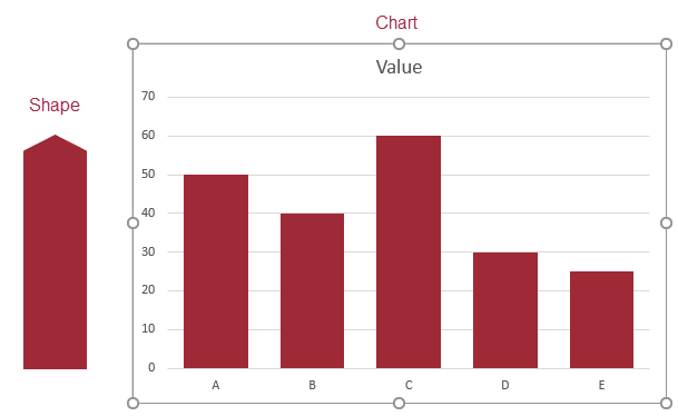
Start by inserting a regular column chart. Then insert the shape you want to use. Make sure it’s roughly the same size as the largest column in your chart.

Excel charts with shapes

CTRL+C to copy the Shape > Select the columns in the chart > CTRL+V to paste the shape.

labels on Excel charts with shapes

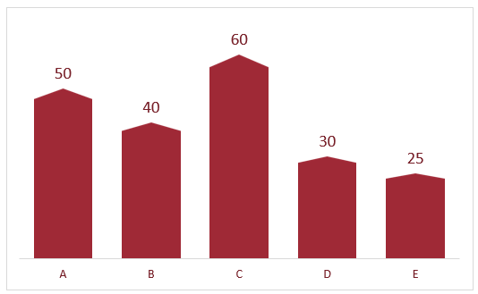
Tip: add data labels and remove the gridlines and vertical axis.

Caution: the shape will be stretched to fit the different column sizes. In the chart above it’s barely noticeable, however see the next step if this is an issue.

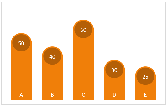
Working with Multiple Shapes

You can use multiple shapes to create a more interesting shape. For example, in the chart below I have circle shapes at the top of my columns. This requires a bit more set up so that the shapes don’t become distorted when your chart has different sized columns.

Excel charts with multiple shapes

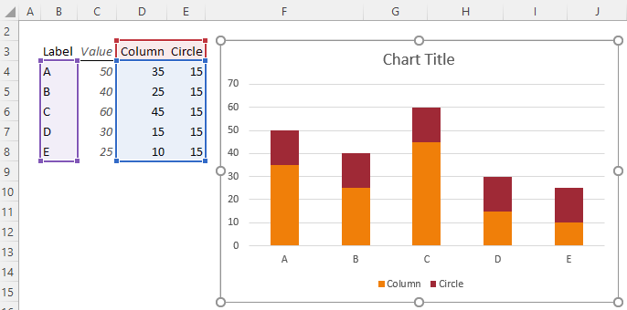
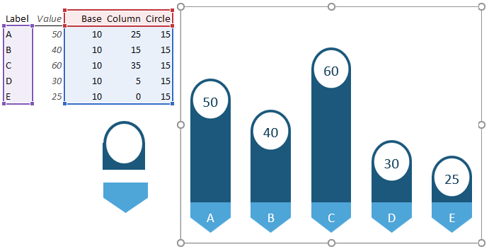
The data for the chart is split between the column and the circle which add up to the total value for the column:

data layout for Excel charts with shapes

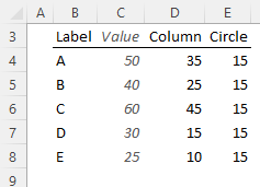
The enables you to insert a stacked column chart for the column and circle values. The ‘Value’ column is not plotted in the chart.

stacked column chart

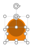
Create the shape for the top of the column. In my example I’m using a circle sitting in front of a rectangle which I’ve grouped together to make one shape:

multiple shapes

Tip: you may need to zoom in to align the circle and rectangles perfectly before the next step.

Copy and paste the shape onto the red circle series:

inserting shapes into Excel charts

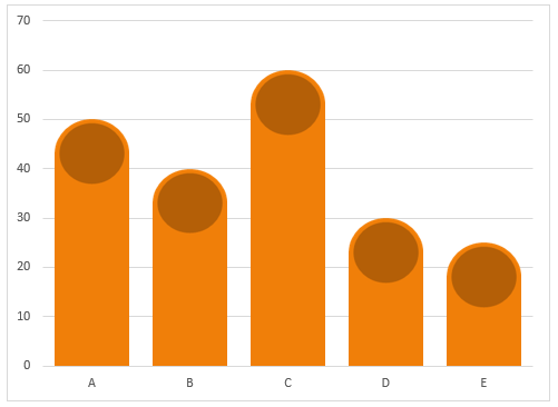
Tip: Turn off the gridlines for a cleaner look. You won’t need them with data labels anyway.

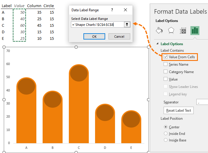
Now you can add labels to the circle using ‘Value From Cells’ (available in Excel 2013 onward):

labels using value from cells

Tip: Repeat for the horizontal axis using the data labels for the bottom series of the chart allowing you to turn off the vertical and horizontal chart axes:

horizontal axis labels

You can use more shapes and more series as required. For example, you might want a different bottom to the column:

multiple shapes in charts

Want more chart tips and tricks, please consider my Excel Dashboard course and check out this tutorial on infographics in Excel.

More Excel Charts Posts

picture fill excel charts

Picture Fill Excel Charts

Using a stylish picture fill in your Excel Charts is a simple way to make your data visualizations more captivating and memorable
excel speedometer charts

Excel Speedometer Charts

How to build Excel Speedometer Charts or Gauge Charts as they're also know, why they are BAD and what to use instead.
burn up burn down charts

Excel Project Management Burn Down and Burn Up Charts

Excel Burn Down and Burn Up Charts are easy to make with line or scatter charts. They are useful for monitoring the progress of a project.
wee people font charts

Excel WeePeople Font Charts

Excel WeePeople Font Charts are a nice change from generic shapes for waffle charts, bar/column charts and more.
excel dot map charts

Excel Dot Map Charts

Interactive Excel dot map charts are not built-in, but with some creative use of Excel’s built-in tools we can create something unique.
Excel S Curve Charts

Excel S-Curve Charts

Easy Excel S-curve Charts made with PivotTables for project management. Track progress by including budget amounts.
chart axis switch

Excel Chart Axis Switch

Use radio button form controls to create an Excel chart axis switch enabling you to toggle pannel charts between same axis and own axis.
excel pyramid chart

Excel Pyramid Charts

Excel Pyramid charts are useful for visualising demographic data across multiple categories. Let’s look at 3 ways we can build them in Excel.

Highlighting Periods in Excel Charts

Highlighting Periods in Excel Charts helps your users interpret them more quickly and or focus their attention on a point or area.
stacked bar waffle chart

Stacked Bar Excel Waffle Charts

Stacked Bar Excel Waffle Charts are an alternate to using conditional formatting to build waffle charts, and some say they're easier.


Category: Excel Charts
Previous Post:fixing incorrect totals in daxFixing Incorrect Totals in DAX
Next Post:Excel CUBE FunctionsCUBE Functions

Reader Interactions

Comments

  1. Danny

    January 28, 2022 at 9:20 pm

    Brilliant as usual !
    This time: brilliant in it’s simplicity 🙂
    thx

    Reply
    • Mynda Treacy

      January 28, 2022 at 9:37 pm

      Thanks so much, Danny!

      Reply

Leave a Reply Cancel reply

Your email address will not be published. Required fields are marked *

Current ye@r *

Leave this field empty

Sidebar

More results...

launch excel macros course excel vba course

Featured Content

  • 10 Common Excel Mistakes to Avoid
  • Top Excel Functions for Data Analysts
  • Secrets to Building Excel Dashboards in Less Than 15 Minutes
  • Pro Excel Formula Writing Tips
  • Hidden Excel Double-Click Shortcuts
  • Top 10 Intermediate Excel Functions
  • 5 Pro Excel Dashboard Design Tips
  • 5 Excel SUM Function Tricks
  • 239 Excel Keyboard Shortcuts

100 Excel Tips and Tricks eBook

Download Free Tips & Tricks

Subscribe to Our Newsletter

Receive weekly tutorials on Excel, Power Query, Power Pivot, Power BI and More.

We respect your email privacy

239 Excel Keyboard Shortcuts

Download Free PDF

mynda treacy microsoft mvpHi, I'm Mynda Treacy and I run MOTH with my husband, Phil. Through our blog, webinars, YouTube channel and courses we hope we can help you learn Excel, Power Pivot and DAX, Power Query, Power BI, and Excel Dashboards.

Blog Categories

  • Excel
  • Excel Charts
  • Excel Dashboard
  • Excel Formulas
  • Excel PivotTables
  • Excel Shortcuts
  • Excel VBA
  • General Tips
  • Online Training
  • Outlook
  • Power Apps
  • Power Automate
  • Power BI
  • Power Pivot
  • Power Query
microsoft mvp logo
trustpilot excellent rating
Secured by Sucuri Badge
MyOnlineTrainingHub on YouTube Mynda Treacy on Linked In Mynda Treacy on Instagram Mynda Treacy on Twitter Mynda Treacy on Pinterest MyOnlineTrainingHub on Facebook
 

Company

  • About My Online Training Hub
  • Disclosure Statement
  • Frequently Asked Questions
  • Guarantee
  • Privacy Policy
  • Terms & Conditions
  • Testimonials
  • Become an Affiliate

Support

  • Contact
  • Forum
  • Helpdesk – For Technical Issues

Copyright © 2023 · My Online Training Hub · All Rights Reserved. Microsoft and the Microsoft Office logo are trademarks or registered trademarks of Microsoft Corporation in the United States and/or other countries. Product names, logos, brands, and other trademarks featured or referred to within this website are the property of their respective trademark holders.

Download A Free Copy of 100 Excel Tips & Tricks

excel tips and tricks ebook

We respect your privacy. We won’t spam you.

x