• Skip to main content
  • Skip to header right navigation
  • Skip to site footer

My Online Training Hub

Learn Dashboards, Excel, Power BI, Power Query, Power Pivot

  • Courses
  • Pricing
    • Free Courses
    • Power BI Course
    • Excel Power Query Course
    • Power Pivot and DAX Course
    • Excel Dashboard Course
    • Excel PivotTable Course โ€“ Quick Start
    • Advanced Excel Formulas Course
    • Excel Expert Advanced Excel Training
    • Excel Tables Course
    • Excel, Word, Outlook
    • Financial Modelling Course
    • Excel PivotTable Course
    • Excel for Customer Service Professionals
    • Excel for Operations Management Course
    • Excel for Decision Making Under Uncertainty Course
    • Excel for Finance Course
    • Excel Analysis ToolPak Course
    • Multi-User Pricing
  • Resources
    • Free Downloads
    • Excel Functions Explained
    • Excel Formulas
    • Excel Add-ins
    • IF Function
      • Excel IF Statement Explained
      • Excel IF AND OR Functions
      • IF Formula Builder
    • Time & Dates in Excel
      • Excel Date & Time
      • Calculating Time in Excel
      • Excel Time Calculation Tricks
      • Excel Date and Time Formatting
    • Excel Keyboard Shortcuts
    • Excel Custom Number Format Guide
    • Pivot Tables Guide
    • VLOOKUP Guide
    • ALT Codes
    • Excel VBA & Macros
    • Excel User Forms
    • VBA String Functions
  • Members
    • Login
  • Blog
  • Excel Webinars
  • Excel Forum
    • Register as Forum Member

Excel Chart Makeover

You are here: Home / Excel Charts / Excel Chart Makeover
Chart Makeover
October 13, 2014 by Mynda Treacy

Getting the formatting in your chart right can make the difference between clear, concise information and just a pretty picture.

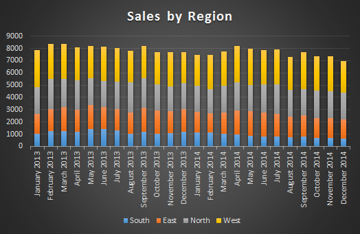
Take a look at this stacked column chart using some of the built in Excel chart formats:

excel chart transformation

What's your initial reaction?

Here are some of mine:

  • Striking use of colour
  • It looks nice

But then the analyst in me starts to try to make sense of the chart and glean information. Hereโ€™s what I find:

  • I have to flit between the legend and the columns to figure out which colour represents each region. Then I have to try to remember them while I analyse the chart.
  • I wonder if the chart is displaying sales units or monetary value
  • I have to turn my head to read the horizontal axis labels
  • I can see the trend for the South series in blue as it starts on a level base but the other series are all affected by the height of the blue series.
  • Itโ€™s difficult to tell how the other series performed
  • Itโ€™s difficult to compare the series against one another
  • Iโ€™m having to work hard to get any useful information from this chart.
  • Iโ€™m getting boredโ€ฆ. I might just admire the colours
  • Ouch! The yellow, orange and blue on the dark background hurt my eyes if I try to focus on them
  • Actually Chart, you is UGLY!

If you produce charts that initially look nice, but make the chart recipient work hard to get any meaning from them then your report recipientโ€™s initial reaction will be similar to mine. And unless they are really motivated to understand the data theyโ€™re likely to end up at the โ€˜getting bored and admiring the coloursโ€™ stage pretty quick.

The worst thing is you may never know because they probably wonโ€™t tell you. Itโ€™s our job to make meaning from the data and communicate that message in the quickest way.
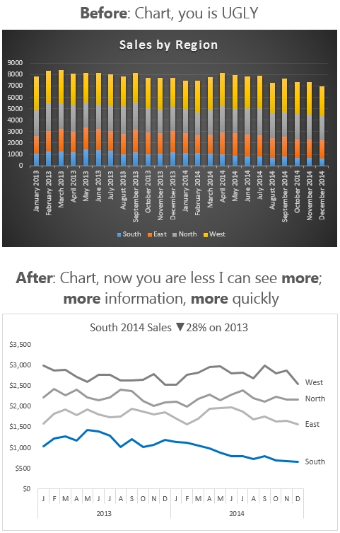
Letโ€™s take a look at our Ugly Chartโ€™s makeover:

Your browser does not support modern web standards. Please update it.

Before and After

I hope from this you can see the importance design and formatting have on your charts. I teach these fundamental data visualisation rules and more in my Excel Dashboards course. Why not take a few minutes to check it out.

excel chart transformation

Chart Makeover

More Excel Charts Posts

picture fill excel charts

Picture Fill Excel Charts

Using a stylish picture fill in your Excel Charts is a simple way to make your data visualizations more captivating and memorable
excel speedometer charts

Excel Speedometer Charts

How to build Excel Speedometer Charts or Gauge Charts as they're also know, why they are BAD and what to use instead.
burn up burn down charts

Excel Project Management Burn Down and Burn Up Charts

Excel Burn Down and Burn Up Charts are easy to make with line or scatter charts. They are useful for monitoring the progress of a project.
wee people font charts

Excel WeePeople Font Charts

Excel WeePeople Font Charts are a nice change from generic shapes for waffle charts, bar/column charts and more.
excel dot map charts

Excel Dot Map Charts

Interactive Excel dot map charts are not built-in, but with some creative use of Excelโ€™s built-in tools we can create something unique.
Excel S Curve Charts

Excel S-Curve Charts

Easy Excel S-curve Charts made with PivotTables for project management. Track progress by including budget amounts.
chart axis switch

Excel Chart Axis Switch

Use radio button form controls to create an Excel chart axis switch enabling you to toggle pannel charts between same axis and own axis.

Excel Charts with Shapes for Infographics

Excel Charts with Shapes for Infographic styling and increased interest in your charts. Easy to insert but there are a few tricks required.
excel pyramid chart

Excel Pyramid Charts

Excel Pyramid charts are useful for visualising demographic data across multiple categories. Letโ€™s look at 3 ways we can build them in Excel.

Highlighting Periods in Excel Charts

Highlighting Periods in Excel Charts helps your users interpret them more quickly and or focus their attention on a point or area.


Category: Excel Charts
Previous Post:Interactive Excel FormulasInteractive Excel Formulas
Next Post:Excel GETPIVOTDATA Functiongetpivotdata function

Reader Interactions

Comments

  1. Glenn Case

    October 22, 2014 at 5:41 am

    Interesting article. I especially like the way you reformated the horizontal axis. I have a couple comments:

    1) While I appreciate the simplicity of the new colors, since there appear to be several shades of gray this could be confusing if the lines on the chart crossed one another.

    2) I alway like to see grid lines, both horizontal and vertical, on a chart. Otherwise, it is very difficult to read with any accuracy. If all you are after is trend information, then fewer or no gridlines is okay. I find that using gridlines in a subdued color makes it easy on the eyes, plus easy to read accurately.

    Thanks for the article.

    Reply
    • Mynda Treacy

      October 22, 2014 at 9:44 am

      Cheers, Glenn.

      I agree you could differentiate the colour a bit more if the lines are crossing over.

      Like you say, if the trend is what is relevant/of interest then no gridlines are fine, but if the detail is what’s important then I will label the points so that I’m not making my chart reader work hard to guess at values based on the gridlines.

      Mynda

      Reply
  2. Jef

    October 15, 2014 at 9:55 pm

    Great idea. Good source of information. Simplicity is good. Thanks for sharing.

    Reply
    • Mynda Treacy

      October 16, 2014 at 6:47 am

      Thanks, Jef

      Reply
  3. Paul Fogel

    October 15, 2014 at 3:07 am

    Mynda,
    How did you create the X-axis?

    Reply
    • Mynda Treacy

      October 15, 2014 at 8:29 am

      Hi Paul,

      It’s a nested axis that references 2 columns. I teach that technique in my Dashboard course.

      Kind regards,

      Mynda

      Reply
  4. Jon Acampora

    October 15, 2014 at 1:56 am

    Another great example Mynda! I agree, the colors of the original chart remind me of a sunset and I would probably start day dreaming if this was presented in a meeting.

    The major problem with the stacked column chart is the uneven baselines for each series. Like you said, it really makes it difficult to see any trends. It is much easier to see the trends in your After chart. If the lines of each series were crossing, I would recommend creating 4 separate panel charts (one for each series) and stacking them. This would allow the reader to really focus on each trend.

    Sometimes we try to fit too much data into one chart for the purposes of a PowerPoint presentation, and it distracts from the important messages. Thanks again!

    Reply
    • Mynda Treacy

      October 15, 2014 at 8:30 am

      Hi Jon,

      You nailed it with the Sunset! Good points about the Panel Charts. They are usually my preference too. Thanks for sharing.

      Mynda

      Reply
  5. Mike McEldowney

    October 14, 2014 at 8:37 pm

    Your newsletters are so informative. I love it when I see a new email in my inbox. You have a way of presenting the information so that it is easily understood, easy to remember and easily put to good use. I used to think pretty was effective, but you have shown me the “error of my ways”! Thank you for all the help you have given to the Excel community.

    Reply
    • Mynda Treacy

      October 14, 2014 at 8:54 pm

      ๐Ÿ™‚ Thanks for your kind words, Mike. Great to know you’re designing charts with ‘more’ nowadays.

      Reply
  6. Chandeep Chhabra

    October 14, 2014 at 3:33 pm

    Hi Mynda,

    Really cool explanation. I agree and follow to whatever you have said, each day each time.

    Thanks
    Chandeep

    Reply
    • Mynda Treacy

      October 14, 2014 at 7:50 pm

      Cheers, Chandeep ๐Ÿ™‚

      Reply
  7. MF

    October 13, 2014 at 12:59 pm

    Hi Mynda,
    This is so true in workplace. I am sure that when both (before and after) charts are presented to audience, they tend to like the former at 1st glance; and then they realize that they get nothing out of it. That’s the temptation for the chart maker to make sure “fancy” chart instead. ๐Ÿ˜›
    btw, I think the chart (after) can be improved further by adding the grand total line on top. I know it involves more efforts though.
    Cheers,

    Reply
    • Mynda Treacy

      October 13, 2014 at 1:03 pm

      Thanks, MF. We have to be strong to not give in to the temptation of the fancy chart’s beauty and always look to provide substance ๐Ÿ™‚

      Reply
      • MF

        October 13, 2014 at 2:08 pm

        Can’t agree more!

        Reply
      • winston snyder

        October 14, 2014 at 10:54 am

        @Mynda,

        While also enticing the reader to study and undertnad the chart as well as remember and take something of value away from the chart.

        More from Robert Kosara chart junk considered useful

        Reply
        • Mynda Treacy

          October 14, 2014 at 1:11 pm

          Thanks for sharing the link, Winston. Interesting read.

          From my point of view info graphics and chart junk are the domain of newspapers and the like where entertainment is the goal, whereas for the business analyst using graphics that obscure the data and other ‘chart junk’ end up hindering interpretation and further understanding of the data.

          Mynda

          Reply

Leave a Reply Cancel reply

Your email address will not be published. Required fields are marked *

Current ye@r *

Leave this field empty

Sidebar

More results...

launch excel macros course excel vba course

Featured Content

  • 10 Common Excel Mistakes to Avoid
  • Top Excel Functions for Data Analysts
  • Secrets to Building Excel Dashboards in Less Than 15 Minutes
  • Pro Excel Formula Writing Tips
  • Hidden Excel Double-Click Shortcuts
  • Top 10 Intermediate Excel Functions
  • 5 Pro Excel Dashboard Design Tips
  • 5 Excel SUM Function Tricks
  • 239 Excel Keyboard Shortcuts

100 Excel Tips and Tricks eBook

Download Free Tips & Tricks

Subscribe to Our Newsletter

Receive weekly tutorials on Excel, Power Query, Power Pivot, Power BI and More.

We respect your email privacy

239 Excel Keyboard Shortcuts

Download Free PDF

mynda treacy microsoft mvpHi, I'm Mynda Treacy and I run MOTH with my husband, Phil. Through our blog, webinars, YouTube channel and courses we hope we can help you learn Excel, Power Pivot and DAX, Power Query, Power BI, and Excel Dashboards.

Blog Categories

  • Excel
  • Excel Charts
  • Excel Dashboard
  • Excel Formulas
  • Excel PivotTables
  • Excel Shortcuts
  • Excel VBA
  • General Tips
  • Online Training
  • Outlook
  • Power Apps
  • Power Automate
  • Power BI
  • Power Pivot
  • Power Query
microsoft mvp logo
trustpilot excellent rating
Secured by Sucuri Badge
MyOnlineTrainingHub on YouTube Mynda Treacy on Linked In Mynda Treacy on Instagram Mynda Treacy on Twitter Mynda Treacy on Pinterest MyOnlineTrainingHub on Facebook
 

Company

  • About My Online Training Hub
  • Disclosure Statement
  • Frequently Asked Questions
  • Guarantee
  • Privacy Policy
  • Terms & Conditions
  • Testimonials
  • Become an Affiliate

Support

  • Contact
  • Forum
  • Helpdesk – For Technical Issues

Copyright © 2023 ยท My Online Training Hub ยท All Rights Reserved. Microsoft and the Microsoft Office logo are trademarks or registered trademarks of Microsoft Corporation in the United States and/or other countries. Product names, logos, brands, and other trademarks featured or referred to within this website are the property of their respective trademark holders.