• Skip to main content
  • Skip to header right navigation
  • Skip to site footer

My Online Training Hub

Learn Dashboards, Excel, Power BI, Power Query, Power Pivot

  • Courses
  • Pricing
    • Free Courses
    • Power BI Course
    • Excel Power Query Course
    • Power Pivot and DAX Course
    • Excel Dashboard Course
    • Excel PivotTable Course – Quick Start
    • Advanced Excel Formulas Course
    • Excel Expert Advanced Excel Training
    • Excel Tables Course
    • Excel, Word, Outlook
    • Financial Modelling Course
    • Excel PivotTable Course
    • Excel for Customer Service Professionals
    • Excel for Operations Management Course
    • Excel for Decision Making Under Uncertainty Course
    • Excel for Finance Course
    • Excel Analysis ToolPak Course
    • Multi-User Pricing
  • Resources
    • Free Downloads
    • Excel Functions Explained
    • Excel Formulas
    • Excel Add-ins
    • IF Function
      • Excel IF Statement Explained
      • Excel IF AND OR Functions
      • IF Formula Builder
    • Time & Dates in Excel
      • Excel Date & Time
      • Calculating Time in Excel
      • Excel Time Calculation Tricks
      • Excel Date and Time Formatting
    • Excel Keyboard Shortcuts
    • Excel Custom Number Format Guide
    • Pivot Tables Guide
    • VLOOKUP Guide
    • ALT Codes
    • Excel VBA & Macros
    • Excel User Forms
    • VBA String Functions
  • Members
    • Login
    • Password Reset
  • Blog
  • Excel Webinars
  • Excel Forum
    • Register as Forum Member

Skip Dates in Excel Chart Axis

You are here: Home / Excel Charts / Skip Dates in Excel Chart Axis
set Excel axis to skip weekend dates
January 28, 2015 by Mynda Treacy

In this tutorial we're going to look at how we can skip dates in the Excel chart axis for those dates that have no data.

When you plot data in a chart that has a time axis Excel is clever enough to recognise you’re using dates and will automatically arrange the data in date order. The axis will also include all dates in the range, even if you don’t have data for those dates in your chart source.

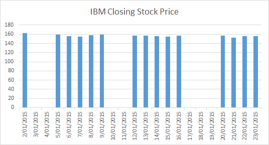
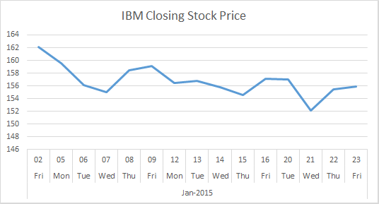
This can be a nice time saver but sometimes you don’t want the missing dates included. For example, if you’re plotting stock prices then you don’t expect to have data for the weekends and as such you don’t want those ‘missing’ weekend dates in your chart cause it’ll look ugly:

skip dates in chart x axis of a column chart

Note: If you plot the data in a line chart, as you typically would for stock prices, then Excel will (by default) continue the line to fill in the missing data:

skip dates in chart x axis of a line chart

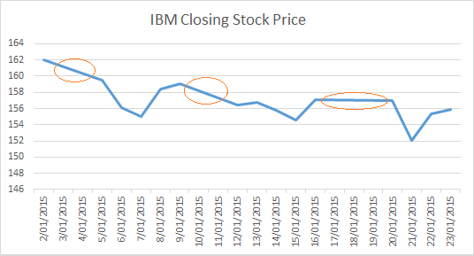
An aside: notice how the vertical axis on the column chart starts at zero but the line chart starts at 146? That’s a visualisation rule – column charts must always start at zero because we subconsciously compare the height of the columns and so starting at anything but zero can give a misleading impression, whereas the points in the line chart are compared to the axis scale. And anyway, if you were to show an equities trader a stock price column chart with an axis that started at zero they’re probably throw it at you. It’s just not how it’s done in their world. They like line charts (or box and whisker) with clear fluctuations because even a 0.01% change can mean millions of dollars to their bottom line.

That said, I don’t tend to plot stocks, commodities or foreign exchange rates so I prefer to always start my line chart vertical axis at zero to avoid being responsible for giving my boss a heart attack 😉 Those peaks and valleys can be scary!

I teach more visualisation tips and rules like this in my online Excel Dashboard course.

Enter your email address below to download the sample workbook.

By submitting your email address you agree that we can email you our Excel newsletter.
Please enter a valid email address.

Download the Excel Workbook. Note: This is a .xlsx file please ensure your browser doesn't change the file extension on download.

Omit Missing Dates

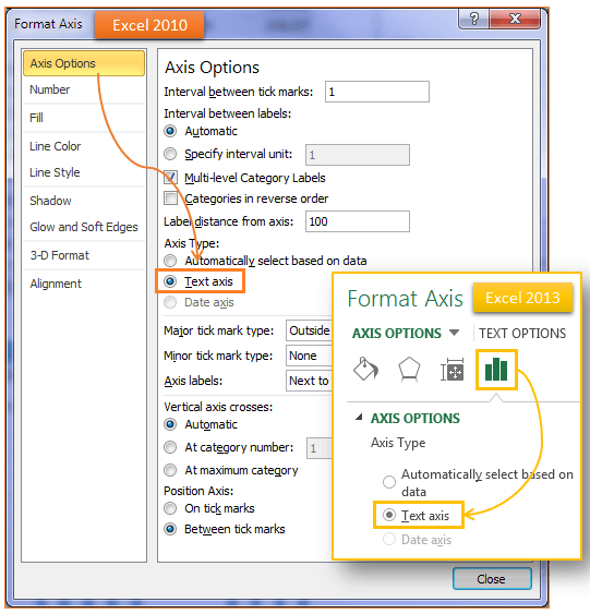
If you want Excel to omit the weekend/missing dates from the axis you can change the axis to a ‘Text Axis’.

Right-click (Excel 2007) or double click (Excel 2010+) the axis to open the Format Axis dialog box > Axis Options > Text Axis:

Excel chart axis options for Text Axis

Now your chart skips the missing dates (see below). I’ve also changed the axis layout so you don’t have to turn your head to read them, which is always a nice touch.

skip dates in chart x axis of a column chart

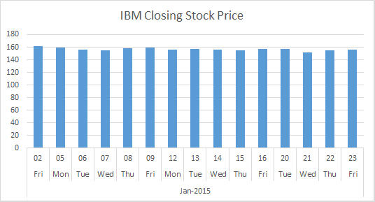
Note: When you set your Axis Type to Text you must ensure the dates in your source data are sorted as this is the order they will appear in the chart.

For completeness here's how the line chart looks when you skip dates. Better eh?:

skip dates in chart x axis of a line chart

set Excel axis to skip weekend dates

More Excel Charts Posts

picture fill excel charts

Picture Fill Excel Charts

Using a stylish picture fill in your Excel Charts is a simple way to make your data visualizations more captivating and memorable
excel speedometer charts

Excel Speedometer Charts

How to build Excel Speedometer Charts or Gauge Charts as they're also know, why they are BAD and what to use instead.
burn up burn down charts

Excel Project Management Burn Down and Burn Up Charts

Excel Burn Down and Burn Up Charts are easy to make with line or scatter charts. They are useful for monitoring the progress of a project.
wee people font charts

Excel WeePeople Font Charts

Excel WeePeople Font Charts are a nice change from generic shapes for waffle charts, bar/column charts and more.
excel dot map charts

Excel Dot Map Charts

Interactive Excel dot map charts are not built-in, but with some creative use of Excel’s built-in tools we can create something unique.
Excel S Curve Charts

Excel S-Curve Charts

Easy Excel S-curve Charts made with PivotTables for project management. Track progress by including budget amounts.
chart axis switch

Excel Chart Axis Switch

Use radio button form controls to create an Excel chart axis switch enabling you to toggle pannel charts between same axis and own axis.

Excel Charts with Shapes for Infographics

Excel Charts with Shapes for Infographic styling and increased interest in your charts. Easy to insert but there are a few tricks required.
excel pyramid chart

Excel Pyramid Charts

Excel Pyramid charts are useful for visualising demographic data across multiple categories. Let’s look at 3 ways we can build them in Excel.

Highlighting Periods in Excel Charts

Highlighting Periods in Excel Charts helps your users interpret them more quickly and or focus their attention on a point or area.


Category: Excel Charts
Previous Post:Excel AutoFilterExcel Custom AutoFilter with Wildcards
Next Post:Excel PivotTable Calculated FieldsExcel PivotTable Calculated Field

Reader Interactions

Comments

  1. Mark A Mediate

    March 21, 2021 at 1:14 am

    You deliver an outstanding instructional format with clarity and efficiency! I’m a huge fan!

    Reply
    • Mynda Treacy

      March 21, 2021 at 10:47 am

      Thanks so much, Mark!

      Reply
  2. Maria K

    June 16, 2020 at 8:18 pm

    Thank youuuuuuuuuu lfe saver!!

    Reply
    • Mynda Treacy

      June 16, 2020 at 8:26 pm

      Glad we can help 🙂

      Reply
  3. Brendan

    April 29, 2020 at 9:40 am

    What if I have a data range that goes from 1991 to 2020 and I when I plot it, the graph goes from 1900 to 2020 so that 2/3 of the graph is just empty space? There is no 1900 datapoint, so I have no idea why it starts there.

    Reply
    • Mynda Treacy

      April 29, 2020 at 10:23 am

      Hi Brendan,

      You can change the axis minimum bound, which is the start date. Right-click the axis > format axis.

      Mynda

      Reply
  4. k kumara swamy

    December 19, 2018 at 9:51 pm

    Dear Sir,
    i need to make bar chart in excel with dates and its default has to show in that excel for constructions industry planning

    Reply
    • Mynda Treacy

      December 20, 2018 at 12:35 pm

      Hi Kumara,

      If you’re stuck building the chart please post your question and sample Excel file on our forum.

      Thanks,

      Mynda

      Reply
  5. Brett

    March 24, 2017 at 1:36 pm

    I have a quick question. What if you have so many dates it becomes illegible and you just want to show say every 5th date in the axis but maintain the data in the chart?

    Reply
    • Mynda Treacy

      March 24, 2017 at 8:09 pm

      Hi Brett,

      Yes, you can set the Date Axis major units to 5 days (Axis Options). The data will still be plotted, it’s just that the axis labels will only display every 5 days.

      Mynda

      Reply
  6. Cecilie

    September 16, 2015 at 9:40 pm

    Hey,

    I am working with excel 2010. I am trying to visualise some data, taken from may until the end of november. However, october was not sampled at all, so I am interested in making a visual gap in the bar graphs x-axis, that covers the month of october.

    How is this possible?

    Best regards,
    Cecilie

    Reply
    • Mynda Treacy

      September 16, 2015 at 9:48 pm

      Hi Cecilie,

      You need to enter proper dates for the x-axis and then in the Axis Options set the Axis type to ‘Date’. You can always format the dates to only show the month name with a custom number format of mmmm

      I hope that helps but if you get stuck the best thing is to send a sample workbook via the help desk so we can show you an example.

      Mynda

      Reply
  7. Lynne Pike

    February 3, 2015 at 5:31 am

    Thank you so much

    This has driven me crazy for years!!!

    Brilliant (and so simple – when you know how!!

    xx

    Reply
    • Mynda Treacy

      February 3, 2015 at 8:27 am

      Thanks, Lynne. Glad you found it useful 🙂

      Mynda

      Reply
  8. Hans Hallebeek

    January 29, 2015 at 5:54 pm

    I like what you guys are doing.
    It’s great:)

    Cheers,

    Hans

    Reply
    • Mynda Treacy

      January 29, 2015 at 8:02 pm

      Thanks, Hans! Glad you like it.

      Mynda

      Reply
  9. Col Delane

    January 29, 2015 at 1:27 pm

    Hi Mynda

    If you actually select a time series range (of dates that does NOT include weekends, say by using formulae to only return weekdays) when setting up the chart, will Excel still include them in the chart axis (presumably by filling in all dates between first and last?)?

    It seems a little presumptuous / autocratic of MS to think that you just gotta have weekends in your time series even if they aren’t in the source data in the first place!

    Cheers
    Col

    Reply
    • Mynda Treacy

      January 29, 2015 at 2:25 pm

      Hi Col,

      Yes it will include all dates irrespective of whether they’re in your chart source or not. It will also arrange the data in date order, even if the source isn’t. In some ways this feature is helpful, but there are occasions where you don’t want to use Excel’s built in date intelligence.

      Mynda

      Reply

Leave a Reply Cancel reply

Your email address will not be published. Required fields are marked *

Current ye@r *

Leave this field empty

Sidebar

More results...

Featured Content

  • 10 Common Excel Mistakes to Avoid
  • Top Excel Functions for Data Analysts
  • Secrets to Building Excel Dashboards in Less Than 15 Minutes
  • Pro Excel Formula Writing Tips
  • Hidden Excel Double-Click Shortcuts
  • Top 10 Intermediate Excel Functions
  • 5 Pro Excel Dashboard Design Tips
  • 5 Excel SUM Function Tricks
  • 239 Excel Keyboard Shortcuts

100 Excel Tips and Tricks eBook

Download Free Tips & Tricks

Subscribe to Our Newsletter

Receive weekly tutorials on Excel, Power Query, Power Pivot, Power BI and More.

We respect your email privacy

Guides and Resources

  • Excel Keyboard Shortcuts
  • Excel Functions
  • Excel Formulas
  • Excel Custom Number Formatting
  • ALT Codes
  • Pivot Tables
  • VLOOKUP
  • VBA
  • Excel Userforms
  • Free Downloads

239 Excel Keyboard Shortcuts

Download Free PDF

Free Webinars

Excel Dashboards Webinar

Watch our free webinars and learn to create Interactive Dashboard Reports in Excel or Power BI

Click Here to Watch Now

mynda treacy microsoft mvpHi, I'm Mynda Treacy and I run MOTH with my husband, Phil. Through our blog, webinars, YouTube channel and courses we hope we can help you learn Excel, Power Pivot and DAX, Power Query, Power BI, and Excel Dashboards.

Blog Categories

  • Excel
  • Excel Charts
  • Excel Dashboard
  • Excel Formulas
  • Excel PivotTables
  • Excel Shortcuts
  • Excel VBA
  • General Tips
  • Online Training
  • Outlook
  • Power Apps
  • Power Automate
  • Power BI
  • Power Pivot
  • Power Query
microsoft mvp logo
trustpilot excellent rating
Secured by Sucuri Badge
MyOnlineTrainingHub on YouTube Mynda Treacy on Linked In Mynda Treacy on Instagram Mynda Treacy on Twitter Mynda Treacy on Pinterest MyOnlineTrainingHub on Facebook
 

Company

  • About My Online Training Hub
  • Disclosure Statement
  • Frequently Asked Questions
  • Guarantee
  • Privacy Policy
  • Terms & Conditions
  • Testimonials
  • Become an Affiliate

Support

  • Contact
  • Forum
  • Helpdesk – For Technical Issues

Copyright © 2023 · My Online Training Hub · All Rights Reserved. Microsoft and the Microsoft Office logo are trademarks or registered trademarks of Microsoft Corporation in the United States and/or other countries. Product names, logos, brands, and other trademarks featured or referred to within this website are the property of their respective trademark holders.