Charts provide a visual representation of data, making it easier to understand and interpret large amounts of information quickly.
At least that’s the objective, but too often poor choice of chart formatting is more of a hindrance than a help.
In this tutorial we’ll look at the types of Excel chart formatting that is an instant give away that you’re new to data visualization, and the formatting that pros would choose instead.
Table of Contents
Watch the Video

Download PDF
Enter your email address below to download the PDF containing all the pro tips in this blog post.

3D Charts
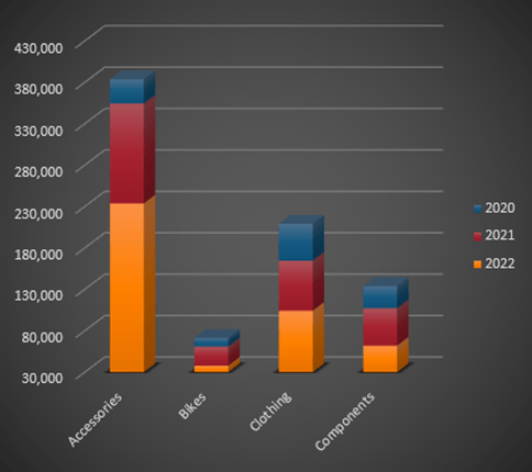
At best 3D effects add zero value to data visualization and at worst they can distort the results and mislead. The pie chart below illustrates this with the red segment falsely appearing far bigger than the yellow segment:
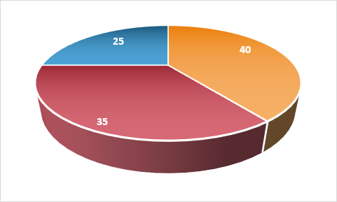
Don’t use 3D charts, EVER.
Effects
Dark fill colour, gradient fills and other gimmicks detract from the data.
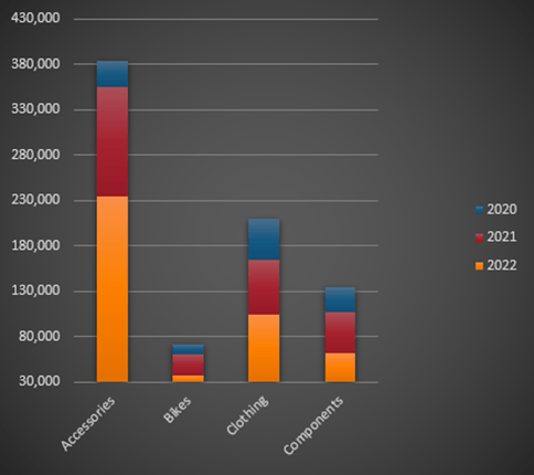
Let the data be the star of the show:
And avoid the Chart Styles in the Chart Design Menu:
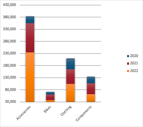
Vertical Axis
Column chart’s vertical axis should always start at zero because we subconsciously compare column heights and make judgements based on the difference in size.
Just take the chart below from Airwallex illustrating their fees compared to other companies.
They have purposely hidden the vertical axis so you can’t see that it starts way above zero.
The difference between the column heights makes Airwallex appear 75% cheaper than their nearest competitor, when in reality it’s only 31% cheaper:
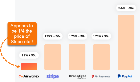
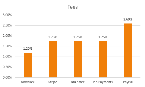
This is a common marketing ploy to distort the truth. It’s effective because we subconsciously compare the height of the columns and make judgments. This is how the chart should look:
Note: The axis starting at zero is less important with line charts because we tend to refer to axis labels to interpret one line’s position in relation to others.
Axis Labels
Don’t make people turn their head to read your chart labels.
If your axis labels don’t fit horizontally, then use a different chart, like the bar chart below:
Sorting
Sorting data takes the work out of ranking making your charts quicker to interpret:
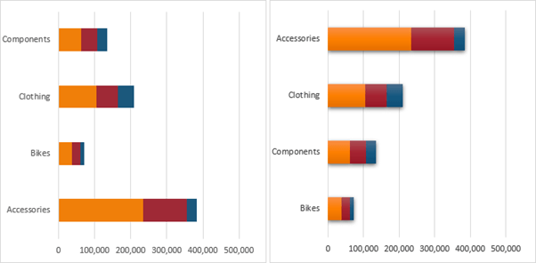
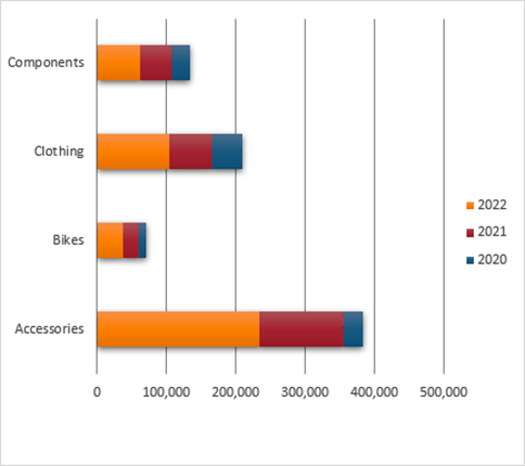
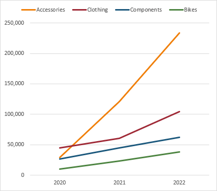
Chart Choice
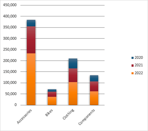
Stacked charts make all but the first series difficult to compare. Better to use a line chart if the point of the chart is to compare the different series:
Labels
Excessive labelling clutters and distracts.
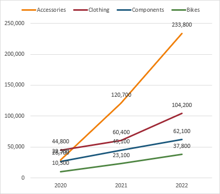
Only label key data points:
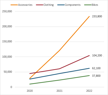
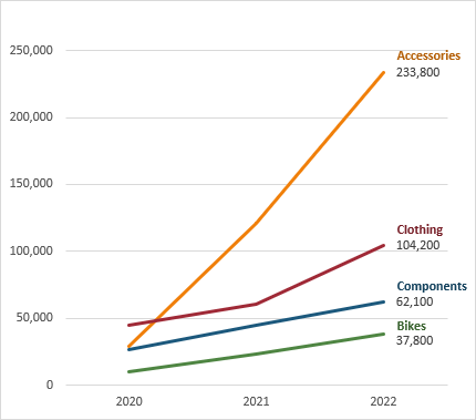
Legend
Legends slow down interpretation because we have to flit between the data points and the legend. Better to directly label the data:
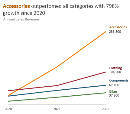
Titles
Chart titles are often wasted on stating the obvious.
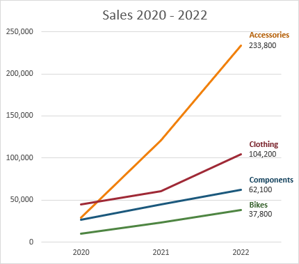
Instead, use this prime real estate to communicate the key message:
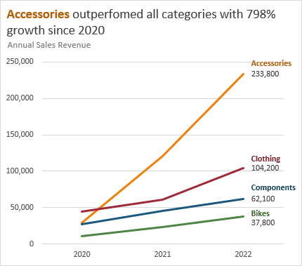
Bonus tip: notice the alignment of the title is left in line with the axis. This makes the chart appear tidier than a centred title.
Gridlines
When you have data labels and vertical axis labels, the vertical axis labels and gridlines can often be redundant. Consider whether you really need both:
What other amateur chart habits did I miss? Share them in the comments.

Pie charts – just don’t (unless you actually want to have a pretty picture to fill up the Board’s monthly PowerPoint presentation – in which case, I’d recommend the exploded 3d doughnut version with gradient fill)
and, as you’ve demonstrated, less is more (2 colours, 1 font, everything should be there for a reason – no superfluous data, formatting or text)
“everything” includes the white space – which is sometimes the most important thing
Thanks for sharing, Jim!
Very nice tips Mynda! Thank you.
I was about to write a comment that the stacked bar chart seems to be a not-so-good choice to convey the category-wise 3 years’ sales figures!
Then I thought that it’s quite unlike you to make such an elementary mistake… ha ha!
So I re-read the post and realised that you were improving the chart presentation with each tip as you went down the list of tips. 🙂
Thanks, KV!