• Skip to main content
  • Skip to header right navigation
  • Skip to site footer

My Online Training Hub

Learn Dashboards, Excel, Power BI, Power Query, Power Pivot

  • Courses
  • Pricing
    • Free Courses
    • Power BI Course
    • Excel Power Query Course
    • Power Pivot and DAX Course
    • Excel Dashboard Course
    • Excel PivotTable Course – Quick Start
    • Advanced Excel Formulas Course
    • Excel Expert Advanced Excel Training
    • Excel Tables Course
    • Excel, Word, Outlook
    • Financial Modelling Course
    • Excel PivotTable Course
    • Excel for Customer Service Professionals
    • Excel for Operations Management Course
    • Excel for Decision Making Under Uncertainty Course
    • Excel for Finance Course
    • Excel Analysis ToolPak Course
    • Multi-User Pricing
  • Resources
    • Free Downloads
    • Excel Functions Explained
    • Excel Formulas
    • Excel Add-ins
    • IF Function
      • Excel IF Statement Explained
      • Excel IF AND OR Functions
      • IF Formula Builder
    • Time & Dates in Excel
      • Excel Date & Time
      • Calculating Time in Excel
      • Excel Time Calculation Tricks
      • Excel Date and Time Formatting
    • Excel Keyboard Shortcuts
    • Excel Custom Number Format Guide
    • Pivot Tables Guide
    • VLOOKUP Guide
    • ALT Codes
    • Excel VBA & Macros
    • Excel User Forms
    • VBA String Functions
  • Members
    • Login
  • Blog
  • Excel Webinars
  • Excel Forum
    • Register as Forum Member

Plot Excel Data on a Map

You are here: Home / Excel Charts / Plot Excel Data on a Map
Plot Excel Data on a Map
June 16, 2014 by Mynda Treacy

If you don’t have Excel 2013 then this post will be a bit like window shopping with an empty wallet. You get to try stuff on and test drive it, you just don’t get to take it home. Window shopping is still fun though, right?

Excel 2013 has gone all iPad on us and now we can even incorporate Apps right inside Excel. I think of them as fancy add-ins.

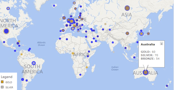
One such free App is Bing Maps. We can see it below in action with this Olympic data I’ve analysed in a PivotTable, linked it to the Bing Map and added a Slicer to allow you to easily choose the year.

Go ahead and try it out yourself – click on the years to select different data, click on the dots on the map to see the medal breakdown.

Note; for some unknown reason the Bing Map gets its knickers in a knot over some countries in this Web App view. For example it told me it couldn’t find Greece! It works fine in my desktop version of Excel though. If you get an error just click the ‘x’ to close the error message and the remaining data will load, or download the file by clicking on the Excel icon at the bottom of the Web App screen (need Excel 2013).

I think it's pretty snazzy (as my Mum used to say back in 1985), and dead easy to use.

The Good Points

  • Dead easy to set up and use
  • Nice interactivity – zoom/pan and clickable dots reveal more information
  • Map automatically updates as data changes
  • Choose between circles or pie charts
  • Customize colours
  • Filter from the Map filter icon
  • Embed in Excel Web App (although seems to be temperamental in the Web App – maybe some form of ‘App jealousy' going on between the Excel Web App and the Bing Maps App! ;-))
  • Much easier to use than Power View Maps for Excel

The Not So Good Points

  • Limited to 100 lines of data – if you need more then you’ll have to progress to Power View Maps which are a whole new (exciting) league
  • Keeps resizing the map when data is refreshed

How to Plot Data in Bing Maps in Excel 2013

1. Download the Bing Maps App

You can download the free Bing Maps App here. Note: You need Excel 2013 for this.

2. Setup Your Data

List your data in a tabular format with your row labels in the first column and the values in columns to the right. Mine happens to be in a PivotTable:

Map data

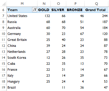
Select the columns you want plotted in your map including the headers. Note: I don’t want the ‘Grand Total’ column plotted so I only selected cells M6:P105.

As I mentioned earlier, there is a limit of 100 rows of data, so I had to omit some data.
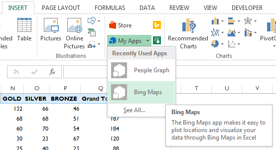
3. Insert a Map

Go to the Insert tab of the Ribbon and click on ‘My Apps’ and select ‘Bing Maps’:

insert Bing Map into Excel

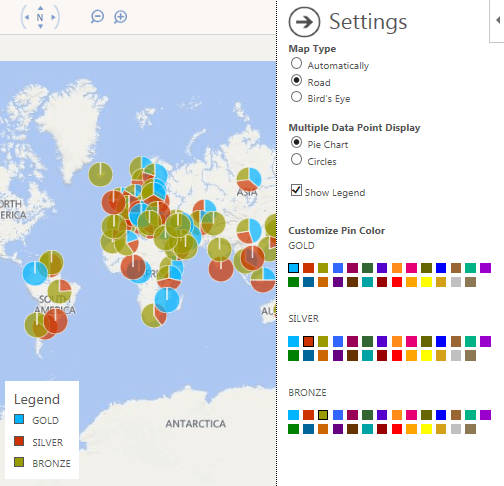
Click on the ‘Pin’ icon in the map header:

Link Excel data to Bing Map

This will plot your selected data in pie charts on your map. Click on the cog icon (to the right of the pin icon) to set your colour and data point preferences (I chose gold, silver and blue for bronze – anything bronze-like just got lost):

Customize Bing Map settings

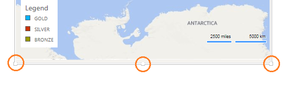
Left-click on the outer edge of the map to activate the pull handles so you can resize it to suit:

resize your map

4. Interact with your Map Data

Details: Click on the dots to reveal more details:

interact with your map

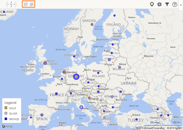
Zooming: Click the zoom buttons in the top left or click in the map and then use your mouse wheel to zoom in/out:

zoom in and out

Excel 2007/2010 Alternative

Now, for those of you who don’t have Excel 2013 I did try to find an alternative way to plot data in a chart with a world map set as the background it but I ran into some road blocks.

Namely I couldn’t find a map and co-ordinates for every country that matched accurately enough. If only the world was flat!

The curvature of the earth makes plotting data on maps at a world scale very difficult. It’s ok at a country level, even for countries the size of the United States of America, so I’ll add a tutorial for this to my To-Do list, but for now I throw the towel in at trying to find a map and co-ordinates by country that match. If you have one please send it to me and put me out of my misery.

Plot Excel Data on a Map

More Excel Charts Posts

picture fill excel charts

Picture Fill Excel Charts

Using a stylish picture fill in your Excel Charts is a simple way to make your data visualizations more captivating and memorable
excel speedometer charts

Excel Speedometer Charts

How to build Excel Speedometer Charts or Gauge Charts as they're also know, why they are BAD and what to use instead.
burn up burn down charts

Excel Project Management Burn Down and Burn Up Charts

Excel Burn Down and Burn Up Charts are easy to make with line or scatter charts. They are useful for monitoring the progress of a project.
wee people font charts

Excel WeePeople Font Charts

Excel WeePeople Font Charts are a nice change from generic shapes for waffle charts, bar/column charts and more.
excel dot map charts

Excel Dot Map Charts

Interactive Excel dot map charts are not built-in, but with some creative use of Excel’s built-in tools we can create something unique.
Excel S Curve Charts

Excel S-Curve Charts

Easy Excel S-curve Charts made with PivotTables for project management. Track progress by including budget amounts.
chart axis switch

Excel Chart Axis Switch

Use radio button form controls to create an Excel chart axis switch enabling you to toggle pannel charts between same axis and own axis.

Excel Charts with Shapes for Infographics

Excel Charts with Shapes for Infographic styling and increased interest in your charts. Easy to insert but there are a few tricks required.
excel pyramid chart

Excel Pyramid Charts

Excel Pyramid charts are useful for visualising demographic data across multiple categories. Let’s look at 3 ways we can build them in Excel.

Highlighting Periods in Excel Charts

Highlighting Periods in Excel Charts helps your users interpret them more quickly and or focus their attention on a point or area.


Category: Excel Charts
Previous Post:Excel Paste Special Operations
Next Post:Customize the QAT (Quick Access Toolbar) in ExcelCustomize the QAT (Quick Access Toolbar) in Excel

Reader Interactions

Comments

  1. Alex

    August 10, 2014 at 6:12 pm

    Many of our training and assessment course online students have had to learn how to use Excel 2013 — reluctantly 🙂 I am interested in this plot excel and intend to look further into it with a view of implementing it. The fact that it is easy to learn is a very big plus :-).

    Regards

    Alex

    Reply
  2. Jef

    July 4, 2014 at 4:48 pm

    Great post. An excellent piece of kit. I like the idea and tried different approach. Thanks for sharing.

    Reply
    • Mynda Treacy

      July 4, 2014 at 5:04 pm

      Cheers, Jef. Glad you liked it.

      Reply
  3. Emma G

    July 3, 2014 at 8:11 pm

    Patrick

    Thank you very much for the link. I’ll have a look at it next week. We have the tour de france coming past us so I’m taking some time off to watch them go by.

    Kind regards

    Reply
  4. Chandeep Chhabra

    June 26, 2014 at 10:37 pm

    Hey Mynda,

    This is simple and elegant. Does this work on
    – devices that have excel 13 but not the bing app
    – devices other than excel 13 and not with bing app

    Thanks
    Chandeep

    Reply
    • Mynda Treacy

      June 27, 2014 at 9:00 am

      Hi Chandeep,

      No, unfortunately you need the Bing App for it to work. It’s free to download though.

      Mynda

      Reply
  5. Emma G

    June 26, 2014 at 6:05 pm

    Mynda

    I work for a UK property developer and it would be very useful to visualise on a map sites of interest to us and sale plots yet to be sold. We have excel 2010 and only develop in 1 country so any info as to how to do this, as mentioned above, would be great.

    Many thanks

    Reply
    • Mynda Treacy

      June 26, 2014 at 8:26 pm

      Hi Emma,

      I’ve got a tutorial on my to-do list for how to plot data on maps in versions prior to Excel 2013. If you’re on our Excel newsletter list you’ll get an email when it’s ready.

      Kind regards,

      Mynda

      Reply
    • Patrick Butler

      July 2, 2014 at 7:11 pm

      Emma G. We have free software that works with excel that might just be what you’re looking for. Check out my blog post – https://www.espatial.com/articles/how-to-create-a-map-from-an-excel-spreadsheet Hope this helps

      Reply
      • Mynda Treacy

        July 2, 2014 at 10:14 pm

        Thanks for sharing, Patrick.

        I forgot that BatchGeo also do this. The only thing is neither of these options are maps in Excel, they are maps generated with data from Excel, but to put them into Excel you need to embed the webpage in the file.

        All doable though and an easy option but updating the maps is a bit manual.

        Cheers,

        Mynda

        Reply
        • Patrick Butler

          July 3, 2014 at 6:22 pm

          Emma, I think you’re looking for an API. Coming soon to eSpatial – but I don’t know exactly when. Thanks!

          Reply
          • Mynda Treacy

            July 3, 2014 at 6:48 pm

            Sounds good. Let us know when the API is ready.

            Cheers,

            Mynda

  6. Maxime Manuel

    June 17, 2014 at 11:41 pm

    You will never stop amazing us Mynda our Excel Supermodel Maker.
    Another good thing is that Haiti is on the map. Hourray!!!
    I am waiting when they will release it for Excel Web App. Good presentation Mynda!

    Reply
    • Mynda Treacy

      June 18, 2014 at 8:42 am

      🙂 Aw, thanks Maxime!

      The thing I like most about the Bing Maps app is how easy it is to create a visualisation.

      Reply

Leave a Reply Cancel reply

Your email address will not be published. Required fields are marked *

Current ye@r *

Leave this field empty

Sidebar

More results...

launch excel macros course excel vba course

Featured Content

  • 10 Common Excel Mistakes to Avoid
  • Top Excel Functions for Data Analysts
  • Secrets to Building Excel Dashboards in Less Than 15 Minutes
  • Pro Excel Formula Writing Tips
  • Hidden Excel Double-Click Shortcuts
  • Top 10 Intermediate Excel Functions
  • 5 Pro Excel Dashboard Design Tips
  • 5 Excel SUM Function Tricks
  • 239 Excel Keyboard Shortcuts

100 Excel Tips and Tricks eBook

Download Free Tips & Tricks

Subscribe to Our Newsletter

Receive weekly tutorials on Excel, Power Query, Power Pivot, Power BI and More.

We respect your email privacy

239 Excel Keyboard Shortcuts

Download Free PDF

mynda treacy microsoft mvpHi, I'm Mynda Treacy and I run MOTH with my husband, Phil. Through our blog, webinars, YouTube channel and courses we hope we can help you learn Excel, Power Pivot and DAX, Power Query, Power BI, and Excel Dashboards.

Blog Categories

  • Excel
  • Excel Charts
  • Excel Dashboard
  • Excel Formulas
  • Excel PivotTables
  • Excel Shortcuts
  • Excel VBA
  • General Tips
  • Online Training
  • Outlook
  • Power Apps
  • Power Automate
  • Power BI
  • Power Pivot
  • Power Query
microsoft mvp logo
trustpilot excellent rating
Secured by Sucuri Badge
MyOnlineTrainingHub on YouTube Mynda Treacy on Linked In Mynda Treacy on Instagram Mynda Treacy on Twitter Mynda Treacy on Pinterest MyOnlineTrainingHub on Facebook
 

Company

  • About My Online Training Hub
  • Disclosure Statement
  • Frequently Asked Questions
  • Guarantee
  • Privacy Policy
  • Terms & Conditions
  • Testimonials
  • Become an Affiliate

Support

  • Contact
  • Forum
  • Helpdesk – For Technical Issues

Copyright © 2023 · My Online Training Hub · All Rights Reserved. Microsoft and the Microsoft Office logo are trademarks or registered trademarks of Microsoft Corporation in the United States and/or other countries. Product names, logos, brands, and other trademarks featured or referred to within this website are the property of their respective trademark holders.