• Skip to main content
  • Skip to header right navigation
  • Skip to site footer

My Online Training Hub

Learn Dashboards, Excel, Power BI, Power Query, Power Pivot

  • Courses
  • Pricing
    • Free Courses
    • Power BI Course
    • Excel Power Query Course
    • Power Pivot and DAX Course
    • Excel Dashboard Course
    • Excel PivotTable Course – Quick Start
    • Advanced Excel Formulas Course
    • Excel Expert Advanced Excel Training
    • Excel Tables Course
    • Excel, Word, Outlook
    • Financial Modelling Course
    • Excel PivotTable Course
    • Excel for Customer Service Professionals
    • Excel for Operations Management Course
    • Excel for Decision Making Under Uncertainty Course
    • Excel for Finance Course
    • Excel Analysis ToolPak Course
    • Multi-User Pricing
  • Resources
    • Free Downloads
    • Excel Functions Explained
    • Excel Formulas
    • Excel Add-ins
    • IF Function
      • Excel IF Statement Explained
      • Excel IF AND OR Functions
      • IF Formula Builder
    • Time & Dates in Excel
      • Excel Date & Time
      • Calculating Time in Excel
      • Excel Time Calculation Tricks
      • Excel Date and Time Formatting
    • Excel Keyboard Shortcuts
    • Excel Custom Number Format Guide
    • Pivot Tables Guide
    • VLOOKUP Guide
    • ALT Codes
    • Excel VBA & Macros
    • Excel User Forms
    • VBA String Functions
  • Members
    • Login
  • Blog
  • Excel Webinars
  • Excel Forum
    • Register as Forum Member
  • Login

Interactive Python Charts in Excel

You are here: Home / Excel Charts / Interactive Python Charts in Excel
interactive python charts in excel
August 25, 2023 by Mynda Treacy

One of the best uses for Python in Excel is creating the amazing charts available through Python libraries like Seaborn and Matplotlib.

These libraries open up a huge array of charts we simply cannot make using the built-in Excel charts.

Get started with Python in Excel here.


Your browser does not support the video tag.


You know I love Excel Dashboards, so it’s no surprise that Python charts in Excel was the first feature I tried out and the very next thing I did was try to connect them to a Slicer so I could make them interactive.

I was dreaming about having Python charts alongside native Excel charts in a dashboard all connected to the same Slicer.

However, being new to Python I didn’t know how to approach it, so I asked Microsoft how to do it and they said it couldn’t be done.

However, after much tinkering with Python in Excel and some help from ChatGPT, I found a way to create interactive Python Charts in Excel connected to Slicers that control regular Excel charts and Python Charts side by side!

Interactive Python Chart in Excel

Note: Python in Excel is currently only available to Office Insiders on the Beta channel.


Table of Contents

  • Connect Python in Excel to Power Query
  • Set up Slicers for Python
  • Filter Dataframes Based on Slicers
  • Create Python Charts Linked to Slicers
  • Create Pivot Charts Linked to Slicers
  • Limitations


Interactive Python Charts in Excel Step by Step Video

Subscribe YouTube


File Download

Get the completed Excel and CSV files for the interactive Python charts in Excel lesson here.

Enter your email address below to download the sample workbook.

By submitting your email address you agree that we can email you our Excel newsletter.
Please enter a valid email address.

Download the Excel Workbook and CSV files and follow along. Note: This is a .zip file please ensure your browser doesn't change the file extension on download.


Connect Python in Excel to Power Query

For this example, I’ll connect Python to Power Query data, which is currently only supported for external data sources. i.e., you can’t connect Python in Excel to a query that references data in an Excel Table in the same file, yet!

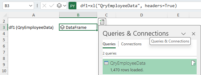
To create a Python dataframe connected to Power Query, simply type =PY or use the keyboard shortcut CTRL+ALT+SHIFT+P then enter the following Python formula:

DataframeName = Xl("Query Name", headers=True)

Note: Python formulas are case sensitive.

Then CTRL+ENTER to complete the formula.

As shown in the image below where my query is called QryEmployeeData:

Create a Python DataFrame in Excel

Tip: Watch the video above to see step by step how to create the query.


Set up Slicers for Python

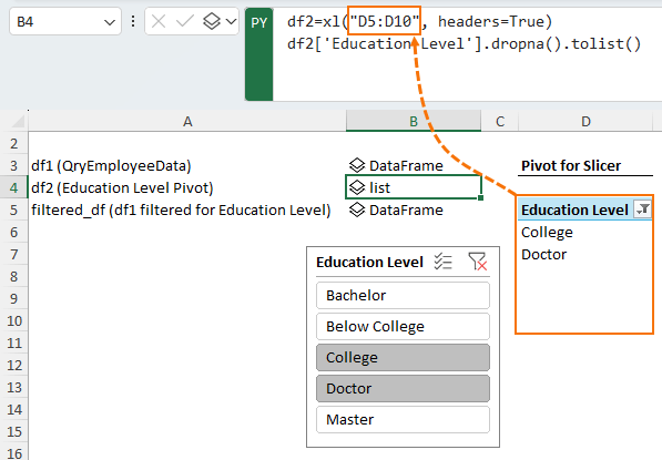
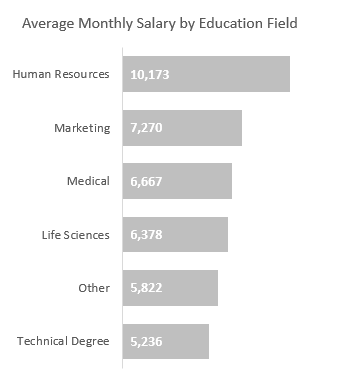
In this example I need a Slicer for the Education Level. The Slicer selection feeds into the Python formula in Excel to filter the dataframe before loading the data to the Python chart.

In the image below I’ve created a new dataframe df2 from the PivotTable and then converted it into a list of Education Levels:

Convert Python DataFrame to List in Excel

Filter Dataframes Based on Slicers

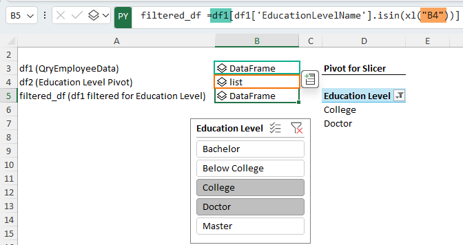
The list created in the previous step is used to create a new dataframe called filtered_df1which is based on the original dataframe df1, and will contain the Employee Data filtered for the Education Levels selected in the Slicer:

Create a filtered DataFrame using the list

Note: I could have done all this filtering in the original dataframe, but then I couldn’t ever use that dataframe in any other analysis or charts in an unfiltered state.

Create Python Charts Linked to Slicers

For this example I’m using a Seaborn Scatterplot with varying point sizes and hues.

It references the dataframe on the ‘Workings’ sheet in cell B5, which contains the filtered results called filtered_df1 based on the Slicer selections:

Python code for Seaborn Scatter Plot in Excel

Create Pivot Charts Linked to Slicers

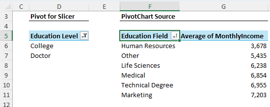
Next, I copied the PivotTable that captures the Slicer selection and pasted it for the Excel Pivot Chart.

By copying it, the connection to the Slicer is maintained, enabling the Slicer to now filter both the Python chart and the Pivot Chart.

Copy pivot table for pivot chart

Note: I could have loaded the Power Query data direct to a Pivot Chart, but I like to build the PivotTable first as it’s easier to set sort orders and number formats.

Next, insert a Pivot Chart and format accordingly:

Insert pivot chart and format it

Tip: if you forget to copy the PivotTable and instead insert a new PivotTable, right-click on the Slicer > Report Connections > select the PivotTables from the list that you want the Slicer to filter.

IMPORTANT: For the Slicer to filter both PivotTables, they must use the same source data Table.

Limitations

Slow Files

Refreshing Python formulas can be slow to recalculate. You may find it helpful to set calculation to Partial while writing Python in Excel:

Set Excel Calculation Mode to Partial

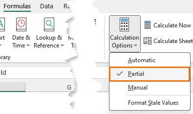
Partial Calculation puts Python and Excel Data Tables into Manual calc mode. Press F9 to force a manual calculation.

Tip: Format Stale Values will put a strikethrough any cells that haven’t been recalculated.

Python Animations

Currently Python charts like these that use Python code for animations and interactivity are not supported in Excel.

interactive python charts in excel
Mynda Treacy

Microsoft MVP logo

AUTHOR Mynda Treacy Co-Founder / Owner at My Online Training Hub

CIMA qualified Accountant with over 25 years experience in roles such as Global IT Financial Controller for investment banking firms Barclays Capital and NatWest Markets.

Mynda has been awarded Microsoft MVP status every year since 2014 for her expertise and contributions to educating people about Microsoft Excel.

Mynda teaches several courses here at MOTH including Excel Expert, Excel Dashboards, Power BI, Power Query and Power Pivot.

More Excel Charts Posts

Circle Progress Charts

Excel Progress Circle Charts

How to easily create dynamic Excel Progress Circle Charts, using doughnut charts and some wizardry, including Slicers to change the data.
professional vs amateur chart formatting

Pro Excel Chart Formatting

10 tell-tale signs that show you’re a chart amateur and the Excel chart formatting you should use instead.

Excel Scroll and Sort Table

Excel scroll and sort table using dynamic array formulas is far simpler than the old approach which required multiple tables, formulas and helper columns.
picture fill excel charts

Picture Fill Excel Charts

Using a stylish picture fill in your Excel Charts is a simple way to make your data visualizations more captivating and memorable
excel speedometer charts

Excel Speedometer Charts

How to build Excel Speedometer Charts or Gauge Charts as they're also know, why they are BAD and what to use instead.
burn up burn down charts

Excel Project Management Burn Down and Burn Up Charts

Excel Burn Down and Burn Up Charts are easy to make with line or scatter charts. They are useful for monitoring the progress of a project.
wee people font charts

Excel WeePeople Font Charts

Excel WeePeople Font Charts are a nice change from generic shapes for waffle charts, bar/column charts and more.
excel dot map charts

Excel Dot Map Charts

Interactive Excel dot map charts are not built-in, but with some creative use of Excel’s built-in tools we can create something unique.
Excel S Curve Charts

Excel S-Curve Charts

Easy Excel S-curve Charts made with PivotTables for project management. Track progress by including budget amounts.
chart axis switch

Excel Chart Axis Switch

Use radio button form controls to create an Excel chart axis switch enabling you to toggle pannel charts between same axis and own axis.


Category: Excel Charts
Previous Post:python in excel nativelyHow to Use Python in Excel Natively
Next Post:Built-in Excel AI Tools8 Excel in-built AI Tools

Reader Interactions

Leave a Reply Cancel reply

Your email address will not be published. Required fields are marked *

Current ye@r *

Leave this field empty

Sidebar

More results...

Popular Content

  • 10 Common Excel Mistakes to Avoid
  • Top Excel Functions for Data Analysts
  • Secrets to Building Excel Dashboards in Less Than 15 Minutes
  • Pro Excel Formula Writing Tips
  • Hidden Excel Double-Click Shortcuts
  • Top 10 Intermediate Excel Functions
  • 5 Pro Excel Dashboard Design Tips
  • 5 Excel SUM Function Tricks
  • 239 Excel Keyboard Shortcuts

100 Excel Tips and Tricks eBook

Download Free Tips & Tricks

239 Excel Keyboard Shortcuts

Download Free PDF

mynda treacy microsoft mvpHi, I'm Mynda Treacy and I run MOTH with my husband, Phil. Through our blog, webinars, YouTube channel and courses we hope we can help you learn Excel, Power Pivot and DAX, Power Query, Power BI, and Excel Dashboards.

Blog Categories

  • Excel
  • Excel Charts
  • Excel Dashboard
  • Excel Formulas
  • Excel Office Scripts
  • Excel PivotTables
  • Excel Shortcuts
  • Excel VBA
  • General Tips
  • Online Training
  • Outlook
  • Power Apps
  • Power Automate
  • Power BI
  • Power Pivot
  • Power Query
microsoft mvp logo
trustpilot excellent rating
Secured by Sucuri Badge
MyOnlineTrainingHub on YouTube Mynda Treacy on Linked In Mynda Treacy on Instagram Mynda Treacy on Twitter Mynda Treacy on Pinterest MyOnlineTrainingHub on Facebook

Sign up to our newsletter and join over 400,000
others who learn Excel and Power BI with us.


Company

  • About My Online Training Hub
  • Disclosure Statement
  • Frequently Asked Questions
  • Guarantee
  • Privacy Policy
  • Terms & Conditions
  • Testimonials
  • Become an Affiliate
  • Sponsor Our Newsletter

Support

  • Contact
  • Forum
  • Helpdesk – For Technical Issues

Copyright © 2023 · My Online Training Hub · All Rights Reserved. Microsoft and the Microsoft Office logo are trademarks or registered trademarks of Microsoft Corporation in the United States and/or other countries. Product names, logos, brands, and other trademarks featured or referred to within this website are the property of their respective trademark holders.