In this post I'll be looking at ways to highlight or label values that may be of special interest in visuals.
Perhaps you are interested in seeing the minimum and maximum values, or some data points of significance like when your business held a promotion.
Or you might want to highlight points that fall within a certain range.
The first couple of examples use line charts, then I'll look at a clustered column chart and finally a scatter chart.
Watch the Video

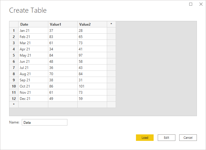
Source Data
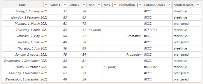
This is the source data I'm using, it's totally made up and consists of 2 columns of values for the 12 months in 2021.
Download PBIX Desktop File
Enter your email address below to download the sample files used in this post.
Highlighting Data in a Line Chart
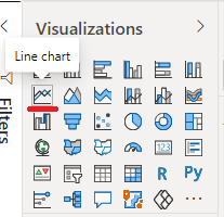
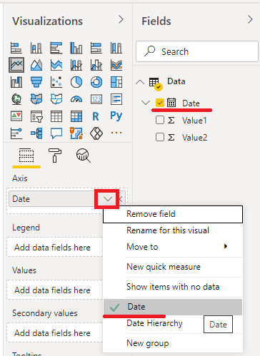
First off let's create a line chart and add the Date and Value1. Make sure the date is set to just the date and not a date hierarchy
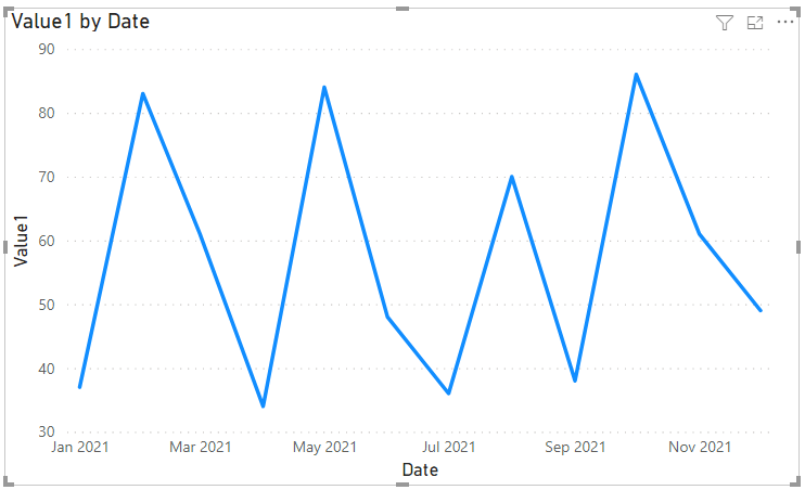
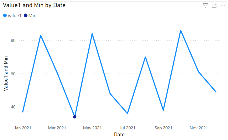
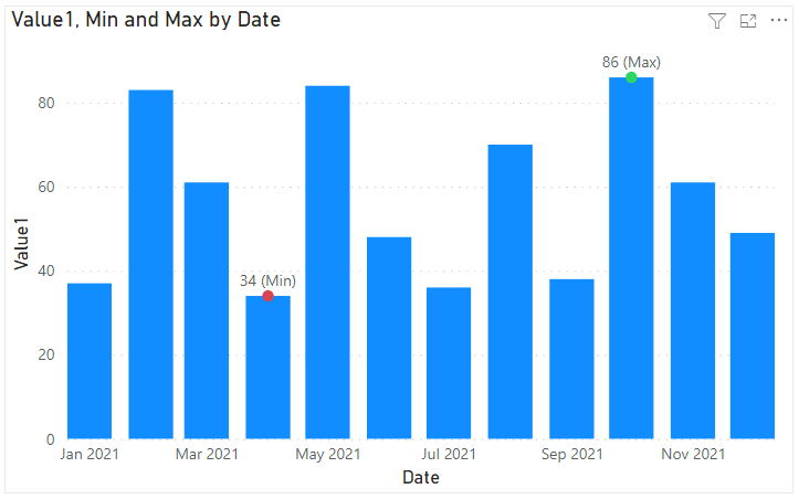
If I want to know the min and max values it's not immediately apparent what these are. There are several dips and peaks that could be the values I want.
To highlight the min and max I first need to create a column for each one. This can be done either in Power Query or in DAX.
I'll show you how to do both so let's start by going in to the Power Query editor by clicking on Transform data.
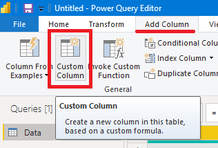
Add a Custom Column
I'll create a column for the minimum value so the code is this
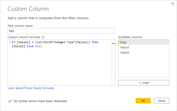
Remember that a column is a list so you can check for the minimum in that list using the List.Min function and referring to the previous step #"Changed Type" and column name [Value1]
Click OK to close this and create the column gives this
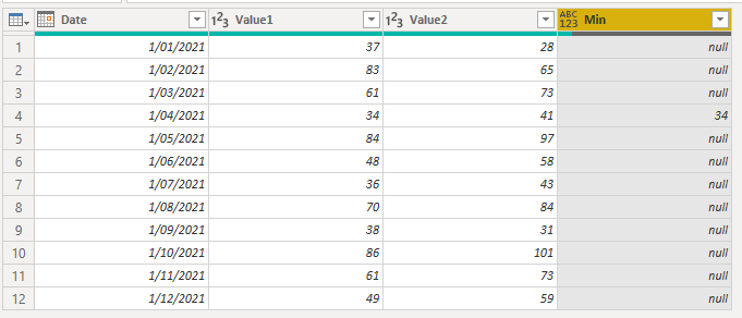
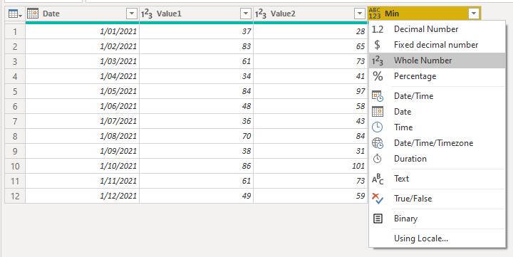
Don't forget to set the column data type to Whole Number
Close and Apply to load the data into the Power BI Data Model
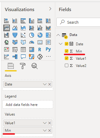
The new Min column can be added to the values
and the chart now shows our minimum value
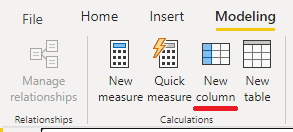
Now to create the Max column in DAX, go to Modelling -> New Column
The column will be named Max and the code to create it is this

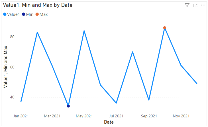
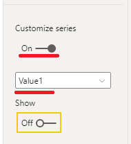
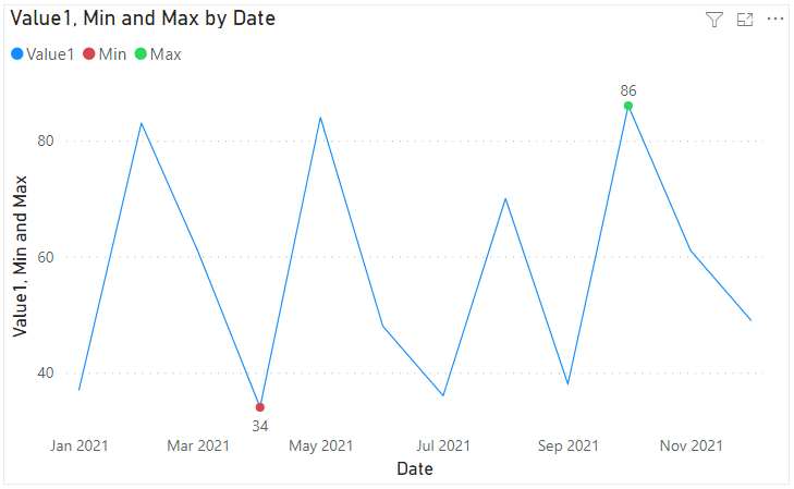
With the max column created, add it to the chart and now both min and max values are clearly shown.
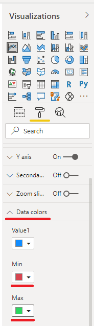
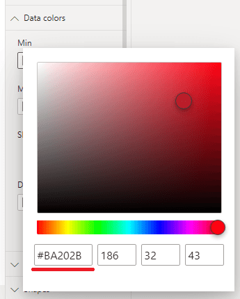
You can change the colors for min and max under Data Colors if you want to.
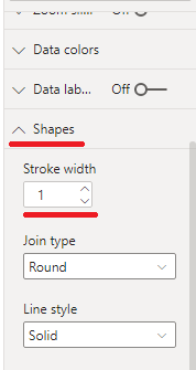
Under Shapes, reduce the stroke width to make the line thinner and the dots stand out more.
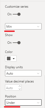
To make it even better, turn on data labels
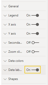
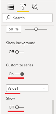
Open the Data Labels section and scroll down, turn on Customize Series. Turn off labels for the main values - Value1.
The label for min is obscured by the line so change that so the label position is Under
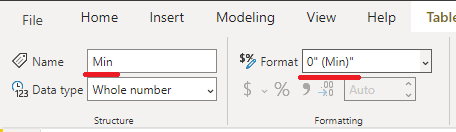
There's one more thing you can do to indicate the min and max even more clearly and that's use Custom String Formats for the Min and Max values.
Click on the Min column and in the Format area of the Ribbon type in a custom format string 0" (Min)"
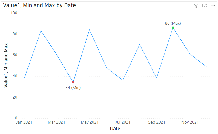
This displays the Min value like this

Similarly for the max, click on the Max column and enter the custom format string 0" (Max)"
I've turned off the Legend, and adjusted the y-axis range and the final chart looks like this.
Highlight Events on a Line Chart
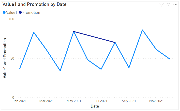
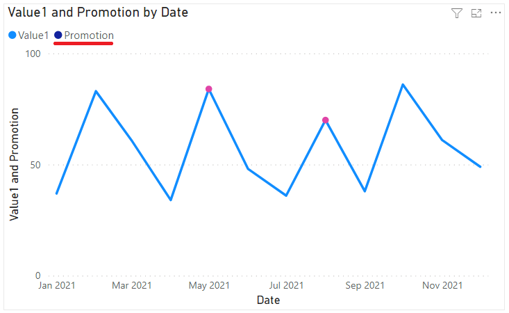
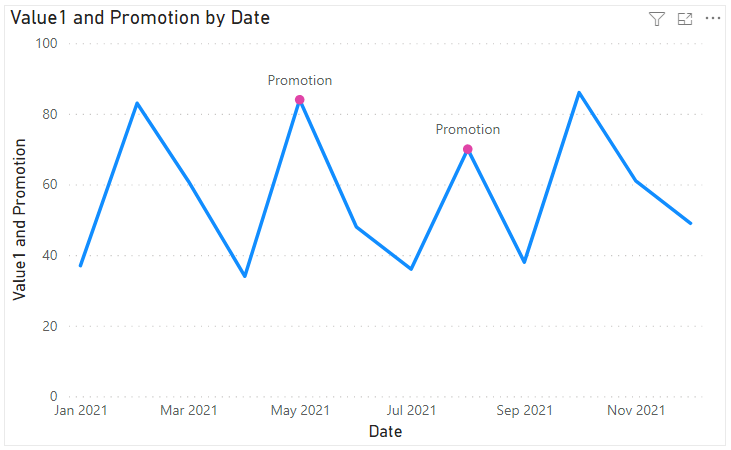
Next I want to look at how to label specific values that correspond to an event for example, when your business runs a promotion.
The process if very similar to what i just did for Min / Max values.
Starting with the same data, create a line chart,add the Date (not as a hierarchy) and Value1.
My pretend business had (or will have) promotions in May and August. I need to create a new column to indicate this and again this can be done either in Power Query or in the Data Model using DAX.
Let's do it with DAX: on the Ribbon go to Modelling - > New Column and enter this code

Promotions were held in May and August so I need to check the month in the Date column. The MONTH function returns 5 for May and 8 for August.
The code means, if the date is either in May or August, add the value corresponding to that date to the new Promotion column.
With the column created, add it to the chart.
and I get this line for the Promotions, but I don't want that.
OK, with the chart visual selected, go to Shapes -> turn on Customise Series.
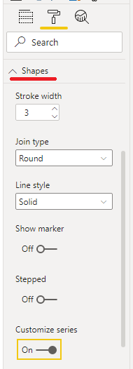
Select Promotion and set Stroke width to 0
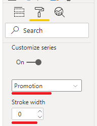
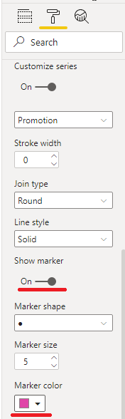
Turn Show marker on, and change the color to something that stands out, I went with pink.
If you use the Legend then you need to match the Promotion series color and the marker color. You can change the series color under Data Colors.
Or you can turn off the Legend and use a custom format string for the Promotion dates.
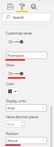
As I did in the previous example, turn on Data Labels, then scroll down and turn on Customize Series, and don't show labels for Value1.
Select Promotion, make sure labels are on, and set the label position to Above
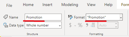
Select the promotion column and enter "Promotion" in the Format area of the Ribbon.
The final chart looks like this
Line and Column Chart
Next up is highlighting values in column charts, or line and clustered column visuals as they are in Power BI.
Using the same data, add a line and column visual, and add the Min and Max to the Line values.
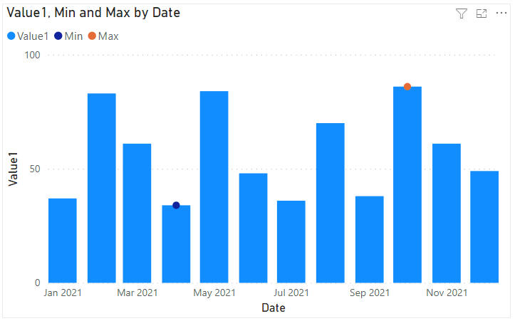
You can turn on Data Labels then customise each series. Turning off labels for the main Value1 series, and change the Data Color for Min and Max. Turn off the Legend.
The Min and Max are displayed with the Custom format string I applied earlier but this visual can be made better.
I'm really only interested in seeing the min and max values so I'm going to change the color of the columns to make it quicker and easier to see the min and max.
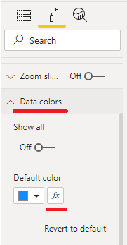
Under Data Colors, I can apply a function for the default color - this is essentially conditional color formatting.
But to do this I need to create a column that contains the colors I want to apply to the columns.
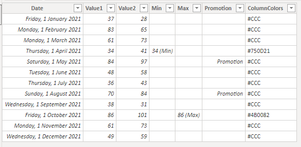
So, Modelling -> New Column, call the new column ColumnColors, the DAX code to create it is
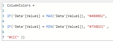
I'm using Hex color codes here for the column colors. These color codes are comprised of a mixture of red, green and blue values in hexadecimal.
The first 2 chars are the red component, the second 2 the green and the last 2 are the blue e.g. #RRGGBB
There are plenty of web sites that allow you to choose a color and gives you the hex code, just do a search in your web browser for hex color.
Or under Data Colors, click a color then click on More colors and pick a color, it shows you the hex code for that color.
Back to my DAX for this new column, I've chosen purple for Max and a reddsish brown for the Min.
The last color, #CCC, is the default for all the other bars, which is grey. I've used shorthand here. #CCC is the same as #CCCCCC.
When the column is created I get this in my data table
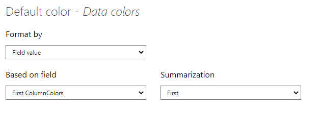
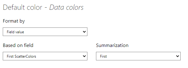
With the color column created I can now use it to color the visual. Click on the visual and under Data Colors, click on the fx button beside Default color.
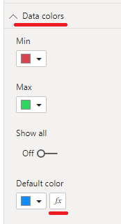
Use these settings : Format by -> Field value, Based on field -> ColumnColors and Summarization -> First.
Click OK to apply these color settings and the min and max values are now immediatley obvious.
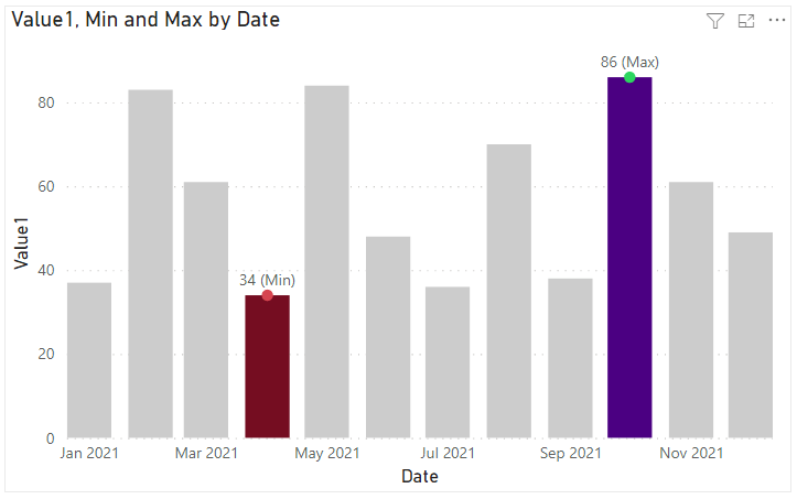
Because Min and Max are Line Values they have their own color for the line and this is currently different to the column color.
Under Data colors you can either change these to match the column colors, or make them white (to match my background) as I have.

Scatter Chart
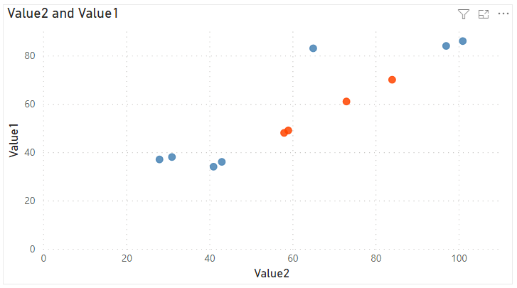
The last visual I'm going to look at is the scatter chart. Add one and then plot Value1 against Value2. Don't summarize either value.
After setting the axis limits to appropriate values I end up with this.
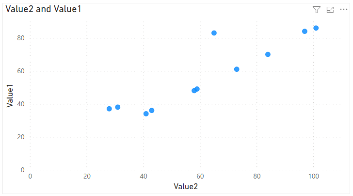
I want to highlight points where Value1 is between 40 and 80 and I'll need to create a column containing colors to do this.
For this column I'll use color keywords rather than the hex color codes. You can use any CSS color which you can find at the w3.org website.
Add a new column from Modelling -> New Column and call it ScatterColors

The points I'm interested in will be colored orangered and everything else will be steelblue.
With the column created, select the scatter chart, go to Data Colors and click the fx button.
The settings here are almost identical to the settings for the line/column chart, except you select ScatterColors in the Based on field.
Click OK and right away the points of interest stand out.
Summary
Hopefully you've found something useful in this post that you can apply to your own Power BI visuals.

hi Mynda, nice site! Just a small extra tip for viewers of your videos and problems keeping up with your prodigious work rate.
Viewers can simply click the cog symbol at bottom-right of the video frame and reduce the playback speed to 50% or even 25%.
As well as getting much more opportunity to take in what you’re saying and perhaps see the keyboard shortcuts flashing up and other settings in the menus that you are clicking your way through, we also get an insight into what you might sound like in 15 or 30 years!
Personally, I find it easier and less frustrating than the rewind and replay method although I don’t really suggest anyone watches whole videos at those rates.
Thanks again for a great site. Sorry if you/someone already suggested that elsewhere.
Thanks, Jes! Yes, the slower playback speed is a great idea that I suggest to people when they complain that I speak too fast, so thanks for sharing it here. I haven’t listened to it at slow speed…not sure I want to hear what I sound like in 15 years! 😀