• Skip to main content
  • Skip to header right navigation
  • Skip to site footer

My Online Training Hub

Learn Dashboards, Excel, Power BI, Power Query, Power Pivot

  • Courses
  • Pricing
    • Free Courses
    • Power BI Course
    • Excel Power Query Course
    • Power Pivot and DAX Course
    • Excel Dashboard Course
    • Excel PivotTable Course – Quick Start
    • Advanced Excel Formulas Course
    • Excel Expert Advanced Excel Training
    • Excel Tables Course
    • Excel, Word, Outlook
    • Financial Modelling Course
    • Excel PivotTable Course
    • Excel for Customer Service Professionals
    • Excel for Operations Management Course
    • Excel for Decision Making Under Uncertainty Course
    • Excel for Finance Course
    • Excel Analysis ToolPak Course
    • Multi-User Pricing
  • Resources
    • Free Downloads
    • Excel Functions Explained
    • Excel Formulas
    • Excel Add-ins
    • IF Function
      • Excel IF Statement Explained
      • Excel IF AND OR Functions
      • IF Formula Builder
    • Time & Dates in Excel
      • Excel Date & Time
      • Calculating Time in Excel
      • Excel Time Calculation Tricks
      • Excel Date and Time Formatting
    • Excel Keyboard Shortcuts
    • Excel Custom Number Format Guide
    • Pivot Tables Guide
    • VLOOKUP Guide
    • ALT Codes
    • Excel VBA & Macros
    • Excel User Forms
    • VBA String Functions
  • Members
    • Login
    • Password Reset
  • Blog
  • Excel Webinars
  • Excel Forum
    • Register as Forum Member

Excel Step Charts

You are here: Home / Excel Charts / Excel Step Charts
Excel Step Charts
April 25, 2013 by Mynda Treacy

I recently came back from a family skiing vacation in Whistler, Canada, which by the way was fantastic.

Here we are at a lookout on a snowmobile trip we took.

Excel Step Chart

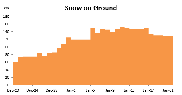
Anyway I digress…. one of the key pieces of information you want to know as a skier (or snowboarder) is how much snow is on the ground, and a great way to visualise this over time is with a step chart.

Step charts are useful for displaying how the levels of snow (or other data) increase, remain constant or decrease over time.

Excel Step Charts

Excel Step Chart

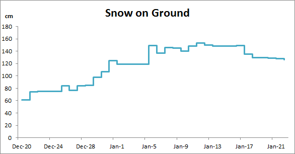
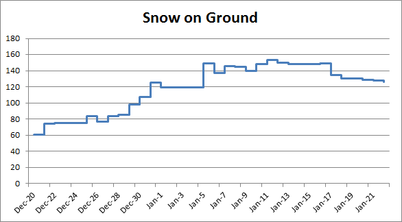
Compare the same data plotted in a regular line chart:

Excel Step Chart

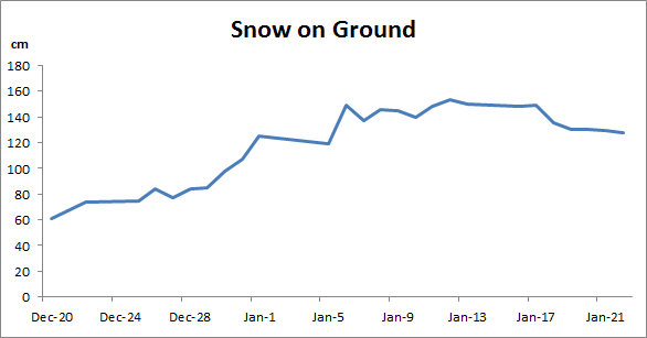
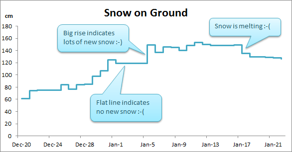
The information that is lacking in the line chart are the periods of no snow, which in the step chart are depicted by the flat lines. Also the rise and fall appears to happen gradually over time in the line chart, as opposed to the day the snow actually falls, or melts.

How to Create a Step Chart

A step chart in Excel can be created from a regular line chart and some clever formatting of your data that I learnt from Jon Peltier. Thanks Jon.

Organise Your Data

The trick to getting the step effect is all in the preparation of your data. It’s an easy 2 step process (no pun intended :)).

The image below illustrates the steps to get your data organised. They are:

Step 1: Copy your original data and paste it below so that your data is repeated twice. My original data is in brown and my duplicate data is in blue.

Step 2: Use the β€˜Delete Cells’ tool and choose β€˜Shift cells up’ to delete the first date cell (containing the date Dec-20), and the last cell of my original data (containing 126) as shown in red below.

Excel Step Charts

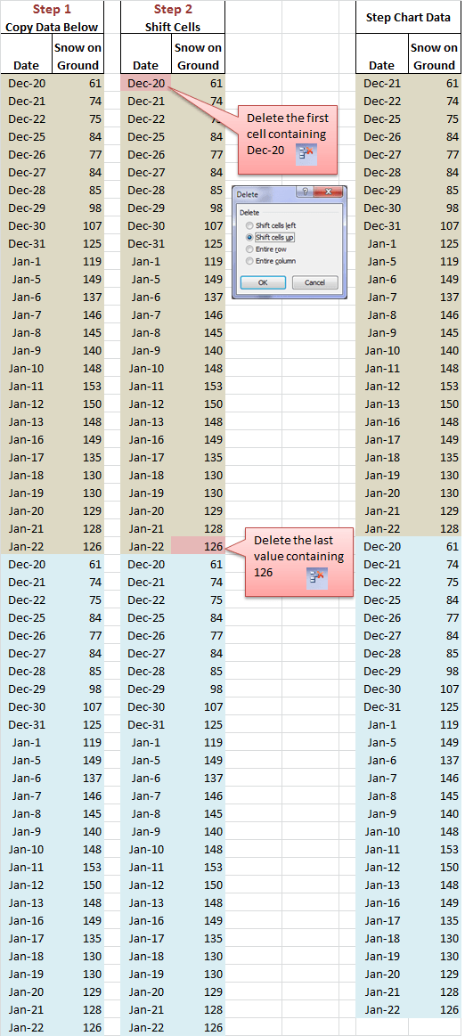
Your data is now ready for charting as you can see in the last block of data labelled β€˜Step Chart Data’.

Note: If you wish you can sort the data in date order, but in this case it’s not necessary. This is because Excel automatically organises X axis dates in the background and plots them in ascending order in the chart.

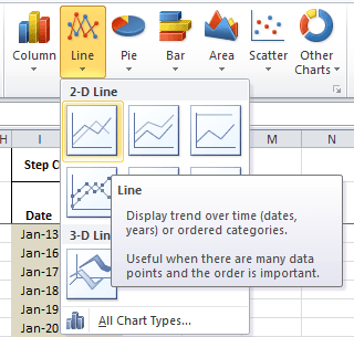
Insert Your Step Chart

Select your data and insert a 2D Line Chart:

Excel Step Charts

Voila:

Excel Step Charts

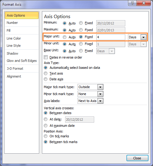
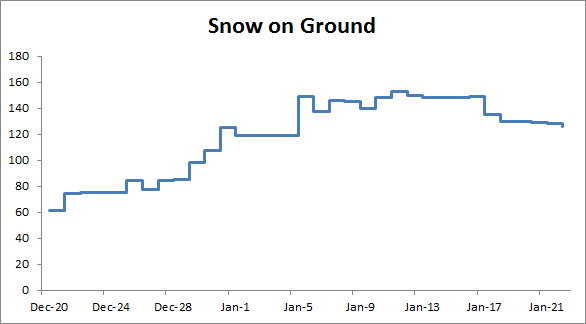
Now, let's make it a bit easier to read. I'll fix my X axis major unit to something less frequent so you don’t have to turn your head to read the axis labels. I’ve chosen 4 days:

Excel Step Charts

And I'll delete the gridlines:

Excel Step Charts

See you on the slopes on January 6 for some powder snow πŸ˜‰

Stepped Area Chart

If you prefer an area chart simply choose β€˜2D Area’ from the Charts menu and use the same data.

Excel Step Charts

Step Chart Key Points:

  1. Useful where you don’t have data for every date in your timeline. For example, when you only record the data when there is a change, as opposed to recording it every day.
  2. If you had data recorded for every day you could use a histogram chart to create a similar effect to the stepped area chart above.
  3. Remember to rearrange the first date and last value as shown in step 2 of Organising Your Data. Your data will be one row shorter than when you started.

More Chart Tricks

If you liked this trick and would like to learn more ways to display your data visually take a look at my Excel Dashboard course that is currently open for registration for a limited time.

Get 20% off if you sign up before 1st May 2013. Click here to find out more.

Did You Like This?

If you liked this tutorial please let me know by using the buttons below to share it on Facebook, LinkedIn, Twitter or +1 on Google. Or leave me a comment and let me know what you use Step Charts for.

Excel Step Charts

More Charts Posts

burn up burn down charts

Excel Project Management Burn Down and Burn Up Charts

Excel Burn Down and Burn Up Charts are easy to make with line or scatter charts. They are useful for monitoring the progress of a project.
wee people font charts

Excel WeePeople Font Charts

Excel WeePeople Font Charts are a nice change from generic shapes for waffle charts, bar/column charts and more.
excel dot map charts

Excel Dot Map Charts

Interactive Excel dot map charts are not built-in, but with some creative use of Excel’s built-in tools we can create something unique.
Excel S Curve Charts

Excel S-Curve Charts

Easy Excel S-curve Charts made with PivotTables for project management. Track progress by including budget amounts.
highlighting data in power bi visuals

Highlighting Data in Power BI Visuals

Learn several techniques to highlight or label important data points in your Power BI visuals. Sample file and code to download.
shape maps in power bi

Shape Maps in Power BI

Shape maps in Power BI can be used to show the distribution of a variable across geographic regions. Learn a trick to plot discrete data too.
using jitter to avoid over plotting

Using Jitter to Avoid Over Plotting in Power BI

Plotting data that has one variable where values are similar, can result in points that are plotted over each other. Use jitter to avoid this overplotting.
Excel custom chart labels

Excel Custom Chart Labels

Create dynamic Excel custom chart labels with this category axis hijack trick
Sorting Excel Date Slicers

Sorting Excel Date Slicers

Slicers have some shortcomings when it comes to dates and sort order. This post explains a couple of ways to sort dates correctly in Excel slicers.
Charting Disparate Data in Excel – 3 Solutions and 1 Crazy Mess

Charting Disparate Data in Excel – 3 Solutions and 1 Crazy Mess

More Excel Charts Posts

picture fill excel charts

Picture Fill Excel Charts

Using a stylish picture fill in your Excel Charts is a simple way to make your data visualizations more captivating and memorable
excel speedometer charts

Excel Speedometer Charts

How to build Excel Speedometer Charts or Gauge Charts as they're also know, why they are BAD and what to use instead.
burn up burn down charts

Excel Project Management Burn Down and Burn Up Charts

Excel Burn Down and Burn Up Charts are easy to make with line or scatter charts. They are useful for monitoring the progress of a project.
wee people font charts

Excel WeePeople Font Charts

Excel WeePeople Font Charts are a nice change from generic shapes for waffle charts, bar/column charts and more.
excel dot map charts

Excel Dot Map Charts

Interactive Excel dot map charts are not built-in, but with some creative use of Excel’s built-in tools we can create something unique.
Excel S Curve Charts

Excel S-Curve Charts

Easy Excel S-curve Charts made with PivotTables for project management. Track progress by including budget amounts.
chart axis switch

Excel Chart Axis Switch

Use radio button form controls to create an Excel chart axis switch enabling you to toggle pannel charts between same axis and own axis.

Excel Charts with Shapes for Infographics

Excel Charts with Shapes for Infographic styling and increased interest in your charts. Easy to insert but there are a few tricks required.
excel pyramid chart

Excel Pyramid Charts

Excel Pyramid charts are useful for visualising demographic data across multiple categories. Let’s look at 3 ways we can build them in Excel.

Highlighting Periods in Excel Charts

Highlighting Periods in Excel Charts helps your users interpret them more quickly and or focus their attention on a point or area.


Category: Excel ChartsTag: charts
Previous Post:Excel Advanced FiltersExcel Advanced Filters
Next Post:Excel Tables as Source for Data Validation ListsExcel Tables as Source for Data Validation Lists

Reader Interactions

Comments

  1. Patrick

    April 5, 2017 at 9:13 pm

    I completely understand the concept, and your explanation is great. However, suppose my data is always increasing so I should get only step ups. Excel however does not plot the data correctly. The graph first goes to the higher value diagonally, and then on the same date, creates a sharped angled tip by dropping to the lower value. Then again diagonally up to the next higher level, followed by a vertical drop to the lower value, etc. My graph looks like a saw…..

    What am I doing wrong?

    Reply
    • Patrick

      April 5, 2017 at 9:18 pm

      Figured it out. The key is to paste the original data below; and not above…

      Reply
  2. Michel Gerday

    November 11, 2013 at 8:03 pm

    I found a way to generate the step chart data on the fly.
    The formulas below consider that date and time original data start in cells A2 and B2.
    Put “Date” and “Snow on ground” in cells D1 and E1.
    In cell D2, write “=OFFSET(A$2,ROUNDUP((ROW()-ROW(A$2))/2,0),0)”.
    Format D2 as a dat.
    In cell E2, write “=OFFSET(B$2,ROUNDDOWN((ROW()-ROW(B$2))/2,0),0)”
    Make a list (table) with Ctrl+L
    Copy down the formulas as needed (stop when you get zeroes for dates).
    Make your chart as usual
    When you add observations in columns A & B, copy down the formulas again. Chart will expand automatically since source data is enclosed in list / table.
    Enjoy!

    Reply
    • Mynda Treacy

      November 11, 2013 at 8:08 pm

      Nice trick, Michel. Thanks for sharing πŸ™‚

      Reply
      • Rasmus Christensen

        November 27, 2013 at 12:51 am

        Thank you for sharing this info. It was very helpful.

        Michael do you by any chance have the guide for the error-bar-solution for Excel 2010? I couldn’t quite get it to work as Excel has changed layout since your originally post.

        Reply
  3. Michel Gerday

    November 9, 2013 at 2:37 am

    7 years after my post on the Excel newsgroup, there is still no native step chart in Excel. πŸ™

    Reply
    • Mynda Treacy

      November 9, 2013 at 8:21 am

      Microsoft remind me of my kids…. sometimes you have to repeat yourself over and over and they still don’t listen, then one day they get it!

      Reply
  4. isaac

    August 26, 2013 at 12:11 pm

    I am needing to do exactly this, but my x axis is a number rather than a date. Unfortunately, switching the format messes up the step chart. Any suggestions?

    Reply
    • Mynda Treacy

      August 27, 2013 at 5:12 pm

      Hi Isaac,

      1. Change the chart type to a XY Scatter chart
      2. Sort your source data by your X axis number in ascending order
      3. Format the data series so that the Marker Options are set to none and the Marker Line color is ‘Automatic’.

      Let me know if you get stuck.

      Kind regards,

      Mynda.

      Reply
  5. Rajesh

    April 29, 2013 at 4:27 pm

    Hi Mynda

    This is the greatest sit for Excel tricks. I am too happy and satisfied to connect with this.

    Thanks & Best Regards

    Reply
    • Mynda Treacy

      April 29, 2013 at 8:27 pm

      Cheers, Rajesh. Glad you like it πŸ™‚

      Reply
  6. moiz

    April 27, 2013 at 3:51 am

    I love your lucid way of explanation.btw,can u suggest a formula or some addin in xl that converts figures into words and vice versa without the currency tag?

    Reply
    • Mynda Treacy

      April 27, 2013 at 1:59 pm

      Hi Moiz,

      Thanks for your kind words.

      Regarding the translation of numbers into words; unfortunately there isn’t a simple formula. Daniel Ferry (AKA Excel Hero) wrote a very complex formula to handle this but I would only recommend it to advanced users. If you want to see the formula you can join his Excel Hero LinkedIn group and search for it.

      I’m sorry I can’t point you to a simple link.

      Kind regards,

      Mynda.

      Reply
  7. Susan Jorgensen

    April 26, 2013 at 5:45 am

    I used a step chart to plot daily production values for a Business Interruption claim last year. We needed to determine the production value loss for a period of time which we achieved by using trendlines, error bars and major and minor gridlines. I was a great learning experience and funny thing is that, at the time, I did not know that I was working with a step chart.

    As usual, your example and explanation is great and, see, this is an example of the NOT programmer’s brain I possess. How would Jon even identify that copying the original data and removing the first and last dates even produce this type of graph? (Must be because he understands the excel coding but, I am often at awe. I am creative and intuitive in life but, here, the thought would never occur to me :))

    I view your family picture as a proud Canadian. Whistler is gorgeous and I live just next door in Calgary, Alberta. Did I mention that I lived in Cairns and Brisbane from 1976 to 1984? I am familiar with the Caloundra area (as it was in 1990 – that is the last time I have been back). A beautiful place to live.

    Reply
    • Mynda Treacy

      April 26, 2013 at 10:40 am

      Hi Susan,

      I stumbled across the error bar method for step charts but I liked the simplicity of Jon’s approach. I agree, you have to get your mind inside the chart to invent the shuffling of data technique I’ve shared here. I’m not sure I would have come up with it either….perhaps because I’m a bit too impatient πŸ˜‰

      We loved Whistler…so much so that we’re going back for 2 weeks in December.

      It’s nice to know you are part Aussie. We are about 15 minutes north of Caloundra. I don’t think it matters where you live on the Sunshine Coast, it’s all beautiful beaches. Cairns on the other hand is too hot and humid for my liking. Quite a contrast to Canada.

      Thanks for taking the time to leave your comment.

      Mynda.

      Reply
  8. Jon Peltier

    April 25, 2013 at 8:54 pm

    Nice job. I usually use a 7-day axis tick spacing, since people are used to thinking in terms of days of the week.

    Reply
    • Mynda Treacy

      April 25, 2013 at 9:05 pm

      Good point. Cheers, Jon πŸ™‚

      Reply

Leave a Reply Cancel reply

Your email address will not be published. Required fields are marked *

Current ye@r *

Leave this field empty

Sidebar

More results...

Featured Content

  • 10 Common Excel Mistakes to Avoid
  • Top Excel Functions for Data Analysts
  • Secrets to Building Excel Dashboards in Less Than 15 Minutes
  • Pro Excel Formula Writing Tips
  • Hidden Excel Double-Click Shortcuts
  • Top 10 Intermediate Excel Functions
  • 5 Pro Excel Dashboard Design Tips
  • 5 Excel SUM Function Tricks
  • 239 Excel Keyboard Shortcuts

100 Excel Tips and Tricks eBook

Download Free Tips & Tricks

Subscribe to Our Newsletter

Receive weekly tutorials on Excel, Power Query, Power Pivot, Power BI and More.

We respect your email privacy

Guides and Resources

  • Excel Keyboard Shortcuts
  • Excel Functions
  • Excel Formulas
  • Excel Custom Number Formatting
  • ALT Codes
  • Pivot Tables
  • VLOOKUP
  • VBA
  • Excel Userforms
  • Free Downloads

239 Excel Keyboard Shortcuts

Download Free PDF

Free Webinars

Excel Dashboards Webinar

Watch our free webinars and learn to create Interactive Dashboard Reports in Excel or Power BI

Click Here to Watch Now

mynda treacy microsoft mvpHi, I'm Mynda Treacy and I run MOTH with my husband, Phil. Through our blog, webinars, YouTube channel and courses we hope we can help you learn Excel, Power Pivot and DAX, Power Query, Power BI, and Excel Dashboards.

Blog Categories

  • Excel
  • Excel Charts
  • Excel Dashboard
  • Excel Formulas
  • Excel PivotTables
  • Excel Shortcuts
  • Excel VBA
  • General Tips
  • Online Training
  • Outlook
  • Power Apps
  • Power Automate
  • Power BI
  • Power Pivot
  • Power Query
microsoft mvp logo
trustpilot excellent rating
Secured by Sucuri Badge
MyOnlineTrainingHub on YouTube Mynda Treacy on Linked In Mynda Treacy on Instagram Mynda Treacy on Twitter Mynda Treacy on Pinterest MyOnlineTrainingHub on Facebook
 

Company

  • About My Online Training Hub
  • Disclosure Statement
  • Frequently Asked Questions
  • Guarantee
  • Privacy Policy
  • Terms & Conditions
  • Testimonials
  • Become an Affiliate

Support

  • Contact
  • Forum
  • Helpdesk – For Technical Issues

Copyright © 2023 · My Online Training Hub · All Rights Reserved. Microsoft and the Microsoft Office logo are trademarks or registered trademarks of Microsoft Corporation in the United States and/or other countries. Product names, logos, brands, and other trademarks featured or referred to within this website are the property of their respective trademark holders.