• Skip to main content
  • Skip to header right navigation
  • Skip to site footer

My Online Training Hub

Learn Dashboards, Excel, Power BI, Power Query, Power Pivot

  • Courses
  • Pricing
    • Free Courses
    • Power BI Course
    • Excel Power Query Course
    • Power Pivot and DAX Course
    • Excel Dashboard Course
    • Excel PivotTable Course – Quick Start
    • Advanced Excel Formulas Course
    • Excel Expert Advanced Excel Training
    • Excel Tables Course
    • Excel, Word, Outlook
    • Financial Modelling Course
    • Excel PivotTable Course
    • Excel for Customer Service Professionals
    • Excel for Operations Management Course
    • Excel for Decision Making Under Uncertainty Course
    • Excel for Finance Course
    • Excel Analysis ToolPak Course
    • Multi-User Pricing
  • Resources
    • Free Downloads
    • Excel Functions Explained
    • Excel Formulas
    • Excel Add-ins
    • IF Function
      • Excel IF Statement Explained
      • Excel IF AND OR Functions
      • IF Formula Builder
    • Time & Dates in Excel
      • Excel Date & Time
      • Calculating Time in Excel
      • Excel Time Calculation Tricks
      • Excel Date and Time Formatting
    • Excel Keyboard Shortcuts
    • Excel Custom Number Format Guide
    • Pivot Tables Guide
    • VLOOKUP Guide
    • ALT Codes
    • Excel VBA & Macros
    • Excel User Forms
    • VBA String Functions
  • Members
    • Login
  • Blog
  • Excel Webinars
  • Excel Forum
    • Register as Forum Member
  • Login

Excel Pyramid Charts

You are here: Home / Excel Charts / Excel Pyramid Charts
excel pyramid chart
February 11, 2021 by Mynda Treacy

Excel pyramid charts are easy to build using bar charts or Conditional Formatting, but there are a few rules you must follow depending on the approach you choose.

Before we look at the steps, keep in mind that these charts aren’t limited to visualising gender splits. They’re also handy for any type of demographic data where you have two groups (typically male and female) split into categories.

excel pyramid charts

Watch the Video

Subscribe YouTube

Download Workbook

Enter your email address below to download the sample workbook.

By submitting your email address you agree that we can email you our Excel newsletter.
Please enter a valid email address.

Download the Excel Workbook and follow along. Note: This is a .xlsx file please ensure your browser doesn't change the file extension on download.

Options for Excel Pyramid Charts

Option 1: Pyramid Charts using a Single Chart

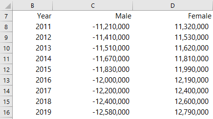
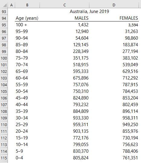
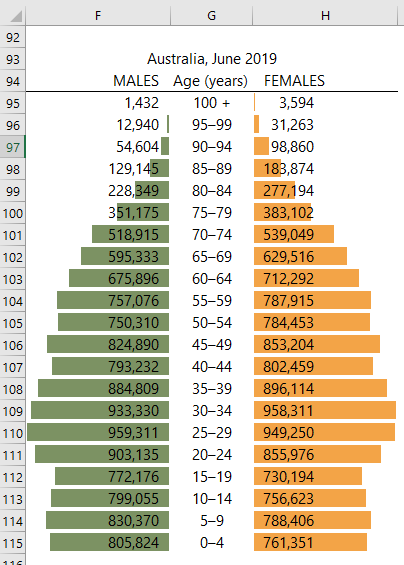
The easiest way to create a pyramid chart is with a bar chart. The trick is to convert the values for the left-hand series to negatives, as you can see in my source data below:

chart data

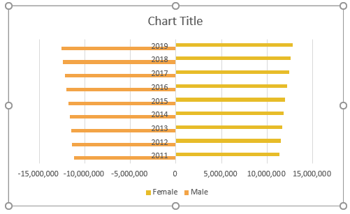
Step 1: insert a bar chart:

bar chart

Step 2: Set the series overlap to 100%:

chart series overlap

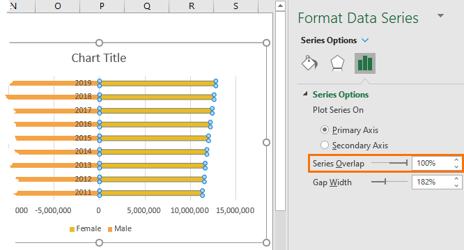
Tip: also reduce the gap width for thicker bars. 50% is often ideal.

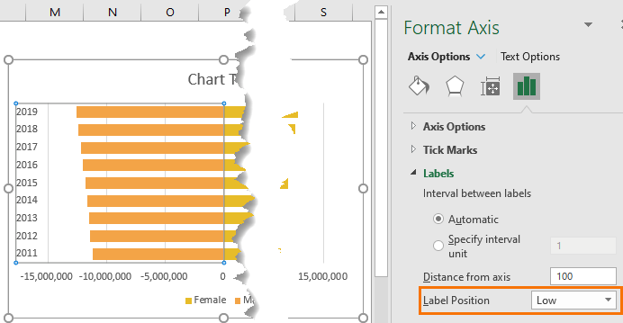
Step 3: Set the vertical axis labels’ position to ‘Low’, which will move it to the left:

chart gap width

Step 4: Set the horizontal axis label number format to hide the minus sign using a custom number format:

chart vertical axis labels

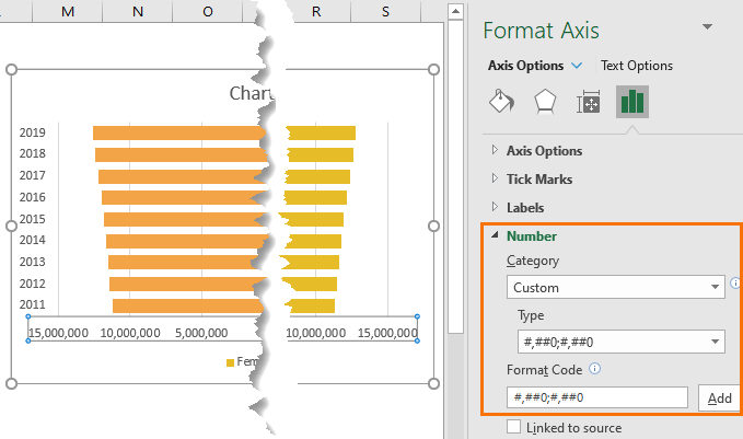
Tip: for large numbers you might also consider scaling the values to millions or billions with a custom number format.

Step 5: If you prefer the pyramid to run in ascending order, change the sort order of the source data, or set the vertical axis ‘categories in reverse order’:

chart axis label custom number format

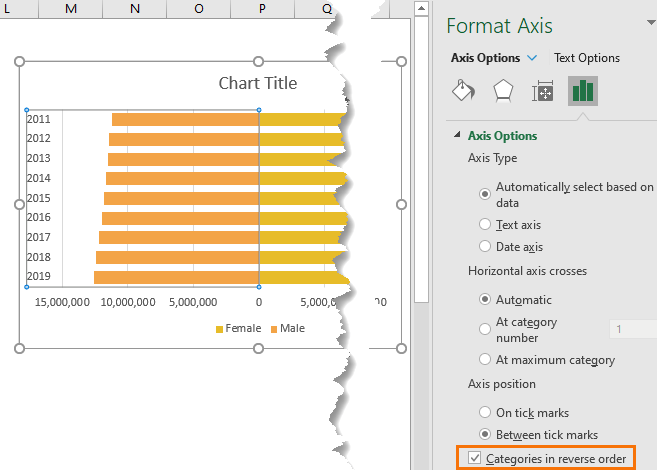
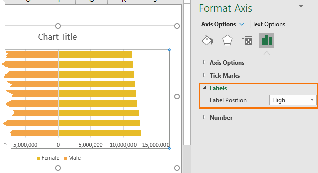
Note: if you check this setting, you’ll also need to change the horizontal axis position to ‘High’:

chart categories in reverse order

Step 6: Finally, give the chart a title and change the colours as desired.

chart horizontal axis position

Option 2: Pyramid Charts using Two Charts

If you prefer the vertical axis labels in the centre of the bars you can use two charts:

excel pyramid charts

Note: For visual instructions please watch the video above. If you’re confident with charts you can follow the written steps below.

Again, the source data requires the left-hand series to be negative values.

  1. Start by selecting all the data and inserting a bar chart.
  2. Set the vertical axis to ‘categories in reverse order’.
  3. And the horizontal axis labels to position ‘high’.
  4. Set the gap width as desired. I like 50%.
  5. Enter a space in the chart title to delete the contents while retaining the space above the plot area for a manual title to be added later.
  6. Move legend to the top if preferred.
  7. Set a custom number format on the horizontal axis to hide the minus signs.
  8. Duplicate the chart (CTRL+D)
  9. Remove the Male series from one and the Female series from the other.
  10. In the Male series chart remove the vertical axis labels.
  11. Resize the charts as required.
  12. Remove the chart outline and fill colour from both charts.
  13. Ensure the minimum, maximum, major and minor units are the same in both charts. Fix them in the Chart Options if required.
  14. Position the charts on top of one another and make sure the plot areas are the same size. This ensures they are both to the same scale.
  15. Insert a text box for the chart title.

Option 3: Pyramid Charts using Conditional Formatting

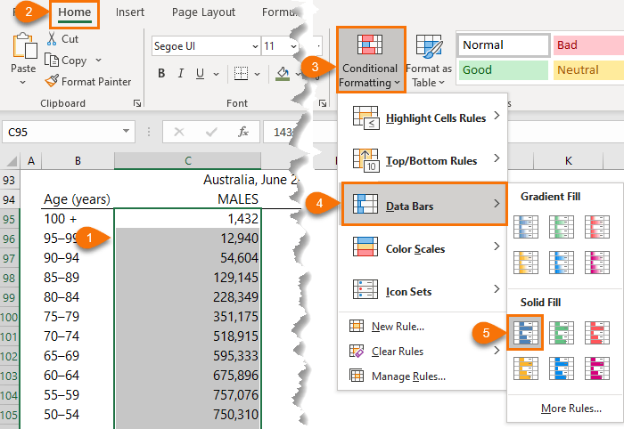
Conditional Formatting data bars are another easy way to create Excel pyramid charts.

With this approach there is no need to convert one series to negative values, as you can see below:

conditional formatting excel pyramid chart data

Step 1: Select the first series (in column C) > Home tab > Conditional Formatting > Data Bars"

conditional formatting data bars

Step 2: Edit the rule: Home tab > Conditional Formatting > Manage Rules. Select the rule in the list and Edit:

edit conditional formatting rules

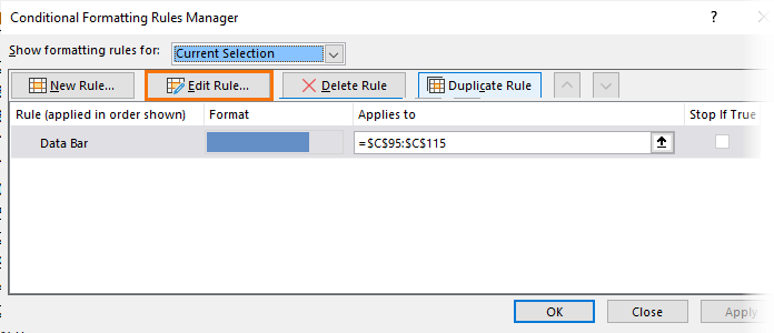
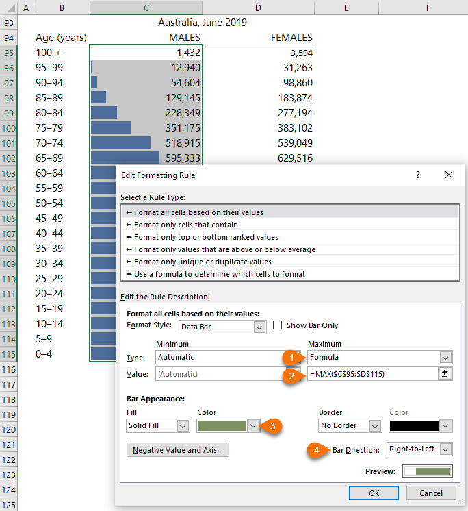
In the Edit Formatting Rule dialog box make the following changes:

  1. Set the Maximum to a formula. We do this to ensure the scale is the same for both Male and Female.
  2. Use a MAX formula referencing the values for both Male and Female.
  3. Change the bar colour as desired.
  4. Set the bar direction to right-to left.

edit conditional formatting rules

Step 3: Repeat step 1 for the Female series.

Step 4: Edit the rule for the Female series except you can leave the bar direction as is.

Step 5: Conditional Formatting data bars don’t have a horizontal axis therefore you may prefer to leave the numbers visible in the cells. If so, I like to algin them close to the centre line, but it’s important that the numbers themselves are still left aligned to one another. You can do this by clicking the Indent button to move the numbers to the left:

align values

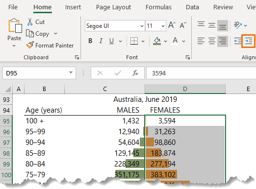
Tip: I also do this for the Male series to move it just off the centre line. And repeat for the column headers.

conditional formatting excel pyramid charts

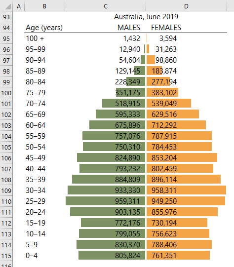
If you prefer the vertical axis labels in the centre of the bars, then it’s easily repositioned by moving them to the centre column in a Conditional Formatting pyramid chart:

conditional formatting excel pyramid charts

excel pyramid chart
Mynda Treacy

Microsoft MVP logo

AUTHOR Mynda Treacy Co-Founder / Owner at My Online Training Hub

CIMA qualified Accountant with over 25 years experience in roles such as Global IT Financial Controller for investment banking firms Barclays Capital and NatWest Markets.

Mynda has been awarded Microsoft MVP status every year since 2014 for her expertise and contributions to educating people about Microsoft Excel.

Mynda teaches several courses here at MOTH including Excel Expert, Excel Dashboards, Power BI, Power Query and Power Pivot.

More Excel Charts Posts

interactive python charts in excel

Interactive Python Charts in Excel

How to build interactive Python Charts in Excel and regular charts with Slicers connected to data from Power Query.
Circle Progress Charts

Excel Progress Circle Charts

How to easily create dynamic Excel Progress Circle Charts, using doughnut charts and some wizardry, including Slicers to change the data.
professional vs amateur chart formatting

Pro Excel Chart Formatting

10 tell-tale signs that show you’re a chart amateur and the Excel chart formatting you should use instead.

Excel Scroll and Sort Table

Excel scroll and sort table using dynamic array formulas is far simpler than the old approach which required multiple tables, formulas and helper columns.
picture fill excel charts

Picture Fill Excel Charts

Using a stylish picture fill in your Excel Charts is a simple way to make your data visualizations more captivating and memorable
excel speedometer charts

Excel Speedometer Charts

How to build Excel Speedometer Charts or Gauge Charts as they're also know, why they are BAD and what to use instead.
burn up burn down charts

Excel Project Management Burn Down and Burn Up Charts

Excel Burn Down and Burn Up Charts are easy to make with line or scatter charts. They are useful for monitoring the progress of a project.
wee people font charts

Excel WeePeople Font Charts

Excel WeePeople Font Charts are a nice change from generic shapes for waffle charts, bar/column charts and more.
excel dot map charts

Excel Dot Map Charts

Interactive Excel dot map charts are not built-in, but with some creative use of Excel’s built-in tools we can create something unique.
Excel S Curve Charts

Excel S-Curve Charts

Easy Excel S-curve Charts made with PivotTables for project management. Track progress by including budget amounts.


Category: Excel Charts
Previous Post:personal share portfolio dashboardPersonal Stock Portfolio Dashboard
Next Post:Sort-By Columns in Power BIsort by column in power bi

Reader Interactions

Comments

  1. James

    May 20, 2022 at 3:40 pm

    Thanks for help me, but i cant make a chart with positif value. Can u help me please?

    Reply
    • Mynda Treacy

      May 20, 2022 at 4:54 pm

      Hi James, please post your question on our Excel forum where you can also upload a sample file and we can help you further.

      Reply
  2. Pouriya

    April 18, 2021 at 4:31 pm

    Its very useful. We can show negative numbers positive in cells by using custom format for Option1:
    #,##0;#,##0

    Reply
    • Mynda Treacy

      April 18, 2021 at 5:18 pm

      Yes, indeed 🙂

      Reply
  3. Jon Peltier

    February 12, 2021 at 2:22 am

    Nice tutorial. I thought I had a way to get a chart like your option 2 but with a single chart to minimize problems with aligning two charts and two axis scales, using primary and secondary axis bars, but the axis labels wouldn’t work the way I wanted them to. I could still do it with data labels, but it becomes very tedious. I haven’t given up, though.

    I’m not a fan of this kind of pyramid (aka tornado) chart, as I point out in my own ancient article, Tornado Charts and Dot Plots (https://peltiertech.com/tornado-charts-and-dot-plots/). Since the bars extend in opposite directions, you get a very neat near-symmetry, but you cannot easily compare the data, which you could with clustered bar charts or dot plots.

    Reply
    • Mynda Treacy

      February 12, 2021 at 8:46 am

      Thanks, Jon! I agree, it’s not my favourite chart for the reasons you cited. Probably should have mentioned those caveats. Let me know if you crack the secondary axis in the middle.

      Reply

Leave a Reply Cancel reply

Your email address will not be published. Required fields are marked *

Current ye@r *

Leave this field empty

Sidebar

More results...

Popular Content

  • 10 Common Excel Mistakes to Avoid
  • Top Excel Functions for Data Analysts
  • Secrets to Building Excel Dashboards in Less Than 15 Minutes
  • Pro Excel Formula Writing Tips
  • Hidden Excel Double-Click Shortcuts
  • Top 10 Intermediate Excel Functions
  • 5 Pro Excel Dashboard Design Tips
  • 5 Excel SUM Function Tricks
  • 239 Excel Keyboard Shortcuts

100 Excel Tips and Tricks eBook

Download Free Tips & Tricks

239 Excel Keyboard Shortcuts

Download Free PDF

mynda treacy microsoft mvpHi, I'm Mynda Treacy and I run MOTH with my husband, Phil. Through our blog, webinars, YouTube channel and courses we hope we can help you learn Excel, Power Pivot and DAX, Power Query, Power BI, and Excel Dashboards.

Blog Categories

  • Excel
  • Excel Charts
  • Excel Dashboard
  • Excel Formulas
  • Excel Office Scripts
  • Excel PivotTables
  • Excel Shortcuts
  • Excel VBA
  • General Tips
  • Online Training
  • Outlook
  • Power Apps
  • Power Automate
  • Power BI
  • Power Pivot
  • Power Query
microsoft mvp logo
trustpilot excellent rating
Secured by Sucuri Badge
MyOnlineTrainingHub on YouTube Mynda Treacy on Linked In Mynda Treacy on Instagram Mynda Treacy on Twitter Mynda Treacy on Pinterest MyOnlineTrainingHub on Facebook

Sign up to our newsletter and join over 400,000
others who learn Excel and Power BI with us.


Company

  • About My Online Training Hub
  • Disclosure Statement
  • Frequently Asked Questions
  • Guarantee
  • Privacy Policy
  • Terms & Conditions
  • Testimonials
  • Become an Affiliate
  • Sponsor Our Newsletter

Support

  • Contact
  • Forum
  • Helpdesk – For Technical Issues

Copyright © 2023 · My Online Training Hub · All Rights Reserved. Microsoft and the Microsoft Office logo are trademarks or registered trademarks of Microsoft Corporation in the United States and/or other countries. Product names, logos, brands, and other trademarks featured or referred to within this website are the property of their respective trademark holders.

Download A Free Copy of 100 Excel Tips & Tricks

excel tips and tricks ebook

We respect your privacy. We won’t spam you.

x