Running a small business or side hustle means keeping track of every dollar that comes in and out. But if you’re still spending hours figuring out your profit or which products sell best, you’re doing it the hard way.
In this guide, you’ll learn how to turn a simple bank statement and point-of-sale data into a fully automated Excel Profit & Loss dashboard, with no complex setup or manual calculations required.
You can grab the free Excel template from the link below and follow along.
Table of Contents
- Watch the Step-by-step Video
- Get the Excel Profit & Loss Dashboard Here
- Step 1: Format Your Bank Transactions
- Step 2: Categorize Transactions Automatically
- Step 3: Add a Monthly Period Column
- Step 4: Build the Profit & Loss Report
- Step 5: Add a Profit & Loss Chart
- Step 6: Analyse Sales by Product
- Step 7: Create a Product Sales Chart
- Step 8: Update Your Reports Each Month
- Bonus: Automate It with Power Query
Watch the Step-by-step Video

Get the Excel Profit & Loss Dashboard Here
Enter your email address below to download the free file.

Step 1: Format Your Bank Transactions
Start with your bank transaction data: deposits from EFTPOS, Stripe, cash, or PayPal, and expenses like stall fees or insurance (entered as negative amounts).
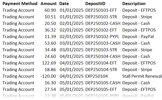
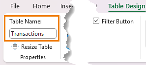
1. Format as a Table:
Select your data and press Ctrl + T. Table Design tab > rename it Transactions.
2. Add Columns for Category and Subcategory:
These will help classify each transaction automatically – see next step.
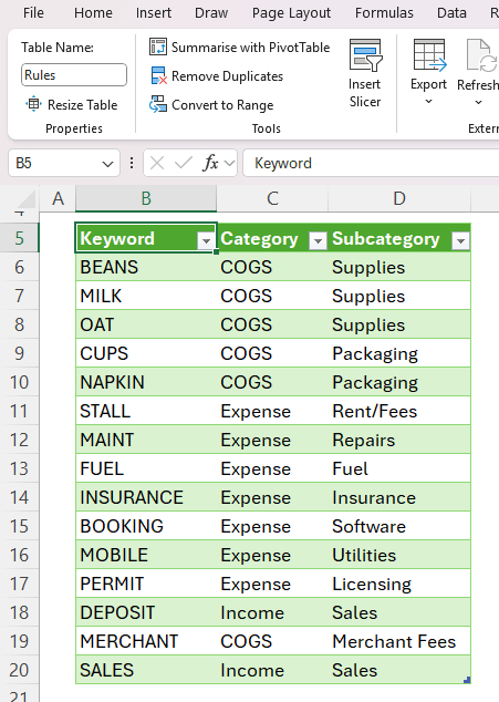
Step 2: Categorize Transactions Automatically
Create a lookup table named Rules that lists:
- Keywords you expect to find in transaction descriptions
- The Category (e.g., Income, COGS, Expense)
- The Subcategory (e.g., Sales, Rent, Insurance)
Back in the Transactions table, use the following formula to assign a category automatically:
=XLOOKUP(
TRUE,
ISNUMBER(SEARCH(Rules[Keyword],[@Description])),
Rules[Category],
"Uncategorised"
)
Then duplicate it for the Subcategory column by replacing Rules[Category] with Rules[Subcategory].
💡 The SEARCH function checks if each keyword appears in the description.
ISNUMBER converts that result to TRUE/FALSE, and XLOOKUP returns the matching category.
Any transactions showing as “Uncategorised” just need a new keyword added to the Rules table. Excel updates everything instantly.
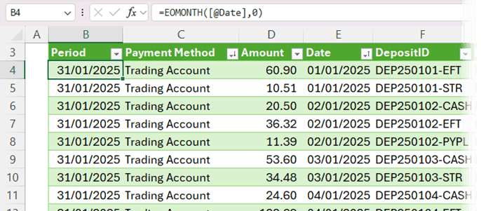
Step 3: Add a Monthly Period Column
To group transactions by month, insert a Period column with:
=EOMONTH([@Date],0)
This formula returns the last day of the month for each transaction date, making your PivotTables much easier to summarize later.
Step 4: Build the Profit & Loss Report
Insert a PivotTable from your Transactions table onto your Analysis sheet (see video for step-by-step).
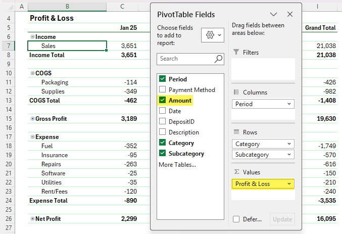
- Ungroup Dates: Press Ctrl + Z if Excel groups them automatically.
- Format Dates in column labels: Right-click a date → Field Settings → Number Format → mmm-yy.
- Tidy the Layout: Remove Grand Totals, add Subtotals, and reorder so Income appears at the top.
- Add Calculated Items:
- Gross Profit/(Loss): =Income+COGS
- Net Profit/(Loss): =Income+COGS+Expense
- Format for Clarity: Bold totals, hide +/- buttons, and apply a clean PivotTable style.
You now have a dynamic Profit & Loss report that updates with one click.
Step 5: Add a Profit & Loss Chart
To make your data easier to interpret:
- Copy your PivotTable and remove the Period field.
- Insert a 2D Bar Chart.
- Clean it up: hide field buttons, remove gridlines and legend, reverse axis order, and adjust bar gap width to 50%.
- Change the bars to green or whatever your theme colour is, and title it Profit and Loss.
Now you’ve got a professional, easy-to-read summary of your financial performance.
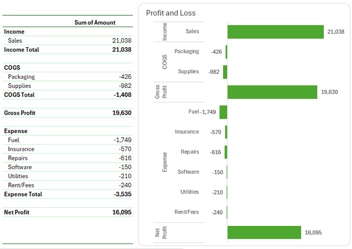
Tip: hide the PivotTable under the chart for a tidy report.
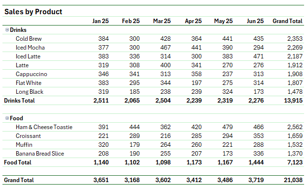
Step 6: Analyse Sales by Product
Download your sales transactions from your POS or online store.
Each record should include:
- Date
- Receipt ID
- Deposit ID
- Item, Quantity, Category
- Unit Price, Gross Amount, Merchant Fee, and Net Amount
- Format as a Table and name it Sales_Items.
- Add a Period column using =EOMONTH([@Date],0).
- Create a PivotTable with:
- Rows: Category and Item
- Columns: Period
- Values: Net Amount
Sort from Largest to Smallest to highlight top-selling products. Format neatly using subtotals, compact layout, and the same style as before.
Step 7: Create a Product Sales Chart
Copy the PivotTable, remove the Period field, and insert another 2D Bar Chart.
- Reverse the axis order
- Set Bar Gap Width to 50%
- Colour bars green
- Title it Sales by Product
You can now easily compare product performance month by month.
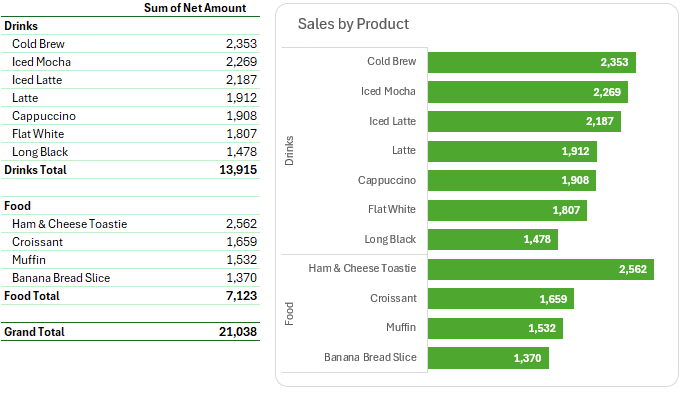
Tip: hide the PivotTable under the chart for a tidy report.
Step 8: Update Your Reports Each Month
When new data arrives:
- Paste new bank transactions under your existing Transactions table.
- Paste new POS data below your Sales_Items table.
- Go to the Data tab → Refresh All (or use Auto-refresh if your Excel version supports it).
That’s it, your entire dashboard updates instantly.
Bonus: Automate It with Power Query
If you want to skip the copy-paste step, you can automate data import directly from your bank or POS system using Power Query. This is exactly what I teach in my
This is exactly what I teach in my Power Query course.


Hi Mynda, your dashboard designs are always so clean and professional! I love how you explained the logic behind the formulas here. As someone who also creates Excel resources and templates, I always find your teaching style very inspiring. Thanks for the detailed video! You can also check my website for excel related articles.
Great to hear you found them helpful.
I enjoy your posts and find them quite educational. But you commented at the end about a personal monitory post. I cannot find the link. Thanks.
Hi Jack,
I’m not sure what you mean by “personal monitory post”, perhaps that is autocorrect at play. At the end of the video, I recommend checking out my personal finance tracker in Excel.
To many distracting adds on the page, remove the unwanted adds and soar with your teachings.
Thanks for your feedback. The ads support our expenses so we can give this to you for free. It sounds like you might be looking at the page on a phone, in which case, it’s better to watch the video, or wait until you can read the blog on a bigger screen.
This is an excellent video and one I will use in my Charity accounting. I do have a question for you though. Does your bank account come with those descriptions of your debits and credits? Or do you add those in as a step before the excel creation? Mine (canada) does not have detailed descriptions such as those.
Glad it’s helpful, Karen. Your bank transactions should have a description of some sort that allows you to identify what the transaction is for, or the information in one column that you can split out to identify the nature of the transaction.
In India bank statements have two separate columns for amounts – Deposis (Cr) and Withdrawals (Dr). How to deal with this
Just add a column that adds them together into one ‘Amount’ column.