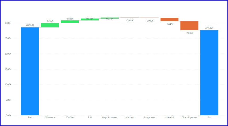
Dear, I am trying to show start and end value in waterfall chart which is by default not possible.
1. I found a solution online but I got somehow a 'blank' column in my breakdown which has a value of -1k, I have no idea where it comes from... This leads to a result that the sum of the breakdown doesn't match with the end value (the blank -1k should not exist).
2. Also how can I custom sort the order from the breakdown categories?
Thanks!
Link from the solution I found:
Hi Yuan,
That's an interesting problem. I can't see what's causing it, sorry.
Mynda
You created a relationship between tables E3 and Breakdown. It seems to create a nameless extra "field" for the sum of all Categories (i.e. 914). Remove the relationship and the (blank) will go away and the End column will be correctly lined up with the previous one.

Thanks! That works! Do you perhaps know how can I custom sort the order from the breakdown categories?
No, don't know how to custom sort. But isn't the whole purpose of a Waterfall Chart to display the categories in their order of significance? No expert on that subject, though.
Thanks Riny! I get your point but the end user (CFO) has a preference to see the same order of categories which is the same used in all reports...
Sorry, I'm not aware of the ability to sort inside a Waterfall Chart (WC) like in your example.
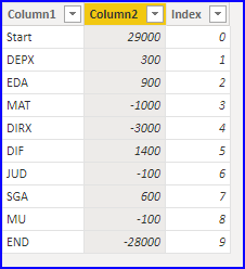
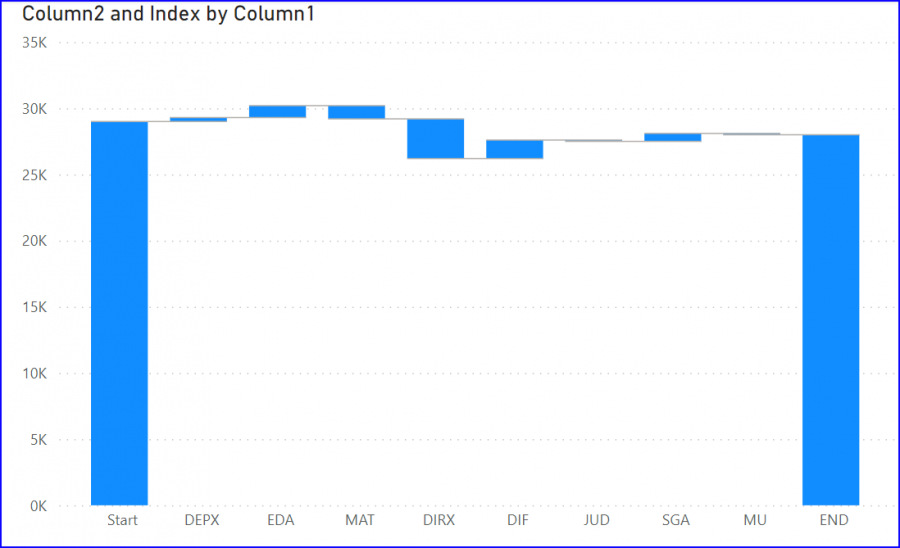
What you can do, however, is create a chart without the fancy SWITCH statements and just base it on a table with three columns. Categories ordered as you wish, Values and an Index.

Then, create a regular WC. Categories in the Category field, Values in the Value field and Index into the Tooltips filed. This adds the Index number to the sort options and you can create a WC with categories ordered by their index number. Something like this:

Hi Riny, thanks a lot for your reply!
Indeed, that was my solution 3... For that solution, they criticize the coloring. So they want the start and end using one color, increase one color and decrease for one color. (If I show decrease as a different color, the end will be also shown as decrease color which is not ok).
My option 1 which is so far the best solution for the end user is: excluding 'end' data in the table then I could use 'total' as end and use the same color and start and increase (blue), decrease (orange). I had to add a text box and change name as 'end' and cover it at the chart location for 'Total'... I could use custom sort here also. so drawback maintained: fake label using text box for end (which is not a big deal for the end user...), same color for start & end and increase...
I see. Then I'm afraid I can't help you any further.
Thank you Riny for your help!

