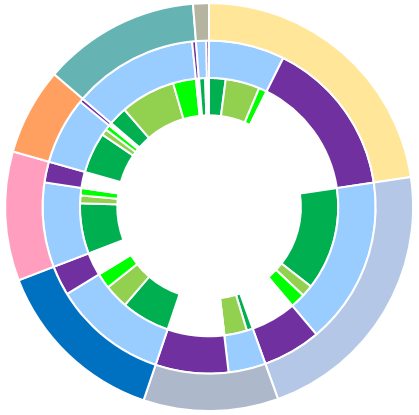
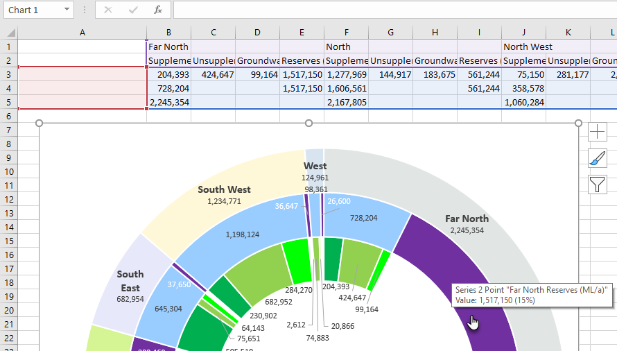
Hi . . I used the data in the attachment to create this nested sunburst, but I'm having difficulty with (nesting / data labelling ?) to create an effective mouseover display of the data label. The outer circle (QBWOS region) works ok, but not the inner circles (Entitlements and reserves, Source classification).
Thanks for any advice!

Hi Ian,
Welcome to our forum. I'm not really sure what you're trying to do, sorry. I don't see any difference between the tooltips that appear when you hover your mouse over the inner segments compared to the outer segments.
Could you give us an example of what you're seeing vs what you'd expect to see?
Mynda
hello Mynda . . thanks for responding!
What previously occurred is that the inner rings registered nothing more than, say, "Series 1 Point 1".
In the excel file I'll attach to this comment, please refer to the manually labelled chart on the left. I've named the three series now ( a good start to the desired mouseover), but I'm still unsure how I name the points within each series.
For example, in the middle ring, starting at 12 o'clock, there are two datapoints sitting under the Far North region. I wish they'd read 'Entitlements' and 'Reserves', respectively. But, as you'll see, they read as 'Series "Entitlements and Reserves" Point "Far North"', and 'Series "Entitlements and Reserves" Point 4'.
Is there a way I can name the individual datapoints in the middle and inner rings/calculate-longest-series of the chart please?
Thank you! I really do appreciate any advice you may have!
Ian 😀
Hi Ian,
The tool tips that appear when you mouse over the segments come from your source data. If you expand the Horizontal Category Axis labels to reference A1:AG2 (right-click chart > Select Data > edit horizontal category axis labels), it will include the labels in row 2 of the worksheet. You can then delete the labels in column A if you want make sure the tooltip doesn't get truncated.

Mynda
