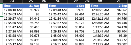
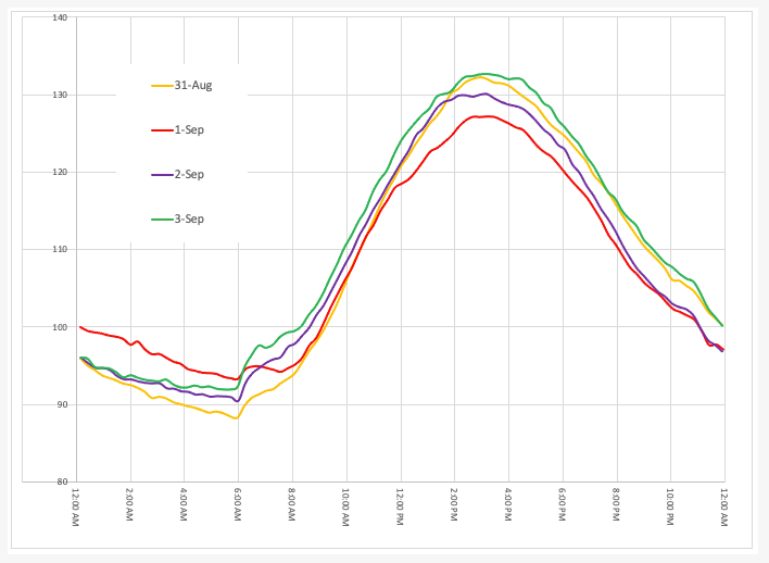
Greetings. I'm trying to chart the data from a temperature sensor in a repeating 24-hour chart, like in the attached. Currently, I'm collecting each day's data into separate 2-column time and temp tables, and then adding the day's day via the "Select Data Source" function. I am hoping there is a way of automating this by creating a single 3-column list (date/time/temp), and then just adding each day's data to the bottom of the list and having the chart auto-update.
From what I've Googled, is seems Pivot Table/Pivot Chart solution, but I can't figure out the time grouping, or how to plot the actual data vs summed or averaged data.
Any help is appreciated.


Hi David,
Welcome to our forum!
Yes, you can structure your data into a 3 column table. Use a PivotTable to summarise the data by date and time and then plot in a Pivot Chart.
If you're stuck, please upload a sample Excel file where we can provide you with an example.
Mynda
Mynda, Thanks for the quick reply!
3 days of sample data is attached, along with my attempt at a Pivot Chart. It appears to be plotting the average temp over each hour, which isn't too bad. But I would prefer to a line/scatter plot of the actual data.
Dave
Hi David,
You're on the right track.
If you prefer to have actuals, you'll need to remove the duplicate data on 23rd August at 6:23PM, 8:30PM, 9:33PM and 8:46PM. Then you can change the summarisation to SUM instead of AVERAGE, and remove the grouping for the time field.
You'll need to edit the chart data source (right-click > select data) and click on Hidden and Empty cells and change 'show empty cells as:' connect data points with line.
See attached.
Mynda
