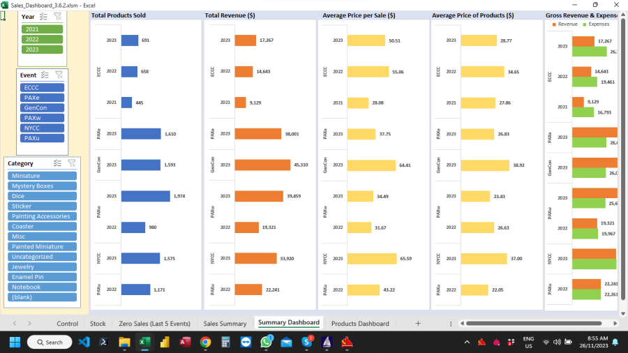
I am attaching a sample file of the chart (plus the Data Table, Pivot Table and slicers) that needs customised grouping, if even possible.
In my actual file the Sales Data Table is created from many csv files in Power Query (loaded as a Pivot Table and added to the Data Model). The 3 slicers in the actual file are also tables in the Data Model with particular "Sort Orders" but that should not affect the customisation of the chart I am trying to achieve.
The customisation required is to have each Event (ECCC, PAXw, PAXu, NYCC etc.) grouped together and the specific year of each (ECCC 21, ECCC 22, ECCC 23, PAXw 22, PAXw 23 etc.) grouped together with Sales still in descending order. There should be a separation between each Group that is twice the space between each member of the group.
I hope that makes sense! Any suggestions greatly appreciated.
TIA
Perhaps the attached file does what you asked for. Use 'Event no year' and 'Year' as row labels in the PT in stead of 'Event'. That will group the PT and chart first by event and then by year. The groups are then separated by a marker. Not sure if you can define anywhere that the groups should be separated by an exact amount of white space, though.
If this makes no sense, please come back here and clarify what you need.
Many thanks.
My actual file can have up to 7 Events per Year and 4 years. So the chart will fill up pretty quickly of all slicers are cleared. That is why I was hoping for a defined gap between each Group. However the 2 Row Fields and the marker should be just fine.
I will apply what you have done to the actual file and see how it goes!
Thanks Again.
Great!
It works great!
I am attaching a screenshot of the actual dashboard. At the moment there is limited data (and most "expenses" is dummy data).

