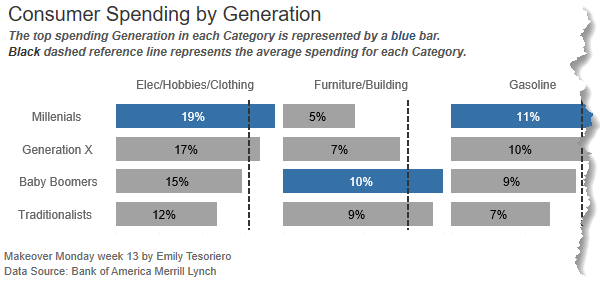
In this post I’m going to show you a way to create an Excel bar chart with a vertical line. The inspiration was taken from this Tableau chart by Emily Tesoriero:
Unfortunately, adding a vertical line to a bar chart isn’t a simple feat in Excel, but I’ll step you through a workaround that’s relatively painless.
Download Workbook
Enter your email address below to download the sample workbook.
Creating an Excel Bar Chart with Vertical Line
Watch the Video
Step by Step Written Instructions
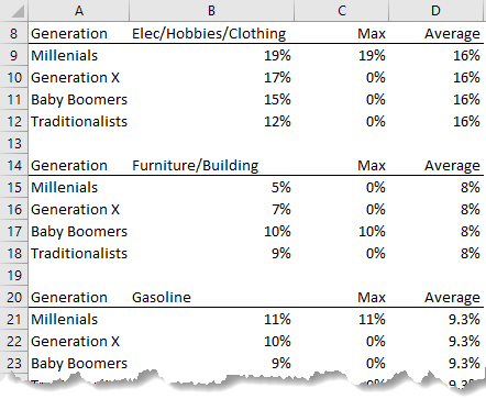
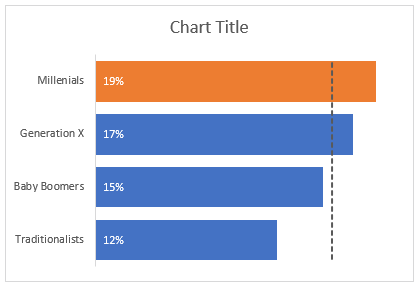
My data is split into separate tables for each spend category and I have 3 value columns; the actual spend by generation (column B), the maximum and the average:
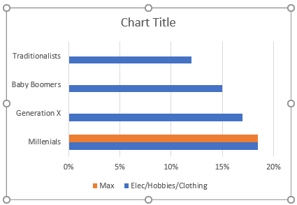
Step 1: Insert a Bar Chart
Taking the first category; Elec/Hobbies/Clothing, select cells A8:C12 > Insert tab > Bar Chart. It should look like this:
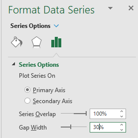
Step 2: Overlap Series and Set Gap Width
Single left click one of the series (bars) in the chart to select them > CTRL+1 to open the Format Chart Area (or right-click). Set the series overlap to 100% and the gap width to 30%:
Step 3: Add Data Labels
Select the blue bars (single left-click) > click on the + icon > Data Labels > Inside Base:

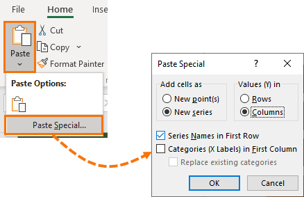
Step 4: Add the Vertical Line
Select cells D8:D12 containing the Average header and values then CTRL+C to copy. Left click the outer edge of the chart to select it > Home tab > Paste drop down > Special:
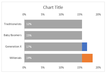
It should look like this:
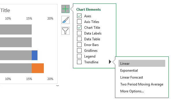
Step 5: Add a Trendline
Select the grey bars (left click once) > click the + > Trendline > Linear:
Note: if the two horizontal axes don't end at the same maximum value, edit them to suit. It's important that the scales are the same, otherwise the average line won't be in the correct position.
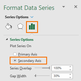
Step 6: Switch Axis and Hide the Average Series’ Bars
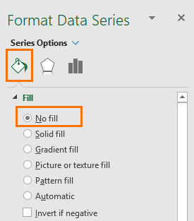
Left click the grey bars > CTRL+1 to open the Format Series dialog box > on the Series Options tab > Secondary Axis:
On the Paint tab > set the fill colour to ‘No Fill’:
You should be left with a pale grey dotted trendline and an extra axis on the top:
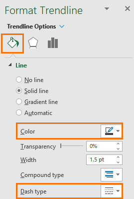
Step 7: Format the Trendline
Left click the trendline > CTRL+1 to open the format pane. In the paint bucket tab set the colour to a dark grey and change the dash type to suit your preference:
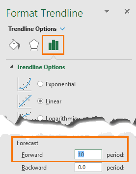
Step 8: Extend the Trendline
We want the trendline to start and finish in line with the top and bottom bars. To do this, go to the Options tab and set the ‘Forecast’ Forward 10:
Step 9: Formatting
Let’s do some tidying up:
- Select the bottom horizontal axis > press DELETE.
- Repeat for the top horizontal axis.
- Left click to select a gridline in the chart > press DELETE.
- Left click to select the legend > press DELETE.
- Left click to select the labels > format font white.
- Left click on the vertical axis > CTRL+1 to open the Format Axis pane > check the box ‘Categories in reverse order’:
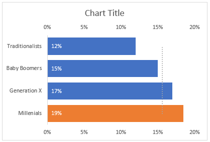
It should now look like this:
Step 10: Chart Title
Left click the chart title > click in the formula bar > type = then left click on cell B8 containing the spend category. This will link the chart title to the text in cell C8.
Step 11: Rinse and Repeat
Repeat the above steps for the remaining spend categories. Tip: copy the chart and edit the source data (right-click > Select Data to open series dialog box where you can change the cell references).
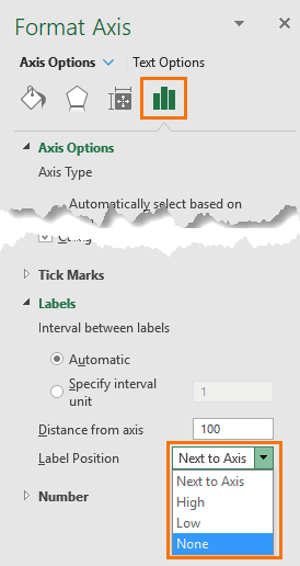
Step 12: Hide Vertical Axes on Subsequent Charts
Left click the vertical axis > CTRL+1 to open format pane > Labels > Label Position > None:
Align them close together so they can share the vertical axis of the first chart.
Step 13: Create a Legend
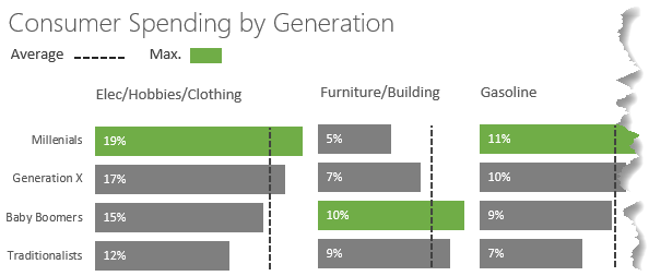
I don’t like the built-in legend for Trendlines, so I created my own legend using Shapes available on the Insert tab. Here is my finished result:

The video gives us very clear idea to create bar chart it is very helpful for me.
hi Treacy,
I’m a big fan of your YouTube channel.
Quick question, can I use this technique to highlit my top in-flight projects. the idea is the show the top 5 or 10 most progressed projects based on their progress and duration in time.
As you may know, such reporting is really tricky in Excel and requires high maintenance with not such satisfying results (Gantt charts ) are rarely communicative to business leaders.
I hope my question can trigger some creativity from your side and look forward to your next video/ tutorial.
You can use another series in your chart to highlight the top n values. This post explains how to highlight the min and max in charts, but you simply modify the formulas to return the top n. I hope that points you in the right direction. If you get stuck, please post your question and Excel sample file on our forum where we can help you further.
Is it possible to use this technique in stacked bar chart? I can get it to work with XY Scatter but wanted to see if possible this way.
No. Unfortunately, there’s no option to add a trendline in a stacked bar chart.
Great work! And a great work-around! 🙂
Definitely filing this one for reference!
Thanks, Stephen! Glad you’ll find it useful.
Great tutorial – many thanks!
Thanks, Robert!