Last week I wrote about how I used Excel to design a Minecraft cake. The response to that post was bigger than I expected and it was nice to know that many of you use Excel for extraordinary things too.
One of the emails I received was from my friend and Excel extraordinaire, Roberto Mensa of Excel Blog E90E50 with this adaptation of the Minecraft cube as a 3D report matrix.
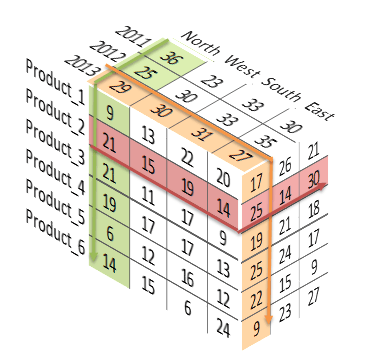
It certainly jazzes up the usual boring old financial statements. Here’s what they looked like before (am I showing my age saying ‘jazzes up’? Perhaps ‘pimps up’ is more 2014, or is that old now too…oh, forget it):
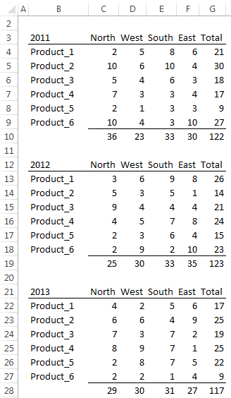
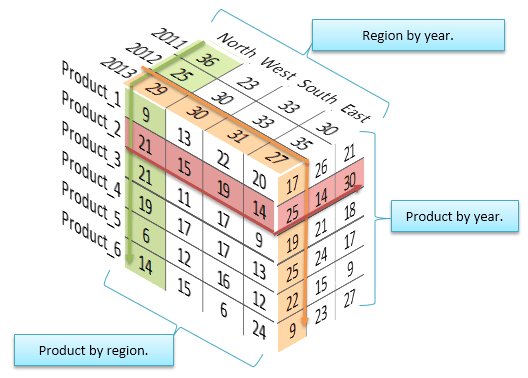
Now we can view the totals from different perspectives (no pun intended ;-)):
I know this cube can’t replace the more detailed financials but it’s an interesting way to display the data at the summary level.
Of course you can use different summary levels that relate to your business. For example, divisions, salespeople, quarters etc.
How to Assemble 3D Reports
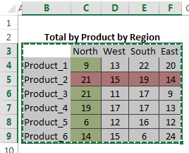
It’s fairly straight forward to create a 3D financial report like the one above. Each visible side of the cube is a table in your workbook. Here are the 3 you can see in the cube above:
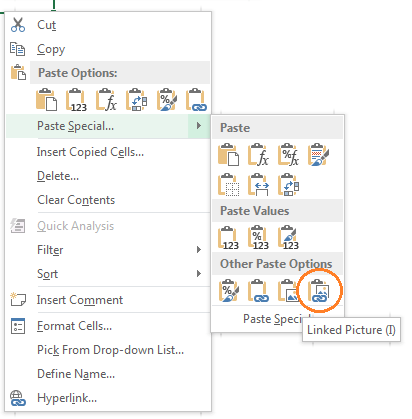
You then select one range at a time and press CTRL+C to copy the range to the clipboard:
In the Paste Special menu choose Paste Linked Picture:
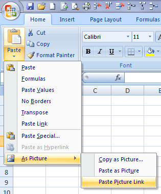
In Excel 2007 the menu for pasting a Picture Link is slightly different:
Note: Unfortunately in Excel 2007 you cannot apply the 3D effects to the linked picture so that's as far as you can go 🙁
Tip: the great thing about using a Linked Picture is if any of the values or formats in the table change you will see them instantly update in your cube too. No need to copy the table again.
Pasting the range of cells you copied as a linked picture results in an image that is an object which hovers above the cells of your worksheet, in the same was as picture does.
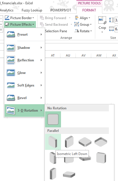
Next use the Picture Effects (Picture Tools > Format menu) on the Ribbon to apply 3D effects to the image:
Rinse and repeat for the other two tables/sides of your cube.
Enter your email address below to download the sample workbook.
Thanks
I'd like to thank Roberto for allowing me to share his idea with you.
If you'd like to see more of Roberto and the Frankens Team's work I highly recommend you take a few moments to browse their site.



Wow! I like that this “cube” is actually using the “live” table data and formats. Very nice!
Thanks John
WOW!
Love it! Just set up last 5 years of results by quarter and result and the cube is fabulous and so easy using your template. Thank you for your generosity in sharing the latest and greatest!
Wow! This is cool! Reminds me of playing with a rubik’s cube back in the 80s.
🙂 it sure is different. Glad you like it, Kevin.
When I saw this – I was so excited (such a geek) with the prospects of reporting some of the most boring figures imaginable (currently our business uses pages and pages of tables that don’t relate) – this format brings together the key elements of numbers in different dimensions, to view as a single entity – so I wholly disagree with Frans Van Zelm on all his points.
Obviousle, lots of businesses are stuck in the dark ages and still using excel 2007, but there’s a way to make it work. First draw your cube elements with normal shapes and rotate as required. Then using the method in the first part create seperate pictures. To make this dynamic – it should be a simple case of using a little VBA to reset the ‘fill’ element of the shape to the clipboard (copy the resulting ‘picture’).
Cheers, David. Glad you’ll find it useful.
Good Job Mynda, this is new trick in reporting, I like it and will try myself too…. I will surprise my boss :-)…thanks for sharing and one thing am regular reader of your newsletters
Thanks, Khurram. I’m pleased you like it.
I hope your boss does too 🙂
Mynda.
Data doesn’t need to be “jazzed up” to make it useful and 3-D representations are the least effective methods of presenting data.
Cheers, John.
Sounds like you’d put 3D charts in the same bin as pie charts 🙂
What’s interesting is that based on the social likes this post is very popular.
I think the 3D effect allows for quicker comparison of the different dimensions at a total level than you can get with the ‘boring financial statements’. While that may not be relevant in every industry it seems some people will find it useful.
Cheers,
Mynda.
“What’s interesting is that based on the social likes this post is very popular.”
Sadly, good data representation has not really caught on in popular opinion 🙁 It seems flashy and pretty win out over useable. For me, personally, I would find the three-chart approach more useful, and some sort of visual representation significantly more engaging. This is a really cool trick, but I look at it and have a hard time getting any insights from it — or indeed, even wanting to *try* to find any insights. Though really, perhaps there is no “perfect” way to show data with two degrees of freedom. This is where dynamic solutions come in — allow you to select which two to compare and generate a graph on the fly.
Just thinking out loud here… one way where this type of data representation could really shine is if you used dynamic conditional formatting… have a dropdown for Product, Year, and Region, then highlight each row/column (along with its label) as red, blue, and yellow, respectively. The product/year intersection would be purple, product/region would be orange, and year/region would be green. Hrm, then again, maybe that idea is pretty terrible! 🙂
Hi Bryan,
Thanks for joining in the discussion.
I agree that good data visualisation is yet to catch on. There’s still far too much use of chart junk and the like. Perhaps this 3D chart falls into that category too. What seems to be a constant challenge for the data analyst is producing reports that ‘look appealing’ to management who aren’t naturally ‘numbers people’, and yet still meet good design criteria.
I constantly hear from members who insist on using pie charts and the like because their manager thinks they look good, or they make their report look appealing and therefore draw the reader in. Both aren’t good enough reasons for me to use a pie chart, but I think in the real world that’s what some are up against.
I suspect this 3D chart meets that need for making reports look good on the surface. Whether anyone finds it useful remains to be seen. Perhaps your conditional formatting idea will take off too 😉
Mynda.
Unfortunately, I have run into the situation where a superior wants you to do something in a way that just isn’t the best way to do things :-/ This 3D table definitely gives the boss his/her “wow factor”! (And as we know, the bosses don’t actually *use* the graph anyway, so it doesn’t matter if it’s not useful…)
Jorge Cameos posts a lot about “real world” vs “best practice” (or at least he used to… looks like he hasn’t written a post in a while). I think I read an article of his where he recommended incremental changes to “teach” your supervisor. So instead of changing the entire pie chart to a bar graph start by removing redundant labels, then by changing the rainbow color to one color with different shades, etc.
Hi Bryan,
Thanks for sharing Jorge’s tip. I like that idea.
Cheers,
Mynda.
thank you so much for you recent 3D report which was fantastic and good luck for you all
Glad you liked it, Mano 🙂
Hi Mynda,
You created something pritty. Never thought of the possibility. Yet I don’t think it is the proper way to present data.
– It takes quite a lot of work.
– It doesn’t show all available data (in bigger sets even less).
– It is pictural but doesn’t picture out the values like in a chart.
– Always combine all data in one list for analysis (as you write in some other blog).
I’ll look around on your site: the trick in reference edit boxes is bingo!
Cheers, Frans. I agree, it’s more like a 3D table than a graphical representation of the data like a chart, and quite a bit of work to set up.
Mynda.
Very nice and amazing thing new innovation in Excel Reporting
I really appreciate.
You’re welcome, Shahnawaz 🙂
Hi Mynda,
Thanks for the great article, I can see lots of uses in our organisation for this method. I have a question though, I cannot get the picture tools menus to appear after paste special, picture as link in Excel 2007 so I am unable to rotate the images. Is this a feature of later releases?
Regards Chris
Cheers, Chris.
In Excel 2007 you need to select the Linked Picture that you just inserted > select the ‘Picture Tools: Format’ menu from the ribbon > in the Picture Styles group select ‘Picture Effects’ > 3-D Rotation.
Let me know if you’re still stuck.
Kind regards,
Mynda.
Hi Mynda,
Have tried again but still appears that the Picture tools don’t appear when linked picture is selected but do for ‘normal’ picture. Tried on Excel 2010 and all works OK so perhaps this is an Excel 2007 ‘feature’.
Regards
Chris
Hi Chris,
Right you are. Looks like you need Excel 2010 for this trick 🙂
Mynda.