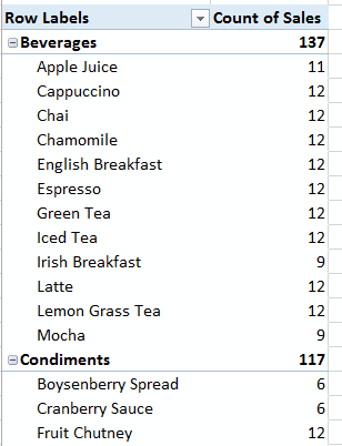
In Excel 2007 Microsoft thought they’d get clever and impose nested row labels in our PivotTables:
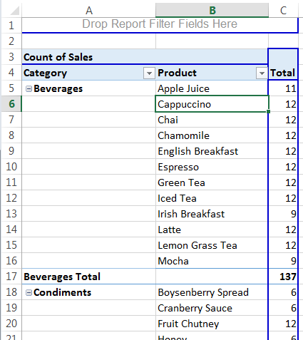
If you’re a PivotTable old-timer like me then you’ll most likely wish you could have the classic PivotTable default layout back:
Turn On Classic PivotTable Default Layout
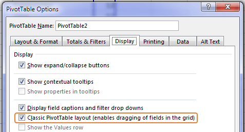
The retro Excel 2003 looking PivotTable above is still available in Excel 2007, 2010, 2013 and 2016. You just have to enable it in the PivotTable Options (right-click PivotTable > Options) > Display tab > Classic PivotTable Layout:
If you go back into the PivotTable Options and uncheck the ‘Classic PivotTable Layout’ you’ll find the tabular format sticks and the retro blue lines around your PivotTable are gone.
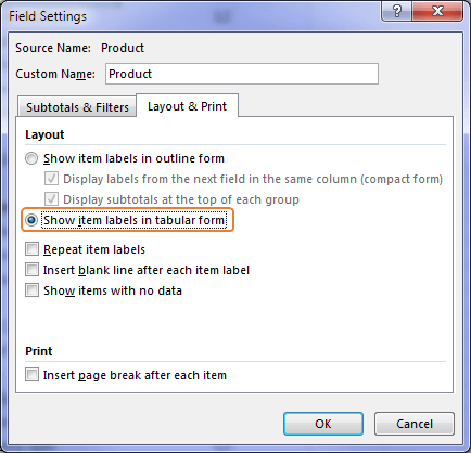
Alternatively you can set each of the row labels Field Settings > Layout & Print > ‘Show item labels in tabular form’:
But this is a lot more work if you have many row labels since you have to set this individually for each one. It’s easier to apply the Tabular layout using the ‘Classic PivotTable Layout’ option as this automatically selects the ‘Show item labels in tabular form’ for each field.
Classic PivotTable Default Layout Shortcut
Tip: if you find yourself choosing the Classic PivotTable Layout regularly then you can go ahead and add the ‘Show in Tabular Form’ icon to your Quick Access Toolbar. And while you’re there you’ll probably want to add the ‘Do Not Show Subtotals’ icon too (after all, it doesn’t cost any more to add both of these icons 😉 ):


Is there something similar to pivot tables in Power BI? I’ve been looking for this for a long time. Thanks!
Hi Francisco, Not exactly, but you could try a regular ‘Table’ in Power BI or a Matrix Table. Mynda
What’s the advantage of the Classic lay-out? Is just a question of taste or is there something it does better than the “new” lay-out?
Hi Peter,
The Classic Layout is in more of a tabular format where there is one column for each item and this is useful when working with formulas related to the PivotTable etc., whereas the new report style layout has nested row labels which means one column could have multiple fields and this can make it difficult to work with.
If you just need your PivotTable for a report then the new layout is fine, it’s more for when you want to perform further analysis on the PivotTable that it becomes annoying.
Mynda
OK Mynda, I understand. It might be an idea to add that comment to the spiel above, because you just state that the classic lay-out is for “old-timers” like you. But that is not the whole story as there is another reason too, as you point out.
A lot of times when I go to your website, despite the fact I work in MS Excel all the time, I realize that I am an outsider and not a member of the club. You guys are so immersed in your Excel world you have no clue that outsiders need a few more directions.
Let me illustrate: How to change a flat tire. Remove the lug bolts; take off the flat tire, put on the new tire; tighten the lug bolts. Still struggling to get the flat tire off? Oh, I forgot to tell you to jack up the car.
I said all that to point out, it took me 15 minutes on Google to find the Pivot Table Options menu.
And I have read Alan Wyatt’s Book on “Pivot Tables for the Faint of Heart. It is a confusing book with a lot of omissions for the newbie. No one if the office could tell me why I got the wrong dates when I opened up his workbook. I finally found the “Refresh” button after a month. Yeah, jack up the car. I made a lot of suggestions for his book, but I still have not sent them. I doubt if he would care anyway since he is so far above my level.
So I said all that to cry out: Why didn’t you tell me at the beginning to bring up the Pivot Table Options Menu by placing your cursor on any cell in the pivot table and right click?
I am having the same type trouble following your Excel Slicer Trick. Wow, there were a lot of omissions there also. I am still struggling with the hidden pivot table. But once I figure your stuff out it is worth it?? Like Livingston upon being shown Victoria Falls. “Yes it is worth seeing, but not worth going to see.”
Hi Ted,
The Options menu is fundamental to knowing how to use PivotTables, which is the level this post was pitched at, i.e. people who know how to use PivotTables learn where the Options menu is very early on in their learning journey. I can’t start at the beginning with every post so I have to assume a certain level of knowledge otherwise they would be too long. I’ll add a note about how to open the Options menu, BTW you’ll also find it on the PivotTable tab on the Ribbon which is active anytime you have a cell in a PivotTable selected.
It sounds like you need to start at the beginning with PivotTables and I highly recommend this comprehensive PivotTable course that doesn’t leave any stone unturned. And if you’re quick you could catch our free PivotTable webinar which ends Monday April 18, 2016.
Mynda
Hi Mynda,
Is there any difference between the classic default layout tips above and just using the “Show in tabular form” option under Report layout on the Pivot Tables – Design tab? The latter would appear to be less clicks (but not as quick as the QAT tip!). Am I missing something?
Hi Paul,
It’s the same setting in fact, you can change that setting from the Design tab in ribbon or in Pivot Table options. As usual, the most frequently used commands are displayed in the right click menu too, not only in the Pivot Table Tools tab from ribbon.
Same thing is for worksheet cells: in the right click menu, you can see commands from different Ribbon tabs: Format Cells (from Home tab), Define Name (from Formulas Tab), Hyperlink (from Insert tab)
Cheers,
Catalin
I found that if I actually add the number field before anything else that seems to lessen the occurrence of the cursed Count. Another thing that I find annoying is that if I want to group by figures e.g. currency or percentage, I either have to manually change the numbers to show currency or percent or locate a macro to do the same…grrr…another thing that’s annoying is how if you add a new item it doesn’t automatically go in the list in its correct alphabetical position – instead it just plonks itself at the end. 🙁
Hi Anne,
PivotTables sure do have some annoying features. The number formatting is one of my biggest too. You should check out this PivotTable add-in as it makes working with PivotTables and their annoying features less of a pain by reducing the number of clicks required set your preferences etc.
BTW, in my experience if there are any empty cells in a values column it will count the results irrespective of the order you add the field to the PivotTable. I suspect if it’s returning a SUM then there aren’t any blanks in your column.
Mynda