Designing dashboards and reports can be a time consuming task, particularly if you’re not artistically inclined. In 60 seconds, AI generated four dashboard designs for me for free! All I had to do was give it a sentence worth of instructions and it returned the four bicycle sales dashboards you see below. I think you’ll agree they’re super eye catching and make you want to take a closer look, which is half the battle in getting your audience to read your reports. We’ll talk about the (more important) other half of the battle later.
Watch the Video

How to Generate AI Dashboard Designs
Everyone is talking about ChatGPT which provides text based AI answers to questions. ChatGPT also has a sister service for generating images called Dall E. Unfortunately, it generates dashboard images that look like they were made in 1985, as you can see below:
Thankfully, Midjourney is more up to the task, although not without limitations either and I’ll talk more about that later. With Midjourney you simply describe in words what you’d like, and it spits out four ideas. From there you can ask for variations of a design, or simply ask another question, tweaking the instructions to get your desired result.
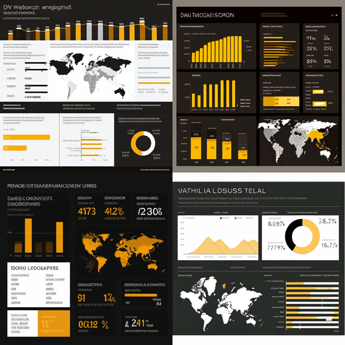
My first attempts were ok. I started asking it to create a
“Microsoft Excel dashboard report for coffee company displaying monthly sales data over 1 year with 6 different charts”
and in 60 seconds I got these 4 images, which are ok, but not amazing:
Notice it has used shades of brown in keeping with the coffee theme, but most of the dashboard images have ignored the instructions to include 6 different charts.
So, I thought maybe Power BI dashboard designs will be better, so I asked it for a
“Power BI dashboard for tracking global clothing company sales and distribution data”
and got this:
It’s better than the Excel dashboards and in the absence of anything specific in my request it appears to have taken inspiration from the Power BI logo for the color scheme.
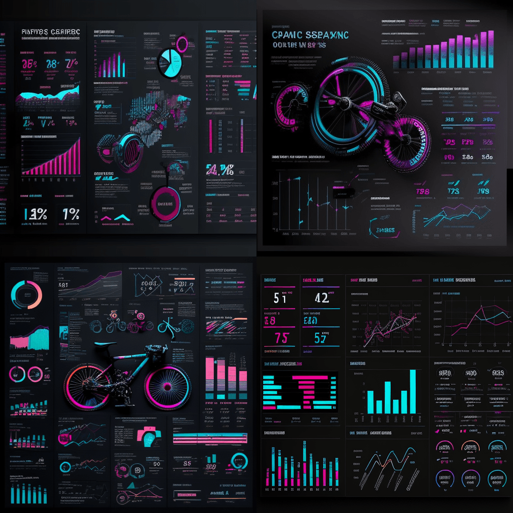
Then I thought I’d omit the application name altogether from my request and see if I can get something more eye catching by specifying a color scheme, so I asked it for a
“dashboard report displaying different types of charts and visuals for a bicycle company's sales and distribution data kpis using a dark color theme including bright blue and pink”
It returned this:
You can see that the more descriptive you can be, the more likely you’ll get something elaborate and closer to what you’re after.
How to use Midjourney for Dashboard Design
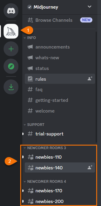
Midjourney uses Discord to deliver the images which seems a bit odd, especially if you’ve never used Discord before (my teenage sons will be rolling their eyes at me should they ever read this).
After signing up for an account, select one of the Newcomer rooms for Newbies:
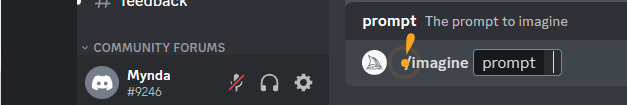
To generate an image, type /imagine in the chat window and the press enter. This will open the prompt field where you type the image description you’d like created:
You get 25 designs for free, which go very fast because it generates 4 images at a time! Their basic plans start at US$8/month.
Effectiveness of AI for Dashboard Design
No doubt you’re excited to give AI a try for designing your dashboards and reports, but before you go all in, let’s understand the limitations.
The good news is there’s nothing in these designs that can’t be achieved in Excel or Power BI. However, if we take a closer look at one of the dashboard designs you can see it’s very light on details. It contains a load of pretty visuals that have no substance, as well as what appears to be piles of bike parts that will serve no purpose in a business report. Also, the bike in the middle is taking up some prime dashboard real estate, so you probably wouldn’t keep this.
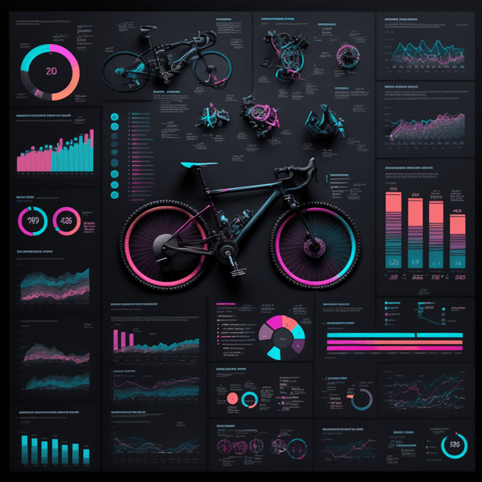
At best, we can use this design for color inspiration (assuming your audience aren’t color blind). The contrasting boxes behind each visual nicely segregate the data, and the blue or pink font for the chart titles with grey labels complement the colour scheme.
Don’t be tempted to create charts to match those in the design. The prime driver of the visuals you include in your reports should meet the business purpose of the dashboard. If you’re displaying data over time, then use a line or column chart. If you’re showing parts to a whole with 3 or less segments, use a pie or doughnut chart. If your categories have long labels, use a bar chart etc. I cover more on chart best practices in my Excel Dashboard course.
The bottom line, have some fun getting ideas for your reports from Midjourney, but don’t use it to inform decisions on what charts to include in your dashboard. And certainly, don’t include charts for the sake of art. The objective of a dashboard report is to allow your users to interpret the data at a glance. Adding superfluous data is only going to waste everyone’s time.