• Skip to main content
  • Skip to header right navigation
  • Skip to site footer

My Online Training Hub

Learn Dashboards, Excel, Power BI, Power Query, Power Pivot

  • Courses
  • Pricing
    • Free Courses
    • Power BI Course
    • Excel Power Query Course
    • Power Pivot and DAX Course
    • Excel Dashboard Course
    • Excel PivotTable Course – Quick Start
    • Advanced Excel Formulas Course
    • Excel Expert Advanced Excel Training
    • Excel Tables Course
    • Excel, Word, Outlook
    • Financial Modelling Course
    • Excel PivotTable Course
    • Excel for Customer Service Professionals
    • Excel for Operations Management Course
    • Excel for Decision Making Under Uncertainty Course
    • Excel for Finance Course
    • Excel Analysis ToolPak Course
    • Multi-User Pricing
  • Resources
    • Free Downloads
    • Excel Functions Explained
    • Excel Formulas
    • Excel Add-ins
    • IF Function
      • Excel IF Statement Explained
      • Excel IF AND OR Functions
      • IF Formula Builder
    • Time & Dates in Excel
      • Excel Date & Time
      • Calculating Time in Excel
      • Excel Time Calculation Tricks
      • Excel Date and Time Formatting
    • Excel Keyboard Shortcuts
    • Excel Custom Number Format Guide
    • Pivot Tables Guide
    • VLOOKUP Guide
    • ALT Codes
    • Excel VBA & Macros
    • Excel User Forms
    • VBA String Functions
  • Members
    • Login
  • Blog
  • Excel Webinars
  • Excel Forum
    • Register as Forum Member

New Charts in Excel 2016

You are here: Home / Excel Charts / New Charts in Excel 2016
New Charts in Excel 2016
September 15, 2015 by Mynda Treacy

With Office 2016 officially launching on September 22, 2015 I thought I’d give you a sneak peek at a few of the new charts in Excel 2016.

Treemap Chart

New Charts in Excel 2016 - Treemap

A Treemap chart is an area based visualisation that displays your data in a hierarchical pattern.

The tree branches are represented by rectangles, with sub-branches displayed as a smaller rectangle.

The size of the rectangle represents the quantity measure and the colour of the boxes can be used to create associations in the data, or a colour scale can indicate performance comparisons in the data.

Treemaps are good for visualising a lot of data with multiple levels or groupings, i.e. hierarchical data.

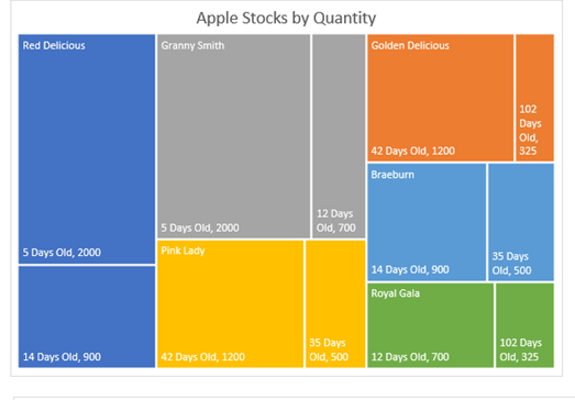
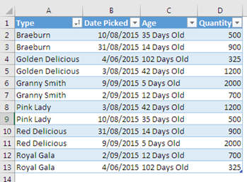
The chart above enables you to quickly see that Red Delicious apples have the most stock and the sub-branches enable you to see the different ages of the stock. It is based on the following data:

Treemap source data

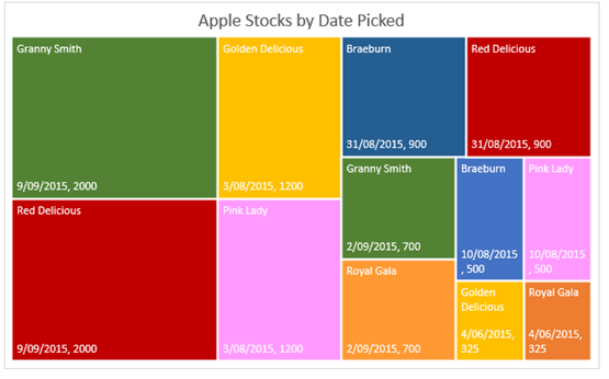
Alternatively you could arrange the data by age, which might make more sense for monitoring fruit stocks, and use the colours to create associations between the different types of apples like this:

example excel 2016 Treemap chart

Treemap Cautions

  • In my opinion Treemaps could quickly become the pie chart of Data Visualisation if they’re used purely for the purpose of having some eye candy in your report.
  • Careful labelling of these charts is required for them to be useful in decision making.
  • Comparisons in the data are tricky because there isn’t a common baseline for all categories.
  • Unfortunately the colour encoding must be done manually so this chart still needs some development before it meets all the requirements of a Treemap.
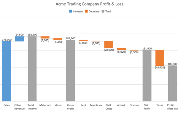
Waterfall Chart

Waterfall charts, sometimes called Bridge Charts, show the breakdown from a starting value to the end result. They are often used to visualise financial statements by illustrating the cumulative effect of income and expenses to get to the final figure.

new charts in excel 2016 - waterfall chart

Learn how to create Office 365 Excel Waterfall Charts here, including a workaround for earlier versions of Excel.

Pareto Charts

new charts in excel 2016 - pareto chart

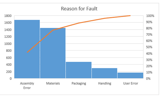
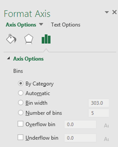
We’ve always been able to build a Pareto chart in Excel by combining a column and line chart, but in Excel 2016 it’s built in so there’s a little less effort required to create it. Plus there are some settings for the bins so you don’t need to collate the data into bins first:

pareto chart options menu

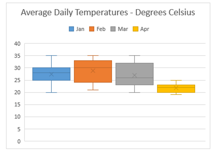
Box and Whisker Chart

Box-and-whisker plots are a great way to display data broken into four quartiles, each with an equal number of data values.

The box shows where the middle of the data lies and the whiskers show the smallest and largest values in the data set, which are sometimes also outliers.

It's a nice chart to use when analysing how your data is skewed.
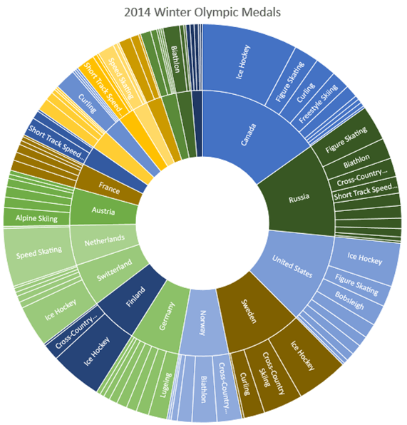
new charts in excel 2016  - box and whisker chart

Sunburst

I’ve left this one till last because it’s my least favourite. Sure it looks pretty, but so do pie charts. It doesn’t mean they are always useful!

Clearly there is too much data in this example as you can only read the labels on the largest segments, but then maybe that’s all you’re interested in.

new charts in excel 2016  - sunburst chart

Is Excel 2016 a Pipedream?

If the thought of upgrading to Excel 2016 is a pipedream for you and you want to be able to create Waterfall charts, Box and Whisker charts and more then you needn’t wait. Check out these Excel add-ins:

Charting Collection by add-ins.com – use coupon code MOTH to get 10% off.

excel chart add-ins

Peltier Tech Chart Utility – available for PC and Mac:

excel chart add-ins by peltier tech

Disclosure: If you purchase the Excel chart add-ins I earn a few dollars, but that's not why I recommend them. I do so because they're excellent tools.

Thanks

Special thanks to Shane Devonshire for providing the Olympics data for the sunburst chart.

New Charts in Excel 2016

More Excel Charts Posts

burn up burn down charts

Excel Project Management Burn Down and Burn Up Charts

Excel Burn Down and Burn Up Charts are easy to make with line or scatter charts. They are useful for monitoring the progress of a project.
wee people font charts

Excel WeePeople Font Charts

Excel WeePeople Font Charts are a nice change from generic shapes for waffle charts, bar/column charts and more.
excel dot map charts

Excel Dot Map Charts

Interactive Excel dot map charts are not built-in, but with some creative use of Excel’s built-in tools we can create something unique.
highlighting data in power bi visuals

Highlighting Data in Power BI Visuals

Learn several techniques to highlight or label important data points in your Power BI visuals. Sample file and code to download.
animating excel charts

Animating Excel Charts

Use animation correctly to enhance the story your data is telling. Don't animate your chart just for some eye candy. Sample code and workbook to download.
project management dashboard

Excel Project Management Dashboard

Excel project management dashboard video tutorial covering various techniques including conditional formatting, PivotTables, Slicers, charts and more.
jitter in scatter charts

Jitter in Excel Scatter Charts

Jitter introduces a small movement to the plotted points, making it easier to read and understand scatter plots particularly when dealing with lots of data.
Custom Excel Chart Label Positions

Custom Excel Chart Label Positions

Custom Excel Chart Label Positions using a dummy or ghost series to force the label position neatly above the columns of data
Lookup Pictures in Excel

Lookup Pictures in Excel

Lookup Pictures in Excel using values in cells returned by data validation lists (drop down lists) or Slicers. No VBA/Macros required!

Cross Highlight Excel Charts

Filter and Cross Highlight Excel Charts like you can in Power BI using some Excel Power Pivot magic, regular charts and a Slicer.

More Excel Charts Posts

picture fill excel charts

Picture Fill Excel Charts

Using a stylish picture fill in your Excel Charts is a simple way to make your data visualizations more captivating and memorable
excel speedometer charts

Excel Speedometer Charts

How to build Excel Speedometer Charts or Gauge Charts as they're also know, why they are BAD and what to use instead.
burn up burn down charts

Excel Project Management Burn Down and Burn Up Charts

Excel Burn Down and Burn Up Charts are easy to make with line or scatter charts. They are useful for monitoring the progress of a project.
wee people font charts

Excel WeePeople Font Charts

Excel WeePeople Font Charts are a nice change from generic shapes for waffle charts, bar/column charts and more.
excel dot map charts

Excel Dot Map Charts

Interactive Excel dot map charts are not built-in, but with some creative use of Excel’s built-in tools we can create something unique.
Excel S Curve Charts

Excel S-Curve Charts

Easy Excel S-curve Charts made with PivotTables for project management. Track progress by including budget amounts.
chart axis switch

Excel Chart Axis Switch

Use radio button form controls to create an Excel chart axis switch enabling you to toggle pannel charts between same axis and own axis.

Excel Charts with Shapes for Infographics

Excel Charts with Shapes for Infographic styling and increased interest in your charts. Easy to insert but there are a few tricks required.
excel pyramid chart

Excel Pyramid Charts

Excel Pyramid charts are useful for visualising demographic data across multiple categories. Let’s look at 3 ways we can build them in Excel.

Highlighting Periods in Excel Charts

Highlighting Periods in Excel Charts helps your users interpret them more quickly and or focus their attention on a point or area.


Category: Excel ChartsTag: excel charts
Previous Post:Calculate end of period dates in ExcelExcel End of Period Dates
Next Post:Automatically Add Items to Data Validation ListAutomatically Add Items to Data Validation List

Reader Interactions

Comments

  1. Matthew Kuo

    October 18, 2015 at 6:35 am

    I’ve been waiting for the Box and Whisker chart for a while. Glad it’s finally here.

    Reply
  2. Jon von der heyden

    September 18, 2015 at 7:19 pm

    Waterfall chart – wooohoooo! I can finally scrap my age old addin! Accountants love the waterfall!

    Reply
    • Mynda Treacy

      September 18, 2015 at 7:24 pm

      😀 indeed, we do love the waterfall chart!

      Reply
  3. Renato Vianello

    September 16, 2015 at 1:44 am

    Hi Mynda,
    good sneak peek…
    Does waterfall chart support negative numbers too???
    Ciao
    Renato

    Reply
    • Mynda Treacy

      September 16, 2015 at 9:36 am

      Hi Renato,

      Sure does!

      Mynda

      Reply

Leave a Reply Cancel reply

Your email address will not be published. Required fields are marked *

Current ye@r *

Leave this field empty

Sidebar

More results...

launch excel macros course excel vba course

Featured Content

  • 10 Common Excel Mistakes to Avoid
  • Top Excel Functions for Data Analysts
  • Secrets to Building Excel Dashboards in Less Than 15 Minutes
  • Pro Excel Formula Writing Tips
  • Hidden Excel Double-Click Shortcuts
  • Top 10 Intermediate Excel Functions
  • 5 Pro Excel Dashboard Design Tips
  • 5 Excel SUM Function Tricks
  • 239 Excel Keyboard Shortcuts

100 Excel Tips and Tricks eBook

Download Free Tips & Tricks

Subscribe to Our Newsletter

Receive weekly tutorials on Excel, Power Query, Power Pivot, Power BI and More.

We respect your email privacy

239 Excel Keyboard Shortcuts

Download Free PDF

mynda treacy microsoft mvpHi, I'm Mynda Treacy and I run MOTH with my husband, Phil. Through our blog, webinars, YouTube channel and courses we hope we can help you learn Excel, Power Pivot and DAX, Power Query, Power BI, and Excel Dashboards.

Blog Categories

  • Excel
  • Excel Charts
  • Excel Dashboard
  • Excel Formulas
  • Excel PivotTables
  • Excel Shortcuts
  • Excel VBA
  • General Tips
  • Online Training
  • Outlook
  • Power Apps
  • Power Automate
  • Power BI
  • Power Pivot
  • Power Query
microsoft mvp logo
trustpilot excellent rating
Secured by Sucuri Badge
MyOnlineTrainingHub on YouTube Mynda Treacy on Linked In Mynda Treacy on Instagram Mynda Treacy on Twitter Mynda Treacy on Pinterest MyOnlineTrainingHub on Facebook
 

Company

  • About My Online Training Hub
  • Disclosure Statement
  • Frequently Asked Questions
  • Guarantee
  • Privacy Policy
  • Terms & Conditions
  • Testimonials
  • Become an Affiliate

Support

  • Contact
  • Forum
  • Helpdesk – For Technical Issues

Copyright © 2023 · My Online Training Hub · All Rights Reserved. Microsoft and the Microsoft Office logo are trademarks or registered trademarks of Microsoft Corporation in the United States and/or other countries. Product names, logos, brands, and other trademarks featured or referred to within this website are the property of their respective trademark holders.