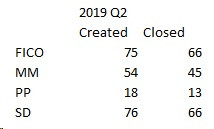
I am trying to prepare Doughnut chart for Tickets Created and Closed for a month / quarter / year.
My understanding is Doughnut chart should always be in percent in which case, can you please help me to understand how to arrive this? I mean, how to arrive the percent for open tickets and closed tickets per module ? Sample data attached
Hi Lakshmipathi,
After you've added a standard Doughnut chart (via the Insert, Charts part of the Ribbon), you need to add Data Labels and select the appropriate formatting options
Hopefully, it will eventually look something like the attached example
jim
Thank you very much for pitching in and help. My doubt is how do I arrive the Created percent automatically when I have the data only as ticket counts ? To cite an example, for FI, created ticket count shows as 75 and from there, your chart shows 34%. I want to know, from where I can fetch this percent. Hope, my query is clear now.
I myself got the direction and once again thank you very much for the help.
Not sure whether I can continue with the same thread but wanted to know how to make it as a Dash Board. My requirement is to module wise / year wise Doughnut Dash Board
I would be much obliged if someone can help me preparing Doughnut Dash Board for the attached data. In the next couple of days, I need to present it to all my clients.
You have the tools, use them wisely to complete the job
If you need any advice on a particular issue, I am happy to help with that, but I cannot second guess your requirements and do this for you
Thanks for the response. Yes I know the tools are available but since I am not familiar with Dash Boards, I sought the help here. I have explained my requirement that I need to prepare a Doughnut chart in DashBoard format for the Tickets Created versus Closed which could be month wise or customer wise. I know how to prepare a Doughnut chart but not sure for this specific requirement. Hope someone here can guide me.
Hi Lakshmipathi,
The purpose of the forum is to help you with specific Excel questions and troubleshooting. 'How to build a dashboard' is too broad and therefore verges on Excel consulting, rather than troubleshooting. In other words, helping you build a dashboard is outside the scope of forum support.
If you'd like to learn how to build dashboards, please consider my Excel Dashboard course.
Mynda
I wish to reiterate that I am not asking to send me a step by step document but requesting to let me know whether it is possible to prepare Doughnut DashBoard for the tickets created versus closed for a month or for a customer. From the tutorial I went through, my understanding is I need to have two Doughnut charts - one for month wise / customer wise created and another for closed. Can you please let me know my understanding is correct or not.
There are many ways to present the same information visually, some are better than others
The best way to find out (and improve your Excel expertise) is to experiment, asking for technical help with specific issues as they arise
There are no right or wrong solutions and only you and those around you will know what is better for your needs
It does take time, but the final results (in both your knowledge and your dashboard) will be the better for it
