Notifications
Clear all
General Excel Questions & Answers
2
Posts
2
Users
0
Reactions
585
Views
Topic starter
I am trying to make a graph that has a range from 0-800 in 100 increments on the y axis and 0 to 6.5 on the x axis in .5 increments. They aren’t the data points but I need to be able to insert one value for the x axis and one for the y axis and see what the line looks like. For example, 103 and 2.5. I am not sure how to make the graph without it taking the 0-800 and 0-6.5 as the actual data points. Thank you!
Posted : 22/11/2020 11:56 am

Hi Agal,
I presume you want a scatter chart?
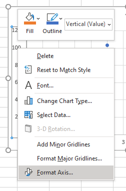
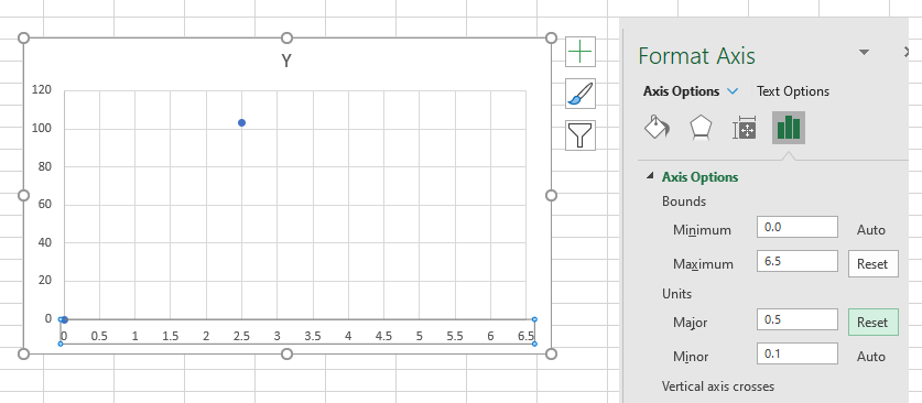
Enter your data and create the chart, then select an axis and right-click -> Format Axis.
Then set the min and max for the axis and set the major units
Here's a sample Excel file with chart.
Regards.
Phil
Posted : 22/11/2020 10:38 pm