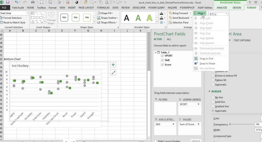
I am trying to recreate the 11/1/18 blog post on Excel Line Charts vs. Dot Plot. I'm having trouble lining up the two charts. I'm using Excel 2013 & when I click on Format, then Align, all the options are greyed out except snap to grid & snap to shape. I'm attaching my sample file & a screen shot of what I'm seeing when I click Format. Neither option seems to line up the two charts. Please help!
Hi Denise
I suggest you display the Primary Vertical Axis of your overlay chart. It is currently hidden.
Change the Axis font size to match the underlying chart as both are different in size. One is 9 pt and the other is 10 pt.
You can then adjust the overlay chart and plot area till the axis value is exactly on top of the underlying chart.
Hope this helps.
Sunny
