I'm having an issue with getting my charts to display how I would like.
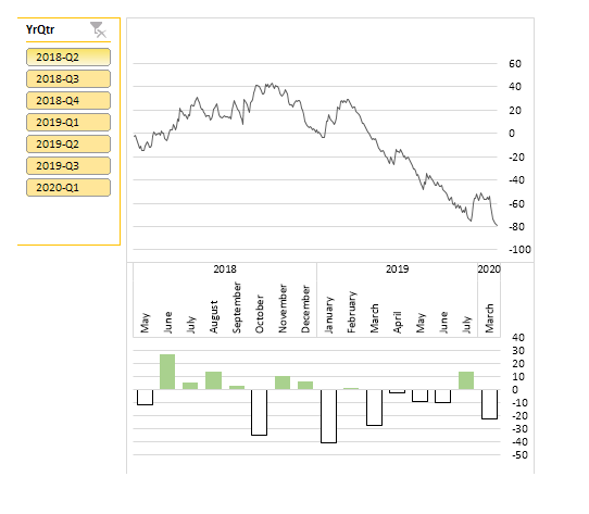
I have two charts positioned above each other as shown in the below image, the idea behind stacking them like this is so that I don't need to show the x axis values on the line chart as they are the same as the column chart underneath.

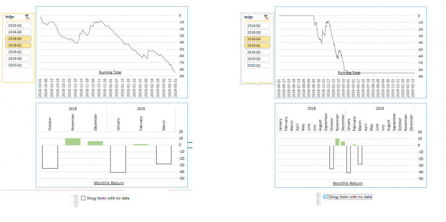
All was fine, or so i thought. Looking at the above chart it looks fine, but then i realised that there are several months without any returns at the end of 2019 which means that the charts aren't actually in sync. Now when I've had a play around the 'show items with no data' checkbox, I end up with the below.
As independent charts they do display the data as it should be, but they are not in sync with each other as the running total chart displays only up to the last entry in the data while the monthly return shows all months up to the end of the year.
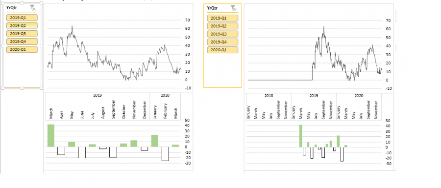
Another issue is that leading months going back to the start of the 'complete' master table are also being displayed. This is not so obvious on the above example, but on the below, these blank months take up the majority of the charts.

Any suggestions on how I can stop the leading and trailing months from showing while still displaying blank months within the dataset would be really appreciated.
Thanks
Hi Richard,
I see you have Slicers so these are obviously PivotCharts. You can use a filter on the Month field to select the specific date range you want, which will allow you to exclude the leading and trailing months. When you apply the Financial Year Slicer filters it shouldn't affect the month filters as these are different fields.
Mynda
I've tried filtering the months but this just filters out the same month for each year, im using excel 2013, not sure if that makes much of a difference.
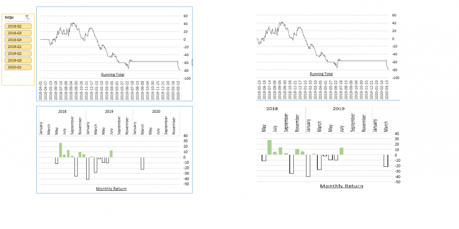
I've done a bit of clipping and pasting in paint to show the desired result in the below image.

On the left is how the charts displays at the moment and on the right is how I would like the charts to look.
I've shown the date axis on the running total as this makes the chart a bit clearer. As you can see the running total chart runs from 1st April 2018 to 24th March 2020 (this is the full range of the records in the master sheet but the actual dates for this Investment Strategy are from the 14th May 2018 to 24th March 2020). The Monthly Return chart displays all of the months for each year that has data for the specified strategy as I only selected 'show items with no data' on the month field and not the year field (for other strategies that start in 2019, only 2019 and 2020 are shown). The below image shows the fields that I have for the running total & monthly return pivot-tables. The YrMthDay on the running total has the 'show items with no data' option selected.
Another issue i've just noticed is that with the 'show items with no data' option selected it almost makes the slicer redundant as it doesn't change the chart view, but instead just hides the columns as shown below.

Apologies for the long posts
Thank you for the help
Hi Richard,
When I said filter out the months you don't need, I should have used the word 'dates'. i.e. make sure your dates in your PivotTable are grouped by days, months and years. Then expand the collapsed fields in the PivotTable for the periods you don't need so that the day dates are displayed > select one of the date cells in the row labels > click on the filter button for the row labels > deselect the dates you don't want in your chart.
Hope that points you in the right direction. If you're stuck, please share your file so we can show you how to do it.
Mynda
