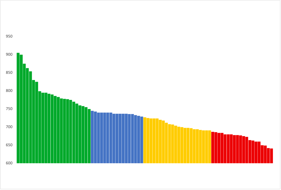
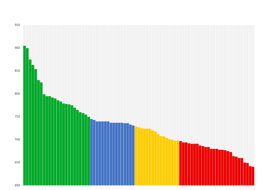
I am trying to create a 100% stacked column chart with the top portion of each column a grey color (like pic 2 attached).
I used the Excel Multi-colored Line Charts tutorial and successfully created a chart with the colored bars (pic 1 attached) using IF formulas, but I don't know how to add an additional data series to color grey. When I change the chart type to 100% stacked, it changes the y-axis to a percent, and when I change the category to number, the columns disappear.
I used the excel_chart_multi_colored_line.xlsx file (renamed excel_chart_multi_colored_bar_LY.xlsx, attached).
I appreciate any help.
Lisa

Hi Lisa,
The images uploaded, but the Excel file didn't. Please try again and wait for the grey check mark to appear beside the file size after pressing 'start upload' and before pressing 'submit reply'.
Mynda
Here's the spreadsheet I tried to attach.rnThanks!rnLisa
Hi Lisa,
You just need to add a column to the source data and chart for the balance of 950 and change the chart type to Stacked Column. See file attached.
Mynda
