How to change the data series name of a Pivot chart?
Ex; I need to change the name Total, Cannot change through the "select data" option.
Hi Ahamed,
You can only change the PivotTable row and column headers by typing over them on the face of the PivotTable. In your example, you don't need the legend because there is only one series. You can simply type a new chart title in to explain the content of the chart.
Mynda
Noted and thanks
Hi,
I have similar problem try to rename the legend entries in my power pivot chart.
I am trying to display a bar chart with Part and Full time employee by Countries.
Under [Legend Entries (Series)] it shown:
- FT
- PT
Under [Horizontal (Category)) Axis Labels
- Australia
- New Zealand
- Japan
etc...
The [Add],[edit], [remove] buttons are all greyed out. Therefore, I am not able to rename at all. How to get around this?
Hi Darren,
Welcome to our forum. When you're plotting data from a PivotTable in a Pivot Chart, as you are, you can only plot what is stored in the PivotTable. If you want different infromation in the chart, then you need to change the source data for the PivotTable so that it feeds through to the chart the way you want.
Mynda
Thank you very much, Mynda!
Hi,
Sorry, I have another question. How can I hide the "Total" in my pivot chart?
Thank you.
With regards
Darren
Looks like you have a 'Total' in your source data because totals calculated by the PivotTable do not display in Pivot Charts. You should never have totals in your source data because you'll end up double counting the data. Best to remove it from the source, then it also won't show in the Pivot Chart.
Mynda
Hello,
I have a similar question, but not quite.
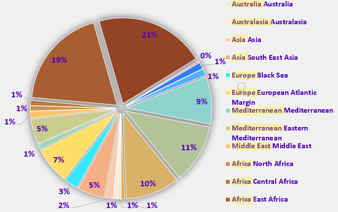
I have a pivot pie chart that refers to a pivot table with expandable fields, i.e. fields Region and Global Region. When I collapse all fields only Global Regions are shown on the pivot pie, when I expand them there are only Regions shown. My issue is when only Regions are shown the chart's legend looks wierd because for every series point it shows both Global Region and Region. I'm wondering if there is a way to exclude the GLobal Region part of the name in the legend?
Thank you.
Misha

Hi Misha,
Can I suggest you use a bar chart instead of a pie chart. You should never show more than 3 segments in a pie chart. Any more than that and it becomes very difficult to make sense of. Charts should be interpretable at a glance. Your reader shouldn't have to spend time deciphering the message.
I hope that points you in the right direction.
Mynda
Hy Mynda,
Many thanks for pointing me in the right direction. I agree with you that such a chart is challenging to read. Unfortunatelly my manager doesn't agree and insists on using pie charts, even when it makes no sense at all.
So my question remains open and I would appreceate any help.
Thanks,
Misha
It's a side effect of using a PivotTable as the source for a pie chart when you have multiple axis labels/expandable fields. I'd try showing your boss a bar chart and blame me for the suggestion, because there's no solution to the pie chart problem 😉
Thanks Mynda!
Thank you Mynda. I have mistaken "Ungraded" in my chart as "Total". It is a non issue.
