When you hover your mouse over an element in a visual, like a column in a clustered column chart, a tooltip like this appears.
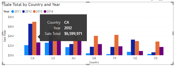
The mouse is over the first orange column so the tooltip is showing the country, year, and sale total for that column.
The country could be removed as you can tell this from the X axis. Also, I feel the year isn't needed in the tooltip. You can see the years in the legend and each cluster of columns is always 2011, 2012, 2013, 2014 from left to right, which I find easy to remember.
This Works In Power BI Service Too
I'm using Power BI Desktop in this example but the process is almost identical in Power BI Service.
Watch the Video

Download Example Power BI File
Enter your email address below to download the sample PBIX file.
Creating a Custom Tooltip
What I need is a custom tooltip that just shows me the Total Sales for the column I've got my mouse over.
To start this process, create a new page either by clicking the + in the yellow square at the bottom of the page, or from the Ribbon -> Insert -> New page
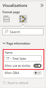
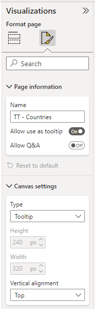
In Format Page -> Page Information, set the page name and click on Allow use as tooltip.
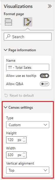
in Canvas Settings - choose type and set page size if using Custom. You can choose a number of different pre-defined types (page sizes) but you can use any size if you choose Custom.
I'll set the height of my custom page to 120 pixels, width is 320 pixels.
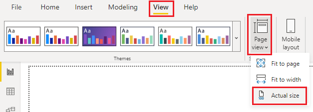
Then set the Page View to Actual Size
Add a card visual and add Sale Total to it, renaming that to Total Revenue.
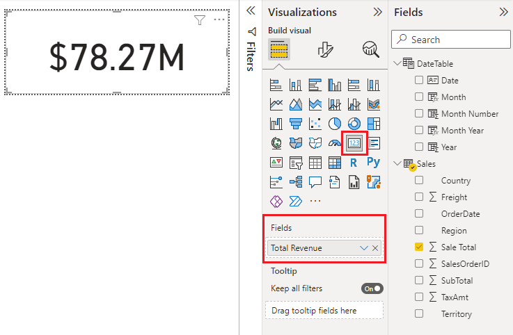
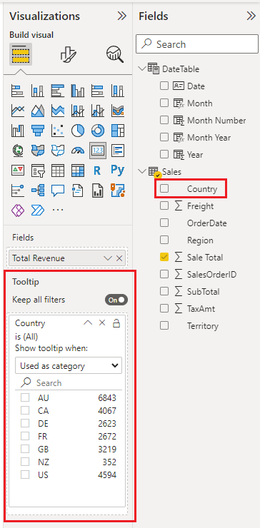
By dragging Country to the Tooltip area, whenever you hover over Country in a visual, this tooltip will appear.
Back in my clustered column visual, when I now hover over a column, I see the new tooltip.
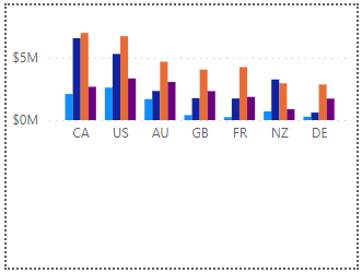
Breakdown of Sales by Each Country
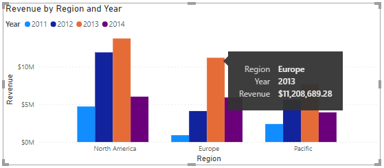
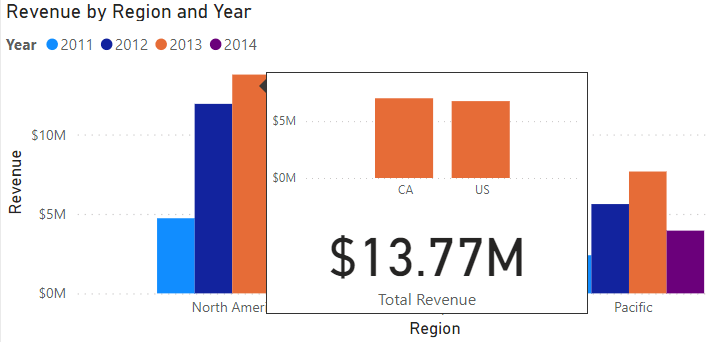
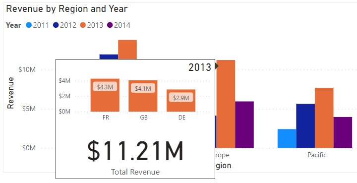
I've got another visual showing Revenue by Year by Region. The default tooltip shows Region, Year and Revenue.
I think I can do without the Region, and probably the Year. Revenue is needed but what would make this even better is if the tooltip showed a breakdown of the column so that I could see the contribution each country makes to the column's total.
To create the new tooltip, the first few steps are the same as before. Add a new page, in Page Information name the page, and enable Allow use as tooltip.
Under Canvas settings I'm going with the Tooltip type. The height and width of this is set already.
Then from the Ribbon, set Page View to Actual Size.
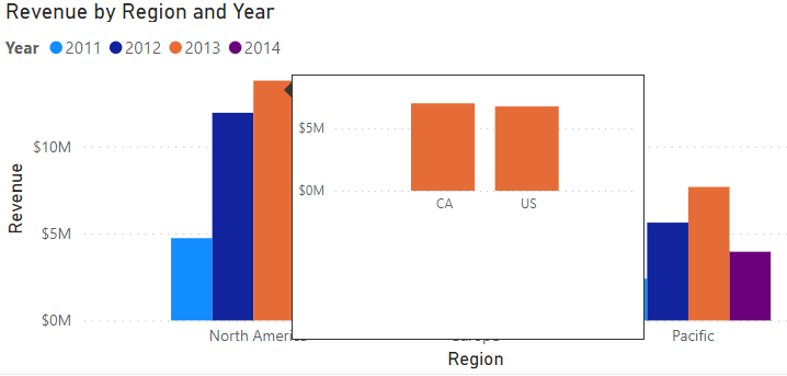
What I'm actually trying to do here is use my first visual (Revenue by Country by Year) as the tooltip for the Revenue by Region by Year visual. So to save a bit of time, I can copy and paste the Revenue by Country by Year clustered column visual from the main page into the tooltip page
I resize the visual and remove unwanted parts. I want it to only show the minimum, useful information. No need for things like the legend, axis titles and such. I end up with this.
I want to see this tooltip just for a specific visual, not every time I hover over a region. To set this, go back to the main page, and with the relevant visual selected, go to Format visual -> General -> Tooltips
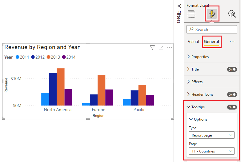
Make sure Tooltips is set to On and in Options set Type to Report Page and choose the name of the Page
This is what the tooltip looks like when it pops up in a visual
That's good but I can make the tooltip more useful by adding a figure for Sale Total to the bottom of the tooltip.
Back in the tooltip page, add a card (exactly as I did in the first example) and add Sale Total to this, renaming it Total Revenue
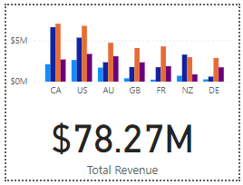
The tooltip now looks like this on the visual
Perhaps one more thing might help, adding the year to the top right of the tooltip. Up to you if you feel like this needs to be included.
On the tooltip page, add another card, add Year to the card with the aggregation MIN, and shrink the card down really small and position it in the top right corner of the tooltip page.
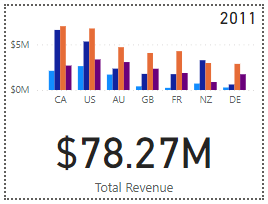
This is what the final tooltip looks like.
I'm really happy with that. It provides far more useful information than the default tooltip
Perhaps one more useful addition to the tooltip would be to add data labels to each column. I'll leave that to you to figure out how to do.
Hint : select the clustered column visual on the tooltip page then go to Format Visual -> Data Labels


I have a team that conducts inventory of equipment and other items for our college system and separates reports by departments, annual losses and total costs. I’d like to report other useful data to my bosses, but not sure how to develop trends or quick reports that can tell them something about the losses or totals. Any ideas?
Hi Gina,
Trends usually require a timeline (days, weeks, months, years etc.), or some other form of relationship between the data points. What you can do will depend on the data you have and what the drivers are of the business. It’s difficult to give you specific ideas without this understanding, however you might find our Power BI course or Excel Dashboards course helpful for ideas.
Mynda