• Skip to main content
  • Skip to header right navigation
  • Skip to site footer

My Online Training Hub

Learn Dashboards, Excel, Power BI, Power Query, Power Pivot

  • Courses
  • Pricing
    • Free Courses
    • Power BI Course
    • Excel Power Query Course
    • Power Pivot and DAX Course
    • Excel Dashboard Course
    • Excel PivotTable Course – Quick Start
    • Advanced Excel Formulas Course
    • Excel Expert Advanced Excel Training
    • Excel Tables Course
    • Excel, Word, Outlook
    • Financial Modelling Course
    • Excel PivotTable Course
    • Excel for Customer Service Professionals
    • Excel for Operations Management Course
    • Excel for Decision Making Under Uncertainty Course
    • Excel for Finance Course
    • Excel Analysis ToolPak Course
    • Multi-User Pricing
  • Resources
    • Free Downloads
    • Excel Functions Explained
    • Excel Formulas
    • Excel Add-ins
    • IF Function
      • Excel IF Statement Explained
      • Excel IF AND OR Functions
      • IF Formula Builder
    • Time & Dates in Excel
      • Excel Date & Time
      • Calculating Time in Excel
      • Excel Time Calculation Tricks
      • Excel Date and Time Formatting
    • Excel Keyboard Shortcuts
    • Excel Custom Number Format Guide
    • Pivot Tables Guide
    • VLOOKUP Guide
    • ALT Codes
    • Excel VBA & Macros
    • Excel User Forms
    • VBA String Functions
  • Members
    • Login
  • Blog
  • Excel Webinars
  • Excel Forum
    • Register as Forum Member

Change PivotChart Aggregation Methods using Excel Slicers

You are here: Home / Power Pivot / Change PivotChart Aggregation Methods using Excel Slicers
Change PivotTable Aggregation Methods using Excel Slicers
February 12, 2019 by Mynda Treacy

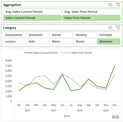
With disconnected tables in Power Pivot* we can change PivotChart aggregation methods using Excel Slicers. It allows us to create Pivot Charts where the user can select different views of the data like so:

Change PivotChart Aggregation Methods using Excel Slicers

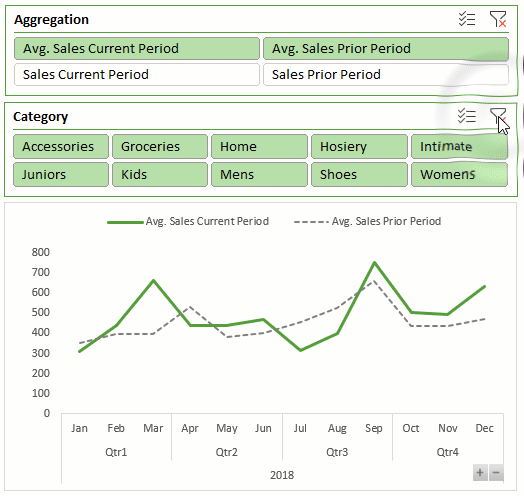
It’s handy if you have limited space in your report or dashboard, as it allows you fit two charts into one.

*Click here to see if your version of Excel supports Power Pivot.

This post assumes you are familiar with Power Pivot (aka the Data Model), can load data to the model and create relationships. If you’d like to learn Power Pivot, please consider my Power Pivot course.

Power Pivot Model Structure

The model contains a table for the facts i.e. the transaction data, called ‘Sales’. There’s also a Calendar table because the sales transactions are not on consecutive dates, which are required for the prior period measures below. And finally a table for the aggregation type.

aggregation table

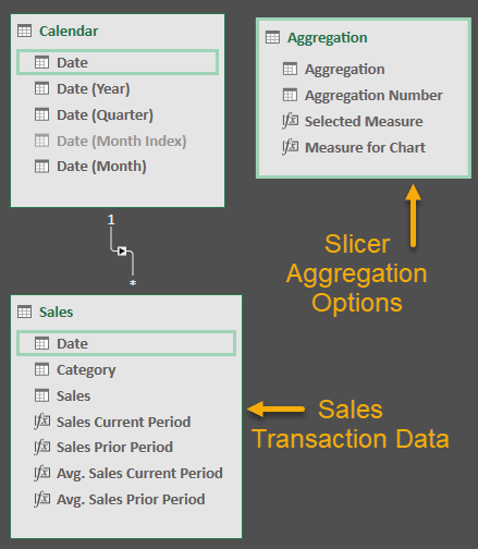
Tip: Notice that the Aggregation table is not connected to any other tables.

Power Pivot Measures

There are four measures that aggregate the sales values for the current period and prior period:

measures that aggregate the sales values

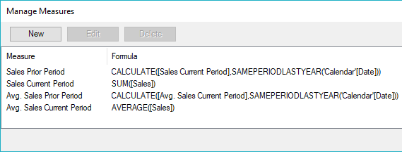
You can create more measures if required.

Disconnected Table

The trick to this is creating a disconnected table that we use to feed the Slicer. It’s just a Table in Excel that lists the measures/aggregations that I want the user to choose from, which I’ve loaded into the Power Pivot model.

disconnected table

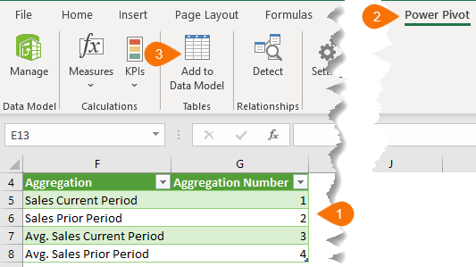
Remember, this table doesn’t get connected to any other tables in the model.

Next you need to set up a measure for this table that detects the aggregation number selected in the Slicer. Mine is called ‘Selected Measure’:

=MIN(Aggregation[Aggregation Number])

Then create another measure with the SWITCH function that takes the ‘Selected Measure’ value and returns the corresponding measure. Mine is called ‘Measure for Chart’:

=SWITCH(
[Selected Measure],
1, [Sales Current Period],
2, [Sales Prior Period],
3, [Avg. Sales Current Period],
4, [Avg. Sales Prior Period]
)

PivotTable

The PivotTable uses the field; ‘Aggregation’ in the column labels and the field; ‘Measure for Chart’ in the Values area. I’ve used dates in my row labels because my Sales table prior period measures require them.

aggregation in the column labels

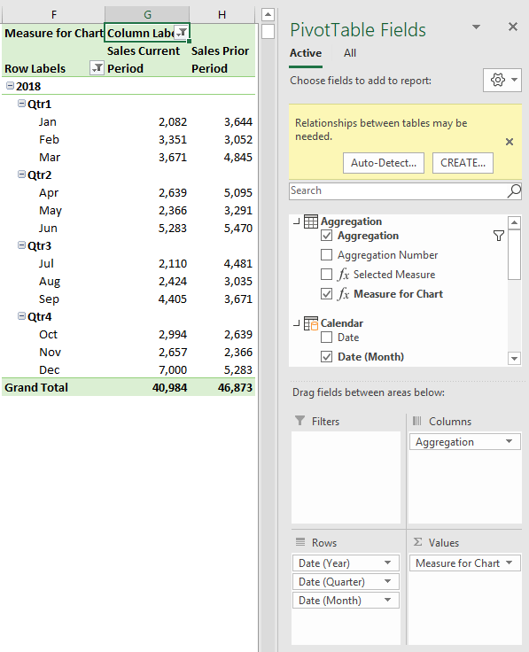
Note: You can ignore the Relationship warning in the field list that appears when you add ‘Aggregation’ and ‘Measure for Chart’ to the PivotTable.

PivotChart

And finally, insert your Slicer for the Aggregation type (and any others you want), and the Pivot Chart:

the pivottable feeds the pivot chart

Download Workbook

Enter your email address below to download the sample workbook.

By submitting your email address you agree that we can email you our Excel newsletter.
Please enter a valid email address.

Download the Excel Workbook. Note: This is a .xlsx file please ensure your browser doesn't change the file extension on download.

Thanks

Thanks to Erik Svensen for sharing this idea.

Change PivotTable Aggregation Methods using Excel Slicers

More Pivot Chart Posts

Excel Pivot Chart Drill Down Buttons

Excel Pivot Chart Drill Down Buttons are an easy way for users to drill up/down through levels of data in charts. They're new in Excel 2016.
pivot charts

Pivot Charts

How to insert Excel Pivot Charts. Includes workbook and video.

More Power Pivot Posts

CUBE Functions

Excel CUBE Functions

Excel CUBE Functions are a great alternative to GETPIVOTDATA for Power Pivot PivotTables and still work with Slicers.
Introduction to DAX

Introduction to DAX Measures

Introduction to DAX in Power BI and Excel. Where and how to write DAX measures, understanding filter context and more.

Toggle Top N with Slicers

Toggle Top N with Slicers using disconnected tables in Power Pivot. These easy measures allow users to choose their top n.
power pivot running total

Power Pivot Running Total

The defaul Power Pivot Running Total setting doesn't handle aggregated periods. This measure solves this issue.
static data tables

Static Tables in Power Query, Power Pivot and Power BI

Use static tables to store data in Power Query, Power Pivot and Power BI without needing to load data from an external source
custom formatting strings in power bi

Custom Formatting Strings in Power BI

Control how data is displayed in Power BI using your own formats. Like hiding negative or zero values, using symbols or custom number formats
GETPIVOTDATA Function for Power Pivot

GETPIVOTDATA Function for Power Pivot

The GETPIVOTDATA Function for Power Pivot references measures and so it works a little different to GETPIVOTDATA for regular PivotTables.
values_as_%_of_another_column_thumb

Show Values as Percentage of Another PivotTable Column Total

Show Values as % of Another PivotTable Column Total can't be done with regular PivotTables, however with Power Pivot we can use a DAX measure.
Change PivotTable Aggregation Methods using Excel Slicers

Change PivotChart Aggregation Methods using Excel Slicers

Change Pivot Chart Aggregation Methods using Excel Slicers and Power Pivot. Disconnected tables and the SWITCH function are the secret sauce.
PivotTable Distinct Count

Excel PivotTable Distinct Count

Excel PivotTable Distinct Count, sometimes called ‘Unique Count’ will return a count of unique items in a field. It uses the Data Model (Power Pivot).


Category: Power PivotTag: pivot chart
Previous Post:Excel Scroll and Sort Table
Next Post:RegEx (Regular Expressions) in Excelregex regular expressions in excel

Reader Interactions

Comments

  1. astier

    July 23, 2020 at 11:49 pm

    Hello,

    This is a dream. I humbly bow before you.
    Seriously this is amazing!

    astier

    Reply
    • Mynda Treacy

      July 24, 2020 at 9:28 am

      🙂 glad you can make use of it!

      Reply
  2. Frans van de Vlierd

    March 4, 2019 at 9:04 am

    Hi Mynda – I have just emailed the downloaded file to you along with sample screen shots of what I was experiencing. Frans

    Reply
    • Mynda Treacy

      March 4, 2019 at 9:43 am

      Thanks, Frans.

      It’s just that the line has lost its formatting. If you go to the PivotTable format tab and in the ‘Current Selection’ group choose the series from the drop down you can then add some colour back to the line (outline).

      You’ll have to do this for each series that’s missing the data, but once you’ve set them all up they’ll stick.

      Mynda

      Reply
  3. Frans van de Vlierd

    March 2, 2019 at 9:09 am

    Hi Mynda – fyi – When I opened the sample file and changed aggregation selections the chart lost the line colour – i.e. the plot area appeared blank (this occurred in Office 365 Business – Excel Version 1903 and also in MS Office Professional Plus 2016). Kind regards, Frans

    Reply
    • Mynda Treacy

      March 3, 2019 at 12:38 pm

      Hi Frans,

      That’s strange. Can you please send the file to me: website at myonlinetraininghub.com

      Mynda

      Reply
  4. Erik Svensen

    February 15, 2019 at 4:44 am

    Thanks for the mention 😉

    Reply
    • Mynda Treacy

      February 15, 2019 at 3:02 pm

      🙂 of course.

      Reply

Leave a Reply Cancel reply

Your email address will not be published. Required fields are marked *

Current ye@r *

Leave this field empty

Sidebar

More results...

launch excel macros course excel vba course

Featured Content

  • 10 Common Excel Mistakes to Avoid
  • Top Excel Functions for Data Analysts
  • Secrets to Building Excel Dashboards in Less Than 15 Minutes
  • Pro Excel Formula Writing Tips
  • Hidden Excel Double-Click Shortcuts
  • Top 10 Intermediate Excel Functions
  • 5 Pro Excel Dashboard Design Tips
  • 5 Excel SUM Function Tricks
  • 239 Excel Keyboard Shortcuts

100 Excel Tips and Tricks eBook

Download Free Tips & Tricks

Subscribe to Our Newsletter

Receive weekly tutorials on Excel, Power Query, Power Pivot, Power BI and More.

We respect your email privacy

239 Excel Keyboard Shortcuts

Download Free PDF

mynda treacy microsoft mvpHi, I'm Mynda Treacy and I run MOTH with my husband, Phil. Through our blog, webinars, YouTube channel and courses we hope we can help you learn Excel, Power Pivot and DAX, Power Query, Power BI, and Excel Dashboards.

Blog Categories

  • Excel
  • Excel Charts
  • Excel Dashboard
  • Excel Formulas
  • Excel PivotTables
  • Excel Shortcuts
  • Excel VBA
  • General Tips
  • Online Training
  • Outlook
  • Power Apps
  • Power Automate
  • Power BI
  • Power Pivot
  • Power Query
microsoft mvp logo
trustpilot excellent rating
Secured by Sucuri Badge
MyOnlineTrainingHub on YouTube Mynda Treacy on Linked In Mynda Treacy on Instagram Mynda Treacy on Twitter Mynda Treacy on Pinterest MyOnlineTrainingHub on Facebook
 

Company

  • About My Online Training Hub
  • Disclosure Statement
  • Frequently Asked Questions
  • Guarantee
  • Privacy Policy
  • Terms & Conditions
  • Testimonials
  • Become an Affiliate

Support

  • Contact
  • Forum
  • Helpdesk – For Technical Issues

Copyright © 2023 · My Online Training Hub · All Rights Reserved. Microsoft and the Microsoft Office logo are trademarks or registered trademarks of Microsoft Corporation in the United States and/or other countries. Product names, logos, brands, and other trademarks featured or referred to within this website are the property of their respective trademark holders.