Dashboards are time consuming to make, but this AI dashboard generation tool can make them in under a minute, and it's not ChatGPT!
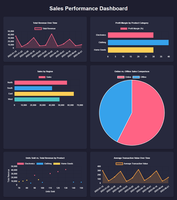
We'll take a basic table of data and transform it into the dynamic, interactive dashboard you see below with minimal effort, thanks to the power of AI.
By the end of this post, you'll see just how easy it can be to turn raw data into valuable insights.
Table of Contents
Watch AI Create a Dashboard in Seconds

Try creating your own AI Dashboard with the same example data.
Download Example File
Enter your email address below to download the sample workbook.
Introduction to Claude AI
Claude AI, created by Anthropic with backing from Google and Amazon, is a versatile AI assistant designed to handle a variety of tasks, from data analysis to coding. Unlike some other AI tools (I'm looking at you, ChatGPT), Claude allows you to upload files for free and can generate and display complex content like charts and entire dashboards.
Getting Started with Claude AI
You can access Claude directly from your web browser at claude.ai. One of its standout features is the ability to create and display interactive dashboards.
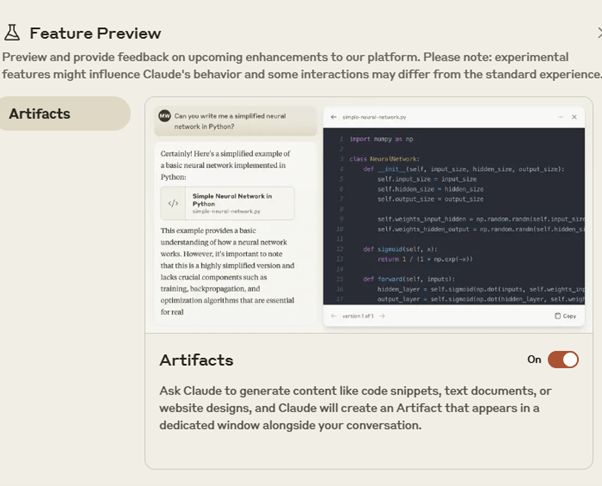
To get started, you'll need to enable the "Artifacts" feature in Claude. This feature allows you to view complex visualizations directly in the AI interface. Here's how you enable it:
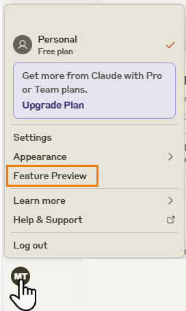
- Click on your initials in the bottom left corner.
- Select "Feature Preview."
- Toggle the 'Enable Artifacts' option:
Now that we have artifacts enabled, let's move on to creating a dashboard.
Uploading and Analyzing Data
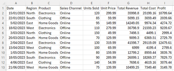
I'll use a fictional dataset that includes fields for date, region, product, sales channel, units sold, unit price, total revenue, total cost, and profit. This raw data can be overwhelming to interpret in its table format.
To simplify, we'll upload this dataset to Claude and let the AI do the heavy lifting.
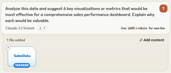
Drag and drop your data file into Claude and use the following prompt to get started:
This prompt not only asks Claude to generate visualization ideas but also to provide reasoning for each suggestion, giving us insights into effective data visualization.
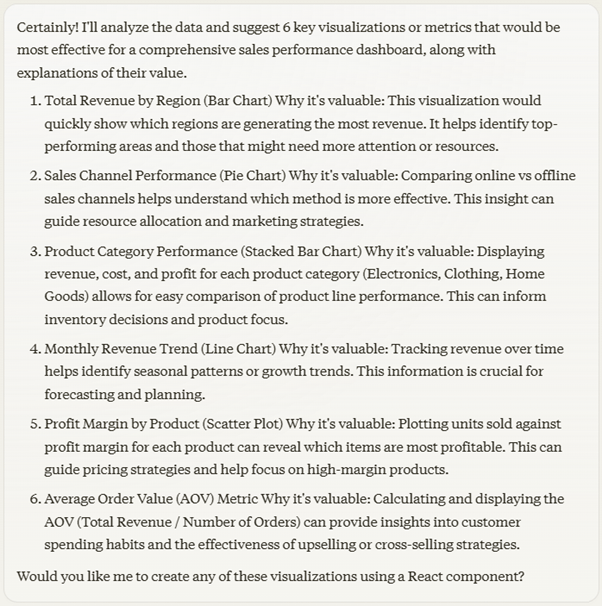
Claude responds with several suggestions for visualizations, such as geographic performance, time trends, product analysis, and sales channel effectiveness. These cover various aspects of our sales data, providing a comprehensive overview.
Some of the suggestions above aren't ideal. For example, the stacked bar chart at number 3 isn't great because the stacked elements are difficult to compare. And the Average Order Value at number 6 can't be calculated because the dataset doesn't contain order details. However, we can allow for this in our next prompt.
Creating the Dashboard
Next, let's ask Claude to create the actual dashboard using the following prompt:
Based on the visualizations you've suggested, create a visual representation of our complete dashboard with interactive elements excluding chart number 6 (average order value).
Make the line chart span the width of the dashboard.
Use the data from the CSV file I uploaded to populate the charts. Provide this as an HTML/CSS artifact that represents how our dashboard should look.
Use Chart.js for creating the charts and include the necessary JavaScript to process the CSV data and create the visualizations.
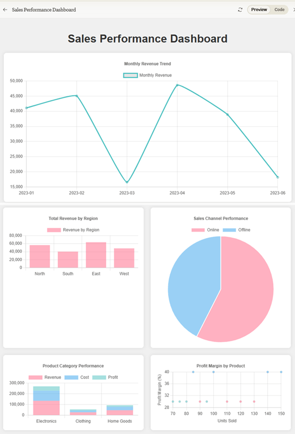
Claude will generate the HTML, CSS, and JavaScript needed to create the dashboard. The resulting dashboard displays the data in a user-friendly format, making it easy to identify key trends and insights.
There are some elements that aren't ideal, including the scatter chart which doesn't really show any useful insights and the stacked column chart that I mentioned earlier. But I think you'll agree, it's an impressive first attempt and took under a minute to generate.
Enhancing the Dashboard
To improve the dashboard's design, we can ask Claude to adjust the color theme with the following simple prompt:
Make the dashboard color theme more impressive.
Note: You can provide specific instructions to align the dashboard with your brand's colors and design guidelines to get better results.
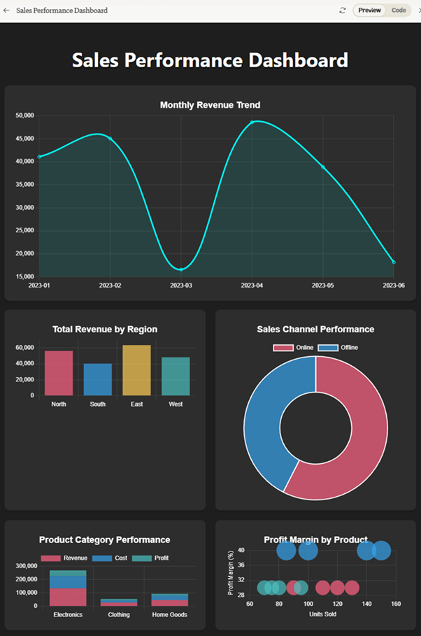
Claude responds with an upgraded design:
It's not bad. Again, there are a few elements that aren't ideal. For example, the curved line on the line chart results in the line going above the actual point for February and April, which is misleading. And the scatter and bubble chart is no more useful that the original, but I didn't specifically ask it to fix that chart.
AI Dashboard Design Limitations
While Claude AI offers impressive capabilities, it's important to recognize its limitations:
- Data Volume Limit: Claude can handle datasets up to 30MB, but I found it struggled with files containing more than 1,000 rows and a handful of columns coming in at just 13KB.
- Customization Challenges: While Claude can make adjustments, it's not as flexible as manual dashboard creation, especially for complex custom visualizations or layouts.
- Data Security: Be cautious about uploading sensitive business data to AI tools.
- Integration Limitations: Claude can't directly connect to databases or automatically update with new data. Advanced JavaScript and Python skills are needed for these tasks.
- Accuracy: as with all AI, you must check the output and not blindly rely on its accuracy, which means that even if the AI can create the dashboard in under a minute, you'll be spending much more than that verifying the results.
Alternatives and Workarounds
Given these limitations, here are some alternatives:
- Excel with AI Assistance: Use Claude to get ideas and formulas, then implement them in Excel yourself.
- Power BI: Professional business intelligence tools like Power BI offer more flexibility and robustness for large datasets and complex visualizations along with added security.
Next Steps
Claude AI is a powerful tool for quickly transforming raw data into interactive dashboards, making complex data analysis more accessible. While it's an excellent starting point that you should try out, understanding the process yourself adds immense value.
For those looking to dive deeper into data visualization, consider mastering tools like Power BI, which offer greater functionality and customization.
If you're interested in mastering Power BI, check out my comprehensive course designed to take you from novice to expert in creating professional interactive dashboards. You'll learn to transform raw data into stunning visual reports with advanced features and user-friendly interfaces.
Check out the Power BI course here.


I signed up for a free account with Claude AI, but the Feature Preview was not available. Is it regional or does it show up after one has used the software for a certain period of time?
Hi Susan,
It may be a regional constraint, or it might be that they’ve recently changed what they include in the free license. For me, it was available from the start.
Mynda
I’m in Ballarat Mynda, its not available for me here.
In that case, it looks like it’s a recent change because it worked for me when I recorded the video.
i want to learn Excel , Excel Dashboards, Power BI, Power Query, VBA and Power Pivot.
Hi Kehar,
Great to hear you’re interested in learning these skills. I recommend you check out my Power BI course page, as you can get those courses in a discounted bundle, with the exception of VBA. I would recommend learning Power Query before VBA, as it can automate the gathering and cleaning of data far easier than you can with VBA.
Reach out via email if you have any questions.
Mynda