Spreadsheets have been at the centre of business analysis for decades. They are familiar, flexible, and accessible to almost everyone.
But modern data analysis rarely happens in one tool.
You might start in Excel or Google Sheets, clean data in Power Query, query a database with SQL, automate tasks with Python, create charts in a dashboarding tool, and then use an AI assistant to help interpret the results.
That workflow can be powerful, but it can also be fragmented.
Quadratic is an AI-powered spreadsheet that aims to bring more of those capabilities together in one workspace. It combines a familiar spreadsheet interface with AI, formulas, Python, SQL, charts, data connections, and collaboration tools.
In this walkthrough, I tested Quadratic using a messy ecommerce dataset spread across multiple sheets. The goal was simple: could it take raw business data, clean it, analyse it, build interactive charts, and create an executive summary with only a few prompts?
This post is sponsored by Quadratic. All opinions and experiences are my own.
Table of Contents
- Watch the Video
- Get the Example Files
- What Is Quadratic?
- The Data Analysis Challenge
- Importing Data into Quadratic
- Cleaning Messy Date Data with AI
- Removing Duplicate Records
- Analysing Data Across Multiple Sheets
- Using Python Inside a Spreadsheet
- Creating Interactive Charts with AI
- Turning Analysis into an Opportunity and Risk Matrix
- Creating an Executive Summary from Spreadsheet Data
- Other Useful Quadratic Features
- Scheduled Reports and Automation
- Is Quadratic Spreadsheet 2.0?
- Try Quadratic with the Sample File
Watch the Video

Get the Example File
Enter your email address below to download the free file.

What Is Quadratic?
Quadratic is a modern spreadsheet tool designed for people who work with data but do not necessarily want to move between multiple applications to get the job done.
At first glance, it looks familiar. You have a spreadsheet grid, menus, formatting tools, sheet tabs, formulas, and the ability to sort and work with tabular data.
What makes it different is that it also brings several other data capabilities into the spreadsheet environment, including:
- AI chat and prompt-based analysis
- Python, SQL, and JavaScript support
- Data connections
- Interactive charts
- Formula editing
- Collaborative editing
- Workflow automation and scheduled updates
This means your spreadsheet is a one-stop workspace for cleaning, transforming, analysing, and presenting data using any tool you need.
The Data Analysis Challenge
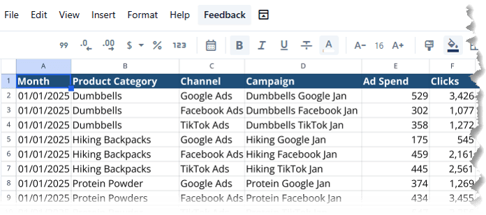
For this test, I used an ecommerce dataset containing several worksheets:
- Marketing activity
- Customer orders
- Product information
- Stock status
- Returns
- Search trends
This is a realistic structure for many businesses. Important information is often spread across several systems and worksheets rather than stored in one clean reporting table.
The data also had some issues that needed to be addressed before analysis could begin.
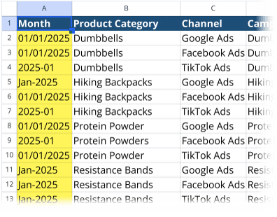
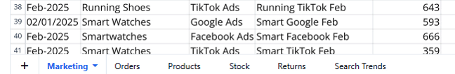
The marketing dates were inconsistent, with some entered as dates and others entered as text:
There was also a duplicate marketing record.
These may sound like minor issues, but inconsistent dates can make analysis difficult. In Excel, text dates often need careful cleaning before they can be used reliably in PivotTables, formulas, Power Query, or charts.
Importing Data into Quadratic
Quadratic allows you to import data from any source. For users who work with live data, Quadratic supports connections to databases and business tools. Its AI can help with connecting to data sources that may not already appear in the available connector list.
For this test, I connected to an existing Excel workbook which opens in a familiar spreadsheet layout.
Once the file is uploaded, the worksheets are available as tabs, making it easy to move between data. In this example, I could quickly switch between the marketing, orders, product, stock, returns, and search trend sheets:
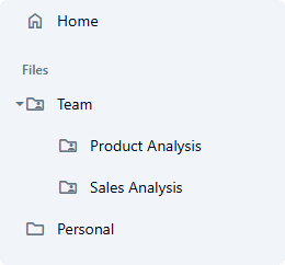
Quadratic also includes options to organise files into folders, which can be useful if you are working across multiple projects, reporting cycles, or teams.
Cleaning Messy Date Data with AI
The first task was to clean the inconsistent marketing dates.
In a traditional spreadsheet workflow, this could involve formulas, manual checking, Power Query transformations, or a combination of all three. Text dates are particularly difficult because the spreadsheet may interpret the same-looking date differently depending on the original format and regional settings.
Quadratic identified the inconsistent date column and suggested standardising it.
After selecting the suggestion, it cleaned and converted the dates into a consistent format. The spreadsheet showed that Quadratic was actively editing the data, so it was clear where the changes were being made.
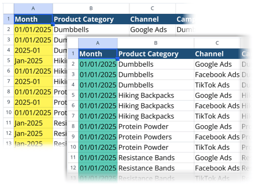
The result was a clean, usable date column without manually writing formulas or building a Power Query transformation.
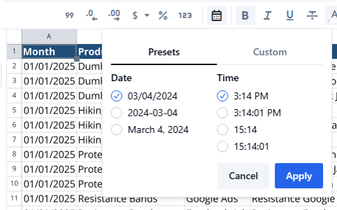
The date format could then be changed using the spreadsheet formatting tools, just as you would expect in a more traditional spreadsheet application.
Removing Duplicate Records
The next step was removing a duplicate record from the marketing data.
Again, this is a common data-cleaning task. In Excel, you could use the Remove Duplicates feature, Power Query, or formulas such as COUNTIFS to identify duplicate records.
Quadratic handled the task through an AI prompt.
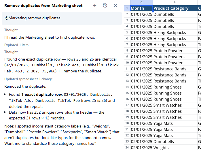
This is where AI inside the spreadsheet becomes useful. Instead of needing to decide which feature, formula, or transformation method to use, you can describe the intended outcome and then inspect the result in the worksheet.
Of course, it is still important to review what has been removed. A duplicate record is not always an error. In some datasets, repeated rows may be legitimate transactions, repeated customer interactions, or multiple events occurring on the same date.
Analysing Data Across Multiple Sheets
Once the data was cleaned, the more interesting test began.
The goal was to create a category-level summary that included:
- Revenue
- Units sold
- Average discount
- Gross margin
- Advertising spend
- Clicks
- Return rate
- Stock on hand
- Search interest
- Month-over-month revenue change
The challenge was that these metrics were spread across several different worksheets and were missing key measures.
For example, the orders data did not contain a revenue field. Revenue needed to be calculated from quantity and price. Product categories needed to be brought into other sheets before they could be used for analysis. Stock, marketing, returns, and search data all needed to be incorporated into one summary.
In Excel, this could involve a combination of calculated columns, XLOOKUP formulas, SUMIFS, PivotTables, Power Query merges, and possibly Power Pivot measures.
None of that is impossible, but it can take time to build and maintain.
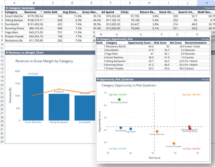
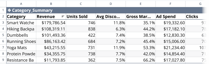
Instead, I asked Quadratic to create the category-level summary on a new sheet.
Quadratic read the data across the workbook, calculated the required fields, normalised inconsistent category names, and returned a Category Summary table.
Using Python Inside a Spreadsheet
One of the most interesting parts of the workflow was that Quadratic created the analysis as a Python object within the spreadsheet.
This is useful because Python is often the next step when spreadsheet formulas become too complex, data transformations become more involved, or you need a more repeatable workflow.
For people who know Python, Quadratic provides access to the underlying code. You can open the code editor, inspect the logic, and make changes directly.
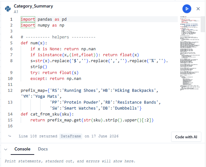
For people who do not know Python, the AI can help generate and edit the code.
That creates a useful middle ground.
You do not have to be a Python developer to benefit from Python-based analysis, but the code is still visible and editable for those who want more control.
This also avoids one of the biggest concerns people have about AI-generated analysis: the feeling that the result is a black box.
The AI can do much of the initial work, but the logic is still available for review.
Creating Interactive Charts with AI
After creating the category summary, Quadratic suggested building a combo chart to compare revenue and margin.
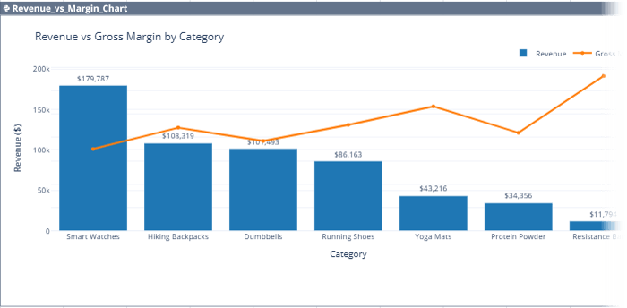
The chart is interactive. You can click and drag to zoom into sections, hover over data points for tooltips, and double-click to reset the view.
Interactive charts are particularly useful when you want to explore data rather than simply present a static report.
I then continued working with the AI to refine the analysis.
The next prompt asked Quadratic to create an opportunity and risk score for each product category using:
- Revenue trend
- Margin
- Stock availability
- Return rate
- Advertising efficiency
- Search interest trend
The result was a ranked table showing categories with potential growth opportunities and categories that may need operational attention.
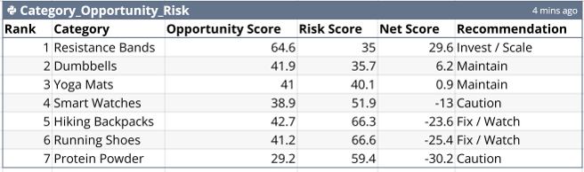
Quadratic also explained the assumptions it had made when weighting the factors in the score.
That is important.
An opportunity score is only as useful as the assumptions behind it. A business with excess stock may see that as a risk, while another business may see it as an opportunity to increase promotion. A high return rate might be a serious quality issue in one category but an expected pattern in another.
AI can create a useful starting point, but the weighting and interpretation should be informed by people who understand the business.
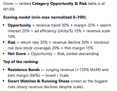
Turning Analysis into an Opportunity and Risk Matrix
Quadratic then suggested visualising the opportunity and risk scores in a quadrant scatter chart.
This type of chart can be useful for decision-making because it helps separate categories into groups, such as:
- High opportunity, low risk
- High opportunity, high risk
- Low opportunity, low risk
- Low opportunity, high risk
For an ecommerce business, this could help identify product categories that deserve more advertising spend, additional stock, better margins, product quality investigation, or closer operational monitoring.
The chart was generated as a Python chart inside the spreadsheet and remained interactive.
This is a good example of how the workflow can move from raw data to a more strategic business discussion.
Creating an Executive Summary from Spreadsheet Data
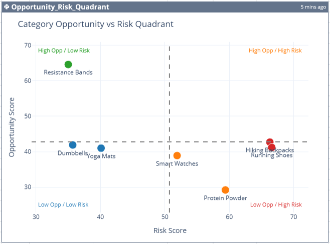
The final task was to create an executive summary.
After analysing the category performance, opportunities, and risks, I asked Quadratic to produce a written summary of the findings.
It created a new worksheet with:
- A business performance snapshot
- Category rankings
- Opportunity and risk observations
- Recommendations for each category
This is potentially one of the most useful parts of the workflow.
Many analysts spend a lot of time not only preparing data and building reports, but also translating the numbers into clear business language.
AI can help draft that first version of the narrative. It can identify patterns, summarise rankings, and turn metrics into a structured set of observations.
However, the final summary should always be reviewed before it is shared with stakeholders or used to support a business decision.
AI may make assumptions that are not appropriate for your organisation, overlook important context, or overstate the significance of a pattern.
The goal is to save time on the first draft, then apply your own judgement.
Other Useful Quadratic Features
Beyond the data-cleaning and analysis workflow, a few other features stood out.
Organised AI Chat History
Quadratic keeps AI conversations organised and searchable.
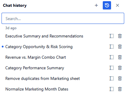
This can be useful when you are working on a larger analysis project and need to return to an earlier prompt, find the logic behind a calculation, or continue a previous line of investigation.
Instead of starting again from scratch, you can search your chat history and continue where you left off.
Collaboration
Quadratic supports sharing and collaborative editing.
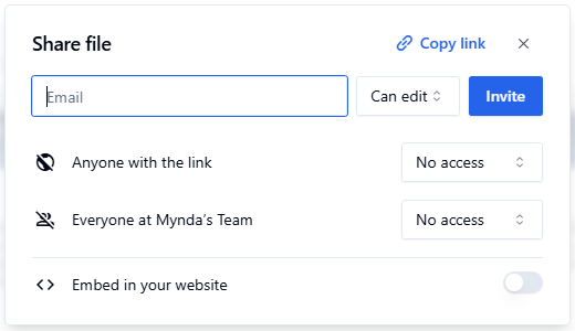
That means multiple people can work on the same spreadsheet-based analysis, rather than passing files back and forth through email or creating multiple versions of the same report.
For teams working on reporting, forecasting, or data-cleaning projects, this can make the workflow easier to manage.
Scheduled Reports and Automation
Quadratic also supports scheduled updates for recurring reports.
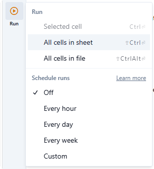
This could be useful for reports that need to be refreshed regularly, such as weekly sales reports, monthly marketing performance summaries, stock status reports, or operational dashboards.
A recurring workflow could potentially include:
- Gathering updated data
- Cleaning and transforming it
- Refreshing calculations
- Updating charts
- Producing a revised summary
That has the potential to reduce the manual work involved in routine reporting.
Is Quadratic Spreadsheet 2.0?
I would not suggest that AI spreadsheets will replace every existing spreadsheet workflow.
Excel remains extremely capable, particularly for people who know how to use formulas, PivotTables, Power Query, Power Pivot, VBA, and the wider Microsoft ecosystem.
But tools like Quadratic point towards an interesting direction for spreadsheet software.
They keep the familiar grid layout that people already understand, while adding more of the tools that modern data work often requires:
- AI
- Python
- SQL
- Formulas
- Charts
- Data connections
- Collaboration
- Automation
The biggest advantage that AI can help shorten the distance between messy data and a useful business conversation.
In this example, a few prompts took the workflow from inconsistent dates and multiple disconnected worksheets to cleaned data, category-level analysis, Python outputs, interactive charts, risk and opportunity scoring, and an executive summary.
The results still need to be checked.
Important assumptions, calculations, recommendations, and business conclusions should always be reviewed before they are used in a real business setting.
But you are no longer starting from a blank workbook, manually building every formula, or accepting an unexplained answer from an AI chatbot.
You can inspect the data, review the logic, refine the analysis, and build on the result.
That is what makes Quadratic an exciting analysis workspace for people who want the familiarity of a spreadsheet with more of the power of modern data tools.
Try Quadratic with the Sample File
You can try Quadratic here and download the sample ecommerce dataset used in this walkthrough using the links here.


This is greatly interesting.
Have fun testing it out, Raphael!